Category Archives: Python Tips & Tricks

Doing things in Python that you would normally do in Excel

Learning a new coding language is always a challenge. One thing that helps me is to create a short tutorial for myself of some of the basic data tasks that I might do when I initially sit down with a data set. I try and think through this in relationship to stuff I might have done (a long, long time ago) in Excel with regards to summarizing data, adding new features, and creating pivot tables.

Since I’m not that great in Python, here is my Doing things in Python that you would normally do in Excel tutorial that may help others looking to get started with this coding language.

The tasks that I cover are:

  1. Exploring features of the data
  2. Sorting the columns
  3. Filtering the columns
  4. Creating new features
  5. Calculating summary statistics
  6. Building pivot tables
  7. Data visualization

The data I use comes form the pybaseball library, freely available for install in python. I’ll be using the pitchers dataset from years 2012 to 2016.

The entire jupyter notebook is accessible on my GitHub page.

Libraries and Data

The libraries I use are:

  • pandas — for working with data frames
  • numpy — for additional computational support
  • matplotlib & seaborn — for plotting data
  • pybaseball — for data acquisition

I called the data set pitchers. The data consists of 408 rows and 334 columns. After doing a bit of exploring the data set (seeing how large it is, checking columns for NA values, etc), we begin by sorting the columns.

Sort Columns

Sorting columns is done by calling the name of the data set and using the sort_values() function, passing it the column you’d like to sort on (in this case, sorting alphabetically by pitcher name)

## Sort the data by pitcher name

pitchers.sort_values(by='Name')

If you have a specific direction you’d like to sort by, set the ‘ascending’ argument to either True or False. In this case, setting ascending = False allows us to sort the ERA from highest to lowest (descending order).

## Sort the data by ERA from highest to lowest

pitchers.sort_values(by = 'ERA', ascending = False)

(For additional sorting examples, see the GitHub code)

Filtering Columns

Filtering can be performed by explicitly stating the value you’d like to filter on within the square brackets. Here, I call the data frame (pitchers) and add the .loc function after the data frame name in order to access the rows that are specific to the condition of interest. Here, I’m only interested in looking at the 2012 season. Additionally, I only want a few columns (rather than the 334 from the full data set). As such, I specify those columns AFTER the comma within the square brackets. Everything to the left of the comma is specific to the rows I want to filter (Season == 2012) and everything to the right of the comma represents the columns of interest I’d like returned.


## Filter to only see the 2012 season
# Keep only columns: Name, Team, Age, G, W, L, WAR, and ERA

season2012 = pitchers.loc[pitchers['Season']== 2012, ['Name', 'Team', 'Age', 'G', 'W', 'L', 'WAR', 'ERA']]
season2012.head()

If I only want to look at Clayton Kershaw over this time period, I can filter him out like so:


## Filter Clayton Kershaw's seasons
# Keep only columns: Season, Name, Team, Age, G, W, L, WAR, and ERA
# arrange the data set from earliest season to latest

kershaw = pitchers.loc[pitchers['Name']=='Clayton Kershaw', ['Season', 'Name', 'Team', 'Age', 'G', 'W', 'L', 'WAR', 'ERA']].sort_values('Season', ascending = True)
kershaw.head()

To make the data set more palatable for the rest of the tutorial, I’m going to create a smaller data set, with fewer columns (pitchers_small).


## Create a smaller data set
# Keep only columns: Season, Name, Team, Age, G, W, L, WAR, ERA, Start-IP, and Relief-IP
# arrange the data set from earliest season to latest for each pitcher

pitchers_small = pitchers[['Season', 'Name', 'Team', 'Age', 'G', 'W', 'L', 'WAR', 'ERA', 'Start-IP','Relief-IP']].sort_values(['Name', 'Season'], ascending = True)
pitchers_small.head(30)


Creating New Features

I create three new features in the data set:

  1. A sequence counter that counts the season number of each pitcher from 1 to N seasons that they are in the data set.This is done by simply grouping the data by the pitcher name and then cumulatively counting each row that the pitcher is seen in the data. Notice I add “+1” to the end of the code because python begins counter at “0”. NOTE: To make this work properly, ensure that the data is ordered by pitcher name and season. I did this at the end of my code, in the previous step.
  2. An ‘age group’ feature that groups the ages of the pitchers in 5 year bins.To accomplish this task, I use a 3 step process. First, I specify where I want the age bins to occur and assign it to the bins variable. I then create the labels I would like to correspond to each of the bins and assign that to the age_group variable. Then I use the np.select() function to combine this information, assigning it to a new column in my data set called ‘age_group‘.
  3. A ‘pitcher type’ feature that considers anyone who’s starter innings pitched was greater or equal to the median number of starting innings pitched as a ‘starter’ and all others as ‘relievers’.To create the pitcher_type column, I use the np.where() function, which works like ifelse() or case_when() in R or like IF() in excel. The first argument is the condition I’d like checked (“did this pitcher have starter innings pitched that were greater than or equal to the median number of starter innings pitched?). If the condition is met, the function will assign the pitcher in that row as a “starter”. If the condition is not met, then the pitcher in that row is designated as a “reliever”.


## Add a sequence counter for each season for each pitcher
pitchers_small['season_id'] = pitchers_small.groupby(['Name']).cumcount() + 1

## Create a new column called 'age_group'
# create conditions for the age_group bins
bins = [
    (pitchers_small['Age'] <= 25), (pitchers_small['Age'] > 25) & (pitchers_small['Age'] <= 30), (pitchers_small['Age'] > 30) & (pitchers_small['Age'] <= 35), (pitchers_small['Age'] > 35) & (pitchers_small['Age'] <= 40), (pitchers_small['Age'] > 40)
]

# create the age_group names to be assigned to each bin
age_group = ['<= 25', '25 to 30', '31 to 35', '36 to 40', '> 40']

# add the age_group bins into the data
pitchers_small['age_group'] = np.select(bins, age_group)

## Create a pitcher_type column which makes a distinction between starters and relievers
pitchers_small['pitcher_type'] = np.where(pitchers_small['Start-IP'] >= pitchers_small['Start-IP'].median(), 'starter', 'reliever') 

pitchers_small.head()


Calculating Summary Statistics

The GItHub repo for this post offers a few ways of obtaining the mean, standard deviation, and counts of values for different columns. For simplicity, I’ll show a convenient way to get summary stats over an entire data set using the describe() function, which is called following the name of the data frame and a period.


## Get summary stats for each column

pitchers_small.describe()

Pivot Tables

There are a few ways to create a pivot table in python. One way is to use the groupby() function for the class you’d like to summarize over and then call the mathematical operation (e.g., mean) you are interested in. I have an example of this in the GitHub post in code chuck 42 as well as several examples of other pivot table options. Another way is to use the pivot_table() function from the pandas library.

Below is a pivot table of the mean and standard deviation of pitcher age across the 5 seasons in the data set.

## Pivot Table of Average and Standard Deviation of Wins by Season
# Round the results to 1 significant digit

round(pitchers_small.pivot_table(values = ['Age'], index = ['Season'], aggfunc = (np.mean, np.std)), ndigits = 1)

You can also make more complicated pivot tables by setting the columns to a second grouping variable, as one would do in Excel. Below, we look at the average WAR across all 5 seasons within the 5 age groups (which we created in the previous section).

## Calculate the average WAR per season across age group

pitchers_small.pivot_table(values = ['WAR'], index = ['Season'], columns = ['age_group'], aggfunc = np.mean)


Data Visualization

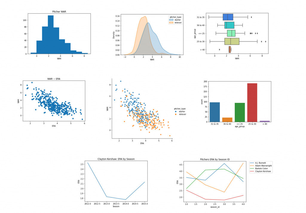
In the GitHub post I walk through how to plot 8 different plots:

  1. Histogram
  2. Density plots by group
  3. Boxplots by group
  4. Scatter plot
  5. Scatter plot highlighting groups
  6. Bar plots for counting values
  7. Line plot for a single player over time
  8. Line plots for multiple players over time


Python Tips & Tricks: Coding A Tensorflow Neural Network to Predict Yards After Catch

As I work to improve my python skills, I’ll keep adding my efforts to the blog. This week, I saw a nice article showing a basic approach to coding a neural network in R to predict yards after catch in NFL receivers from the folks at www.opensourcefootball.com. So, I decided to take that idea and try and create my own neural network in Python.

Some notes:

  1. This is not a to say that the neural network was the best method to answer the question. Rather, it was just a way for me to try and take stuff I’d already do in R and see if I could learn it in Python.
  2. This is not a blog post to cover all aspects of neural networks (not even close). It just so happened that the original article used a neural network via tensorflow in R and I happened to be doing some work in tensorflow in Python this week, so it was an easy connection to make.
  3. My Python coding is pretty messey and at times I feel like it takes me several steps to do what someone might do in a few lines. Feel free to comment and offer suggestions.
  4. Harking back to point one, I finish the script by coding a linear regression model to answer the same question (predict yards after catch) as it is a simpler and more interpretable than a neural network. I construct the regression model in two ways. First, I do it in sklearn, which seems to be the preferred approach to coding models by pythoners. I then do it in the statsmodels library. I’m sure this is more a function of my poor python programming skills but I do feel like the model output from statsmodels is more informative than what I can get returned from sklearn (and I show this in the script).

The data came from nflfastR, which is an R package for obtaining NFL play-by-play data created by Ben Baldwin et al.

I provide a step-by-step explanation for coding the model on my GITHUB page.


Python Tips & Tricks: Random Forest Classifier for TidyX Episode 18

As a means of working on improving some of my Python skills, I decided I’ll attempt to re-create different elements from some of our TidyX Screen Casts.

This past week, we did an episode on building a random forest classifier for coffee ratings (CLICK HERE). I’ve recreated almost all of the steps that we did in R in Python Code.

1) Loading the data from the TidyTuesday github page.

2) Data pre-processing

3) Exploratory data analysis

4) Random Forest classifier development and model testing


You can access the full Jupyter Notebook on my GITHUB page. I’m still trying to get the hang of Python so if there are any Pythonistas out there that have feedback or see errors in my code, I’m all ears!


Python Pivot Tables

Feedback from the last two blog entries suggests that people seem to enjoy the “how to” nature of them. Walking through how to do some basic coding steps while exploring, summarizing, visualizing, and analyzing data is a great way to help others feel comfortable when trying to move from excel or SPSS to a code language (like R or Python). Additionally, this also helping me to get back to first principles and put together a step-by-step approach to teaching this stuff to others.

As such, I’ve decided to start incorporating some articles where I walk through each line of code. Since I’ve started to do a bit more work in Python (though I still strongly favor R), I feel like this is a great place for me to start.

For those of us who started out in sport and exercise science, using Excel Pivot Tables was one of the first way we began to explore our data and summarize what was there. Today, I’ll walk through how we can create some of those exact same pivot tables in Python.

The Jupyter Notebook and data for this article are available on my GitHub page.

The data I used for this article was taken from www.hockey-reference.com and consists of game outcomes from the 2014-2015 Season through the 2018-2019 Season. I stored the data as a .csv file for this article but I’ll do a future blog article on how to scrape data from webpages like this. This is additionally fun because I know very little about hockey, so I get to learn along the way!

Step 1: Load Packages

  • First I start out just loading the packages (Python people call them “libraries” but I’m still stuck in the old R jargon, so I say “packages”) that contain some of the functions that I’ll need to do my analysis.
  • Pandas is the main data frame package in Python and numpy is useful for dealing with arrays and various mathematical functions.
  • Seaborn and Matplotlib are two packages that I mainly use for data visualizing, however I do not do anything visualization in this article.
  • Finally, the OS package is what I use to check my working directory and change the working directory, if needed (more on that later).
  • Once importing each package I give them an alias (e.g., pandas as pd) so that I can use a short hand version of the package name when I call one of it’s functions, which you will see throughout this article.

# Load packages

import pandas as pd
import numpy as np
import seaborn as sns
import matplotlib.pyplot as plt
import os as os

Step 2: Change the working directory if needed and load data

  • The working directory is the place where the data for your analysis is stored.
  • os.getcwd() is a function from the “os” package that gets my current working directory. If the directory needs to be changed to a different folder (for example, if the data were stored somewhere other than my desktop), I use the os.chdir() function to change it.
  • Once I have the directory set, I load the data using the pd.read_csv() function from the pandas package.
  • After the data is loaded, we take a look at the first few rows of the data frame.
  • An example of all of these steps is provided in the screen shot of my Jupyter notebook.

# Get current working directory
os.getcwd()

# Change the working directory
os.chdir('/Users/Patrick/Desktop')

# Load the 2014 - 2018 NHL Scores data
nhl = pd.read_csv('2014-2018 NHL Scores.csv')

# Look at the first few rows
nhl.head()

Step 3: Clean up the data (All little housekeeping)

  • We notice that the Goals (‘G’) column is repeated, once for the Visitor and once for the Home team. Thus, the second time it is referred to as ‘G.1’. So, we can rename these columns to ‘Visitor_G’ and ‘Home_G’, so that they are more explicit and less confusing.
  • Next, we want to create four new columns. First, we create a column that calculates the point differential of the game for the home team. Then we create a column that identifies whether the winner was the home or away team. Finally, we create a column that tells us which team was the winner and a column telling us which team was the loser. You can see that I do all of these steps by first creating the conditions I’m testing (comparing goals for the home team to goals for the away team) and then assigning the outcome a specific label (e.g. home, away, or tie).

nhl['Point_Diff'] = nhl['Home_G'] - nhl['Visitor_G']

conditions = [
(nhl['Home_G'] > nhl['Visitor_G']),
(nhl['Home_G'] < nhl['Visitor_G']),
(nhl['Home_G'] == nhl['Visitor_G'])]

choices = ['home', 'visitor', 'tie']

nhl['winner'] = np.select(conditions, choices, default = 'null')

cond_for_winner = [
(nhl['winner'] == 'home'),
(nhl['winner'] == 'visitor'),
(nhl['winner'] == 'tie')]

choices_for_winner = [nhl['Home'], nhl['Visitor'], 'tie']
choices_for_loser = [nhl['Visitor'], nhl['Home'], 'tie']

nhl['winning_team'] = np.select(cond_for_winner, choices_for_winner, default = 'null')
nhl['losing_team'] = np.select(cond_for_winner, choices_for_loser, default = 'null')

  • Our data frame now looks like this:

Step 4: Create Pivot Tables

Now that we have the data arranged, we can create some pivot tables.

First, let’s create a pivot table looking at the average home point differential by season.


nhl.groupby('Season').mean()['Point_Diff']


I produced this, as you can see from the code, by looking for the mean of ‘Point_Diff’, grouped by the variable ‘Season’.

This is useful, but I don’t love how it looks. Using the pivot_table() function, we can get a nicer looking output.


nhl.pivot_table(values = 'Point_Diff', index = 'Season', aggfunc = np.mean)


Much nicer!!

Next, lets look at how many times the home team won.


nhl.groupby(['winner']).size()

If we divide by the total number of observations, we get the percentage of times the home team won.


nhl.groupby(['winner']).size() / len(nhl.index)


We can also look at home and visitor win percentage by each season within our data, again by using the groupby() function. We then create two columns, one for home and one for visitor win percentage with just some basic math.


season_totals = nhl.groupby(['Season', 'winner']).size().unstack()
season_totals['Home_Win_Pct'] = season_totals['home'] / (season_totals['home'] + season_totals['visitor'])
season_totals['Visitor_Win_Pct'] = season_totals['visitor'] / (season_totals['home'] + season_totals['visitor'])
season_totals

Finally, we can look at the Win% for each team over this 5 year stretch. Three steps were required to do this:

  1. The first chunk of code gets the total number of times each team played a game.
  2. The second chunk of code tally’s up the teams total wins and losses and stores them in a data frame (team_perf).
  3. The final chunk of code calculates a win percentage an then sorts the win percentage from best to worse.

team_win_totals = nhl.groupby(['winning_team']).size()
team_loss_totals = nhl.groupby(['losing_team']).size()

team_win_totals = pd.DataFrame(team_win_totals, columns = ['wins'])
team_loss_totals = pd.DataFrame(team_loss_totals, columns = ['losses'])
team_perf = team_win_totals.join(team_loss_totals)

team_perf['Win_Pct'] = team_perf['wins'] / (team_perf['wins'] + team_perf['losses'])
team_perf.sort_values(by = ['Win_Pct'], ascending = False)

Conclusion

There are a number of other things we could have built Pivot Tables on to explore this simple data set. Feel free to take the code and the data from my GitHub page and play around with it yourself. I don’t code too often in Python (still trying to figure out a lot of the syntax) so if you notice any errors in the code or ways to make it cleaner (nothing beats R Tidyverse, in my opinion), feel free to comment below.


Data Analysis Template in R Markdown & Jupyter Notebook

The nice thing about working on a team with other analysts, working as part of a research group, or working on your PhD is the ability to share analysis with other colleagues, get feedback, and learn new ways of thinking about things.

Interestingly, when I’ve inquired to colleagues at some teams about how they share their analysis with their group they often say that, “people do their analysis and just present the results”. I think this is a big miss in terms of being able to have transparency in the research process, sharing so that others can learn or help to provide constructive feedback, and walking through the steps you went through (data retrieval,  data cleaning, analysis, model testing, etc) to ensure that things make sense to the group before being shared with the end user.

For the PhD student, a more streamlined approach to the entire analysis can help them talk through what they did with their advisors, ensure that all the correct steps were taken during the analysis, and have greater confidence about what their data is and is not saying (which can really come in handy when it is time to defend the thesis!). When I was doing my PhD I would often try and put all my steps into a power point presentation to walk through with my supervisors. I never liked that, however, because it always felt clumsy and I was never really getting to the guts of the analysis as much as I was just sharing the outcomes of what I did and why I did it and talking through how I did it. A template that allows for a clear presentation would have made things much easier for both myself and my supervisors

In my last post, I used R Markdown to create a report that allows the sport scientist to share some basic data analysis with the strength and conditioning staff and other coaches. As I said in that post, R Markdown is a wonderful resource for creating reports where you can hide your code and simply show visualizations of the data and model outputs. But, what if we don’t want to hide our code?! In this sense, R Markdown is extremely useful for setting up a data analysis template to allow you to walk through all the steps in your project and share the results with your colleagues or PhD supervisors. Additionally, you could also keep R Studio open when presenting your findings and address any changes/suggestions that people may have, in real time before, “knitting” the markdown file into the final html or pdf document. This last part allows the analysis to come to life and allows you to make direct changes and immediately show how they impact the outcome of the analysis!

Data Analysis Templates

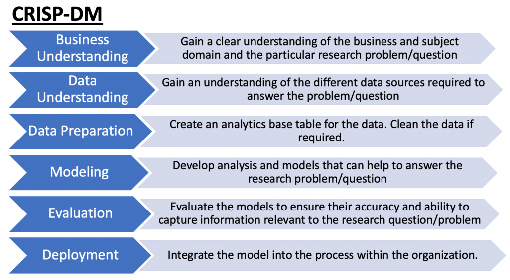
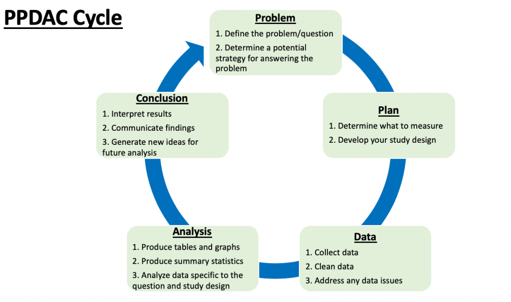
There are a number of different data analysis frameworks one could follow. Two that immediately come to mind are the Cross Industry Standard Process for Data Mining (CRISP-DM) and the Problem, Plan, Data, Analysis, and Conclusion (PPDAC) Cycle.

Although they come from different industries — CRSIP-DM from the business world  and PPDAC from more of the statistics education world — there is considerable overlap and both have the aim of providing the analyst with a clear path to answering their research question.

The objectives of each phase within these two frameworks is shown below.


As you can see, the end goal of the analysis is different between the two frameworks: CRISP-DM being targeted at deploying a model specific to business use cases and PPDAC providing more of a runway for scientific publication. However, both can provide us with an appreciation for creating a systematic process around data analysis, allowing for a clear explanation of our approach when discussing with colleagues or PhD supervisors.

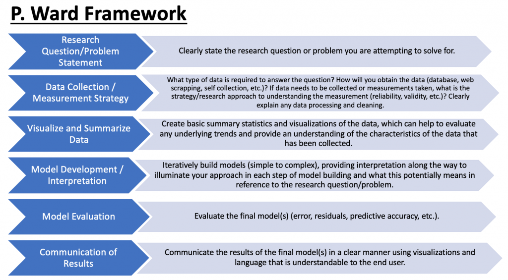
In an attempt to create something more generic and less specific to a certain industry or field, I came up with my own framework:

The framework is freely available on my GitHub page in both an R Markdown and Jupyter Notebook (if you prefer Python) formats. If you’d like to see with the R Markdown HTML looks like, click here >> PWard_-_Data_Analysis_Framework.

All you have to do is take the template (either R Markdown or Jupyter Notebook), delete the comments that I have under each section and fill in your own comments and your R or Python script, where applicable, to conduct your analysis. Once complete, you will have a clean looking file that details your entire approach.

I’ve made a simple example of what using the template could look like. If you are interested in seeing the result in R Markdown, CLICK HERE >> Data_Analysis_Framework_Example_–_MLB_Hitting. If you are interested in seeing the result in a Python Jupyter Notebook, CLICK HERE >> Data Analysis Framework Example — MLB Hitting (Jupyter).

All of the code and the templates for use are available on my GitHub page.