Category Archives: Sports Analytics

The Effects of High vs. Low Protein Intake on Body Composition — Simulating a Previous Study

This week I was listening to Layne Norton’s Podcast Interview with Bill Campbell on training and nutrition research. I found it to be an interesting listen. Layne has been in this space for a long time (he and I started out on the same internet forum back in the early 2000’s, Avant Labs — RIP Patrick Arnold). Layne always does a nice job at trying to combat a lot of the nonsense that takes place in the health and fitness space (with internet influencers pedaling whatever the latest supplement or training program is). I also have enjoyed much of the work that Bill Campbell has put out (we even published a paper together many years ago).

In this podcast, the two get into a discussion about protein intake and Bill makes the statement that you can overeat your calories and as long as the surplus is coming from protein the evidence seems to suggest that you’d be hard pressed to put on excess body fat and, in fact, gain some muscle. Layne is skeptical of this and the two discuss a few potential hypotheses of why this may be, ultimately concluding that Layne would do a bit of a deep dive into the literature — I’ll be interested to see what he finds.

During the discussion, Bill referenced one of his papers, Effects of high vs. low protein intake on body composition and maximal strength in aspiring female physique athletes engaging in an 8-week resistance training program. I decided to pull the paper and give it a read. In the process of reading it, I decided to pull out my laptop and write a simulation of aspects of the study (primarily calories and fat free mass) to better understand the results, explore uncertainty (it was only 17 subjects) and create a slightly different model (Bayesian hierarchical model) to show how we can understand more about where the variance is coming from and what we can learn from that.

I wont hash out al of the code here. If you want the full coded simulation you can download it from my GITHUB page and knit it from there if you want to also see it in an HTML form.

With that said, let’s dive in…

Introduction

  • Individuals participating in a regimented resistance training program require more protein than that of sedentary individuals. Recent research has suggested that requirements may be as high as 2.2 g/kg/day (1g/lb/day) in a young bodybuilder population.
  • However, longitudinal studies are lacking and many of the studies conducted up to this point have some methodological flaws (e.g., unsupervised training programs). Additionally, there is a paucity of such research in female populations.

Study Aim: The purpose of this study was to investigate the effects of higher versus lower daily protein intakes on body composition changes in aspiring female physique athletes following a supervised daily undulating periodized resistance training program.

Conclusions up front

NOTE: If you don’t want to read the nitty-gritty down below the primary take away from the study is on protein, calories, and increases in lean mass and decreases in fat mass:

  1. A high-protein diet of 2.4 grams protein/kg/day (1.1g/lb/day) increased Fat Free Mass compared to a low-protein diet of 1.2 grams protein/kg/day (0.5g/lb/day)
  2. These findings are similar to those of prior studies — though many of these studies have limitations such as the duration of time the study can be run, the population studied, the inability to control other aspects of diet or sometimes training, and the issue with sample size (most higher level trainees are not looking to be a part of a study where they could potentially end up in a control group and be forced to train and eat sub-optimally for 8-12 weeks)
  3. Importantly, the high-protein group also saw increased calorie intake compared to the low-protein group. Despite this, they still lost more body fat and gained more muscle mass. So, calories went up (with the excess of calories coming from protein) and body composition results improved!! It was hypothesized that this may be due to the increased calories from additional protein being used to help build lean tissue (as opposed to being stored as adipose tissue) and the higher levels of protein potentially having a positive influence on the energy expenditure side of the energy balance equation.

Goal of this simulation

  • The aim of this simulation is to try and recreate some of the analysis and better understand the observed data from the 17 participants.
  • The goal of this simulation is not to say that the study is wrong or incorrect or point out flaws. Generally, I am in favor of high protein diets (I’m a meathead at heart) and the results from this study are part of a bigger body of literature on protein intake, which despite study limitations (every study has some) generally seems to favor higher levels of protein for those with strength and physique based goals.

Methods

Design

  • Parallel group, repeated measures design
  • Subjects were randomized to a high protein or low protein diet group in conjunction with a supervised resistance training program for 8-weeks
  • Participants were healthy aspiring female physique athletes who were required to have been resistance training for the prior three months or longer and needed to be able to deadlift 1.5x body weight

Diet Groups

  • High Protein Group (n = 8) = 2.4 grams protein/kg/day (1.1g/lb/day)
  • Low Protein Group (n = 9) = 1.2 grams protein/kg/day (0.5g/lb/day)
  • NOTE: Subjects tracked all food intake but no restrictions were placed on dietary carbohydrate or fat intake.

Workouts

  • 8-week training program (28 sessions)
  • 2 upper body and 2 lower body sessions per week
  • Lower body consisted of 5 exercises per session
  • Upper body consisted of 6 exercises per session
  • Sets and reps varied throughout the program and included ranges such as 3-5 reps, 9-11 reps, 14-16 reps
  • Subjects self-selected loads that would allow them to complete the appropriate number of reps within the specified rep range allowing for one rep in reserve
  • Subjects also performed a high intensity interval program consisting of 30-sec sprints with 2min of rest between sets using their modality of choice (treadmill, sprinting, cycle ergometer, rowing machine, etc)

Statistics

  • Dependent Variables
    • Body Comp (fat-free mass, fat mass, body fat%)
    • Max strength (back squat and deadlift)
    • Resting metabolic rate
  • Nutrition intake data was analyzed with independent sample t-tests
  • Data for the dependent variables were analyzed with a 2-group (high vs moderate protein) * 2-time point (pre- and post-training) between-within factorial ANOVA with repeated measures

Results

  • This result section leaves a lot to be desired. It is literally a paragraph of about 30 words that basically say, “see the tables”. The authors then talk about the results in the discussion section as they pertain to prior research. However, the discussion section should be for the researchers to talk about their interpretation of the research (what they found, why they think the results were the way they were, how the results compare with other studies, what potential research should be done in the future to better understand the phenomenon, limitations of the study, etc). So, we don’t have a clear explanation of the observed data in the results section.
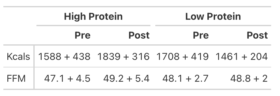
  • To try and better understand the data, we will recreate the analysis for Kcals (Table 1) and then build a simulation to better understand the analysis for Fat Free Mass (Table 2).
KCals

  • Kcals were analyzed with an independent t-test
  • Table 1 of the paper provides the pre- and post-mean Kcals for both groups and indicates a statistically significant effect.
  • We can easily calculate the change score for both groups (the change from pre to post). But, to calculate the standard deviation of the change score, which we need when conducting an independent t-test, we need to use a little bit of math to help us. We will estimate the standard deviation of the change scores for both groups using the pre- and post-test standard deviations provided in the table and then take a guess that the correlation between pre- and post-tests is relatively high, say, `r = 0.85`.

We will investigate the Kcals in two different ways:

  1. Calculate a t-test by hand
  2. Calculate a Cohen’s D Effect Size Statistic to help us understand the magnitude of the effect

T-test

Cohen’s D Effect Size
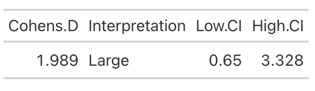
  • From the t-test we conclude that the high protein group consumed, on average, 498 more Kcals (+/- 121.3) than the low protein group. It’s important to note that most of these extra calories came from protein and, although the high protein group increased their calories they actually lost body fat and increased muscle mass (as we will see below) relative to the low protein group!
  • Cohen’s D tells us that the magnitude of the effect ranges from medium to large, indicating that the high protein group saw a rather large increase in calories relative to the low protein group

Analyzing Fat Free Mass

  • This is where things get interesting. We need the actual raw data to run a between-within factorial ANOVA with repeated measures. Soooo…that means we will have to simulate the study (since we don’t have raw data), which is tricky because we don’t know enough about the sources of variance between and within the groups. So, we will need to make some assumptions.
  • Looking at Fat-Free Mass from Table 2, we see that the author’s produced a Cohen’s d effect size for the change in fat-free mass from pre- to post-testing for both the high- and low-protein groups. Let’s first calculate those using the function we built above.

High Protein Group Effect Size
Low Protein Group Effect Size
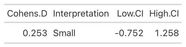
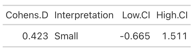
  • Using the data from Table 2 of the paper, we easily re-create the point estimate for Cohen’s d. The authors did not produce the confidence interval around the effect statistic, but that shouldn’t stop us! We can see from our outputs above, in both cases the 95% Confidence Interval around the observed Cohen’s d ranges from negative to positive. This indicates that, while the author’s did find a statistically significant effect for the change in Fat-Free Mass, there is some uncertainty around the magnitude of this change. The high-protein group did have a standard deviation that was nearly 2x larger than that observed for the low-protein group. So, we don’t really know how the individuals in the high-protein group looked. Perhaps a few of them saw a really large effect, a few of them saw an effect more similar to that of the low-protein group, and a few of them saw a worse effect? We simply don’t know with the data being presented as it is. A change looks like it took place but their analysis doesn’t allow us to tease out the within-subject variability. Perhaps some people saw better results (for any number of reasons) than others. We’d love to know this!

Simulating the Fat Free Mass variable

  • We will turn to simulation to get a grasp of what might be taking place in this study. We know that the author’s find a statistically significant effect, but we want to try and put into perspective how certain we should be (after-all, it is only 17 subjects).
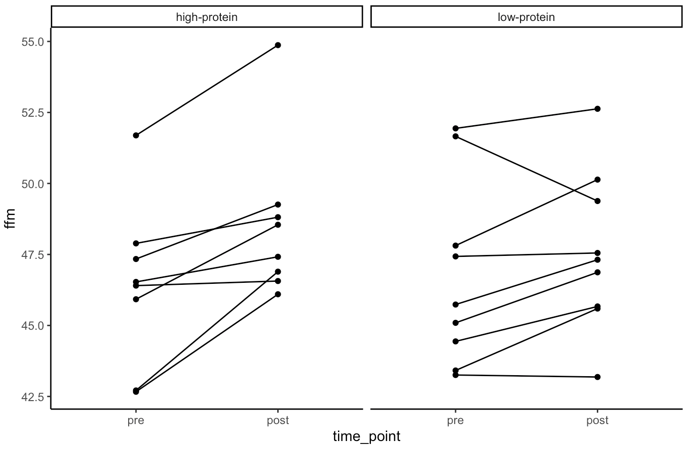
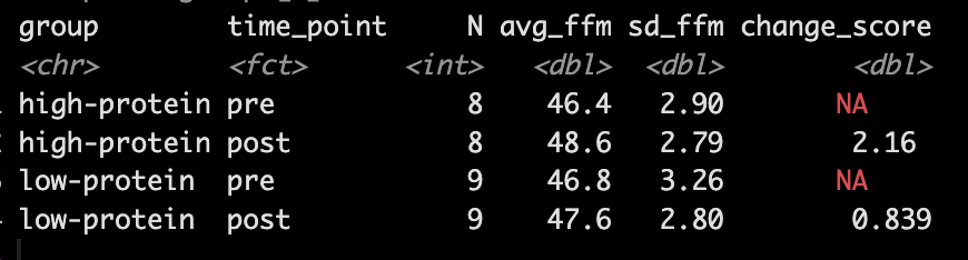
  • Our simulation looks similar to the results presented in the study for FFM. We see that the high-protein group increased their FFM be 2.2kg, on average, while the low-protein group only increased by 0.85 kg, on average.
  • From the plots we can see thas that in the simulated data, a few of the subjects in the high-protein group had very dramatic increases in FFM, while some of the others saw smaller improvements and one appeared to stay the same. The simulated low-protein group shows two of the subjects actually decreased their FFM. one stayed relatively the same, and the others saw small increases in FFM.

Model

  • Next, we take our simulated data set and we construct a model. The authors used a between-within factorial ANOVA with repeated measures. Instead, of doing this, I’m going to build a hierarchical mixed model so that we can better explore the the sources of variance in the data. We will use a Bayesian hierarchical model so that we can get the full posterior distribution. Our fixed effects will be group, time, and a group*time interaction and our random effects will consisted of a random intercept slope across time points for each subject.
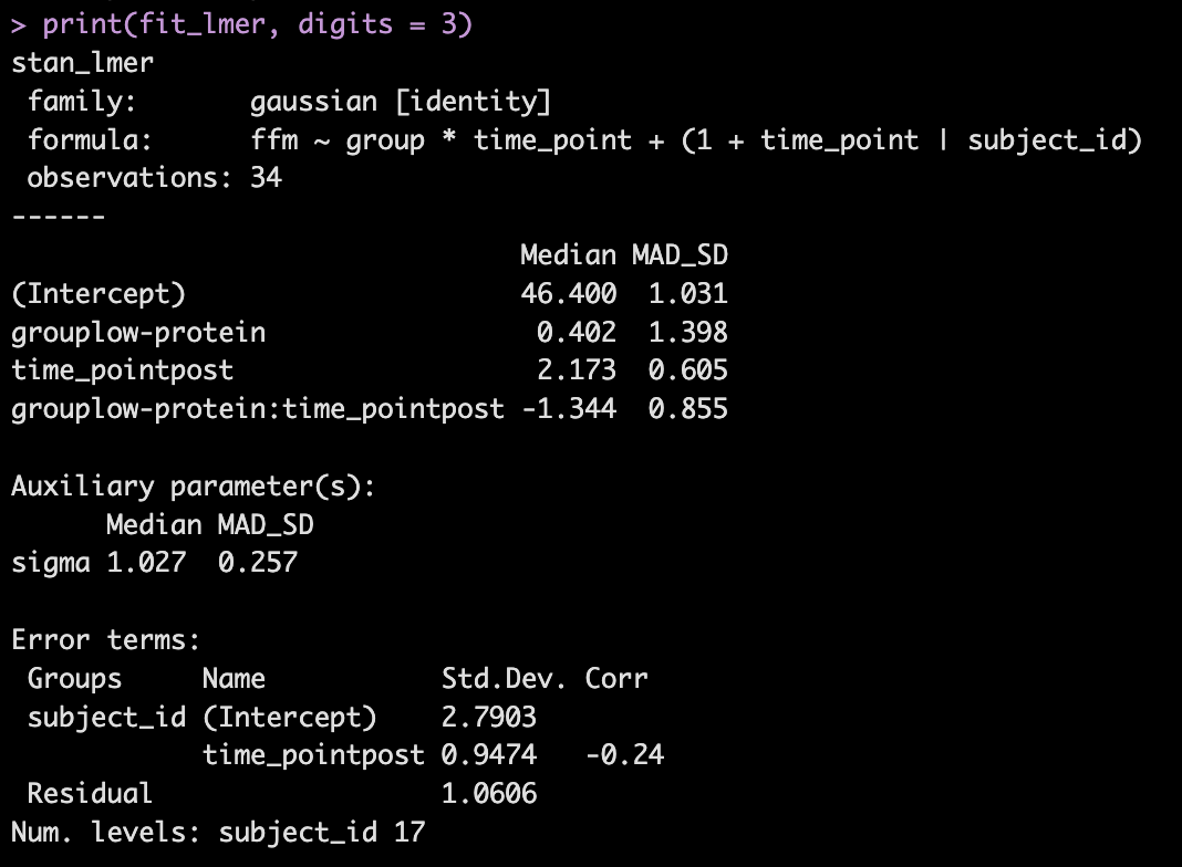
  • The model recovers the parameters that we used for our simulation (the ground truth) as it should, as this is how we built the model.
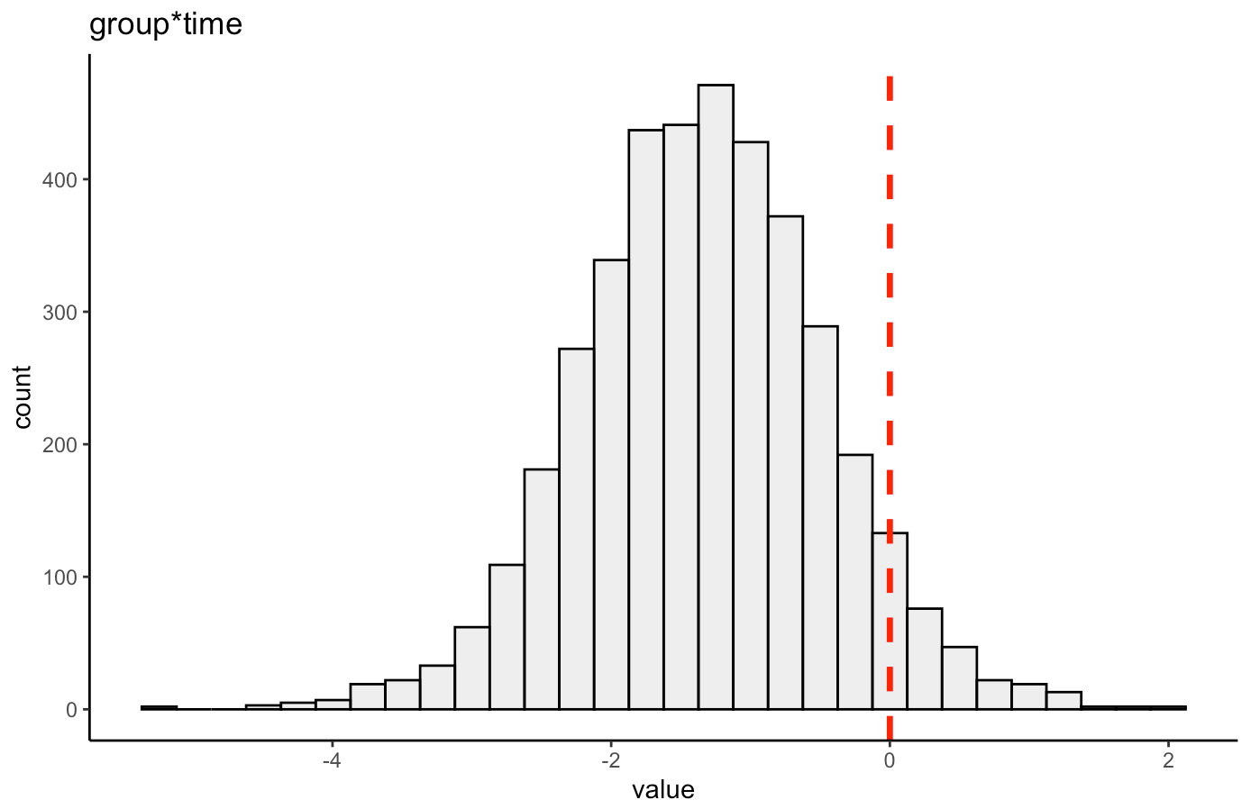
  • The group*time interaction indicates the difference in the slope (change) between the two groups from pre to post. Here, -1.3 indicates that the low protein group experienced 1.3kg less improvement in FFM than the high-protein group.
  • In Table 2 we see that the high-protein group increased FFM, on average, by 2.0kg and the low-protein group by 0.6kg, on average, which is a -1.4kg difference between the groups (`0.6 – 2.0 = -1.4`), which is very closer to our interaction of -1.3

We can get credible intervals for the mixed effects from the model
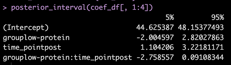
  • Here, the 90% credible interval for the group*time interaction ranges from -2.7 to 0.09. So, we have a rather wide range of uncertainty in the credible interval, where it may be plausible that there is no difference in the two groups during the post-test FFM. There is 90% confidence that the change in FFM differs between the low and high group from -2.8 kg to nearly a 0.1 kg increase in FFM for the low-protein group (compared to the high protein group).

We can also plot the posterior distribution for the group*time interaction
Random Effects

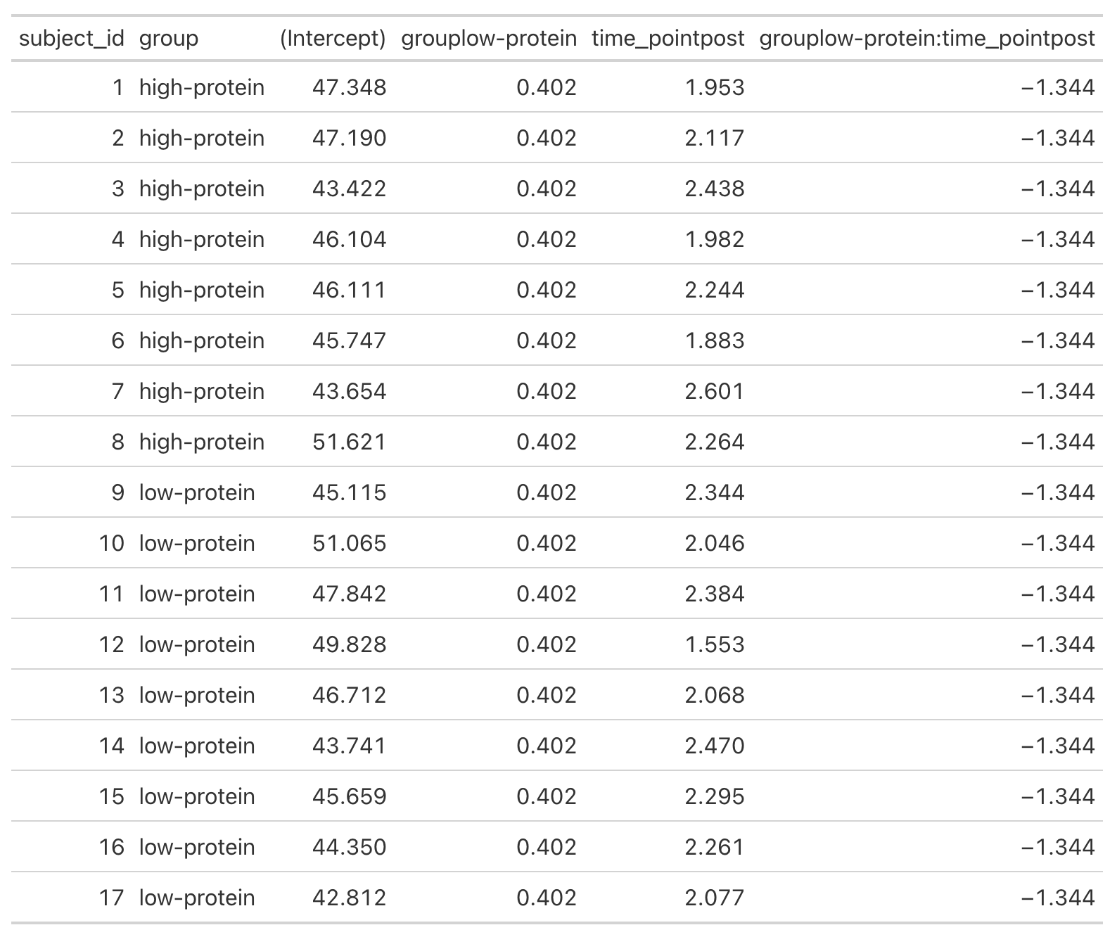
  • From our model output, the random effects (Error Terms) tell is that the between subject standard deviation is 2.8 and the within subject standard deviation (Residual) is 1.1. We also see that the random effect for the time_point slope is 0.95.
  • We can get a table of the regression equation for each subject, incorporating their random intercept and slopes (notice how Intercept and time_pointpost differ for each)
  • We can plot each subjects random effects intercept posterior distribution (see GITHUB code)
  • We can plot each subjects random slope posterior distribution (see GITHUB code)
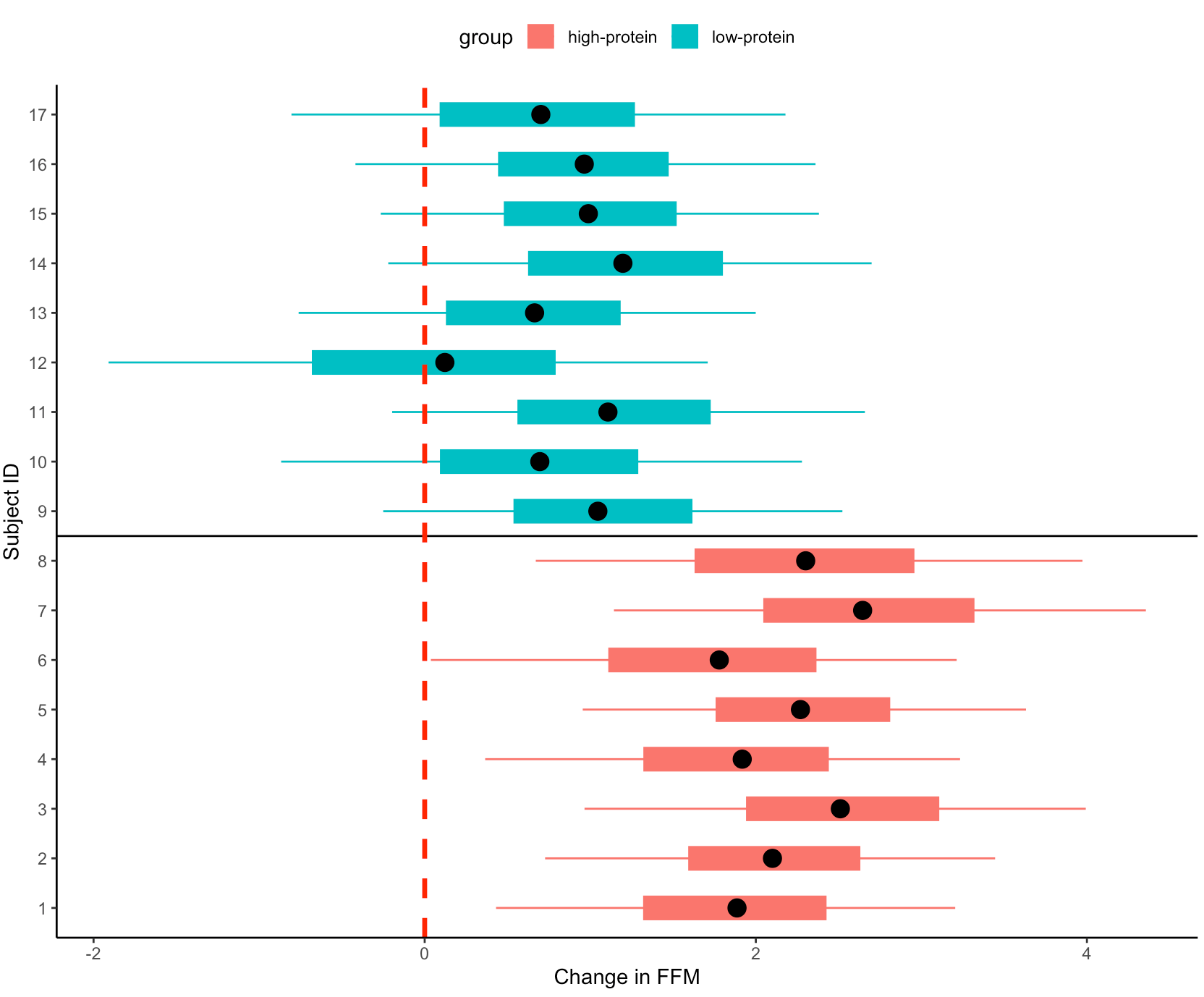
  • Finally, we can get predicted values from the model for the pre- and post-test FFM for each subject, based on their group.
    • We will use `posterior_epred()` to do this, which provides us with uncertainty around the average value, helping us to visualize the uncertainty around our model estimates. This is different than if we were to use `posterior_preidct()`, which also incorporates observation-level noise and is good simulating raw data on a *hypothetical* new person who we are trying to make an inference on.
Repeating the simulation

  • Okay, that is all interesting. We can see how the simulation returned the results of the ground truth coefficients that we set up. We can also see how the Bayesian mixed model was useful in helping us say more than just *”This group was better than that group”* by allowing us to extract posterior draws, visualize our uncertainty and, if we wanted, make more substantive statements about the individual subjects in our study.
  • The next thing we need to consider is the notion that this was one study with 17 subjects. If we pulled 17 new subjects, perhaps the results would look different? So, let’s set up a `for()` loop to play out 1000 simulated studies of the same data. We will keep the ground truth coefficients for the fixed effects the same as above — but of course you can allow them to vary if you’d like. In the loop, with each study, we will allow our subject intercepts and our model error to vary since we wouldn’t expect those to be the same if we selected a new group of 17 subjects. For each simulation we will simply extract the group*time interaction coefficient, since that is what we care about from the study.

NOTE: For purposes of time, we will use {lme4} to calculate the mixed models so that we don’t have to run 1000 Markov Chain Monte Carlo Simulations (as we would if we did a Bayesian mixed model like above).
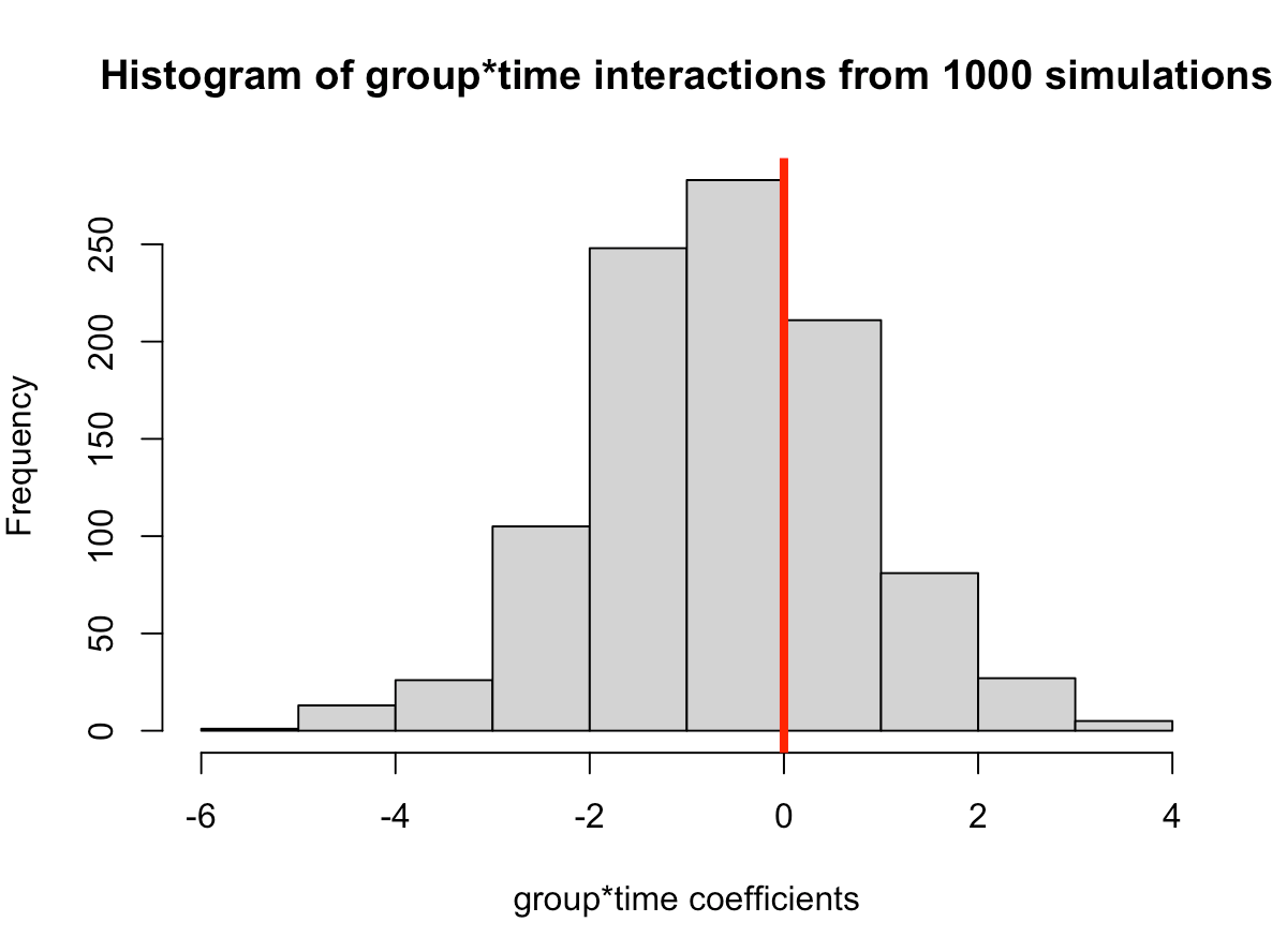

  • In simulating this 1000 times we see that the median value is around where we specified it, 0.6 (the ground truth). However, we see considerable variability in this effect over the 1000 simulations. This could be because of the amount of variability that I have in the subject intercepts and the model error. Someone who does this type of research all of the time might have a better/more plausible prior assumption of what type of variability we would expect for these parameters. The point, however, is that one study is simply a snapshot of a small population that we hope to learn from and infer something meaningful to the broader population. Had the study been done again with a different group of 17 female physique competitors we might have gotten totally different results.
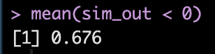
  • Overall, the effect does still favor the high-protein group with 68% of the distribution below 0, indicating a positive effect on fat free mass for high-protein relative to low protein.
XGBOOST Tuning – Tutorial in {xgboost} and {tidymodels}

A colleague recently asked me about XGBOOST (Extreme Gradient Boosting) models so I figured I’d put together a short tutorial of using XGBOOST both with the {xgboost} package and within the {tidymodels} environment.

Like all machine learning models, XGBOOST, has a number of different knobs and levers we can twist, push, and pull in order to tune the model and identify the best parameters for learning from the data. One can get a look at these parameters by loading the {xgboost} package and then typing ?xgboost into the console.

XGBOOST falls in the class of tree-based models. It is an effective machine learning algorithm for identifying patterns in data and it can be used for regression or classification problems.

When fitting the model in {tidymodels} it is pretty straight forward as far as the {tidymodels} syntax goes. However, if fitting models with the {xgboost} package, there are a number of considerations we need to make with the data. For example. XGBOOST can only use numeric data, so any categorical features will need to be one-hot-encoded. Additionally, the data cannot be in a data frame form, but rather needs to be turned into a matrix.

Let’s jump in!

(NOTE: All code is available on my Github page.)

Load Data & Packages

We will keep the data simple and use the mtcars data from base R. XGBOOST is well suited for complex data with a lot of interactions and non-linearity, but I’d like to use a simple data set so that the models can run fast for you and you get the gist of fitting them. Tuning all of the parameters can take a lot of time if you are dealing with a big data set.

Our goal is to predict mpg using the other features in the data.

{xgboost} for a regression problem

First we split our data into a training and testing data set.

set.seed(2025)
N <- nrow(mtcars)
ids <- sample(x = 1:N, size = floor(N * 0.7), replace = FALSE)
train <- mtcars[ids, ]
test <- mtcars[-ids, ]

Prepare the data

For the {xgboost} package to run we need the predictor variables to be in a data matrix and the outcome variables to be a vector. We then place the prepared data into a dense matrix so we can run our XGBOOST model.

train_x <- data.matrix(train[, -1])
train_y <- train$mpg

test_x <- data.matrix(test[, -1])
test_y <- test$mpg

xgb_train <- xgb.DMatrix(data = train_x, label = train_y)
xgb_test <- xgb.DMatrix(data = test_x, label = test_y)

Tune the model

First, we walk through an example of of how the xgb.cv function works and what it outputs. Then we can write a loop to extract the relevant information for the purposes of the tuning the hyperparameters.

Notice that we specified a variety of hyperparameters (e.g., max.depth, eta, subsample, and colsample_bytree). These aren’t all of the possible hyperparameters that can be tuned, though. Rather than hash out them all out here, you can find a list of their definitions by either using the help function in the R console, ?xgb.cv() or checking out THIS webpage.

fit_example <- xgb.cv(data = xgb_train,
                      params = list(booster = "gbtree",
                        objective = "reg:squarederror",
                        max.depth = 15,
                        eta = 0.1,
                        subsample = 0.1,
                        colsample_bytree = 0.5),
                      eval_metric = "rmse",
                      nfold = 5,
                      watchlist = list(train = xgb_train, test = xgb_test),
                      early_stopping_rounds = TRUE,
                      nrounds = 1000)

There are a number of features within the model that we can extract:

  • best_iteration indicates the best iteration of the model fit, represented as the nrounds argument in our function.

  • evaluation_log provides us with information about the RMSE for all iterations of model fitting.

We can directly select the best iteration from the evaluation log.

Here we see the RMSE for the training and testing data at the best iteration.

Now that we know what we are looking at with the xgb.cv() output, let’s write a grid of possible values for the hyperparameters and create a data frame, grid_params that stores this information.

eta <- seq(0.1, 0.9, 0.1)
max_depth <- c(5, 10, 15)
subsample <- c(0.5, 0.75, 1)
colsample_bytree <- c(0.5, 0.75, 1)
nrounds <- seq(100, 500, 100)

grid_params <- expand.grid(nrounds = nrounds,
                           max_depth = max_depth, 
                           subsample = subsample,
                           colsample_bytree = colsample_bytree,
                           eta = eta)

head(grid_params)

n <- nrow(grid_params)

Next, we need an empty data frame to store the best iteration for each row of our grid parameters data frame.

output_df <- data.frame("iter" = rep(NA, n), 
                           "train_rmse_mean" = rep(NA, n), 
                           "train_rmse_std" = rep(NA, n), 
                           "test_rmse_mean" = rep(NA, n), 
                           "test_rmse_std" = rep(NA, n))

Now run a for() loop to find the best parameters for the data!


for(i in 1:n){
  
  fit <- xgb.cv(data = xgb_train,
                params = list(booster = "gbtree",
                      objective = "reg:squarederror",
                      max.depth = grid_params$max_depth[i],
                      eta = grid_params$eta[i],
                      subsample = grid_params$subsample[i],
                      colsample_bytree = grid_params$colsample_bytree[i]),
                      eval_metric = "rmse",
                      nfold = 5,
                      nrounds = grid_params$nrounds[i],
                      watchlist = list(train = xgb_train, test = xgb_test),
                      early_stopping_rounds = TRUE,
                      grid_params$nrounds[i],
                      verbose = FALSE)
  
  best_fit <- fit$best_iteration
  
  output_df[i, 1] <- fit$evaluation_log %>% as.data.frame() %>% filter(iter == best_fit) %>% pull(iter)
  output_df[i, 2] <- fit$evaluation_log %>% as.data.frame() %>% filter(iter == best_fit) %>% pull(train_rmse_mean)
  output_df[i, 3] <- fit$evaluation_log %>% as.data.frame() %>% filter(iter == best_fit) %>% pull(train_rmse_std)
  output_df[i, 4] <- fit$evaluation_log %>% as.data.frame() %>% filter(iter == best_fit) %>% pull(test_rmse_mean)
  output_df[i, 5] <- fit$evaluation_log %>% as.data.frame() %>% filter(iter == best_fit) %>% pull(test_rmse_std)

}

Join the grid_params data set with the output_df` of our for() loop and select the output that had the lowest train set RMSE.

Fit the model

After tuning, we want to fit the model to the optimized hyper-parameters stored in the best_params element.

## fit model
fit_mpg <- xgboost(data = xgb_train,
                   params = list(booster = "gbtree",
                      objective = "reg:squarederror",
                      max.depth = best_params$max_depth,
                      eta = best_params$eta,
                      subsample = best_params$subsample,
                      colsample_bytree = best_params$colsample_bytree),
                      eval_metric = "rmse",
                      nrounds = best_params$nrounds)

Variables of Importance

Plot the variables of importance from the tuned model.

Predictions

We can plot the predictions and obtain the RMSE on our test set.

train_pred_y <- predict(fit_mpg, xgb_train)
test_pred_y <- predict(fit_mpg, xgb_test) test_x %>%
  bind_cols(mpg = test_y) %>%
  mutate(pred_mpg = test_pred_y) %>%
  ggplot(aes(x = pred_mpg, y = mpg)) +
  geom_point() +
  geom_abline()

sqrt(mean((test_y - test_pred_y)^2))

{tidymodels} XGBOOST for regression

We can do the same type of XGBOOST model fitting in {tidymodels}.

Train/Test Split

set.seed(3333)
car_split <- initial_split(mtcars)
car_split

train <- training(car_split)
test <- testing(car_split)

Cross Validation Folds

set.seed(34)
cv_folds <- vfold_cv(
  data = train, 
  v = 5
  ) 

Model Specification

In the boost_tree() function we specify which hyperparameters we want to tune.

boost_spec <- boost_tree( trees = tune(), 
      tree_depth = tune(), 
      min_n = tune(), 
      loss_reduction = tune(), 
      sample_size = tune(), 
      mtry = tune(), 
      learn_rate = tune() ) %>%
  set_engine("xgboost") %>%
  set_mode("regression")

Workflow

Create the workflow, add the formula we want for the model, and add the model specifications.

xgb_wf <- workflow() %>%
  add_formula(mpg ~ .) %>%
  add_model(boost_spec)

Set up tuning grid

Instead of specifying specific values for each of the tuning parameters, as we did in the {xgboost} package example, we will use the grid_latin_hypercube() function to construct the parameter grid for us. We pass it a size argument to indicate how large (how many rows) we want the grid to be.


xgb_grid <- grid_latin_hypercube(
  tree_depth(),
  trees(),
  min_n(),
  loss_reduction(),
  sample_size = sample_prop(),
  finalize(mtry(), train),
  learn_rate(),
  size = 40
)

Hyper parameter tuning on cross validated folds

doParallel::registerDoParallel()

set.seed(66)
xgb_res <- tune_grid(
  xgb_wf,
  resamples = cv_folds,
  grid = xgb_grid,
  control = control_grid(save_pred = TRUE)
)

Obtaining cross validated outputs and identify the best model


Fit the final model

boost_spec <- boost_tree(mtry = best_xgb %>% pull(mtry),
                         trees = best_xgb %>% pull(trees),
                         min_n = best_xgb %>% pull(min_n),
                         tree_depth = best_xgb %>% pull(tree_depth),
                         learn_rate = best_xgb %>% pull(learn_rate),
                         loss_reduction = best_xgb %>% pull(loss_reduction),
                         sample_size = best_xgb %>% pull(sample_size)) %>%
  set_engine("xgboost") %>%
  set_mode("regression")


boost_fit <- boost_spec %>%
  fit(mpg ~ ., data = train)

Evaluate Test Set Performance

augment(boost_fit,
        new_data = test) %>%
  rmse(truth = mpg, estimate = .pred)

augment(boost_fit,
        new_data = test) %>%
  rsq(truth = mpg, estimate = .pred)


augment(boost_fit,
        new_data = test) %>%
  ggplot(aes(x = .pred, y = mpg)) +
  geom_jitter() +
  geom_abline(intercept = 0, slope = 1)

Wrapping up

XGBOOST is a flexible model that can be used for continuous outcomes, binary outcomes, and multi-class classification tasks. The model does have a number of tuning parameters that can help to optimize performance. However, it is relatively easy to create a grid of potential values and either write a for() loop or use the {tidymodels} framework to do the heavy lifting for you.

To obtain the full code and RMarkdown file check out my Github page.

Crossed vs Nested Random Effects

I was reading a paper this weekend and the researchers used a mixed model to for their data given that they were dealing with repeated measures of individuals and teams. Mixed models have become common in sport science research and I’ve written about them a few times in this blog:

As I was reading the paper I was wondering, because it wasn’t specified in the methods section, if the researchers had given any thought to whether their random effects were crossed or nested. Then I thought, maybe people aren’t thinking about this and perhaps a short blog article with an example would be useful. So here we are…

For brevity, I’ll only present short snippets of code in the blog article. The entire code is available on my Github Page

Data

We need to simulate some data to work with. To keep things simple, we will create a data set of a league that has 6 teams and 60 players. Each player will have a player value metric, the outcome of interest, for every team they played on during the season.

suppressPackageStartupMessages({
  suppressMessages({
    suppressWarnings({
    library(tidyverse)
    library(lme4)
    library(arm)
    })
  })
})


theme_set(theme_bw())

set.seed(225544)
teams <- sample(c("Sharks", "Bears", "Turtles", "Bisons", "Jaguars", "Pythons"), size = 60, replace = TRUE)
players <- as.factor(sample(1:60, size = 60, replace = TRUE))
intercept <- 50
team_effect <- case_when(teams == "Sharks" ~ rnorm(1, mean = 0, sd = 7), 
                         teams == "Bears" ~ rnorm(1, mean = 0, sd = 2),
                         teams == "Turtles" ~ rnorm(1, mean = 0, sd = 1),
                         teams == "Bisons" ~ rnorm(1, mean = 0, sd = 13),
                         teams == "Jaguars" ~ rnorm(1, mean = 0, sd = 5),
                         teams == "Pythons" ~ rnorm(1, mean = 0, sd = 3))
player_effect <- rnorm(length(levels(players)), mean = 0, sd = 10)
random_noise <- 2


dat <- data.frame( team = teams, player_id = players ) %>%
  mutate(
    mu = intercept + team_effect + player_effect[players],
    player_value = round(mu + rnorm(n(), mean = 0, sd = random_noise), 1)
  ) %>%
  dplyr::select(-mu)

dat %>%
  head()

EDA

How many unique players were on each team during the season?

Which players played on multiple teams?

Team Summary Stats

Crossed vs Nested Effects

We have 14 players that played on multiple teams (Player 11 ended up playing for all 6 teams!) and, as a consequence, different teams had different numbers of individual players. For example, the Bears had 13 different players while the Pythons had 6 different players. This small detail is important to consider with respect to our random effects because crossed and nested effects behave differently with respect to how they partition variance.

When constructing mixed models we usually have a data hierarchy where observations are grouped or nested within specific categories. When the observations are nested the observations are exclusive to specific groups. Some examples:

  • Classes are nested within schools but classes in one school cannot also be grouped within a different school.
  • Athletes competing in the Olympics are nested within their respective countries but an individual cannot compete for two different countries in the same Olympic Games.

By contrast, crossed effects can occur when observations move between groups during the same study/observation period. A few examples of crossed effects are:

  • A student might start the year at one school and then move half way through the semester and attend a different school.
  • Players in team sport might be traded mid-season and play for different teams.
  • In a study where the experimental and placebo groups contain both male and female participants, we would have crossed random effects to account for sex being in both groups.
  • Looking at sports teams, we may be analyzing the behavior of position groups on different teams. The position groups are the same for each team (e.g., Forwards, Guards, and Centers on Basketball teams) so the model has crossed effects.

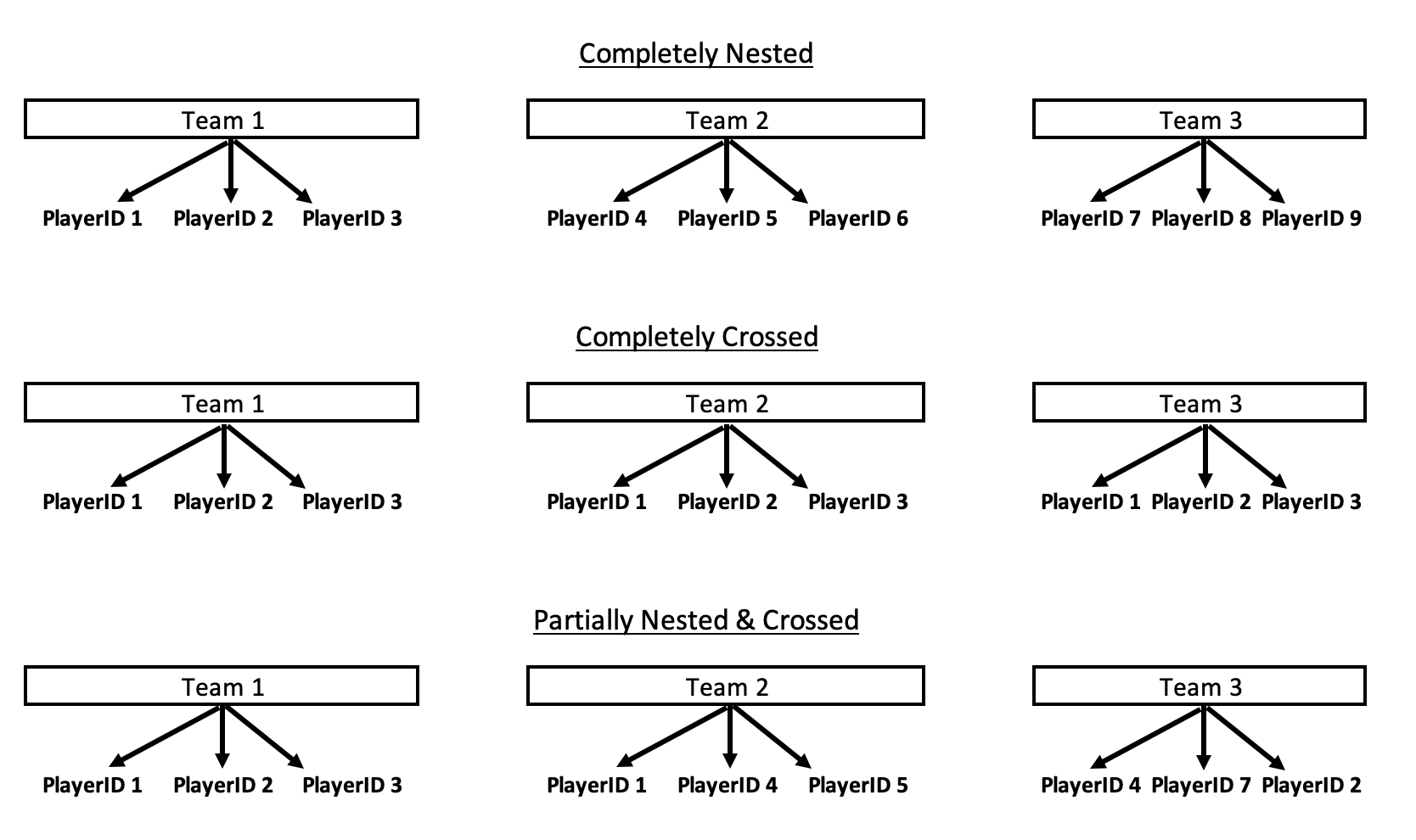
To help solidify this concept a bit more, I’ve created the below drawing.

We see that in the Completely Nested example there are individual players that only player for their respective teams. Contrast that to the Completely Crossed example, where every player ends up playing on each team. This would, obviously, be an incredibly weird scenario and not one we’d see in sport but probably one that you’d see in researched where there is a crossover of treatments. Finally, the Partially Nested & Crossed example has a few players playing for multiple teams (for example, Player 1 played for both Team 1 and Team 2) and some players that stay with a single team during the season. This version is the one that we most frequently encounter in team sport.

Now that we have a general understanding of the difference between crossed and random effects, let’s see how this looks when we build a model on our simulated data and (most importantly) let’s see how specifying the model to have crossed or nested random effects changes the model output.

Model Examples

Crossed

Since we commonly deal with crossed (or partially nested/crossed) data in team sport, I’ll start with modeling the data to have crossed random effects. As a side note, most of the time when I look at people’s models in sport science they are creating the model structure like this, by default.

We will build random intercept model (since we didn’t simulate any fixed effects) and allow a separate intercept variance for both team and player_id, keeping in mind that this specifies that there are players who are potentially playing on different teams (crossed observations) across the season.

lme_crossed <- lmer(player_value ~ 1 + (1|team) + (1|player_id), data = dat)

Nested

Next, we fit the random intercept model but this time we treat our random effects of player_id and team as nested. That is to say that we are allowing the players to be nested within their respective teams. To review, this means that we are treating this data as if each player only played on a single team during the season and never changed teams.

lme_nested <- lmer(player_value ~ 1 + (1|team) + (1|team:player_id), data = dat)

Comparing the two models

First, we notice that the fixed effects are slightly different between the two models, but the difference in small in this simulated data.

The random effects look very different between the two model structures. In the crossed effects model we get two different random effects — one for the player_id and one for the team. However, in the nested effects model we have a random effect for team but then we have a random effect for player_id nested within each team. So, in the nested model a player that played for multiple teams will have different random intercept for each of the teams they were nested in. Both models, of course, also have a residual in the random effects, however the values are very different.

Let’s compile the random effects side-by-side to get a better appreciation for the differences. We will start with the `team` random effect since it is present in both models.

There are pretty stark differences between the random intercepts of the nested and crossed models! Recall from our EDA that the Bears had the highest average value of all the teams and they also had the fewest number of different players (5).

The player random effects get a little wonky because players who played for multiple teams will end up having different random effects depending on which team we nested them in. Conversely, in the crossed model we get one random effect estimate per player.

To join the random effects from both models we have to do a bit of work on the nested model to extract the info. (NOTE: Since the table is really long I’ll only show the first 10 rows here but you can got to the Github page to see the full output.)

Joining the two model random effects on player_id we see that player’s have some very different random effects between the two models. In particular, players that played on different teams can differ greatly between the models.

For example, let’s look at Player 21.

In the crossed model we find that Player 21 has a random intercept that is 1.6 points below league average (the fixed effect intercept). However, in the nested model, when Player 21 was on the Bears he was 1.15 points above the population intercept and 0.74 points below the population intercept when he was on the Turtles. This is partially due to the team effect, where the the Bears were the best team in the league (highest average value) and the Turtles were the worst team in the league (lowest average value).

Wrapping Up

Hopefully this tutorial provided a brief, but useful, overview of crossed versus random effects during mixed model construction. While most people seem to gravitate towards crossed effects by default there may be times where nested effects are indeed required for the structure of the data. As the example shows, how we specify the model can dramatically change the outputs and thus the inference that we can derive from these outputs.

To access the full code please see the Github page.

K-Nearest Neighbor: {tidymodels} tutorial

When working on data science or research teams, it often helps to have a workflow that makes it easy for teammates to review your work and add additional components to the data cleaning or model structure. Additionally, it ensures that the steps in the process are clear so that debugging is easy.

In R, the {tidymodels} package offers one such workflow and in python, folks seem to prefer scikit learn. This week, I’m going to walk through a full workflow in tidymodels using the K-nearest neighbor algorithm. Some of the things I’ll cover include:

  • Splitting the data in test/train sets and cross validation folds
  • Setting up the model structure (what tidymodels refers to as a recipe)
  • Creating preprocessing steps
  • Compiling the preprocessing and model structure together into a single workflow
  • Tuning the KNN model
  • Identifying the best tuned model
  • Evaluating the model on the test set
  • Saving the entire worflow and model to be used later on with new data
  • Making predictions with the saved workflow and model on new data

I’ve provided a number of tidymodels tutorials on this blog so feel free to search the blog for those. Additionally, all of my tidymodels tutorials and templates are available in a GitHub Repo. Alternatively, if Python is more you jam, I did do a previous blog comparing the workflow in tidymodels to Scikit Learn, which can be found HERE.

This entire tutorial and data are available on my GitHub page if you’d like to code along.

Load & Clean Data

For this tutorial I’m going to use the 2021 FIFA Soccer Ratings, which are available on Kaggle. There are several years of ratings there, but we will concentrate on 2021 with the goal being to estimate a player’s contract value based on the various FIFA ratings provided and the position they play.

First, I load the tidyverse and tidymodels libraries and read in the data. I’m going to drop goalies so that we only focus on players who play the field and, since the data has a large number of columns, I’m going to get only the columns we care about: Information about the player (playerID, name, height, weight, club, league, position, and contract value) and then the various FIFA ratings.

The only column with missing data that impacts our analysis is the team position column, as this is a feature in the data set. Additionally, there are 207 players with a contract value of 0 (all 195 players missing a team position have a 0 contract value). So, perhaps these are players who weren’t on a club at the time the ratings were assigned.

I’m going to remove these players from our analysis data set, but I’m going to place them in their own data set because we will use them later to make estimates of their contract value.

Visualizing the Data

Let’s take a look at a visual of the contract value for all of the players in our data set. Since this is severely right skewed, we will plot it on the log scale.

We also notice there are a variety of positions (way more than I would have guessed in soccer!).

Finally, we want to explore how playing position might influence contract value.

tidymodels set up

Now that we have our data organized we want to set up a tidymodels workflow to estimate the contract value of every player using a K-nearest neighbor model.

First, we split the data in train and test splits and then further split the training data into 5 cross validation folds so that we can tune the model to find the best number of K-neighbors.

Next, we specify that we want to use a KNN model and the outcome variable as regression, since it is continuous (as opposed to classification).

Now that the model is specified we need to set up our preprocessing steps. This is one thing that tidymodels is super useful for. Normally, we’d need to do all this preprocessing before fitting the model and, as in the case of KNN and most machine learning models, we’d need to standardize the variables in the training set and then store the means and standard deviations of those variables so that we can use them to standardize the test set or future data. In tidymodels, we set up our preprocessing workflow and store it and it contains all that information for us! We can simply load it and use it for any downstream analysis we want to do. There are three preprocessing steps we want to add to our workflow:

  1. log transform the dependent variable (contract value)
  2. Dummy code the positions
  3. Standardize (z-score) all off the numeric variable in the model (the ratings)

We can view the preprocessing steps using the prep() function.


With the model specified and the preprocessing recipe set up we are ready to compile everything into a single workflow.

We can look at the workflow to make sure everything makes sense before we start fitting the model.

Next, we tune the model using the cross validated folds that we set up on our training data set. We are trying to find the optimal number of k-neighbors that minimizes the RMSE of the outcome variable (the log of contract value).

We see the results are stored in a list for every one of our 5 cross validation splits. We can view the model metrics for each of the folds.

The model with 10 neighbors appears to have the lowest RMSE. So, we want to pull that value directly from this table so that we can store it and use it later when we go to fit the final model.

Fitting the Final Model Version 1: Using finalize_workflow()

Version 1 that I’ll show for fitting the final model uses the finalize_workflow() function. I like this approach if I’m building my model in a local session and then want to see how well it performs on the test session (which is what this function does). This isn’t the approach I take when I need to save everything for downstream use (which we will cover in Version 2).

First, fit the best model using the finalize_workflow() function.

Then, we get the model predictions for this final workflow on the the test data set.

We can plot the predicted contract value compared to the actual contract value and calculate the test set RMSE.

Fitting the Final Model Version 2: Re-sepcify the model on the training set, save it, and use it later

In this second version of fitting the final model, we will take the best neighbors from the tuning phase, re-specify the model to the training set, reset the workflow, and then save these components so that we can use them later.

First, re-specify the model and notice I set the neighbors argument to best_neighbors, which we saved above when we tuned the model.

We then use this finalized/re-specified model to reset the workflow. Notice it is added to the add_model() function however the recipe, with our preprocessing steps, does not change.

With the workflow set up we now need to do the final two sets:

  1. Fit the model to the entire data set and extract the recipe using extract_recipe() since we will need to save this to preprocess any new data before making predictions.
  2. Fit the model to the final data and extract the model itself, using extract_fit_parsnip() so we can use the model to make future predictions.

Now we save the recipe and model as .rda files. We can then load these two structures and use them on new data!

We have 207 players with 0 contract value, of which 195 had no team position. So, that leaves us with 12 players that we can estimate contract value for with our saved model.

First, we use the bake() function to apply the saved recipe to the new data so that we can preprocess everything appropriately.

With the new data preprocessed we can now predict the log of contract value with our saved model.


We can add these predictions back to the new data set, exponentiate the predicted contract value to get it back to the normal scale and then create a visual of our estimates for the 12 players.

Wrapping Up

That’s a quick walk through on how to set up a complete tdymodels workflow. This approach would work for any type of model you want to build, not just KNN! As always, the code and data are available on my GitHub page.

Calculating Confidence Intervals in R

A favorite paper of mine is the 1986 paper by Gardner and Altman regarding confidence intervals and estimation as a more useful way of reporting data than a dichotomous p-value:

Gardner, MJ. Altman, DG. (1986). Confidence intervals rather than P values: Estimation rather than hypothesis testing. Brit Med J; 292:746-750.

In this paper, Gardner and Altman discuss three main points for either moving away from or supplementing statistical reporting with p-values:

  1. Research often focuses on null hypothesis significance testing with the goal being to identify statistically significant results.
  2. However, we are often interested in the magnitude of the factor of interest.
  3. Given that research deals with samples of a broader population, the readers are not only interested in the observed magnitude of the estimand but also the degree of variability and plausible range of values for the population. This variability can be quantified using confidence intervals.

Aside from the paper providing a clear explanation of the issue at hand, their appendix offers the equations to calculate confidence intervals for means, differences in means, proportions, and differences in proportions. Thus, I decided to compile the appendix in an R script for those looking to code confidence intervals (and not have to rely on pre-built functions).

All of this code is available on my GITHUB page.

Confidence Intervals for Means and Differences

Single Sample

  1. Obtain the mean
  2. Calculate the standard error (SE) of the mean as SE = SD/sqrt(N)
  3. Multiply by a t-critical value specific to the level of confidence of interest and the degrees of freedom (DF) for the single sample, DF = N – 1

The confidence intervals are calculated as:

Low = mean – t_{crit} * SE
High = mean + t_{crit} * SE

Example

We collect data on 30 participants on a special test of strength and observe a mean of 40 and standard deviation of 10. We want to calculate the 90% confidence interval.

The steps above can easily be computed in R. First, we write down the known info (the data that is provided to us). We then calculate the standard error and degrees of freedom (N – 1). To obtain the critical value for our desired level of interest, we use the t-distribution is specific to the degrees of freedom of our data.

## Known info
N <- 30
avg <- 40
SD <- 10

## Calculate DF and SE
SE <- SD / sqrt(N)
DF <- N - 1

## Calculate the confidence level of interest (90%), the amount of data in each of the the two tails ((1 - level of interest) / 2) and the t-critical value
level_of_interest <- 0.90
tail_value <- (1 - level_of_interest)/2

t_crit <- abs(qt(tail_value, df = DF))
t_crit

## Calculate the 90% CI
low90 <- round(avg - t_crit * SE, 1)
high90 <- round(avg + t_crit * SE, 1)

cat("The 90% Confidence Interval is:", low90, " to ", high90)

Two Samples

  1. Obtain the sample mean and standard deviations for the two samples
  2. Pool the estimate of the standard deviation:s = sqrt(((n_1 – 1)*s^2_1 + n_2 – 1)*s^2_2) / (n_1 + n_2 – 2))
  3. Calculate the SE for the difference:SE_{diff} = s * sqrt(1/n_1 + 1/n_2)
  4. Calculate the confidence interval as:

Low = (x_1 – x_2) – t_{crit} * SE_{diff}
High = (x_1 – x_2) + t_{crit} * SE_{diff}

Example

The example in the paper provides the following info:

  • Blood pressure levels were measured in 100 diabetic and 100 non-diabetic men aged 40-49 years old.
  • Mean systolic blood pressure was 146.4 mmHg (SD = 18.5) in diabetics and 140.4 mmHg (SD = 16.8) in non-diabetics.

Calculate the 95% CI.

## store the known data
N_diabetic <- 100
N_non_diabetic <- 100
diabetic_avg <- 146.4
diabetic_sd <-18.5
non_diabetic_avg <- 140.4
non_diabetic_sd <- 16.8

## calculate the difference in means, the pooled SD, and the SE of diff
group_diff <- diabetic_avg - non_diabetic_avg

pooled_sd <- sqrt(((N_diabetic - 1)*diabetic_sd^2 + (N_non_diabetic - 1)*non_diabetic_sd^2) / (N_diabetic + N_non_diabetic - 2))

se_diff <- pooled_sd * sqrt(1/N_diabetic + 1/N_non_diabetic)

## Calculate the confidence level of interest (95%), the amount of data in each of the the two tails ((1 - level of interest) / 2) and the t-critical value
level_of_interest <- 0.95
tail_value <- (1 - level_of_interest)/2

t_crit <- abs(qt(tail_value, df = N_diabetic + N_non_diabetic - 2))
t_crit

## Calculate the 95% CI
low95 <- round(group_diff - t_crit * se_diff, 1)
high95 <- round(group_diff + t_crit * se_diff, 1)

cat("The 95% Confidence Interval is:", low95, " to ", high95)

Confidence Intervals for Proportions

Single Sample

  1. Obtain the proportion for the population
  2. Calculate the SE of the proportion, SE = sqrt((p * (1-p)) / N)
  3. Obtain the z-critical value from a standard normal distribution for the level of confidence of interest (since the value for a proportion does not depend on sample size as it does for means).
  4. Calculate the confidence interval:

low = p – z_{crit} * SE
high = p + z_{crit} * SE

Example

We observe a basketball player with 80 field goal attempts and a FG% of 39%. Calculate the 90% CI.

## Store the known info
N <- 80
fg_pct <- 0.39

## Calculate SE
se <- sqrt((fg_pct * (1 - fg_pct)) / N)

## Calculate z-critical value for 50% confidence
level_of_interest <- 0.95
tail_value <- (1 - level_of_interest) / 2
z_crit <- qnorm(p = tail_value, lower.tail = FALSE)

## Calculate the 95% CI
low95 <- round(fg_pct - z_crit * se, 3)
high95 <- round(fg_pct + z_crit * se, 3)

cat("The 95% Confidence Interval is:", low95, " to ", high95)

Two Samples

  1. Calculate the difference in proportions between the two groups
  2. Calculate the SE of the difference in proportions:SE_{diff} = sqrt(((p_1 * (1-p_1)) / n_1) + ((p_2 * (1 – p_2)) / n_2))
  3. Calculate the z-critical value for the level of interest
  4. Calculate the confidence interval as:

low = (p_1 – p_2) – (z_{crit} * se_{diff})
high = (p_1 – p_2) + (z_{crit} * se_{diff})

Example of two unpaired samples

The study provides the following table of example data:

data.frame(
  response = c("improvement", "no improvement", "total"),
  treatment_A = c(61, 19, 80),
  treatment_B = c(45, 35, 80)
)

The difference we are interested in is between the proportion who improved in treatment A and the proportion of those who improved in treatment B.

## Obtain the two proportions from the table and total sample sizes
pr_A <- 61/80
n_A <- 80
pr_B <- 45/80
n_B <- 80

## calculate the difference in proportions
diff_pr <- pr_A - pr_B

## Calculate the SE
se_diff <- sqrt((pr_A * (1 - pr_A))/n_A + (pr_B * (1 - pr_B))/n_B)

## Get z-critical value for 95% confidence
level_of_interest <- 0.95
tail_value <- (1 - level_of_interest) / 2
z_crit <- qnorm(p = tail_value, lower.tail = FALSE)

## Calculate the 95% CI
low95 <- round(diff_pr - z_crit * se_diff, 3)
high95 <- round(diff_pr + z_crit * se_diff, 3)

cat("The 95% Confidence Interval is:", low95, " to ", high95)


Example for two paired samples

We can organize the data in a table like this:

data.frame(
  test_1 = c("Present", "Present", "Absent", "Absent"),
  test_2 = c("Present", "Absent", "Present", "Absent"),
  number_of_subjects = c("a", "b", "c", "d")
)

Let’s say we measured a group of subjects for a specific disease twice in a study. A subject either has the disease (present) or does not (absent) in the two time points. We observe the following data:

dat <- data.frame(
  test_1 = c("Present", "Present", "Absent", "Absent"),
  test_2 = c("Present", "Absent", "Present", "Absent"),
  number_of_subjects = c(10, 25, 45, 5)
)

dat

## total sample size
N <- sum(dat$number_of_subjects)

If we care about comparing those that had the disease (Present) on both occasions (both Test1 and Test2) we calculate them as:

p_1 = (a + b) / N
p_2 = (a + c) / N
Diff = p_1 – p_2

The SE of the difference is:

SE_{diff} = 1/N * sqrt(b + c – (b-c)^2/N)

## Obtain the info we need from the table
p1 <- (10 + 25) / N
p2 <- (10 + 45) / N
diff_prop <- p1 - p2
diff_prop

## Calculate the SE of the difference
se_diff <- 1 / N * sqrt(25 + 45 - (25+45)^2/N)

## Get z-critical value for 95% confidence
level_of_interest <- 0.95
tail_value <- (1 - level_of_interest) / 2
z_crit <- qnorm(p = tail_value, lower.tail = FALSE)

## Calculate the 95% CI
low95 <- round(diff_prop - z_crit * se_diff, 3)
high95 <- round(diff_prop + z_crit * se_diff, 3)

cat("The 95% Confidence Interval is:", low95, " to ", high95)

As always, all of this code is available on my GITHUB page.

And, if you’d like to read the full paper, you can find it here:

Gardner, MJ. Altman, DG. (1986). Confidence intervals rather than P values: Estimation rather than hypothesis testing. Brit Med J; 292:746-750.