Category Archives: Model Building in R

Making predictions from a mixed model using R

Models are built for different reasons. Some models are built to make inferences and explore an underlying phenomenon while other models are built for making predictions and forecasting future outcomes. Often, in the applied sport science setting, the latter is a key goal as we are interested in future predictions that can assist practitioners in making decisions about training or treatment interventions.

I’ve previously discussed building and interpreting mixed models using R (see HERE and HERE). Therefore, today, I wanted to talk about making predictions with mixed models. We will do this in R using the mixed model packages {lme4} and walk through how to use the predict() function and other helper functions to extract confidence intervals and predictions intervals. First, I’ll briefly cover the predict() function using a simple linear regression so that we have a general understanding of how it works and what it does before we get into the mixed models (as a side note, I’ve previously talked about making predictions using Bayesian models here).

Data

As with my previous article on mixed models, I’ll be using the sleepstudy data set, which is freely available in the {lme4} package. It’s a convenient data set to use for this project because it has repeated measurements of reaction time during increasing days of sleep deprivation for multiple subjects. Additionally, the role that sleep plays in sport performance is an important topic that is frequently discussed on social media. Therefore, practitioners might be handling similar wearable tracking data for the groups of athletes they work with.

## Load Packages & Data
library(tidyverse)

dat <- lme4::sleepstudy

Simple Linear Regression

For the purposes of building the model from the ground up, we will create a simple linear regression that acts as if we don’t have repeated measurements on individuals. This model will regress the dependent variable, Reaction, on the independent variable, Days.

Below we see a plot of the data as well as the output of the regression model.

# plot of the data
dat %>%
  ggplot(aes(x = Days, y = Reaction)) +
  geom_point(size = 3,
              shape = 21,
              fill = "grey",
              color = "black") +
  geom_smooth(method = "lm",
              color = "red",
              size = 1.2)

# regression
fit_ols <- lm(Reaction ~ Days, data = dat)
summary(fit_ols)

Visually we can see a linear relationship indicating that for every additional day of sleep deprivation there is a corresponding increase in Reaction time (IE, the people react slower and become more impaired). The model output tells us that this increase is on the magnitude of roughly 10.5 milliseconds (the beta coefficient for the Days variable). Thus, for every one day increase in sleep deprivation we see a 10.5 millisecond increase in Reaction time, on average (for this population that was tested).

Making a prediction with the linear model

What if we were interested in predicting the expected reaction time following 5 days of sleep deprivation? We could do this with the predict() function and we find that we expect the reaction time to be about 304 milliseconds, on average.

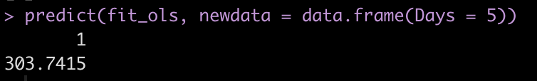
This is the same as if we used the coefficients from the above model and multiplied the Days coefficient (10.5) by 5 days:

251.4 + 10.5 * 5

While this may be the average value of reaction time after 5 days of sleep deprivation we can clearly see from our plot above that there is a considerable amount of dispersion around the regression line. If we are interested in understanding the dispersion around this average estimate at the population level, we might use a confidence interval. Alternatively, if we’d like to understand this dispersion at an individual participant level, we might instead use a prediction interval. I’ve discussed the differences between these two in a prior blog article (see here).

Within the predict function we can pass the interval argument to indicate whether we want confidence or prediction intervals. Additionally, the level argument specifies what level of interval we are interested (e.g., 90%, 95%, 99%, etc).

Below we see the output for a 90% Confidence Interval and a 90% Prediction Interval. Notice that the average value (fit) is the same for both. However, the prediction interval has a much larger 90% width than the confidence interval. For all the details about why this is and the gory calculations behind them, see my previous blog post.


Finally, if we use the predict() function and set the argument se.fit to TRUE, we obtain the fitted value and 90% confidence interval (as seen above) along with the standard error and the model degrees of freedom.

The results are returned in a named list, thus we can extract the standard error and calculate the 90% confidence interval directly. We determine the upper and lower  90% confidence limits by multiplying the t-critical value to the standard error. The t-critical value is determined using a t-distribution with 178 degrees of freedom (180 observations minus 2, since our model has 2 parameters: an intercept and a slope). We then add/subtract the confidence limits from our average predicted value.

# Build the 90% confidence interval with the standard error
predict(fit_ols, newdata = data.frame(Days = 5)) + qt(p = c(0.05, 0.95), df = nrow(dat) - 2) * predict(fit_ols, newdata = data.frame(Days =5), interval = 'confidence', level = 0.90, se.fit = TRUE)$se.fit


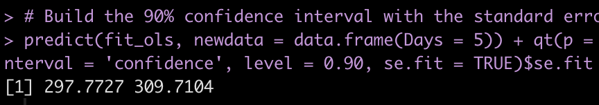
We find that we obtain the exact same results. Fortunately, R makes it relatively easy to build a model and make predictions, so we don’t need to go through all those steps every time. I was mainly just providing them in the instance that you might need to extract values specifically from the model predictions.

Now that we have the basics down, let’s extend this to a mixed model and see what happens when we account for repeated measurements on each participant and what that does to our model predictions.

Mixed Model

To being, we can plot the data for each individual to show that there are a bunch of individual responses to days of sleep deprivation. Then, we construct a mixed model (the same one built in my previous article) where we extend the linear regression above to incorporate random intercepts for each individual. Basically, what this means is that we retain the same linear relationship from the model above; however, the random effect now understands that there are several observations for each participant, meaning that those observations have some correlation to each other (within individual). So, we allow the intercept of the linear regression model to vary by the participant based on the information we can glean from their data.

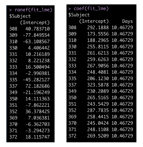
Similar to the linear regression model, for every 1 day increase in sleep deprivation we see, on average, a 10.5 millisecond increase in reaction time. However, notice the standard error around the Days coefficient! In the linear regression model it was 1.24 and we have now shrunk it to 0.804. This is due to accounting for the repeated measures of the data. We can see in the Random Effects portion of the model output how much of the variance is contained between subjects, around the (Intercept), and how much of the variance is left unexplained (Residual).

We can look explicitly at how each individual behaves within the model with the ranef() function, which gives us the difference between the individual and the model intercept (251.4). Alternatively, we can use the coef() function to indicate the linear equation for each participant. This is the model intercept plus the random effect, which we found with the ranef() function. Also notice that since this is not a random slope model, the Days coefficient is the same for each participant.

Making Predictions with a Mixed Model

Making predictions with the mixed model can be a little tricky. We don’t only have the linear regression component of the model (often referred to as the fixed effects), but we also have a component that references specific individuals. Additionally, it’s not as easy as just extracting confidence or predictions intervals, as we did before.

Making point estimate predictions

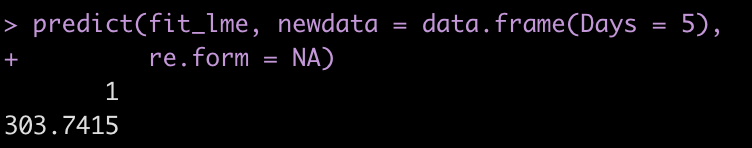
The easiest thing to do is to simply disregard the random effects in the model by passing the predict() function the argument re.form = NA. Doing so indicates that at five days of sleep deprivation we see, on average, a 304 millisecond increase in Reaction time (similar to the linear model above).


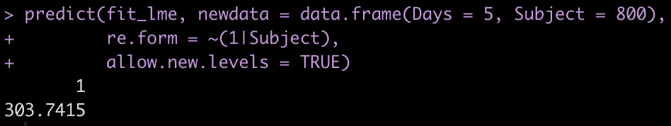
If we are making a prediction for one of the specific participants in our data, for example Subject 308, we can include this in the predict() function by specifying that we want to use the random effects that were previously set. We do this with the re.form argument and pass it the exact random effect that we specified when we built the model.


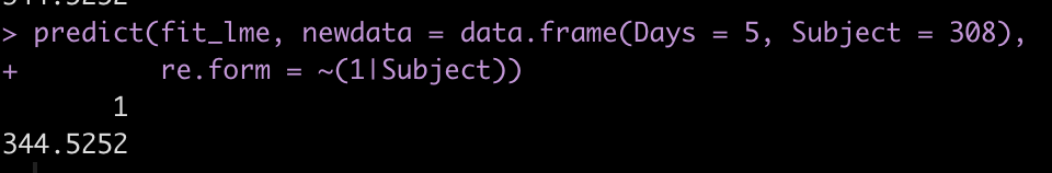
Now we see the point estimate prediction is different than the one above it because the prediction contains some information that is known about Subject 308.

What if we have new participant that the model has no information on?

Using the allow.new.levels argument we can tell the model that we want to allow new random effect levels. In doing so, since the model has no information about the new participant, it will simply return the fixed effects point estimate, just as we got when we specified no random effects in the prediction. This is because the model’s best guess for a new participant is the population average for 5 days of sleep deprivation.


Finally, we can take these point estimate predictions and predict with only the fixed effects and then with the random effects for every participant in our data and then plot the results.

# Make predictions using fixed effect only and then random effects and plot the results
dat %>%
  mutate(pred_fixef = predict(fit_lme, newdata = ., re.form = NA),
         pred_ranef = predict(fit_lme, newdata = ., re.form = ~(1|Subject))) %>%
  ggplot(aes(x = Days, y = Reaction)) +
  geom_point(shape = 21,
             size = 2,
             color = "black",
             fill = "grey") +
  geom_line(aes(y = pred_fixef),
            color = "blue",
            size = 1.2) +
  geom_line(aes(y = pred_ranef),
            color = "green",
            size = 1.2) +
  facet_wrap(~Subject) +
  scale_x_continuous(labels = seq(from = 0, to = 9, by = 3),
                     breaks = seq(from = 0, to = 9, by = 3)) +
  labs(x = "Days of Sleep Deprivation",
       y = "Average Reaction Time",
       title = "Reaction Time ~ Days of Sleep Deprivation",
       subtitle = "Blue = Fixed Effects Prediction | Green = Random Effects Prediction")


We see our fixed effects predictions in blue (which are the same for every participant) and our predictions incorporating random effects in green, which move up and down based on the participant. Also notice that the slope is exactly the same for each participant and each prediction. This is because we only specified a random intercept for this model, which is why the green line moves up and down relative to the fixed effects blue line, given that some participants are higher or lower than the population.

Confidence Intervals

To obtain confidence intervals, we can’t simply specify the interval argument in the predict() function as we did with linear regression. Instead, we need to bootstrap the predictions using the bootMer() function. (NOTE: If you want to always be able to replicate your confidence interval results be sure to set.seed() prior to running the function).

boot_ci <- bootMer(fit_lme,
                   nsim = 100,
                   FUN = function(x) { predict(x, newdata = data.frame(Days = 5), re.form = NA) })

boot_ci

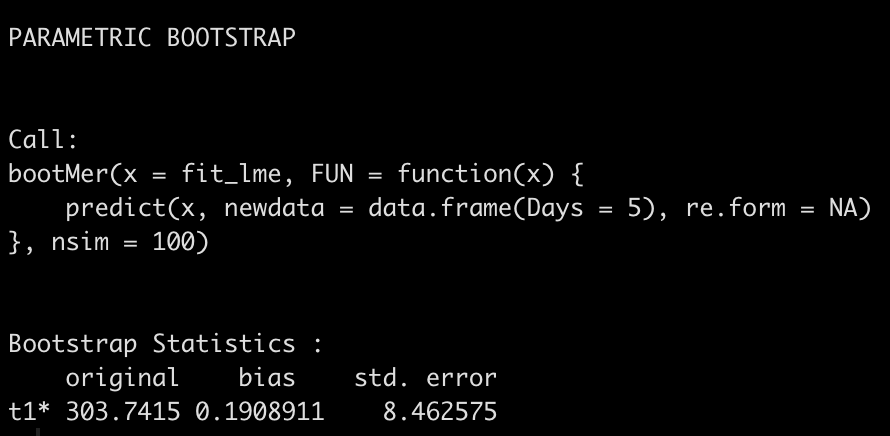
The boot_ci element that we created has a number of different parameters contained within it. The ‘t‘ parameter contains the 100 bootstrapped resamples that we created.

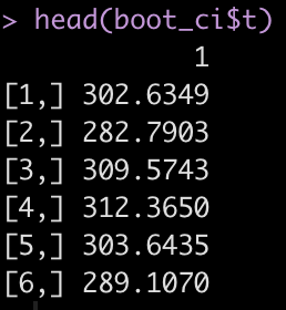
With these bootstrapped resamples we can do a number of things such as plotting a histogram.

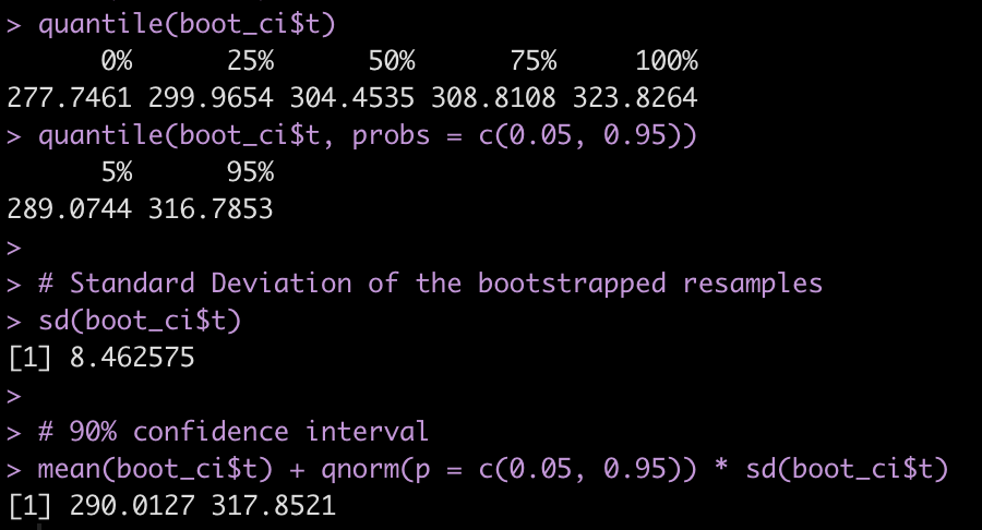
Or extracting information such as the quantiles, quantile intervals, the standard deviation of the bootstrapped resamples, and using the mean and standard deviation of the reamples to build 90% confidence intervals around the point estimate prediction.

Prediction Intervals

We can create prediction intervals around our point estimate predictions using the merTools package and the predictInterval() function.

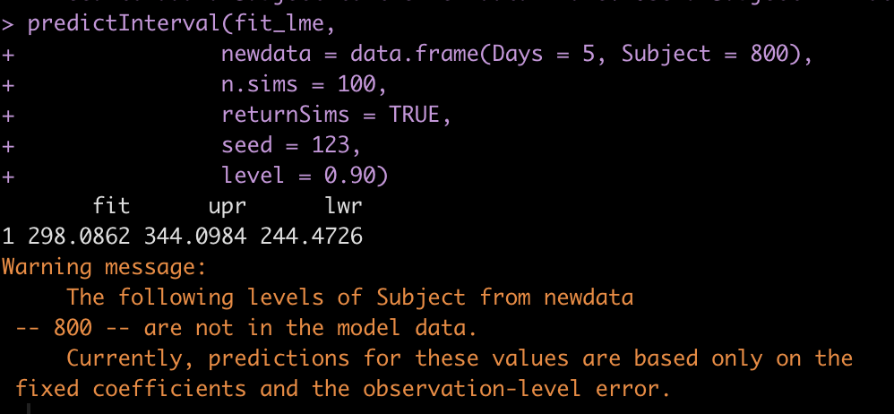
With the predictInterval() function we need to specify a Subject, since that is what the original mixed model also had in its equation (as a random effect). Here I’ll specify a new subject that the model has never seen. The model will return prediction intervals for the point estimate prediction using only fixed effects given that it doesn’t have data on this subject (it will also let me know this in the warning).


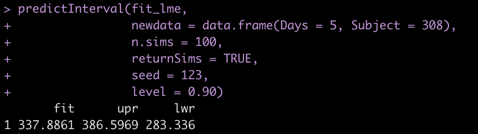
Of course, if we are making a prediction on a subject that the model is familiar with, we can use that information. Here I make a prediction on Subject 308 and we see that the results differ from above.


Finally, just for fun and to show we can do this at scale, we will make a prediction on every single participant in our data across all of the days of sleep deprivation. We will bind those predictions and their corresponding 90% prediction intervals to the original data and then plot the results.

pred_ints <- predictInterval(fit_lme, 
                newdata = dat, 
                n.sims = 100,
                returnSims = TRUE, 
                seed = 123, 
                level = 0.90)

dat_new <- cbind(dat, pred_ints) dat_new %>%
  head()

# plot predictions
dat_new %>%
  ggplot(aes(x = Days, y = Reaction)) +
  geom_point(shape = 21,
             size = 2,
             color = "black",
             fill = "grey") +
  geom_ribbon(aes(ymin = lwr, ymax = upr),
            fill = 'light grey',
            alpha = 0.4) +
  geom_line(aes(y = fit),
            color = 'red',
            size = 1.2) +
  facet_wrap(~Subject) +
  scale_x_continuous(labels = seq(from = 0, to = 9, by = 3),
                     breaks = seq(from = 0, to = 9, by = 3)) +
  labs(x = "Days of Sleep Deprivation",
       y = "Average Reaction Time",
       title = "Reaction Time ~ Days of Sleep Deprivation")

Wrapping Up

Mixed models are an incredibly valuable analysis tools. In sport medicine and sport science, models are often helpful for allowing practitioners to make forecasts about how an athlete is progressing or to understand how an athlete is performing relative to what might be expected. Hopefully this article was useful in walking through how to make point estimate predictions and obtain confidence and prediction intervals from mixed models. If you notice any errors, feel free to reach out!

As always, all of the code if available on my GITHUB page.

The Role of Skill vs Luck in Team Sport Winning

This week on the Wharton Moneyball Podcast, the hosts were discussing World Cup results following the group play stage.

At one point, they talked about the variance in performance and the role that luck can play in winning or losing. They felt like they didn’t have as good an intuition about how variable the games were and one of the hosts, Eric Bradlow, said that he’d try and look into it and have an answer for next week’s episode.

The discussion reminded me of a chapter in one of my favorite books, The Success Equation by Michael Mauboussin. The book goes into nice detail about the role of skill and luck in sports, investing, and life. On page 78, Mauboussin provides the following equation:

Skill = Observed Outcome – Luck

From there, he explains the steps for determining the contribution of luck to winning in a variety of team sports. Basically, the amount of luck plays is represented as the ratio of the variance of luck to the variance of observed outcomes.

To calculate the variance of observed outcomes, we find the win% of each team in a given season and calculate the standard deviation of that win%. Squaring this value gives us the variance of observed outcomes.

When calculating the variance of luck we first find the average win% of all of the teams and, treating this as a binomial, we calculate the standard deviation as sqrt((win% * (1 – win%)) / n_games), where n_games is the number of games in a season.

I scraped data for the previous 3 complete seasons for the Premier League, NHL, NBA, NFL, and MLB from sports-reference.com. All of the data and code for calculating the contribution of luck to winning for these sports is available on my GitHub page.

Let’s walk through an example

Since the guys on Wharton Moneyball Podcast were talking about Soccer, I’ll use the Premier League as an example.

First, we create a function that does all the calculations for us. All we need to do is obtain the relevant summary statistics to feed into the function and then let it do all the work.

league_perf <- function(avg_win_pct, obs_sd, luck_sd, league){
  
  ## convert standard deviations to variance
  var_obs <- obs_sd^2
  var_luck <- luck_sd^2
  
  ## calculate the variation due to skill
  var_skill <- var_obs + var_luck
  
  ## calculate the contribution of luck to winning
  luck_contribution <- var_luck / var_obs
  
  
  ## Results table
  output <- tibble(
    league = {{league}},
    avg_win_pct = avg_win_pct,
    luck_contribution = luck_contribution,
  )
  
  return(output)
  
}


Using the Premier League data set we calculate the games per season, league average win%, the observed standard deviation, and the luck standard deviation.

NOTE: I’m not much of a soccer guy so I wasn’t sure how to handle draws. I read somewhere that they equate to about 1/3 of a win, so that is what I use here to credit a team for a draw.

## get info for function
# NOTE: Treating Draws as 1/3 of a win, since that reflects the points the team is awarded in the standings
premier_lg %>%
  select(Squad, MP, W, D) %>%
  mutate(win_pct = (W + 1/3*D) / MP) %>%
  summarize(games = max(MP),
            avg_win_pct = mean(win_pct),
            obs_sd = sd(win_pct),
            luck_sd = sqrt((avg_win_pct * (1 - avg_win_pct)) / games))

## Run the function
premier_lg_output <- league_perf(avg_win_pct = 0.462,
                                 obs_sd = 0.155,
                                 luck_sd = 0.0809,
                                 league = "Premier League")

premier_lg_output

Looking at our summary table, it appears that teams have had an average win% over the past 3 seasons of 46.2% (not quite 50%, as we will see in NBA, MLB, or NFL, since draws happen so frequently). The standard deviation of team win% was 15.5% (this is the observed standard deviation), while the luck standard deviation, 8.1%, is the binomial standard deviation using the average win percentage and 38 games in a season.

Feeding these values into the function created above we find that luck contributes approximately 27.2% to winning in the Premier League. In Mauboussin’s book he found that the contribution of luck to winning was 31% in the Premier League from 2007 – 2011. I don’t feel like the below value is too far off of that, though I don’t have a good sense for what sort of magnitude of change would be surprising. That said, the change could be due to improved skill in the Premier League (already one of the most skillful leagues in the world) or perhaps how he handled draws, which was not discussed in the book and may differ from the approach I took here.

Let’s look at the table of results for all sports

Again, you can get the code for calculating the contribution of luck to winning in these sports from my GitHub page, so no need to rehash it all here. Instead, let’s go directly to the results.

  • NBA appears to be the most skill driven league with only about 15% of the contribution to winning coming from luck. Mauboussin found this value to be 12% from 2007 – 2011.
  • The NFL appears to be drive most by luck, contributing 39% to winning. This is identical to what Mauboussin observed using NFL data from 2007 – 2011.
  • The two most surprising outcomes here are the MLB and NHL. Mauboussin found the MLB to have a 34% contribution of luck (2007 – 2011) and the NHL a 53% contribution of luck (2008 – 2012). However, in my table below it would appear that the contribution of luck has decreased substantially in these two sports, using data from previous 3 seasons (NOTE: throwing out the COVID year doesn’t alter this drastically enough to make it close to what Mauhoussin showed).

Digging Deeper into MLB and NHL

I pulled data from the exact same seasons that Mauboussin used in his book and obtained the following results.

  • The results I observed for the MLB are identical to what Mauboussin had in his book (pg. 80)
  • The results for the NHL are slightly off (47.7% compared to 53%) but this might have to do with how I am handling overtime wins and losses (which awards teams points in the standings), as I don’t know enough about hockey to determine what value to assign to them. Perhaps Mauboussin addressed these two outcomes in his calculations in a more specific way.

Additional hypotheses:

  • Maybe skill has improved in hockey over the past decade and a half?
  • Maybe a change in tactics (e.g., the shift) or strategy (e.g., hitters trying to hit more home runs instead of just making contact or pitchers trying to explicitly train to increase max velocity) has taken some of the luck events out of baseball and turned it into more of a zero-sum duel between the batter and pitcher, making game outcomes more dependent on the skill of both players?
  • Maybe I have an error somewhere…let me know if you spot one!

Wrapping Up

Although we marvel at the skill of the athletes we watch in their arena of competition, it’s important to recognize that luck plays a role in the outcomes, and for some sports it plays more of a role than others. But, luck is also what keeps us watching and makes things fun! Sometimes the ball bounces your way and you can steal a win! The one thing I always appreciate form the discussions on the Wharton Moneyball Podcast is that the hosts don’t shy away from explaining things like luck, randomness, variance, regression to the mean, and weighting observed outcomes with prior knowledge. This way of thinking isn’t just about sport, it’s about life. In this sense, we may consider sport to be the vehicle through which these hosts are teaching us about our world.

tidymodels train/test set without initial_split

Introduction

In {tidymodels} it is often recommended to split the data using the initial_split() function. This is useful when you are interested in a random sample from the data. As such, the initial_split() function produces a list of information that is used downstream in the model fitting and model prediction process. However, sometimes we have data that we want to fit specifically to a training set and then test on data set that we define. For example, training a model on years 2010-2015 and then testing a model on years 2016-2019.

This tutorial walks through creating your own bespoke train/test sets, fitting a model, and then making predictions, while circumventing the issues that may arise from not having the initial_split() object.

Load the AirQuality Data

library(tidyverse)
library(tidymodels)
library(datasets)

data("airquality")

airquality %>% count(Month)


Train/Test Split

We want to use `tidymodels` to build a model on months 5-7 and test the model on months 8 and 9?

Currently the initial_split() function only takes a random sample of the data.

set.seed(192)
split_rand <- initial_split(airquality ,prop = 3/4)
split_rand

train_rand <- training(split_rand)
test_rand <- testing(split_rand) train_rand %>%
  count(Month)

test_rand %>%
  count(Month)

The strat argument within initial_split() only ensures that we get an even sample across our strat (in this case, Month).

split_strata <- initial_split(airquality ,prop = 3/4, strata = Month)
split_strata

train_strata <- training(split_strata)
test_strata <- testing(split_strata) train_strata %>%
  count(Month)

test_strata %>%
  count(Month)

  • Create our own train/test split, unique to the conditions we are interested in specifying.
train <- airquality %>%
  filter(Month < 8)

test <- airquality %>%
  filter(Month >= 8)
  • Create 5-fold cross validation for tuning our random forest model
set.seed(567)
cv_folds <- vfold_cv(data = train, v = 5)

Set up the model specification

  • We will use random forest
## model specification
aq_rf <- rand_forest(mtry = tune()) %>%
  set_engine("randomForest") %>%
  set_mode("regression")

Create a model recipe

There are some NA’s in a few of the columns. We will impute those and we will also normalize the three numeric predictors in our model.

## recipe
aq_recipe <- recipe( Ozone ~ Solar.R + Wind + Temp + Month, data = train ) %>%
step_impute_median(Ozone, Solar.R) %>%
step_normalize(Solar.R, Wind, Temp)

aq_recipe

## check that normalization and NA imputation occurred in the training data
aq_recipe %>%
prep() %>%
bake(new_data = NULL)

## check that normalization and NA imputation occurred in the testing data
aq_recipe %>%
prep() %>%
bake(new_data = test)


Set up workflow

  • Compile all of our components above together into a single workflow.
## Workflow
aq_workflow <- workflow() %>%
add_model(aq_rf) %>%
add_recipe(aq_recipe)

aq_workflow

Tune the random forest model

  • We set up one hyperparmaeter to tune, mtry, in our model specification.
## tuning grid
rf_tune_grid <- grid_regular(
  mtry(range = c(1, 4))
)

rf_tune_grid

rf_tune <- tune_grid(
  aq_workflow,
  resamples = cv_folds,
  grid = rf_tune_grid
)

rf_tune

Get the model with the optimum mtry

## view model metrics
collect_metrics(rf_tune)

## Which is the best model?
select_best(rf_tune, "rmse")

  • Looks like an mtry = 1 was the best option as it had the lowest RMSE and highest r-squared.

Fit the final tuned model

  • model specification with mtry = 1
aq_rf_tuned <- rand_forest(mtry = 1) %>%
  set_engine("randomForest") %>%
  set_mode("regression")

Tuned Workflow

  • the recipe steps are the same
aq_workflow_tuned <- workflow() %>%
  add_model(aq_rf_tuned) %>%
  add_recipe(aq_recipe) 

aq_workflow_tuned

Final Fit

aq_final <- aq_workflow_tuned %>%
  fit(data = train)

Evaluate the final model

aq_final %>%
  extract_fit_parsnip()

Predict on test set

ozone_pred_rf <- predict(
aq_final,
test
)

ozone_pred_rf

Conclusion

Pretty easy to fit a model to bespoke train/test split that doesn’t require {tidymodels} initial_split() function. Simply construct the model, do any hyperparameter tuning, fit a final model, and make predictions.

Below I’ve added the code for anyone interested in seeing this same process using linear regression, which is easier than the random forest model since there are no hyperparameters to tune.

If you’d like to have the full code in one concise place, check out my GITHUB page.

Doing the same tasks with linear regression

  • This is a bit easier since it doesn’t require hyperparameter tuning.


## Model specification
aq_linear <- linear_reg() %>%
  set_engine("lm") %>%
  set_mode("regression")

## Model Recipe (same as above)
aq_recipe <- recipe( Ozone ~ Solar.R + Wind + Temp + Month, data = train ) %>%
  step_impute_median(Ozone, Solar.R) %>% 
  step_normalize(Solar.R, Wind, Temp)

## Workflow
aq_wf_linear <- workflow() %>%
  add_recipe(aq_recipe) %>%
  add_model(aq_linear)

## Fit the model to the training data
lm_fit <- aq_wf_linear %>%
  fit(data = train)

## Get the model output
lm_fit %>%
  extract_fit_parsnip()

## Model output with traditional summary() function
lm_fit %>%
  extract_fit_parsnip() %>% 
  .$fit %>%
  summary()

## Model output in tidy format  
lm_fit %>%
  tidy()

## Make predictions on test set
ozone_pred_lm <- predict(
  lm_fit,
  test
  )

ozone_pred_lm

Regression to the Mean in Sports

Last week, scientist David Borg posted an article to twitter talking about regression to the mean in epidemiological research (1). Regression to the Mean is a statistical phenomenon where extreme observations tend to move closer towards the population mean in subsequent observations, due simply to natural variation. To steal Galton’s example, tall parents will often have tall children but those children, while taller than the average child, will tend to be shorter than their parents (regressed to the mean). It’s also one of the reasons why clinicians have such a difficult time understanding whether their intervention actually made the patient better or whether observed improvements are simply due to regression to the mean over the course of treatment (something that well designed studies attempt to rule out by using randomized controlled experiments).

Of course, this phenomenon is not unique to epidemiology or biostatistics. In fact, the phrase is commonly used in sport when discussing players or teams that have extremely high or low performances in a season and there is a general expectation that they will be more normal next year. An example of this could be the sophomore slump exhibited by rookies who perform at an extremely high level in their first season.

Given that this phenomenon is so common in our lives, the goal with this blog article is to show what regression to the mean looks like for team wins in baseball from one year to the next.

Data

We will use data from the Lahman baseball database (freely available in R) and concentrate on team wins in the 2015 and 2016 MLB seasons.

library(tidyverse)
library(Lahman)
library(ggalt)

theme_set(theme_bw())

data(Teams)

dat <- Teams %>%
  select(yearID, teamID, W) %>%
  arrange(teamID, yearID) %>%
  filter(yearID %in% c(2015, 2016)) %>%
  group_by(teamID) %>%
  mutate(yr_2 = lead(W)) %>%
  rename(yr_1 = W) %>%
  filter(!is.na(yr_2)) %>%
  ungroup() 

dat %>%
  head()


Exploratory Data Analysis

dat %>%
  ggplot(aes(x = yr_1, y = yr_2, label = teamID)) +
  geom_point() +
  ggrepel::geom_text_repel() +
  geom_abline(intercept = 0,
              slope = 1,
              color = "red",
              linetype = "dashed",
              size = 1.1) +
  labs(x = "2015 wins",
       y = "2016 wins")

The dashed line is the line of equality. A team that lies exactly on this line would be a team that had the exact number of wins in 2015 as they did in 2016. While no team lies exactly on this line, looking at the chart, what we can deduce is that teams below the red line had more wins in 2015 and less in 2016 while the opposite is true for those that lie above the line. Minnesota had a large decline in performance going from just over 80 wins in 2015 to below 60 wins in 2017.

The correlation between wins in 2015 to wins in 2016 is 0.54.

cor.test(dat$yr_1, dat$yr_2)

Plotting changes in wins from 2015 to 2016

We can plot each team and show their change in wins from 2015 (green) to 2016 (blue). We will break them into two groups, teams that saw a decrease in wins in 2016 relative to 2015 and teams that saw an increase in wins from 2015 to 2016. We will plot the z-score of team wins on the x-axis so that we can reflect average as being “0”.

## get the z-score of team wins for each season
dat <- dat %>%
  mutate(z_yr1 = (yr_1 - mean(yr_1)) / sd(yr_1),
         z_yr2 = (yr_2 - mean(yr_2)) / sd(yr_2))

dat %>%
  mutate(pred_z_dir = ifelse(yr_2 > yr_1, "increase wins", "decrease wins")) %>%
  ggplot(aes(x = z_yr1, xend = z_yr2, y = reorder(teamID, z_yr1))) +
  geom_vline(xintercept = 0,
             linetype = "dashed",
             size = 1.2,
             color = "grey") +
  geom_dumbbell(size = 1.2,
                colour_x = "green",
                colour_xend = "blue",
                size_x = 6,
                size_xend = 6) +
  facet_wrap(~pred_z_dir, scales = "free_y") +
  scale_color_manual(values = c("decrease wins" = "red", "increase wins" = "black")) +
  labs(x = "2015",
       y = "2016",
       title = "Green = 2015 Wins\nBlue = 2016 Wins",
       color = "Predicted Win Direction")

On the decreasing wins side, notice that all teams from SLN to LAA had more wins in 2015 (green) and then regressed towards the mean (or slightly below the mean) in 2016. From MIN down, those teams actually got even worse in 2016.

On the increasing wins side, from BOS down to PHI all of the teams regressed upward towards the mean (NOTE: regressing upward sounds weird, which is why some refer to this as reversion to the mean). From CHN to BAL, those teams were at or above average in 2015 and got better in 2016.

It makes sense that not all teams revert towards the mean in the second year given that teams attempt to upgrade their roster from one season to the next in order to maximize their chances of winning more games.

Regression to the with linear regression

There are three ways we can evaluate regression to the mean using linear regression and all three approaches will lead us to the same conclusion.

1. Linear regression with the raw data, predicting 2016 wins from 2015 wins.

2. Linear regression predicting 2016 wins from the grand mean centered 2015 wins (grand mean centered just means subtracting the league average wins, 81, from the observed wins for each team).

3. Linear regression using z-scores. This approach will produce results in standard deviation units rather than raw values.

## linear regression with raw values
fit <- lm(yr_2 ~ yr_1, data = dat)
summary(fit)

## linear regression with grand mean centered 2015 wins 
fit_grand_mean <- lm(yr_2 ~ I(yr_1 - mean(yr_1)), data = dat)
summary(fit_grand_mean)

## linear regression with z-score values
fit_z <- lm(z_yr2 ~ z_yr1, data = dat)
summary(fit_z)

Next, we take these equations and simply make predictions for 2016 win totals for each team.

dat$pred_fit <- fitted(fit)
dat$pred_fit_grand_mean <- fitted(fit_grand_mean)
dat$pred_fit_z <- fitted(fit_z) dat %>%
  head()

You’ll notice that the first two predictions are exactly the same. The third prediction is in standard deviation units. For example, Arizona (ARI) was -0.188 standard deviations below the mean in 2015 and in 2016 they were predicted to regress towards the mean and be -0.102 standard deviations below the mean. However, they actually went the other way and got even worse, finishing the season -1.12 standard deviations below the mean!

We can plot the residuals and see how off our projections where for each team’s 2016 win total.

par(mfrow = c(2,2))
hist(resid(fit), main = "Linear reg with raw values")
hist(resid(fit_grand_mean), main = "Linear reg with\ngrand mean centered values")
hist(resid(fit_z), main = "Linear reg with z-scored values")

The residuals look weird here because we are only dealing with two seasons of data. At the end of this blog article I will run the residual plot for all seasons from 2000 – 2019 to show how the residuals resemble more of a normal distribution.

We can see that there seems to be an extreme outlier that has a -20 win residual. Let’s pull that team out and see who it was.

dat %>%
  filter((yr_2 - pred_fit) < -19)

It was Minnesota, who went from an average season in 2015 (83 wins) and dropped all the way to 59 wins in 2016 (-2.05 standard deviations below the mean), something we couldn’t have really predicted.

The average absolute change from year1 to year2 for these teams was 8 wins.

mean(abs(dat$yr_2 - dat$yr_1))

Calculating Regression to the mean by hand

To explore the concept more, we can calculate regression toward the mean for the 2016 season by using the year-to-year correlation of team wins, the average wins for the league, and the z-score for each teams wins in 2015. The equation looks like this:

yr2.wins = avg.league.wins + sd_wins * predicted_yr2_z

Where predicted_yr2_z is calculated as:

predicted_yr2_z = (yr_1z * year.to.year.correlation)

We calculated the correlation coefficient above but let’s now store it as its own variable. Additionally we will store the league average team wins and standard deviation in 2015.

avg_wins <- mean(dat$yr_1)
sd_wins <- sd(dat$yr_1)
r <- cor.test(dat$yr_1, dat$yr_2)$estimate

avg_wins
sd_wins
r

On average teams won 81 games (which makes sense for a 162 season) with a standard deviation of about 10 games.

Let’s look at Pittsburgh (Pitt)

dat %>%
  filter(teamID == "PIT") %>%
  select(yearID:z_yr1) %>%
  mutate(predicted_yr2_z = z_yr1 * r,
         predicted_yr2_wins = avg_wins + sd_wins * predicted_yr2_z)

  • In 2015 Pittsburgh had 98 wins, a z-score of 1.63.
  • We predict them in 2016 to regress to the mean and have a z-score of 0.881 (90 wins)

Add these by hand regression to the mean predictions to all teams.

dat <- dat %>%
  mutate(predicted_yr2_z = z_yr1 * r,
         predicted_yr2_wins = avg_wins + sd_wins * predicted_yr2_z)

dat %>%
  head()


We see that our by hand calculation produces the same prediction, as it should.

Show the residuals for all seasons from 2000 – 2019

Here, we will filter out the data from the data base for the desired seasons, refit the model, and plot the residuals.


dat2 <- Teams %>%
  select(yearID, teamID, W) %>%
  arrange(teamID, yearID) %>%
  filter(between(x = yearID,
                 left = 2000,
                 right = 2019)) %>%
  group_by(teamID) %>%
  mutate(yr_2 = lead(W)) %>%
  rename(yr_1 = W) %>%
  filter(!is.na(yr_2)) %>%
  ungroup() 

## Correlation between year 1 and year 2
cor.test(dat2$yr_1, dat2$yr_2)


## linear model
fit2 <- lm(yr_2 ~ yr_1, data = dat2)
summary(fit2)

## residual plot
hist(resid(fit2),
     main = "Residuals\n(Seasons 2000 - 2019")

Now that we have more than a two seasons of data we see a normal distribution of the residuals. The correlation between year1 and year2 in this larger data set was 0.54, the same correlation we saw with the two seasons data.

With this larger data set, the average change in wins from year1 to year2 was 9 (not far from what we saw in the smaller data set above).

mean(abs(dat2$yr_2 - dat2$yr_1))

Wrapping Up

Regression to the mean is a common phenomenon in life. It can be difficult for practitioners in sports medicine and strength and conditioning to tease out the effects of regression to the mean when applying a specific training/rehab intervention. Often, regression to the mean fools us into believing that the intervention we did apply has some sort of causal relationship with the observed outcome. This phenomenon is also prevalent in sport when evaluating the performance of individual players and teams from one year to the next. With some simple calculations we can explore what regression to the mean could look like for data in our own setting, providing a compass and some base rates for us to evaluate observations going forward.

All of the code for this blog can be accessed on my GitHub page. If you notice any errors, please reach out!

References

1) Barnett, AG. van der Pols, JC. Dobson, AJ. (2005). Regression to the mean: what it is and how to deal with it. International Journal of Epidemiology; 34: 215-220.

2) Schall, T. Smith, G. Do baseball players regress toward the mean? The American Statistician; 54(4): 231-235.

tidymodels – Extract model coefficients for all cross validated folds

As I’ve discussed previously, we sometimes don’t have enough data where doing a train/test split makes sense. As such, we are better off building our model using cross-validation. In previous blog articles, I’ve talked about how to build models using cross-validation within the {tidymodels} framework (see HERE and HERE). In my prior examples, we fit the model over the cross-validation folds and then constructed the final model that we could then use to make predictions with, later on.

Recently, I ran into a situation where I wanted to see what the model coefficients look like across all of the cross-validation folds. So, I decided to make a quick blog post on how to do this, in case it is useful to others.

Load Packages & Data

We will use the {mtcars} package from R and build a regression model, using several independent variables, to predict miles per gallon (mpg).

### Packages -------------------------------------------------------

library(tidyverse)
library(tidymodels)

### Data -------------------------------------------------------

dat <- mtcars dat %>%
  head()


Create Cross-Validation Folds of the Data

I’ll use 10-fold cross validation.

### Modelling -------------------------------------------------------
## Create 10 Cross Validation Folds

set.seed(1)
cv_folds <- vfold_cv(dat, v = 10)
cv_folds

Specify a linear model and set up the model formula

## Specify the linear regression engine
## model specs
lm_spec <- linear_reg() %>%
  set_engine("lm") 


## Model formula
mpg_formula <- mpg ~ cyl + disp + wt + drat

Set up the model workflow  and fit the model to the cross-validated folds

## Set up workflow
lm_wf <- workflow() %>%
  add_formula(mpg_formula) %>%
  add_model(lm_spec) 

## Fit the model to the cross validation folds
lm_fit <- lm_wf %>%
  fit_resamples(
    resamples = cv_folds,
    control = control_resamples(extract = extract_model, save_pred = TRUE)
  )

Extract the model coefficients for each of the 10 folds (this is the fun part!)

Looking at the lm_fit output above, we see that it is a tibble consisting of various nested lists. The id column indicates which cross-validation fold the lists in each row pertain to. The model coefficients for each fold are stored in the .extracts column of lists. Instead of printing out all 10, let’s just have a look at the first 3 folds to see what they look like.

lm_fit$.extracts %>% 
  .[1:3]

There we see in the .extracts column, <lm> indicating the linear model for each fold. With a series of unnesting we can snag the model coefficients and then put them into a tidy format using the {broom} package. I’ve commented out each line of code below so that you know exactly what is happening.

# Let's unnest this and get the coefficients out
model_coefs <- lm_fit %>% 
  select(id, .extracts) %>%                    # get the id and .extracts columns
  unnest(cols = .extracts) %>%                 # unnest .extracts, which produces the model in a list
  mutate(coefs = map(.extracts, tidy)) %>%     # use map() to apply the tidy function and get the coefficients in their own column
  unnest(coefs)                                # unnest the coefs column you just made to get the coefficients for each fold

model_coefs

Now that we have a table of estimates, we can plot the coefficient estimates and their 95% confidence intervals. The term column indicates each variable. We will remove the (Intercept) for plotting purposes.

Plot the Coefficients

## Plot the model coefficients and 2*SE across all folds
model_coefs %>%
  filter(term != "(Intercept)") %>%
  select(id, term, estimate, std.error) %>%
  group_by(term) %>%
  mutate(avg_estimate = mean(estimate)) %>%
  ggplot(aes(x = id, y = estimate)) +
  geom_hline(aes(yintercept = avg_estimate),
             size = 1.2,
             linetype = "dashed") +
  geom_point(size = 4) +
  geom_errorbar(aes(ymin = estimate - 2*std.error, ymax = estimate + 2*std.error),
                width = 0.1,
                size = 1.2) +
  facet_wrap(~term, scales = "free_y") +
  labs(x = "CV Folds",
       y = "Estimate ± 95% CI",
       title = "Regression Coefficients ± 95% CI for 10-fold CV",
       subtitle = "Dashed Line = Average Coefficient Estimate over 10 CV Folds per Independent Variable") +
  theme_classic() +
  theme(strip.background = element_rect(fill = "black"),
        strip.text = element_text(face = "bold", size = 12, color = "white"),
        axis.title = element_text(size = 14, face = "bold"),
        axis.text.x = element_text(angle = 60, hjust = 1, face = "bold", size = 12),
        axis.text.y = element_text(face = "bold", size = 12),
        plot.title = element_text(size = 18),
        plot.subtitle = element_text(size = 16))

Now we can clearly see the model coefficients and confidence intervals for each of the 10 cross validated folds.

Wrapping Up

This was just a quick and easy way of fitting a model using cross-validation to extract out the model coefficients for each fold. Often, this is probably not necessary as you will fit your model, evaluate your model, and be off and running. However, there may be times where more specific interrogation of the model is required or, you might want to dig a little deeper into the various outputs of the cross-validated folds.

All of the code is available on my GitHub page.

If you notice any errors in code, please reach out!