Category Archives: Strength & Conditioning

If the examples we see in textbooks don’t represent the real world, what about the sports science papers we read?

I enjoyed this short article by Andrew Gelman on the blog he keeps with several of his colleagues. The main point, which I agree 100% with, is that the examples in our stats and data analysis textbooks never seem to match what we see in the real world. The examples always seem to work! The data is clean and looks perfectly manicured for the analysis. I get it! The idea is to convey the concept of how different analytical approaches work. The rub is that once you get to the real world and look at your data you end up being like, “Uh. Wait….what is this? What do I do now?!”

The blog got me thinking about something else, though. Something that really frustrates me. If the examples we see in textbooks don’t reflect the data problems we face in the real world, what about the examples we read about in applied sport science research? How much do those examples reflect what we see in the real world?

At the risk of upsetting some colleagues, I’ll go ahead and say it:

I’m not convinced that the research we read in publications completely represents the real world either!

How can that be? This is applied science! Isn’t the real word THE research?

Well, yes and no. Yes, the data was collected in the real world, with real athletes, and in a sport setting. But often, reading a paper, looking at the aim and the conclusions, and then parsing through the methods section to see how they handled the data leaves me scratching my head.

My entire day revolves around looking at data and I can tell you; the real world is very messy.

  • How things get collected
  • How things get saved
  • How things get loaded
  • How things get logged

There are potential hiccups all along the way, no matter how stringent you are in trying to keep sound data collection practices!

In research, the problem is that the data is often touched up in some manner to create an analysis sufficient for publication. Missing values need to be handled a certain way (sometimes those rows get dropped, sometimes values get imputed), class imbalance can be an issue, errant values and outliers from technology flub-ups are a very real thing, data entry issues arise, etc. These things are all problematic and, if not identified prior to analysis, can be a major issue with the findings. I do believe that most people recognize these problems and would agree with me that they are very real issues. However, it is less about knowing that there are problems but rather, figuring out what to do about them. Often the methods sections gloss over these details (I get it, word counts for journals can be a pain in the butt) and simply produce a result that, on paper at least, seems overly optimistic. As I read through the results section, without details about data processing, I frequently say to myself, “No way. There is no way this effect is as real as they report. I can’t reproduce this without knowing how they cleaned up their data to observe this effect.”

Maybe someone should post a paper about how crappy their data is in the applied setting? Maybe we should just be more transparent about the data cleaning processes we go through so that we aren’t overly bullish on our findings and more realistic about the things we can say with confidence in the applied setting?

Does anyone else feel this way? Maybe I’m wrong and I’m being pessimistic, and this isn’t as big of an issue as I believe it to be? Is the data we see in publication truly representative of the real world?

Weakley et al. (2022). Velocity-Based Training: From Theory to Application – R Workbook

Velocity-based training (VBT) is a method employed by strength coaches to prescribe training intensity and volume based off of an individual athlete’s load-velocity profiles. I discussed VBT last year when I used {shiny} to build an interactive web application for visualizing and comparing athlete outputs.

Specific to this topic, I recently read the following publication: Weakley, Mann, Banyard, McLaren, Scott, and Garcia-Ramos. (2022). Velocity-based training: From theory to application. Strength Cond J; 43(2): 31-49.

The paper aimed to provide some solutions for analyzing, visualizing, and presenting feedback around training prescription and performance improvement when using VBT. I enjoyed the paper and decided to write an R Markdown file to provide code that can accompany it and (hopefully) assist strength coaches in applying some of the concepts in practice. I’ll summarize some notes and thoughts below, but if you’d like to read the full R Markdown file that explains and codes all of the approaches in the paper, CLICK HERE>> Weakley–2021—-Velocity-Based-Training—From-Theory-to-Application—Strength-Cond-J.

If you’d like the CODE and DATA to run the analysis yourself, they are available on my GitHub page.

Paper/R Markdown Overview

Technical Note: I don’t have the actual data from the paper. Therefore, I took a screen shot of Figure 3 in the text and used an open source web application for extracting data from figures in research papers. This requires me to go through and manually click on the points of the plot itself. Consequently, I’m not 100% perfect, so there may be subtle differences in my data set compared to what was used for the paper.

The data used in the paper reflect 17-weeks of mean concentric velocity (MCV) in the 100-kg back squat for a competitive powerlifter, tested once a week. The two main figures, which, along with the analysis, I will recreate are Figure 3 and Figure 5.

Figure 3 is a time series visual of the athlete while Figure 5 provides an analysis and visual for the athlete’s change across the weeks in the training phase.

Figure 3

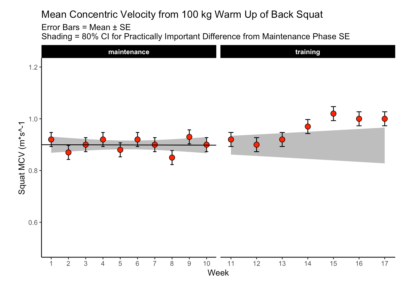
The first 10-weeks represent the maintenance phase for the athlete, which was followed by a 7-week training phase. The maintenance phase sessions were used to build a linear regression model which was then used to visualize the athlete’s change over time along with corresponding confidence interval around each MCV observation. The model output looks like this:

The standard (typical) error was used to calculate confidence intervals around the observations. To calculate the standard error, the authors’ recommend one of two approaches:

1) If you have group-based test-retest data, they recommend taking the difference between the test-retest outcomes and calculating the standard error as follows:

  • SE.group = sd(differences) / sqrt(2)

2) If you have individual observations, they recommend calculating the standard error like this:

  • SE.individual = sqrt(sum.squared.residuals) / (n2))

Since we have individual athlete data, we will use the second option, along with the t-critical value for 80% CI, to produce Figure 3 from the paper :
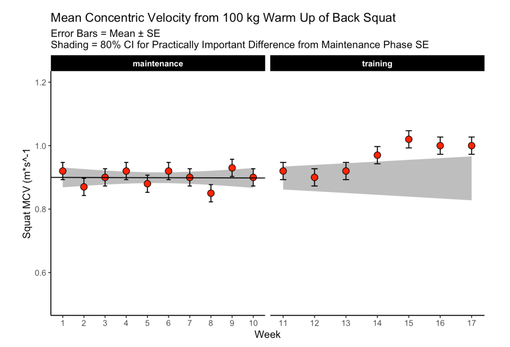
The plot provides a nice visual of the athlete over time. We see that, because the linear model is calculated for the maintenance phase, as time goes on, the shaded standard error region gets wider. The confidence intervals around each point estimate are there to encourage us to think past just a point estimate and recognize that there is some uncertainty in every test outcome that cannot be captured in a single value.

Figure 5

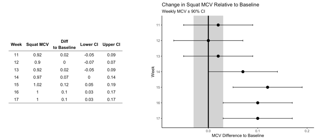
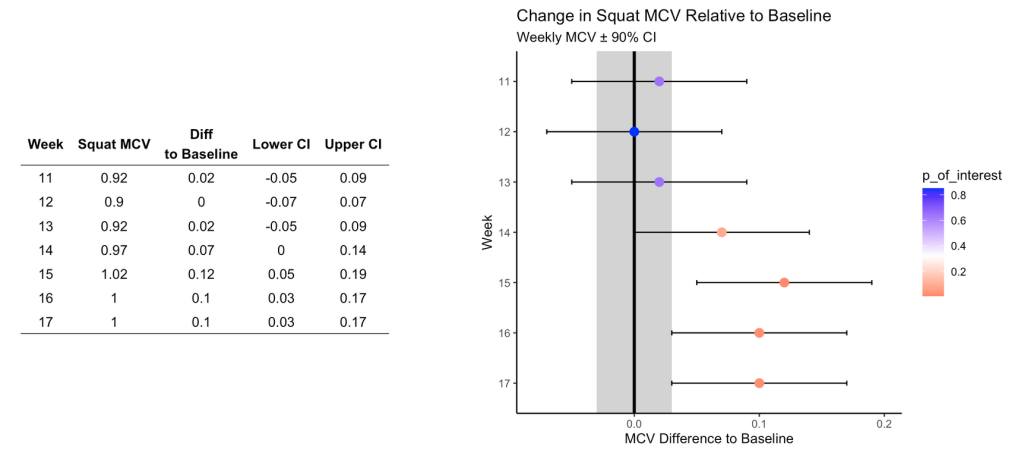
This figure visualizes the change in squat velocity for the powerlifter in weeks 11-17 (the training phase) relative to the mean squat velocity form the maintenance phase, representing the athlete’s baseline performance.

Producing this plot requires five pieces of information:

  1. Baseline average for the maintenance phase
  2. The difference between the observed MVC in each training week and the maintenance average
  3. Calculate the t-critical value for the 90% CI
  4. Calculate the Lower 90% CI
  5. Calculate the Upper 90% CI

Obtaining this information allows us to produce the following table of results and figure:
Are the changes meaningful?

One thing the authors’ mention in the paper are some approaches to evaluating whether the observed changes are meaningful. They recommend using either equivalence tests or second generation p-values. However, they don’t go into calculating such things on their data. I honestly am not familiar with the latter option, so I’ll instead create an example of using an equivalence test for the data and show how we can color the points within the plot to represent their meaningfulness.

Equivalence testing has been discussed by Daniel Lakens and colleagues in their tutorial paper, Lakens, D., Scheel, AM., Isager, PM. (2018). Equivalence testing for psychological reserach: A tutorial. Advances in Methods and Practices in Psychological Science. 2018; 1(2): 259-269.

Briefly, equivalence testing uses one-sided t-tests to evaluate whether the observed effect is larger or smaller than a pre-specified range of values surrounding the effect of interest, termed the smallest effect size of interest (SESOI).

In our above plot, we can consider the shaded range of values around 0 (-0.03 to 0.03, NOTE: The value 0.03 was provided in the text as the meaningful change for this athlete to see an ~1% increase in his 1-RM max) as the region where an observed effect would not be deemed interesting. Outside of those ranges is a change in performance that we would be most interested in. In addition to being outside of the SESOI region, the observed effect should be substantially large enough relative to the standard error around each point, which we calculated from our regression model earlier.

Putting all of this together, we obtain a the same figure above but now with the points colored specific to the p-value provided from our equivalence test:
Warpping Up

Again, if you’d like the full markdown file with code (click the ‘code’ button to display each code chunk) CLICK HERE >> Weakley–2021—-Velocity-Based-Training—From-Theory-to-Application—Strength-Cond-J

There are always a number of ways that analysis can unfold and provide valuable insights and this paper reflects just one approach. As with most things, I’m left with more questions than answers.

For example, Figure 3, I’m not sure if linear regression is the best approach. As we can see, the grey shaded region increases in width overtime because time is on the x-axis (independent variable) and the model was built on a small portion (the first 10-weeks) of the data. As such, with every subsequent week, uncertainty gets larger. How long would one continue to use the baseline model? At some point, the grey shaded region would be so wide that it would probably be useless. Are we too believe that the baseline model is truly representative of the athlete’s baseline? What if the baseline phase contained some amount of trend — how would the model then be used to quantify whatever takes place in the training phase? Maybe training isn’t linear? Maybe there is other conditional information that could be used?

In Figure 5, I wonder about the equivalence testing used in this single observation approach. I’ve generally thought of equivalence testing as a method comparing groups to determine if the effect from an intervention in one group is larger or smaller than the SESOI. Can it really work in an example like this, for an individual? I’m not sure. I need to think about it a bit. Maybe there is a different way such an analysis could be conceptualized? A lot of these issues come back to the problem of defining the baseline or some group of comparative observations that we are checking our most recent observation against.

My ponderings aside, I enjoyed the paper and the attempt to provide practitioners with some methods for delivering feedback when using VBT.

The Nordic Hamstring Exercise, Hamstring Strains, & the Scientific Process

Doing science in lab is hard.

Doing science in the applied environment is hard — maybe even harder than the lab, at times, due to all of the variables you are unable to control for.

Reading and understanding science is also hard.

Let’s face it, science is tough! So tough, in fact, that scientists themselves have a difficult time with all of the above, and they do this stuff for a living! As such, to keep things in check, science applies a peer-review process to ensure that a certain level of standard is upheld.

Science has a very adversarial quality to it. One group of researchers formulate a hypothesis, conduct some research, and make a claim. Another group of researchers look at that claim and say, “Yeah, but…”, and then go to work trying to poke holes in it, looking to answer the question from a different angle, or trying to refute it altogether. The process continues until some type of consensus is agreed upon within the scientific community based on all of the available evidence.

This back-and-forth tennis match of science has a lot to teach those looking to improve their ability to read and understand research. Reading methodological papers and letters to the editor offer a glimpse into how other, more seasoned, scientists think and approach a problem. You get to see how they construct an argument, deal with a rebuttal, and discuss the limitations of both the work they are questioning and the work they are conducting themselves.

All of this brings me to a recent publication from Franco Impellizzeri, Alan McCall, and Maarten van Smeden, Why Methods Matter in a Meta-Analysis: A reappraisal showed inconclusive injury prevention effect of Nordic hamstring exercise.

The paper is directed at a prior meta-analysis which aggregated the findings of several studies with the aim of understanding the role of the Nordic hamstring exercise (NHE) in reducing the risk hamstring strain injuries in athletes. In a nutshell, Impellizzeri and colleagues felt like the conclusions and claims made from the original meta-analysis were too optimistic, as the title of the paper suggested that performing the NHE can halve the rate of hamstring injuries (Risk Ratio: 0.49, 95% CI: 0.32 to 0.74). Moreover, Impellizzeri et al, identified some methodological flaws with regard to how the meta-analysis was performed.

The reason I like this paper is because it literally steps you through the thought process of Impellizzeri and colleagues. First, it discusses the limitations that they feel are present in the previous meta-analysis. They then conduct their own meta-analysis by re-analyzing the data, however, they apply an inclusion criteria that was more strict and, therefore, only included 5 papers from the original study (they also identified and included a newer study that met their criteria). In analyzing the original five papers, they found prediction intervals ranging from 0.06 to 5.14. (Side Note: Another cool piece of this paper is the discussion and reporting of both confidence intervals and prediction intervals, the latter of which are rarely discussed in the sport science literature).

The paper is a nice read if you want to see the thought process around how scientists read research and go about the scientific process of challenging a claim.

Some general thoughts

  • Wide prediction intervals leave us with a lot of uncertainty around the effectiveness of NHE in reducing the risk of hamstring strain injuries. At the lower end of the interval NHE could be beneficial and protective for some while at the upper end, potentially harmful to others.
  • A possible reason for the large uncertainty in the relationship between NHE and hamstring strain injury is that we might be missing key information about the individual that could indicate whether the exercise would be helpful or harmful. For example, context around their previous injury history (hamstring strains in particular), their training age, or other variables within the training program, all might be useful information to help paint a clearer picture about who might benefit the most or the least.
  • Injury is highly complex and multi-faceted. Trying to pin a decrease in injury risk to a single exercise or a single type of intervention seems like a bit of a stretch.
  • No exercise is a panacea and we shouldn’t treat them as such. If you like doing NHE for yourself (I actually enjoy it!) then do it. If you don’t, then do something else. Let’s not believe that certain exercises have magical properties and let’s not fight athletes about what they are potentially missing from not including an exercise in their program when we don’t even have good certainty on whether it is beneficial or not.

Force Decks – Force Plate Shiny Dashboard

Last week, two of the data scientists at Vald Performance, Josh Ruddy and Nick Murray, put out a free online tutorial on how to create a force plate reports using R with data from their Force Decks software.

It was a nice tutorial to give an overview of some of the power behind ggplot2 and the suite of packages that come with tidyverse. Since they made the data available (in the link above), I decided to pull it down and put together a quick shiny app for those that might be interested in extending the report to an interactive web app.

This isn’t the first time I’ve build a shiny app for the blog using force plate data. Interested readers might want to check out my post from a year ago where I built a shiny interactive report for force-velocity profiling.

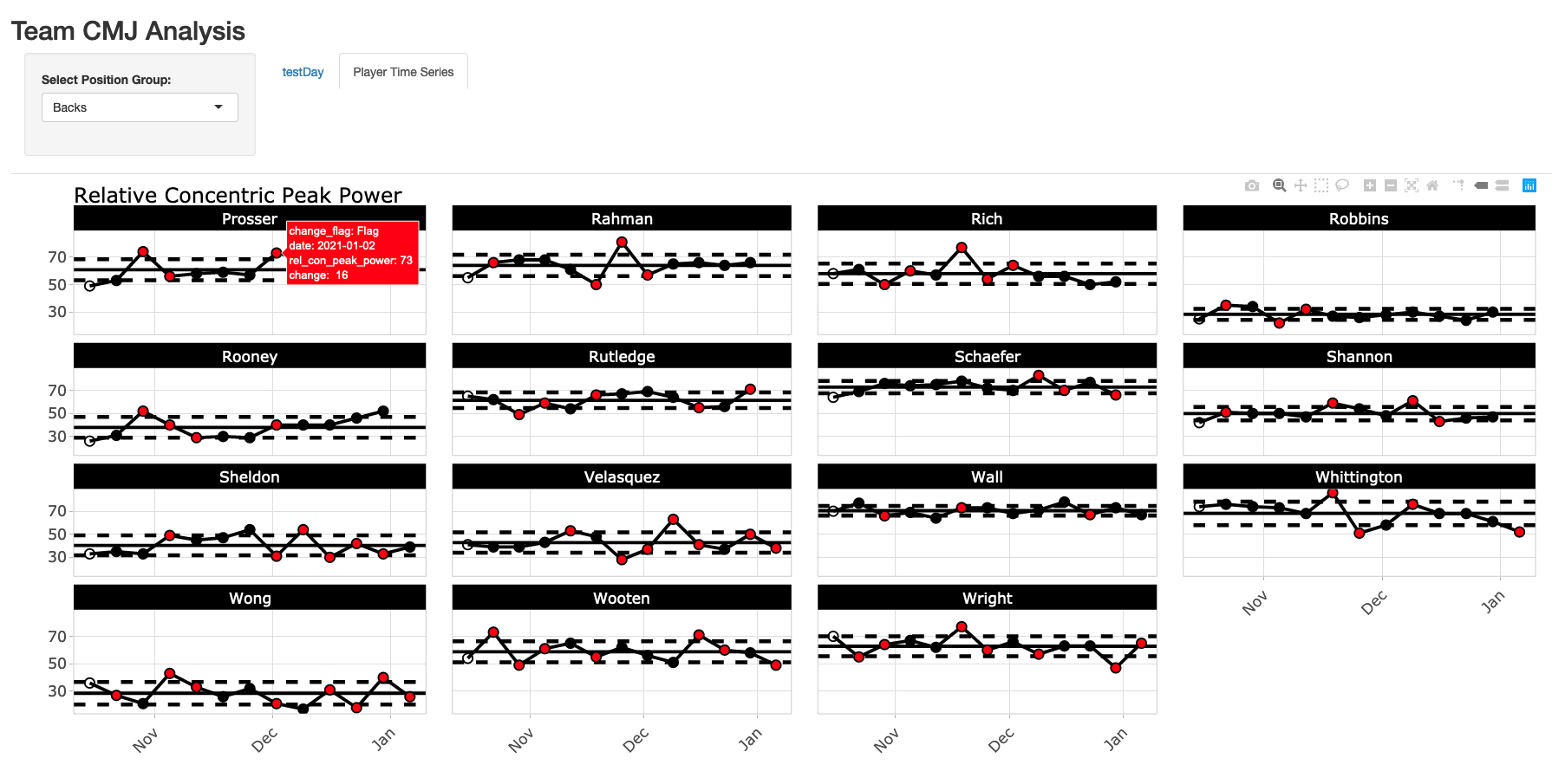
You can watch a short preview of the end product in the below video link and the screen shots below the link show a static view of what the final shiny App will look like.

A few key features:

  1. App always defaults to the most recent testing day on the testDay tab.
  2. The user can select the position group at the top and that position group will be maintained across all tabs. For example, if you select Forwards, when you switch between tabs one and two, forwards will always be there.
  3. The time series plots on the Player Time Series tab are done using plotly, so they are interactive, allowing the user to hover over each test session and see the change from week-to-week in the tool tip. When the change exceeds the meaningful change, the point turns red. Finally, because it is plotly, the user can slice out specific dates that they want to look at (as you can see me do in the video example), which comes in handy when there are a large number of tests over time.

All code and data s accessible through my GitHub page.

vald_shiny_app

Loading and preparing the data

  • I load the data in using read.csv() and file.choose(), so navigate to wherever you have the data on your computer and select it.
  • There is some light cleaning to change the date in to a date variable. Additionally, there were no player positions in the original data set, so I just made some up and joined those in.

### packages ------------------------------------------------------------------
library(tidyverse)
library(lubridate)
library(psych)
library(shiny)
library(plotly)

theme_set(theme_light())

### load & clean data ---------------------------------------------------------
cmj <- read.csv(file.choose(), header = TRUE) %>%
  janitor::clean_names() %>%
  mutate(date = dmy(date))

player_positions <- data.frame(name = unique(cmj$name),
                               position = c(rep("Forwards", times = 15),
                                            rep("Mids", times = 15),
                                            rep("Backs", times = 15)))

# join position data with jump data
cmj <- cmj %>%
  inner_join(player_positions)


Determining Typical Error and Meaningful Change

  • In this example, I’ll just pretend as if the first 2 sessions represented our test-retest data and I’ll work from there.
  • Typical Error Measurement (TEM) was calculated as the standard deviation of differences between test 1 and 2 divided by the square root of 2.
  • For the meaningful change, instead of using 0.2 (the commonly used smallest worthwhile change multiplier) I decided to use a moderate change (0.6), since 0.2 is such a small fraction of the between subject SD.
  • For info on these two values, I covered them in a blog post last week using Python and a paper Anthony Turner and colleagues wrote.

change_standards <- cmj %>%
  group_by(name) %>%
  mutate(test_id = row_number()) %>%
  filter(test_id < 3) %>%
  select(name, test_id, rel_con_peak_power) %>%
  pivot_wider(names_from = test_id,
              names_prefix = "test_",
              values_from = rel_con_peak_power) %>%
  mutate(diff = test_2 - test_1) %>%
  ungroup() %>%
  summarize(TEM = sd(diff) / sqrt(2),
            moderate_change = 0.6 * sd(c(test_1, test_2)))

Building the Shiny App

  • In the user interface, I first create my sidebar panel, allowing the user to select the position group of interest. You’ll notice that this sidebar panel is not within the tab panels, which is why it stands alone and allows us to select a position group that will be retained across all tabs.
  • Next, I set up 2 tabs. Notice that in the first tab (testDay) I include a select input, to allow the user to select the date of interest. In the selected argument I tell shiny to always select the max(cmj$date) so that the most recent session is always shown to the user.
  • The server is pretty straight forward. I commented out where each tab data is built. Basically, it is just taking the user specified information and performing simple data filtering and then ggplot2 charts to provide us with the relevant information.
  • On the testDay plot, we use the meaningful change to shade the region around 0 in grey and we use the TEM around the athlete’s observed performance on a given day to specify the amount of error that we might expect for the test.
  • One the Player Time Series plot we have the athlete’s average line and ±1 SD lines to accompany their data, with points changing color when the week-to-week change exceeds out meaningful change.
### Shiny App -----------------------------------------------------------------------------

## Set up user interface

ui <- fluidPage(
  
  ## set title of the app
  titlePanel("Team CMJ Analysis"),
  
  ## create a selection bar for position group that works across all tabs
  sidebarPanel(
    selectInput(inputId = "position",
                label = "Select Position Group:",
                choices = unique(cmj$position),
                selected = "Backs",
                multiple = FALSE),
    width = 2
  ),
  
  ## set up 2 tabs: One for team daily analysis and one for player time series
  tabsetPanel(
    
    tabPanel(title = "testDay",
             
             selectInput(inputId = "date",
                         label = "Select Date:",
                         choices = unique(cmj$date)[-1],
                         selected = max(cmj$date),
                         multiple = FALSE),
             
             mainPanel(plotOutput(outputId = "day_plt", width = "100%", height = "650px"),
                       width = 12)),
    
    tabPanel(title = "Player Time Series",
             
             mainPanel(plotlyOutput(outputId = "player_plt", width = "100%", height = "700px"),
                       width = 12))
  )
  
)


server <- function(input, output){
  
  ##### Day plot tab ####
  ## day plot data
  day_dat <- reactive({
    
    d <- cmj %>%
      group_by(name) %>%
      mutate(change_power = rel_con_peak_power - lag(rel_con_peak_power)) %>%
      filter(date == input$date,
             position == input$position)
    
    d
    
  })
  
  ## day plot
  output$day_plt <- renderPlot({ day_dat() %>%
      ggplot(aes(x = reorder(name, change_power), y = change_power)) +
      geom_rect(aes(ymin = -change_standards$moderate_change, ymax = change_standards$moderate_change),
                xmin = 0,
                xmax = Inf,
                fill = "light grey",
                alpha = 0.6) +
      geom_hline(yintercept = 0) +
      geom_point(size = 4) +
      geom_errorbar(aes(ymin = change_power - change_standards$TEM, ymax = change_power + change_standards$TEM),
                    width = 0.2,
                    size = 1.2) +
      theme(axis.text.x = element_text(angle = 60, vjust = 1, hjust = 1),
            axis.text = element_text(size = 16, face = "bold"),
            axis.title = element_text(size = 18, face = "bold"),
            plot.title = element_text(size = 22)) +
      labs(x = NULL,
           y = "Weekly Change",
           title = "Week-to-Week Change in Realtive Concentric Peak Power")
    
  })
  
  ##### Player plot tab ####
  ## player plot data
  
  player_dat <- reactive({
    
    d <- cmj %>%
      group_by(name) %>%
      mutate(avg = mean(rel_con_peak_power),
             sd = sd(rel_con_peak_power),
             change = rel_con_peak_power - lag(rel_con_peak_power),
             change_flag = ifelse(change >= change_standards$moderate_change | change <= -change_standards$moderate_change, "Flag", "No Flag")) %>%
      filter(position == input$position)
    
    d
  })
  
  ## player plot
  output$player_plt <- renderPlotly({
    
    plt <- player_dat() %>%
      ggplot(aes(x = date, y = rel_con_peak_power, label = change)) +
      geom_rect(aes(ymin = avg - sd, ymax = avg + sd),
                xmin = 0,
                xmax = Inf,
                fill = "light grey",
                alpha = 0.6) +
      geom_hline(aes(yintercept = avg - sd),
                 color = "black",
                 linetype = "dashed",
                 size = 1.2) +
      geom_hline(aes(yintercept = avg + sd),
                 color = "black",
                 linetype = "dashed",
                 size = 1.2) +
      geom_hline(aes(yintercept = avg), size = 1) +
      geom_line(size = 1) +
      geom_point(shape = 21,
                 size = 3,
                 aes(fill = change_flag)) +
      facet_wrap(~name) +
      scale_fill_manual(values = c("red", "black", "black")) +
      theme(axis.text = element_text(size = 13, face = "bold"),
            axis.text.x = element_text(angle = 45, vjust = 1, hjust = 1),
            plot.title = element_text(size = 18),
            strip.background = element_rect(fill = "black"),
            strip.text = element_text(size = 13, face = "bold"),
            legend.position = "none") +
      labs(x = NULL,
           y = NULL,
           title = "Relative Concentric Peak Power")
    
    ggplotly(plt)
    
  })
  
  
}


shinyApp(ui, server)

Acute:Chronic Workload & Our Research

Some research that myself and a few colleagues have worked on for the past year (and discussed for far longer than that) regarding our critiques of the acute-chronic workload model for sports injury have been recently published.

It was a pleasure to collaborate with this group of researchers and I learned a lot throughout the process and hopefully others will learn a lot when they read our work.

Below are the papers that I’ve been a part of:

  1. Bornn L, Ward P, Norman D. (2019). Training schedule confounds the relationship between Acute:Chronic Workload Ratio and Injury. A causal analysis in professional soccer and American football. Sloan Sports Analytics Conference Paper.
  2. Impellizzeri F, Woodcock S, McCall A, Ward P, Coutts AJ. (2020). The acute-crhonic workload ratio-injury figure and its ‘sweet spot’ are flawed. SportRxiv Preprints.
  3. Impellizzeri FM, Ward P, Coutts AJ, Bornn L, McCall A. (2020). Training Load and Injury Part 1: The devil is in the detail – Challenges to applying the current research in the training load and injury field. Journal of Orthopedic and Sports Physical Therapy, 50(10): 577-584.
  4. Impellizzeri FM, Ward P, Coutts AJ, Bornn L, McCall A. (2020). Training Load and Injury Part 2: Questionable research practices hijack the truth and mislead well-intentioned clinicians. Journal of Orthopedic and Sports Physical Therapy, 50(10): 577-584.
  5. Impellizzeri FM, McCall A, Ward P, Bornn L, Coutts AC. (2020). Training load and its role in injury prevention, Part 2: Conceptual and Methodologic Pitfalls. Journal of Athletic Training, 55(9). 893-901.

Many will argue and say, “Who cares? What’s the big deal if there are issues with this research? People are using it and it is making them think about training load and it is increasing the conversations about training load within sports teams.”

I understand this argument to a point. Having been in pro sport for 7 years now, I can say that anything which increase conversation about training loads, how players are (or are not) adapting, and the potential role this all plays in non-contact injury and game day performance is incredibly useful. That being said, to make decisions we need to have good/accurate measures. Simply doing something for the sake of increasing the potential for conversation is silly to me. It is the same argument that gets made for wellness questionnaires (which I have also found little utility for in the practical environment).

When we measure something it means we are assigning a level of value to it. There is some amount of weighting we apply to that measurement within our decision making process. Even if we are under the belief that collecting the metric is solely for the purpose of increasing the opportunity to have a conversation with a player or coach. In the back of our minds we are still thinking, “Jeez, but his acute-chronic workload ratio was 2.2 today” or “Gosh, I don’t know. He did put an 8 down (out of 10) for soreness this morning”.

Of course challenging these ideas doesn’t mean we sit on our hands and do nothing. Taking simple training load measures (GPS, Accelerometers, Heart Rate, etc.) and applying basic logic about reasonably safe training load increases from week-to-week, doing some basic analysis to understand injury risks and rates within your sport (how they differ by position, age, etc), and identifying players that might be at higher risk of injury to begin with (IE, higher than the baseline risk) and having a more conservative approach with their progression in training can go a long way. Doing something simple like that, doing well, and creating an easy way to report said information to the coach and player can help increase the chance for more meaningful conversation without using measures that might otherwise give a flawed sense of certainty around injury risk.

Regardless of our work, people will use what they want to use and what they are (or have been) most comfortable with in practice. However, that shouldn’t deter us from challenging our processes, critiquing methodologies, and trying to better understand sport, training, physiology, and athlete health and wellness.