Intro
The purpose of workflow sets are to allow you to seamlessly fit multiply different models (and even tune them) simultaneously. This provide an efficient approach to the model building process as the models can then be compared to each other to determine which model is the optimal model for deployment. Therefore, the aim of this tutorial is to provide a simple walk through of how to set up a workflow_set() and build multiple models simultaneously using the tidymodels framework.
The full code (which will include code not directly embedded in this tutorial) is available on my GITHUB page.
Load Packages & Data
Data comes from the nwslR package, which provides a lot of really nice National Women’s Soccer League data.
We will be using stats for field players to determine those who received the the Best XI award (there will only be 10 players per season since we are dealing with field player stats, no goalies).
## packages
library(tidyverse)
library(tidymodels)
library(nwslR)
library(tictoc)

theme_set(theme_light() +
            theme(strip.background = element_rect(fill = "black"),
                  strip.text = element_text(face = "bold")))


## data sets required
data(player)
data(fieldplayer_overall_season_stats)
data(award)

## join all data sets to make a primary data set
d <- fieldplayer_overall_season_stats %>%
  left_join(player) %>%
  left_join(award) %>%
  select(-name_other) %>%
  mutate(best_11 = case_when(award == "Best XI" ~ 1,
                             TRUE ~ 0)) %>%
  select(-award)

d %>%
  head()

Our features will be all of the play stats: mp, starts, min, gls, ast, pk, p_katt and the position (pos) that the player played.
Exploratory Data Analysis
Let’s explore some of the variables that we will be modeling.
How many NAs are there in the data set?

- It looks like there are some players that matches played (mp) and starts yet the number of minutes was not recorded. We will need to handle this in our pre-processing. The alternative approach would be to just remove those 79 players, however I will add an imputation step in the recipe section of our model building process to show how it works.
- There are also a number of players that played in games but never attempted a penalty kick. We will set these columns to 0 (the median value).
How many matches did those who have an NA for minutes play in?

Let’s get a look at the relationship between matches played, `mp`, and `min` to see if maybe we can impute the value for those who have NA.
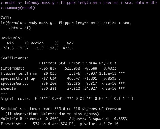
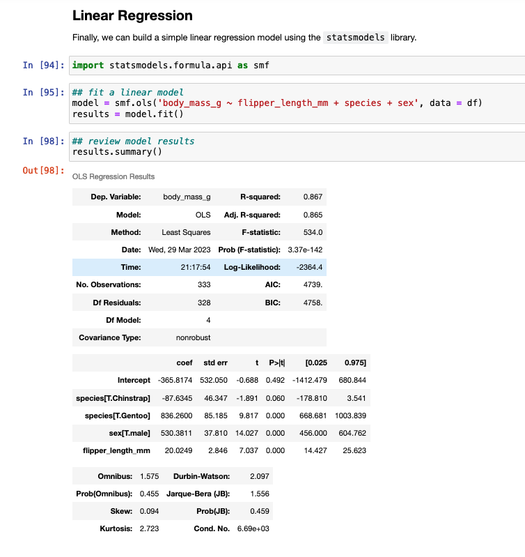
fit_min <- lm(min ~ mp, data = d)
summary(fit_min)

plot(x = d$mp,
     y = d$min,
     main = "Minutes Played ~ Matches Played",
     xlab = "Matches Played",
     ylab = "Minutes Played",
     col = "light grey",
     pch = 19)
abline(summary(fit_min),
       col = "red",
       lwd = 5,
       lty = 2)


- There is a large amount of error in this model (residual standard error = 264) and the variance in the relationship appears to increase as matches played increases. This is all we have in this data set to really go on. It is probably best to figure out why no minutes were recorded for those players or see if there are other features in a different data set that can help us out. For now, we will stick with this simple model and use it in our model `recipe` below.
Plot the density of the continuous predictor variables based on the `best_11` award.
d %>%
  select(mp:p_katt, best_11) %>%
  pivot_longer(cols = -best_11) %>%
  ggplot(aes(x = value, fill = as.factor(best_11))) +
  geom_density(alpha = 0.6) +
  facet_wrap(~name, scales = "free") +
  labs(x = "Value",
       y = "Density",
       title = "Distribution of variables relative to Best XI designation",
       subtitle = "NOTE: axes are specific to the value in question")

How many field positions are there?

Some players appear to play multiple positions. Maybe they are more versatile? Have players with position versatility won more Best XI awards?

Data Splitting
First, I’ll create a data set of just the predictors and outcome variables (and get rid of the other variables in the data that we won’t be using). I’ll also convert our binary outcome variable from a number to a factor, for model fitting purposes.

Split the data into train/test splits.
## Train/Test
set.seed(398)
init_split <- initial_split(d_model, prop = 0.7, strat = "best_11")

train <- training(init_split)
test <- testing(init_split)
Further split the training set into 5 cross validation folds.
## Cross Validation Split of Training Data
set.seed(764)
cv_folds <- vfold_cv(
  data = train,
  v = 5
  )
Prepare the data with a recipe
Recipes help us set up the data for modeling purposes. It is here that we can handle missing values, scale/nornmalize our features, and create dummy variables. More importantly, creating the recipe ensure that if we deploy our model for future predictions the steps in the data preparation process will be consistent and standardized with what we did when we fit the model.
You can find all of the recipe options HERE.
The pre-processing steps we will use are:
- Impute any NA minutes, `min` using the `mp` variable.
- Create one hot encoded dummy variables for the player’s position
- Impute the median (0) when penalty kicks attempted and penalty kicks made are NA
- Normalize the numeric data to have a mean of 0 and standard deviation of 1
nwsl_rec <- recipe(best_11 ~ ., data = train) %>%
  step_impute_linear(min, impute_with = imp_vars(mp)) %>%
  step_dummy(pos, one_hot = TRUE) %>%
  step_impute_median(pk, p_katt, ast) %>%
  step_normalize(mp:p_katt)

nwsl_rec
Here is what the pre-processed training set looks like when we apply this recipe:

Specifying the models
We will fit three models at once:
- Random Forest
- XGBoost
- K-Nearest Neighbor
## Random forest
rf_model <- rand_forest( mtry = tune(), trees = tune(), ) %>%
  set_mode("classification") %>%
  set_engine("randomForest", importance = TRUE)

## XGBoost
xgb_model <- boost_tree( trees = tune(), mtry = tune(), tree_depth = tune(), learn_rate = .01 ) %>%
  set_mode("classification") %>%
  set_engine("xgboost",importance = TRUE)

## Naive Bayes Classifier
knn_model <- nearest_neighbor(neighbors = 4) %>%
  set_mode("classification")
Workflow Set
We are now ready to combine the pre-processing recipes and the three models together in a workflow_set().
nwsl_wf <-workflow_set(
  preproc = list(nwsl_rec),
  models = list(rf_model, xgb_model, knn_model),
  cross = TRUE
  )

nwsl_wf

Tune & fit the 3 workflows
Once the models are set up we use workflow_map() to fit the workflow to the cross-validated folds we created. We will set up a few tuning parameters for the Random Forest and XGBOOST models so during the fitting process we can determine which of parameter pairings optimize the model performance.
I also use the ‘tic()’ and ‘toc()’ functions from the tictoc package to determine the length of time it takes the model to fit, in case there are potential opportunities to optimize the fitting process.
doParallel::registerDoParallel(cores = 10)

tic()

fit_wf <- nwsl_wf %>%
  workflow_map(
    seed = 44,
    fn = "tune_grid",
    grid = 10,           ## parameters to pass to tune grid
    resamples = cv_folds
  )

toc()

# Took 1.6 minutes to fit

doParallel::stopImplicitCluster()

fit_wf

Evaluate each model’s performance on the train set
We can plot the model predictions across the range of models we fit using autoplot(), get a summary of the model predictions with the collect_metrics() function, and rank the results of the model using rank_results().
## plot each of the model's performance and ROC
autoplot(fit_wf)

## Look at the model metrics for each of the models
collect_metrics(fit_wf)

## Rank the results based on model accuracy
rank_results(fit_wf, rank_metric = "accuracy", select_best = TRUE)


We see that the Random Forest models out performed the XGBOOST and KNN models.
Extract the model with the best performance
Now that we know that the Random Forest performed the best. We will grab the model ID for the Random Forest Models and their corresponding workflows.
## get the workflow ID for the best model
best_model_id <- fit_wf %>%
  rank_results(
    rank_metric = "accuracy",
    select_best = TRUE
  ) %>%
  head(1) %>%
  pull(wflow_id)

best_model_id

## Extract the workflow for the best model
best_model <- extract_workflow(fit_wf, id = best_model_id)
best_model
Extract the tuned results from workflow of the best model
We know the best model was the Random Forest model so we can use the best_model_id to get all of the Random Forest models out and look at how each one did during the tuning process.
First we extract the Random Forest models.
## extract the Random Forest models
best_workflow <- fit_wf[fit_wf$wflow_id == best_model_id,
                               "result"][[1]][[1]]

best_workflow
With the collect_metrics() function we can see the iterations of mtry, trees, and tree_depth that were evaluated in the tuning process. We can also use select_best() to get the model parameters that performed the best of the Random Forest models.
collect_metrics(best_workflow)
select_best(best_workflow, "accuracy")

Fit the final model
We saw above that the best model had the following tuning parameters:
We can extract this optimized workflow using the finalize_workflow() function and then fit that final workflow to the initial training split data.
## get the finalized workflow
final_wf <- finalize_workflow(best_model, select_best(best_workflow, "accuracy"))
final_wf

## fit the final workflow to the initial data split
doParallel::registerDoParallel(cores = 8)

final_fit <- final_wf %>%
  last_fit(
    split = init_split
  )

doParallel::stopImplicitCluster()

final_fit

Extract Predictions on Test Data and evaluate model
First we can evaluate the variable importance plot for the random forest model.
library(vip)

final_fit %>%
  extract_fit_parsnip() %>%
  vip(geom = "col",
      aesthetics = list(
              color = "black",
              fill = "palegreen",
              alpha = 0.5)) +
  theme_classic()

Next we will look at the accuracy and ROC on the test set by using the collect_metrics() function on the final_fit. Additionally, if we use the collect_predictions() function we will get the predicted class and predicted probabilities for each row of the test set.
## Look at the accuracy and ROC on the test data
final_fit %>%
  collect_metrics()

## Get the model predictions on the test data
fit_test <- final_fit %>%
  collect_predictions()

fit_test %>%
  head()

Next, create a confusion matrix of the class of interest, best_11 and our predicted class, .pred_class.
fit_test %>%
  count(.pred_class, best_11)

table(fit_test$best_11, fit_test$.pred_class)

We see that the model never actually predicted a person to be in class 1, indicating that they would be ranked as one of the Best X1 for a given season. We have such substantial class imbalance that the model can basically guess that no one will will Best XI and end up with a high accuracy.
The predicted class for a binary prediction ends up coming from a default threshold of 0.5, meaning that the predicted probability of being one of the Best XI needs to exceed 50% in order for that class to be predicted. This might be a bit high/extreme for our data! Additionally, in many instances we may not care so much about a specific predicted class but instead we want to just understand the probability of being predicted in one class or another.
Let’s plot the distribution of Best XI predicted probabilities colored by whether the individual was actually one of the Best XI players.
fit_test %>%
  ggplot(aes(x = .pred_1, fill = best_11)) +
  geom_density(alpha = 0.6)
We can see that those who were actually given the Best XI designation had a higher probability of being indicated as Best XI, just not high enough to exceed the 0.5 default threshold. What if we set the threshold for being classified as Best XI at 0.08?
fit_test %>%
  mutate(pred_best_11_v2 = ifelse(.pred_1 > 0.08, 1, 0)) %>%
  count(pred_best_11_v2, best_11)
Wrapping Up
In the final code output above we see that there are 20 total instances where the model predicted the individual would be a Best XI player. Some of those instances the model correctly identified one of the Best XI and other times the model prediction led to a false positive (the model thought the person had a Best XI season but it was incorrect). There is a lot to unpack here. Binary thresholds like this can often be messy as predicting one class or another can be weird as you get close to the threshold line. Additionally, changing the threshold line will change the classification outcome. This would need to be considered based on your tolerance for risk of committing a Type I or Type II error, which may depend on the goal of your model, among other things. Finally, we often care more about the probability of being in one class or another versus a specific class outcome. All of these things need to be considered and thought through and are out of the scope of this tutorial, which had the aim of simply walking through how to set up a workflow_set() and fit multiple models simultaneously. Perhaps a future tutorial can cover such matters more in depth.
The complete code for this tutorial is available on my GITHUB page.