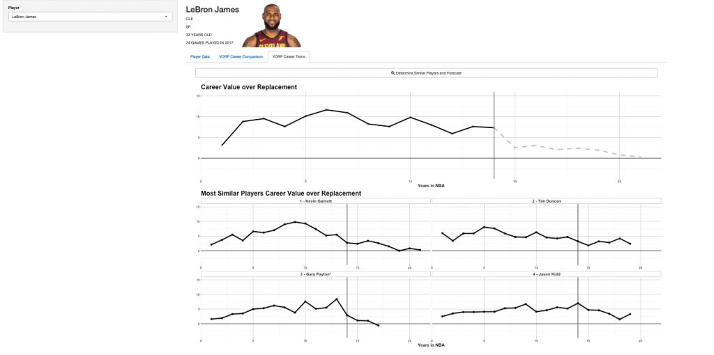
In installment three of our {shiny} dashboard from scratch series, Ellis Hughes and discuss how to use the K-Nearest Neighbor algorithm to forecast a player’s career projection for the Value Over Replacement Player (VORP) metric.
We then take this analysis and build upon our {shiny} app from the previous two weeks by walking through how to add statistical analysis to the server. This will allow you to add your analytics models to your {shiny} app so that the model runs under the hood while the user sees the output. We also go over reactivity and add an action button to give the user more control of the output they see.
The finished result is a {shiny} app with three tabs:
- Tab 1 shows the player stats over the past 3 years and where they rank compared to other players.
- Tab 2 allows the user to compare players in VORP by selecting the players they are interested in.
- Tab 3 uses K-Nearest Neighbor to forecast the rest of the player’s career by identifying the players that are most similar to in regards to how they have performed over time.
To watch the screen cast, CLICK HERE.
To access our code, CLICK HERE.
To see the previous parts of our {shiny} app development series:

