Anyone who reads this blog or watches our Tidy Explained Screen Cast knows that I am a massive R user and R fan. I can work fast in it and I find it to be one of the best tools for building statistical models. That said, there are times when python comes in handy and there are a number of software and web applications that interact and play nicer with python compared to R. For example, R can be run within AWS Sagemaker, but python seems to be more efficient. I’ve recently been doing a few projects in Databricks as well and, while I can use R within their system, I’ve been trying to code the projects using python.
For those of us trying to learn a bit of python to be somewhat useful in that language (or for pythonistas who may need to learn a little bit of R) I’ve put together the following tutorial that shows how to do some of the common stuff you’d use R’s tidyverse for, in python.
The codes for both the RMarkdown file and the Jupyter Notebook are available on my GITHUB page. The codes has many more examples than I will go over here (for space reasons), so be sure to check it out!
Load Libraries and Data
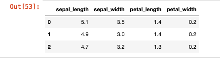
We will be using the famous Palmer Penguins data. Here is a side-by-side look at how we load the libraries and data set in tidyverse and what those same steps look like in Python.
Exploratory Data Analysis
One of the most popular features of the suite of tidyverse libraries is the ability to nicely summarize and plot data.
I won’t go through every possible EDA example contained in the notebooks but here are a few side-by-side.
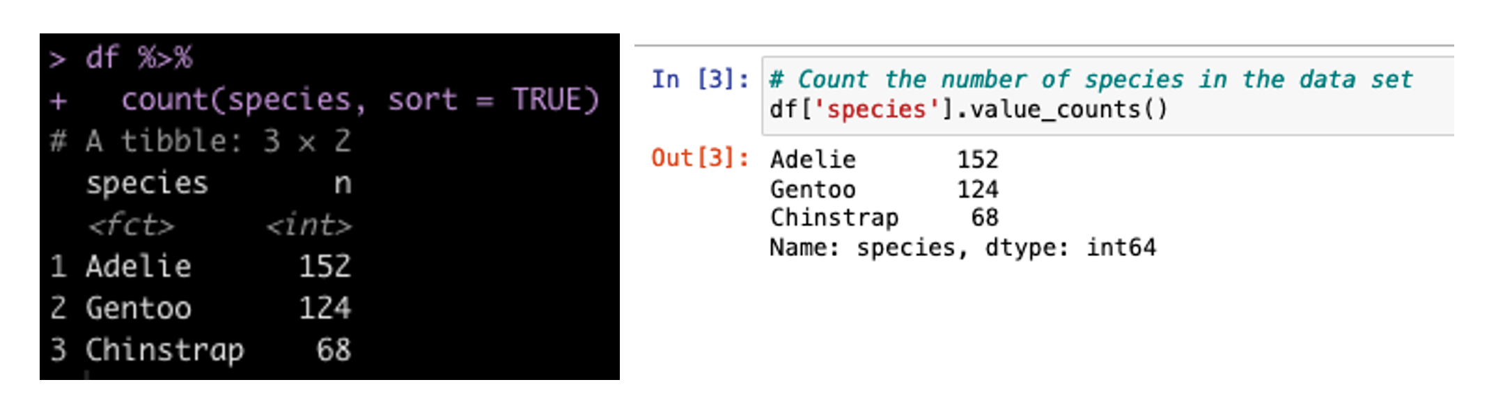
Create a Count of the Number of Samplers for Each Species
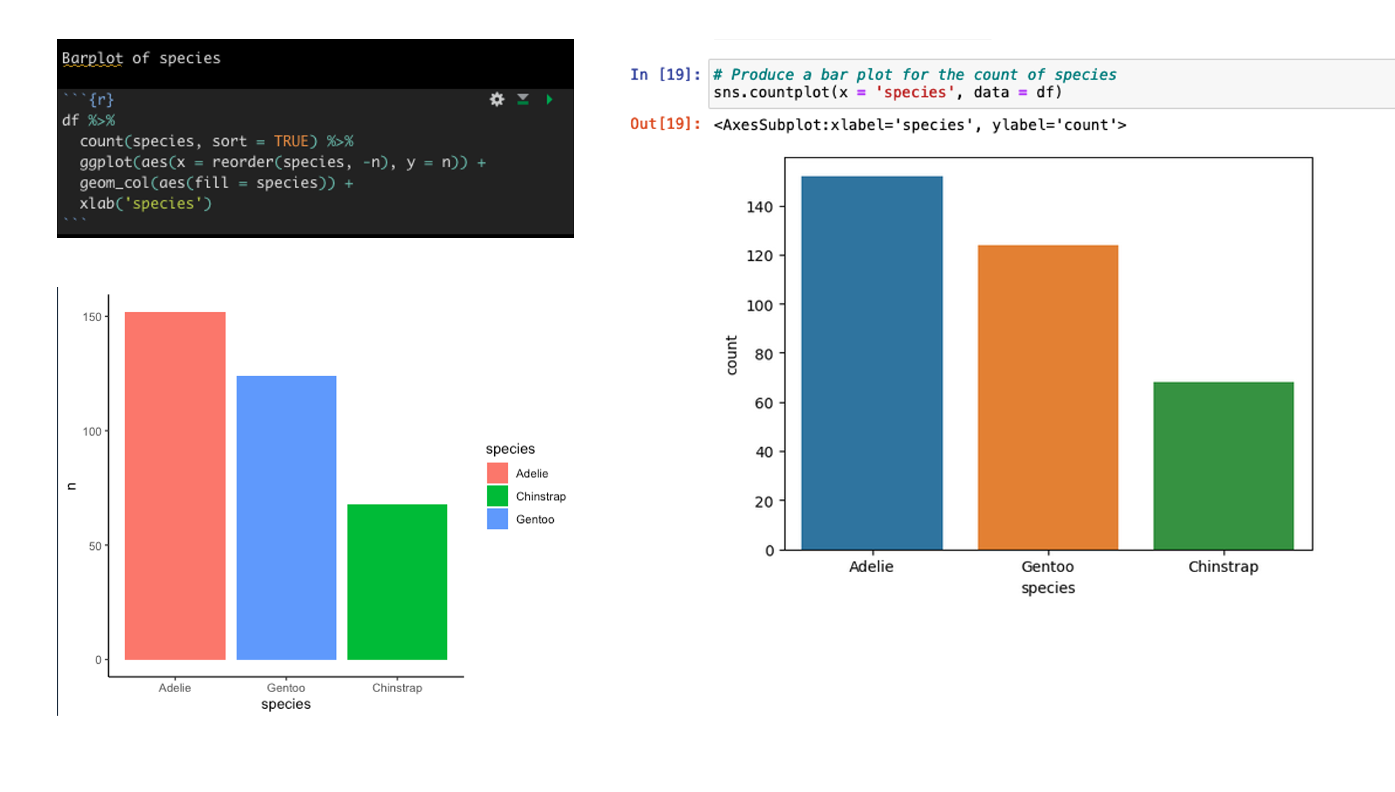
Create a barplot of the count of Species types
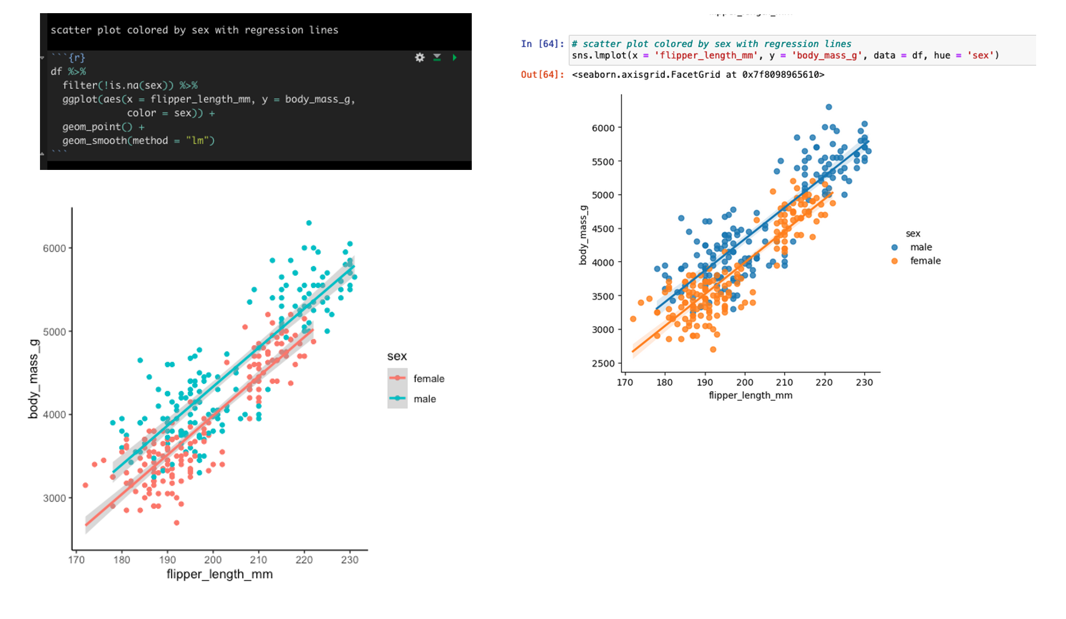
Scatter plot of flipper length and body mass colored by sex with linear regression lines
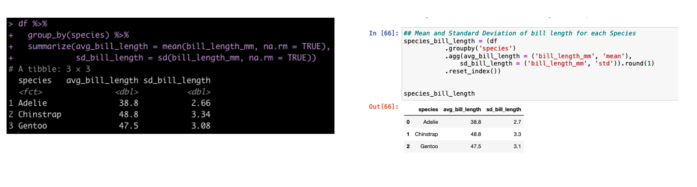
Group By Summarize
In tidyverse we often will group our data by a specific condition and then summarize data points relative to that condition. In tidyverse we use pipes, %>%, to connect together lines of code. In the pandas library (the common python library for working with data frames) we use dots to connect these lines of code.
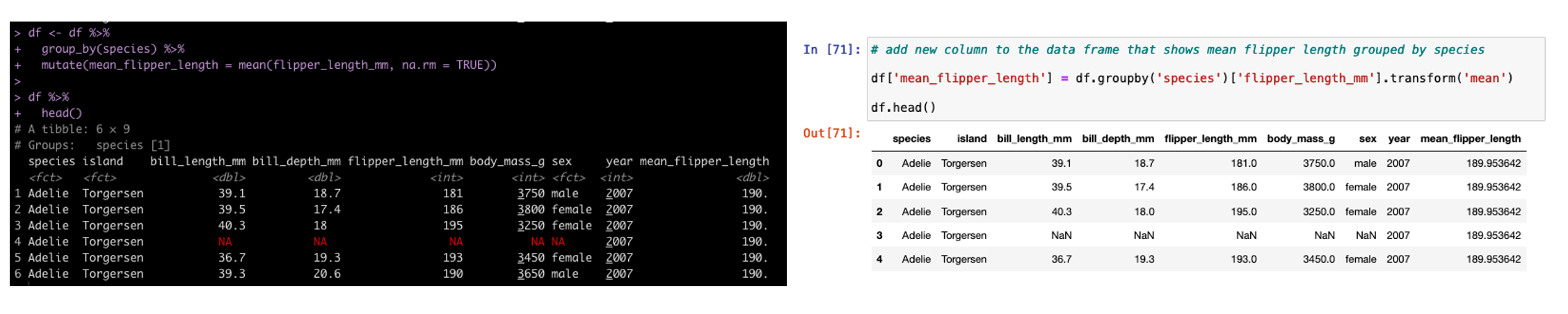
Group By Mutate
In addition to summarizing by group, sometimes we need to add additional columns to the existing data set but those columns need to have the new data conditional on a specific grouping variable. In tidyverse we use mutate and in pandas we use transform.
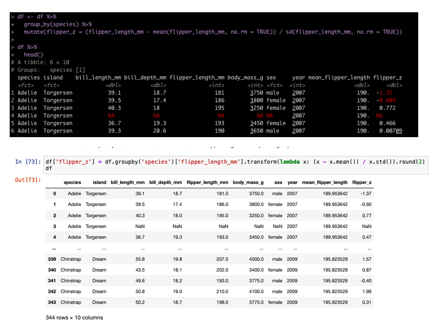
We can also build columns using grouping and custom functions. In tidyverse we do this inside of the mutate but in pandas we need to set up a lambda function. For example, we can build the z-score of each sample grouped by Species (meaning the observation is divided by the mean and standard deviation for that Species population).
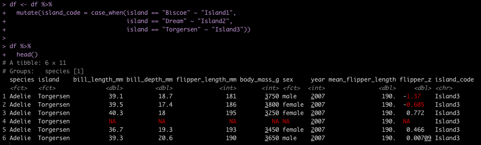
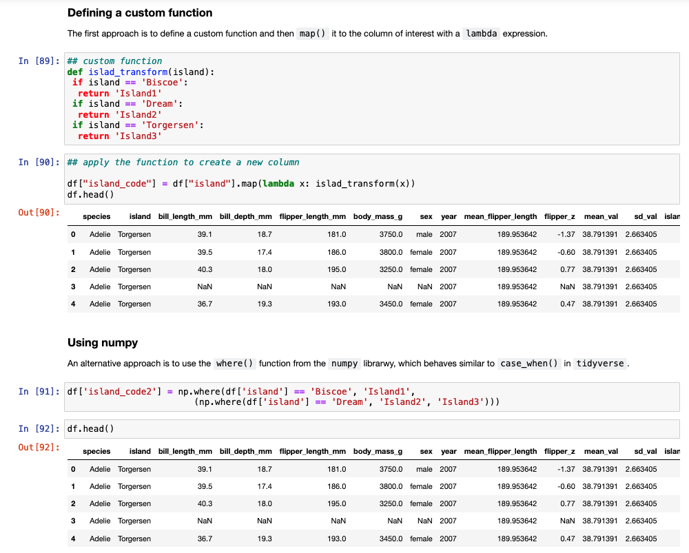
ifelse / case_when
Another task commonly performed in data cleaning is to assign values to specific cases. For example, we have three Islands in the data set and we want to assign them Island1, Island2, and Island3. In tidyverse we could use either ifelse or case_when() to solve this task. In pandas we need to either set up a custom function and then map that function to the data set or we can use the numpy library, which has a function called where(), which behaves like case_when() in tidyverse.
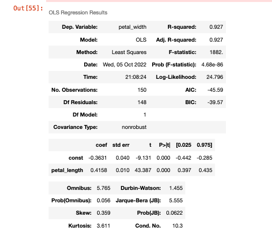
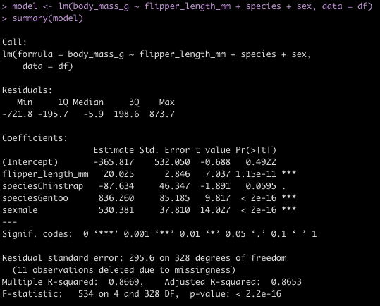
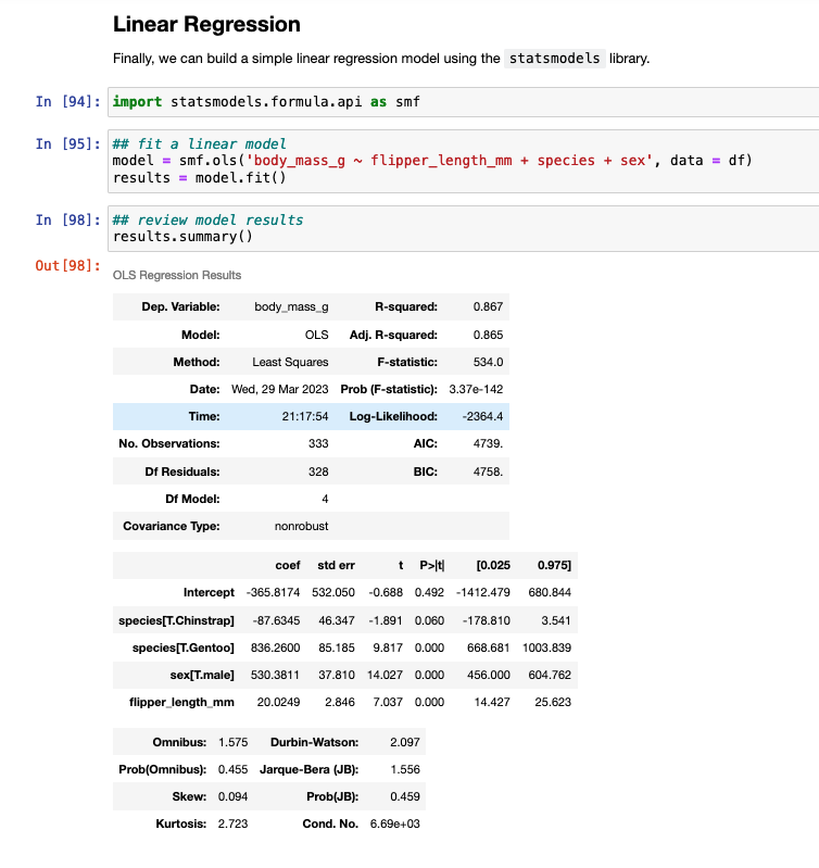
Linear Regression Model
To finish, I’ll provide some code to write a linear model in both languages.
Wrapping Up
Hopefully the tutorial will help with folks going from R to Python or vice versa. Generally, I suggest picking one or the other and trying to really dig into being good at it. But, there are times where you might need to delve into another language and produce some code. This tutorial provides a mirror image of code between R and Python.
As stated earlier, there are a number of extra code examples in the RMarkdown and Jupyter Notebook files available on my GITHUB page.