One of the ways I try and learn things is to code them from first principles. It helps me see what is going on under the hood and also allows me wrap my head around how things work. Building regression models in R is incredibly easy using the lm() function and Bayesian regression models can be conveniently built with the same syntax in packages like {rstanarm} and {brms}. However, today I’m going to do everything by hand to get a grasp of how the Bayesian regression model works, at a very basic level. I put together the code using the mathematical presentation of these concepts from William Bolstad’s book, Introduction to Bayesian Statistics.
The entire script is available on my GITHUB page.
Loading Packages & Getting Data
I’m going to use the data from the {palmerpenguins} package and concentrate on a simple linear regression which will estimate flipper length from bill length.
### packages ------------------------------------------------------
library(tidyverse)
library(palmerpenguins)
library(patchwork)

theme_set(theme_classic())

### data ----------------------------------------------------------
data("penguins")
dat <- penguins %>%
  select(bill_length = bill_length_mm, flipper_length = flipper_length_mm) %>%
  na.omit()

head(dat)

EDA
These two variables share a relatively large correlation with each other.


Ordinary Least Squares Regression
First, I’ll start by building a regression model under the Frequentist paradigm, specifying no prior values on the parameters (even though in reality the OLS model is using a flat prior, where all values are equally plausible — a discussion for a different time), using the lm() function.
### Ordinary Least Squares Regression ------------------------------
fit_ols <- lm(flipper_length ~ I(bill_length - mean(dat$bill_length)), data = dat)
summary(fit_ols)

Technical Note: Since we don’t observe a bill length of 0 mm in penguins, I chose to transform the bill length data by grand mean centering it — subtracting each bill length from the population mean. This wont change the predictions from the model but does change our interpretation of the coefficients themselves (and the intercept is now directly interpretable, which it wouldn’t be if we left the bill length data in its untrasnformed state).
OLS Regression by Hand
Okay, that was easy. In a single line we constructed a model and we are up and running. But, let’s calculate this by hand so we can see where the coefficients and their corresponding standard errors came from.
# Calculate the least squares regression line by hand now
dat_stats <- dat %>%
  summarize(x_bar = mean(bill_length),
            x_sd = sd(bill_length),
            y_bar = mean(flipper_length),
            y_sd = sd(flipper_length),
            r = cor(bill_length, flipper_length),
            x2 = x_bar^2,
            y2 = y_bar^2,
            xy_bar = x_bar * y_bar,
            .groups = "drop")

dat_stats
In the above code, I’m calculating summary statistics (mean and SD) for both the independent and dependent variables, extracting their correlation coefficient, and getting their squared means and the product of their squared means to be used in downstream calculations of the regression coefficients. Here is what the output looks like:

The model intercept is simply the mean of our outcome variable (flipper length).
intercept <- dat_stats$y_bar
The coefficient for our independent variable is calculated as the correlation coefficient multiplied by the the SD of the y variable divided by the SD of the x variable.
beta <- with(dat_stats,
             r * (y_sd / x_sd))

beta
Finally, I’ll store the grand mean of bill length so that we can use it when we need to center bill length and make predictions.
x_bar <- dat_stats$x_bar
x_bar
Now that we have the intercept and beta coefficient for bill length calculated by hand we can construct the regression equation:

Notice that these are the exact values we obtained from our model using the lm() function.
We can use the two models to make predictions and show that they are the exact same.
## Make predictions with the two models
dat %>%
  mutate(pred_model = predict(fit_ols),
         pred_hand = intercept + beta * (bill_length - x_bar))

In the model estimated from the lm() function we also get a sigma parameter (residual squared error, RSE), which tells us, on average, how off the model predictions are. We can build this by hand by first calculating the squared error of the observed values and our predictions and then calculating the RSE as the square root of the sum of squared residuals divided by the model degrees of freedom.
# Calculate the estimated variance around the line
N_obs <- nrow(dat) dat %>%
  mutate(pred = intercept + beta * (bill_length - x_bar),
         resid = (flipper_length - pred),
         resid2 = resid^2) %>%
  summarize(n_model_params = 2,
            deg_freedom = N_obs - n_model_params,
            model_var = sum(resid2) / deg_freedom,
            model_sd = sqrt(model_var))
Again, our by hand calculations equal exactly as what we obtained from the lm() function, 10.6.


Bayesian Linear Regression by Hand
Now let’s turn our attention to building a Bayesian regression model.
First we need to calculate the sum of squared error for X, which we do with this equation:
ss_x = N * (mean(mu_x^2) – mu_x^2)
N <- nrow(dat)
mean_x2 <- mean(dat$bill_length^2)
mu_x2 <- mean(dat$bill_length)^2

N
mean_x2
mu_x2

ss_x <- N * (mean_x2 - mu_x2)
ss_x

Next, we need to specify some priors on the model parameters. The priors can come from a number of courses. We could set them subjectively (usually people hate this idea). Or, we could look in the scientific literature and use prior research as a guide for plausible values of the relationship between flipper length and bill length. In this case, I’m just going to specify some priors that are within the range of the data but have enough variance around them to “let the data speak”. (NOTE: you could rerun the entire analysis with different priors and smaller or larger variances to see how the model changes. I hope to do a longer blog post about priors in the future).
- For the slope coefficient we decide to have a normal prior, N(1, 2^2)
- For the intercept coefficient we choose a normal prior, N(180, 10^2)
- We don’t know the true variance so we use the estimated variance from the least squares regression line
prior_model_var <- sigma(fit_ols)^2

prior_slope_mu <- 1
prior_slope_var <- 1^2

prior_intercept_mu <- 180
prior_intercept_var <- 10^2
Next, we calculate the posterior precision (1/variance) for the slope coefficient. We do it with this equation:
1/prior_slope_var + (ss_x / prior_model_var)
And then convert it to a standard deviation (which is more useful to us and easier to interpret than precision, since it is on the scale of the data).
# 1/prior_slope_var + (ss_x / prior_model_var)
posterior_slope_precision <- 1 / prior_slope_var + ss_x / prior_model_var

# Convert to SD
posterior_slope_sd <- posterior_slope_precision^-(1/2)
Once we have the precision for the posterior slope calculated we can calculate the posterior regression coefficient for the slope using this equation:
(1/prior_slope_var) / posterior_slope_var * prior_slope_mu + (ss_x / prior_model_var) / posterior_slope_var * beta
# posterior slope
posterior_slope_mu <- (1/prior_slope_var) / posterior_slope_precision * prior_slope_mu + (ss_x / prior_model_var) / posterior_slope_precision * beta
posterior_slope_mu

We can plot the prior and posterior slope values, by first simulating the posterior slope using its mu and SD values.
## Plot prior and posterior for the slope
set.seed(4)
prior_sim <- rnorm(n = 1e4, mean = prior_slope_mu, sd = sqrt(prior_slope_var))
posterior_sim <- rnorm(n = 1e4, mean = posterior_slope_mu, sd = posterior_slope_sd)

plot(density(posterior_sim),
     col = "blue",
     lwd = 4,
     xlim = c(-2, 3),
     main = "Prior & Posterior\nfor\nBayesian Regression Slope Coefficient")
lines(density(prior_sim),
      col = "red",
      lty = 2,
      lwd = 4)
legend("topleft",
       legend = c("Prior", "Posterior"),
       col = c("red", "blue"),
       lty = c(2, 1),
       lwd = c(2,2))

We notice that the prior for the slope, N(1, 1^2), had a rather broad range of plausible values. However, after observing some data and combining that observed data with our prior, we find the posterior to have settled into a reasonable range given the value, Again, if you had selected other priors or perhaps a prior with a much narrower variance, these results would be different and potentially more influenced by your prior.
Now that we have a slope parameter we need to calculate the intercept. The equations are commented out in the code below.
## Posterior precision for the intercept
# 1/prior_intercept_var + N/prior_model_var

posterior_intercept_precision <- 1/prior_intercept_var + N/prior_model_var
posterior_intercept_precision

# Convert to SD
posterior_intercept_sd <- posterior_intercept_precision^-(1/2)
posterior_intercept_sd

## Posterior intercept mean
# (1/prior_intercept_var) / posterior_intercept_precision * prior_intercept_mu + (N/prior_model_var) / posterior_intercept_precision * intercept
posterior_intercept_mu <- (1/prior_intercept_var) / posterior_intercept_precision * prior_intercept_mu + (N/prior_model_var) / posterior_intercept_precision * intercept
posterior_intercept_mu

Comparing our Bayesian regression coefficients and standard errors to the ones we obtained from the lm() function, we find that they are nearly identical.

Using the coefficients and their corresponding standard errors we can also compare the 95% Credible Interval from the Bayesian model to the 95% Confidence Interval from the OLS model (again, nearly identical).

And writing out the Bayesian model we see that it is the same as the Frequentist model.

Using the posterior mean and SDs for the slope and intercept we can simulate a distribution and plot and summarize them using quantile intervals and credible intervals, to get a picture of our uncertainty.
## Use simulation for the slope and intercept
set.seed(413)
posterior_intercept_sim <- rnorm(n = 1e4, mean = posterior_intercept_mu, sd = posterior_slope_sd)
posterior_slope_sim <- rnorm(n = 1e4, mean = posterior_slope_mu, sd = posterior_slope_sd)

par(mfrow = c(1, 2))
hist(posterior_intercept_sim)
hist(posterior_slope_sim)


Making Predictions
Now that we have our models specified it’s time to make some predictions!
## Add all predictions to the original data set
dat_final <- dat %>%
  mutate(pred_ols = predict(fit_ols),
         pred_ols_by_hand = intercept + beta * (bill_length - x_bar),
         pred_bayes_by_hand = posterior_intercept_mu + posterior_slope_mu * (bill_length - x_bar))

head(dat_final, 10)

Because the equations were pretty much identical we can see that all three models (OLS with lm(), OLS by hand, and Bayes by hand) produce the same predicted values for flipper length.
We can also visualize these predictions along with the prediction intervals.
## Predictions with uncertainty from the OLS model
ols_preds <- dat_final %>%
  bind_cols(predict(fit_ols, newdata = ., interval = "prediction")) %>%
  ggplot(aes(x = fit, y = flipper_length)) +
  geom_point(size = 2) +
  geom_ribbon(aes(ymin = lwr, ymax = upr),
              alpha = 0.4) +
  geom_smooth(method = "lm",
              se = FALSE) +
  ggtitle("OLS Predictions with 95% Prediction Intervals")

## Now predict with the Bayesian Model
# The error is calculated as:
# residual_variance = prior_model_var +  posterior_intercept_sd^2 + posterior_slope^2*(x - x_bar)
bayes_preds <- dat %>%
  mutate(fit = posterior_intercept_mu + posterior_slope_mu * (bill_length-x_bar),
         error_var = prior_model_var + posterior_intercept_sd^2 + posterior_slope_sd^2 * (bill_length - x_bar),
         rse = sqrt(error_var),
         lwr = fit - qt(p = 0.975, df = N - 2) * rse,
         upr = fit + qt(p = 0.975, df = N - 2) * rse) %>%
  ggplot(aes(x = fit, y = flipper_length)) +
  geom_point(size = 2) +
  geom_ribbon(aes(ymin = lwr, ymax = upr),
              alpha = 0.4) +
  geom_smooth(method = "lm",
              se = FALSE) +
  ggtitle("Bayesian Predictions with 95% Prediction Intervals")


ols_preds | bayes_preds

Okay, I know what you are thinking. The equations were the same, the predictions are the same, and the prediction intervals are the same….What’s the big deal?!
The big deal is that the Bayesian model gives us more flexibility. Not only can we specify priors, allowing us to have a higher weighting on more plausible values (based on prior data, prior research, domain expertise, etc.); but, we can also produce an entire posterior distribution for the predictions.
Let’s take a single row of observation from the data and make a prediction on it, complete with 95% credible intervals, using our Bayesian model.
single_obs <- dat %>% slice(36)
single_obs

pred_bayes <- single_obs %>%
  mutate(fit = posterior_intercept_mu + posterior_slope_mu * (bill_length-x_bar),
         error_var = prior_model_var + posterior_intercept_sd^2 + posterior_slope_sd^2 * (bill_length - x_bar),
         rse = sqrt(error_var),
         lwr = fit - qt(p = 0.975, df = N - 2) * rse,
         upr = fit + qt(p = 0.975, df = N - 2) * rse)

Next, we simulate 10,000 observations using the mean prediction (fit) and the rse from the table above and summarize the results
set.seed(582)
pred_bayes_sim <- rnorm(n = 1e4, mean = pred_bayes$fit, sd = pred_bayes$rse)

mean(pred_bayes_sim)
quantile(pred_bayes_sim, probs = c(0.5, 0.025, 0.975))
mean(pred_bayes_sim) + qt(p = c(0.025, 0.975), df = N - 2) * sd(pred_bayes_sim)

Our mean value, the 95% quantile intervals, and then 95% credible intervals are the similar to the table above (they should be since we simulated with those parameters). We will also get similar values if we use our OLS model and make a prediction on this observation with prediction intervals.

But, because we simulated a full distribution, from the Bayesian prediction we also get 10,000 plausible values for the estimate of flipper length based on the observed bill length.

This offers us flexibility to make more direct statements about the predictive distribution. For example, we might ask, “What is the probability that the predicted flipper length is greater than 210 mm?” and we could directly compute this from the simulated data! This provides us with a number of options if we were using this model to make decisions on and perhaps have threshold values or ranges of critical importance where we need to know how much of the density of our predicted distribution is below or above the threshold or falls outside of the region of importance.
Wrapping Up
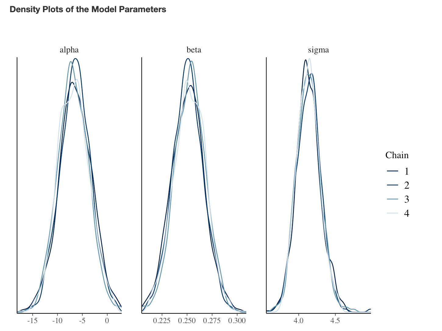
That’s a little bit on working with regression models by hand, from first principles. The Bayesian approach affords us a lot of control and flexibility over the model, via priors (more on that in a future blog post) and the predictions (via simulation). The Bayesian regression model calculated here was a simple approach and did not require Markov Chain Monte Carlo (MCMC), which would be run when using {rstanarm} and {brms}. If you are curious how this works, I wrote a previous blog on using a GIBBS Sampler to estimate the posterior distributions for a regression model, CLICK HERE. But, even with this simple approach we are afforded the ability to specify priors on the model parameters of the deterministic/fixed component of the model. We did not specify a prior on the stochastic/error part of the model (we used the sigma value calculated from the OLS model — which we also calculated by hand). This was necessary in this simple conjugate approach because the normal distribution is a two parameter distribution so we needed to treat one of the parameters as fixed (in this case the SD). Had we used an MCMC approach, we could have further specified a prior distribution on the model error.
If you notice any errors, feel free to drop me an email.
The code is available on my GITHUB page.