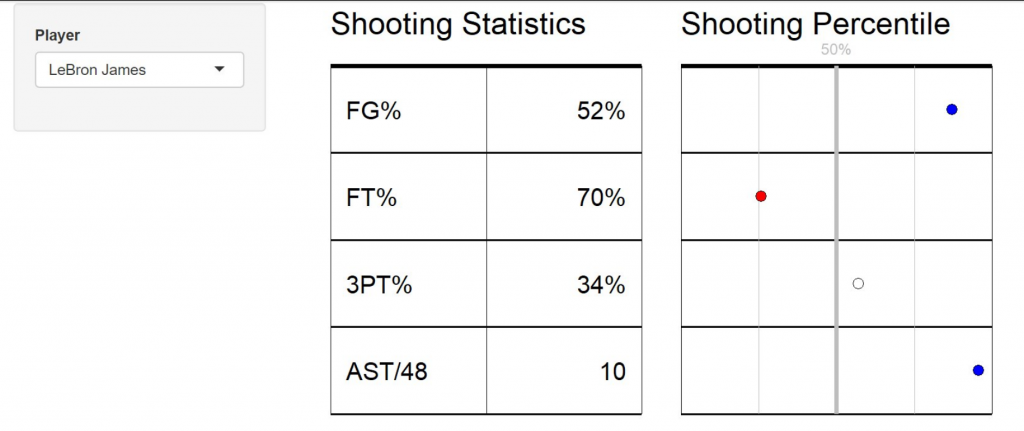
Building off our screen cast from last week, where we discussed the basics of reactivity in a {shiny} app, Ellis Hughes and I expand on the concept and begin constructing the pieces of our NBA dashboard. For inspiration purposes, we are building elements similar to Five Thirty Eight’s CARMELO NBA Player Projection webpage.
We start by creating the table and percentile charts in an interactive web app:
But before we get into that, we break down the code of @MrOchiwar, who made some really nice line plots of Nigerian crop yields over time, using data provided by the TidyTuesday project.
To watch the screen cast, CLICK HERE.
To access our code, CLICK HERE.

