This weekend I posted two new blog articles about building reports that contained both data tables and plots on the same canvas (see HERE and HERE). As a follow up, James Baker asked if I could do some plotting of mixed model outputs. That got me thinking, I’ve done a few blog tutorials on mixed models (see HERE and HERE) and this got me thinking. Because he left it pretty wide open (“Do you have any guides on visualizing mixed models?”) I was trying to think about what aspects of the mixed models he’d like to visualize. R makes it relatively easy to plot random effects using the {lattice} package, but I figured we could go a little deeper and customize some of our own plots of the random effects as well as show how we might plot future predictions from a mixed model.
All of the code for this article is available on my GITHUB page.
Loading Packages & Data
As always we begin by loading some of the packages we require and the data. In this case, we will use the sleepstudy dataset, which is freely available from the {lme4} package.
## Load packages
library(tidyverse)
library(lme4)
library(lattice)
library(patchwork)

theme_set(theme_bw())

## load data
dat <- sleepstudy dat %>%
  head()
Fit a mixed model
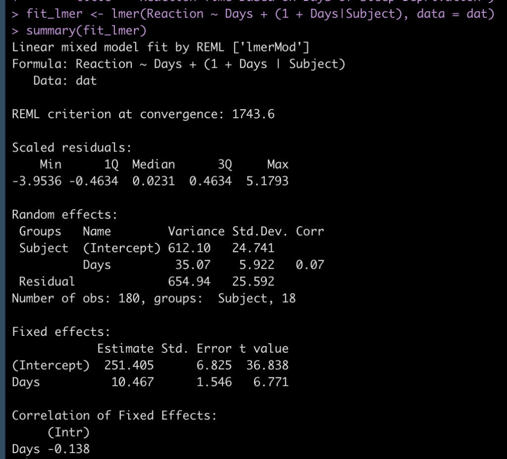
We will fit a mixed model that sets the dependent variable as Reaction time and the fixed effect as days of sleep deprivation. We will also allow both the intercept and slope to vary randomly by nesting the individual SubjectID within each Day of sleep deprivation.
## Fit mixed model
fit_lmer <- lmer(Reaction ~ Days + (1 + Days|Subject), data = dat)
summary(fit_lmer)
Inspect the random effects
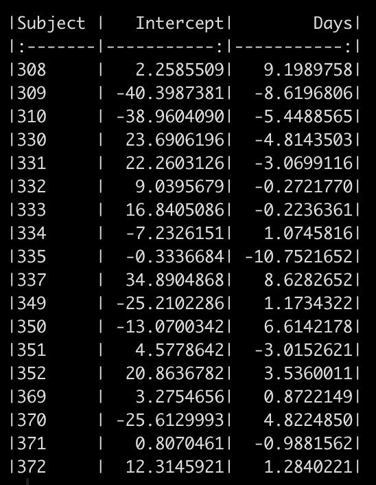
We can see in the model output above that we have a random effect standard deviation for the Intercept (24.84) and for the slope, Days (5.92). We can extract out the random effect intercept and slope for each subject with the code below. This tells us how much each subject’s slope and intercept vary from the population fixed effects (251.4 and 10.5 for the intercept and slope, respectively).
# look at the random effects
random_effects <- ranef(fit_lmer) %>%
  pluck(1) %>%
  rownames_to_column() %>%
  rename(Subject = rowname, Intercept = "(Intercept)")

random_effects %>%
  knitr::kable()
Plotting the random effects
Aside from looking at a table of numbers, which can sometimes be difficult to draw conclusions from (especially if there are a large number of subjects) we can plot the data and make some observational inference.
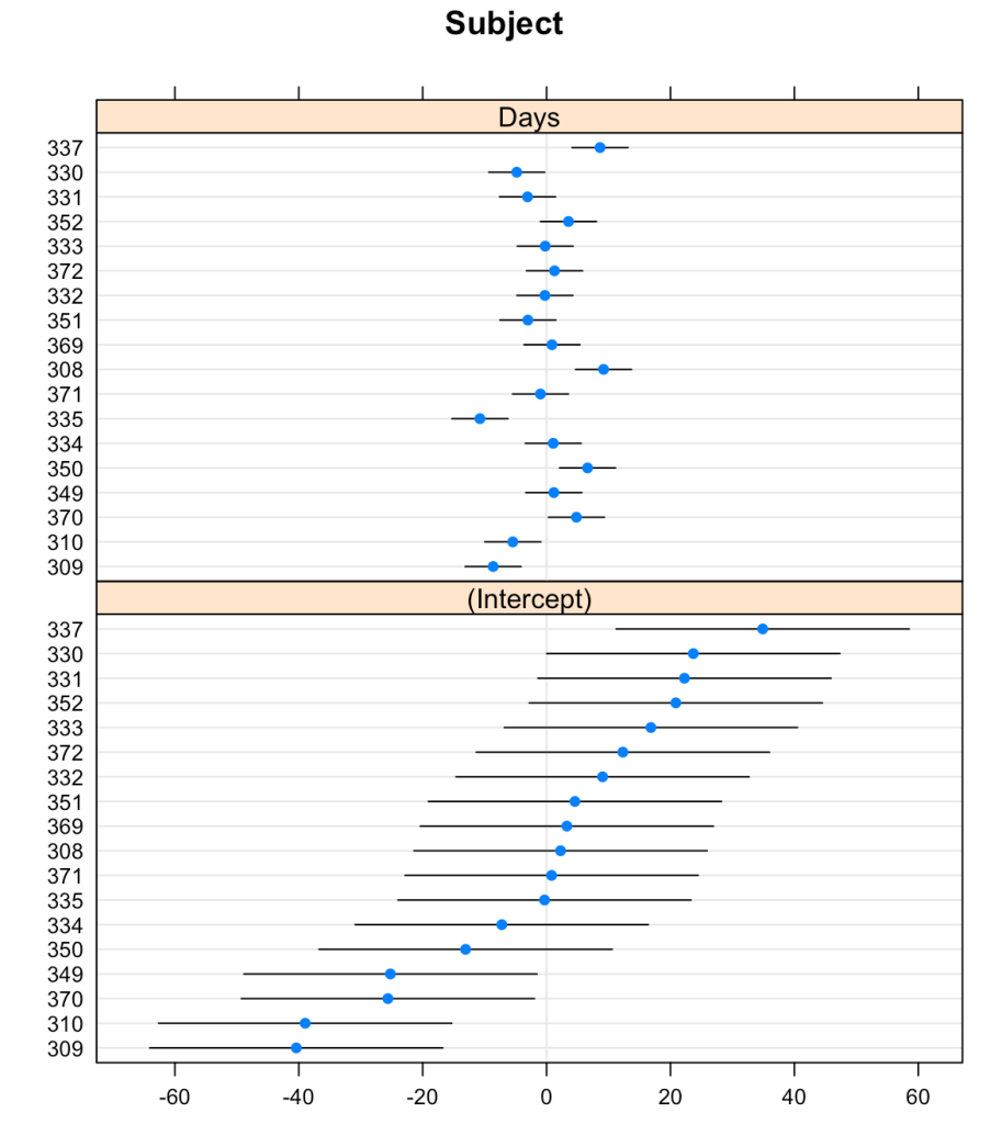
The {lattice} package allows us to create waterfall plots of the random effects for each subject with the dotplot() function.
## plot random effects
dotplot(ranef(fit_lmer))
That’s a pretty nice plot and easy to obtain with just a single line of code. But, we might want to create our own plot using {ggplot2} so that we have more control over the styling.
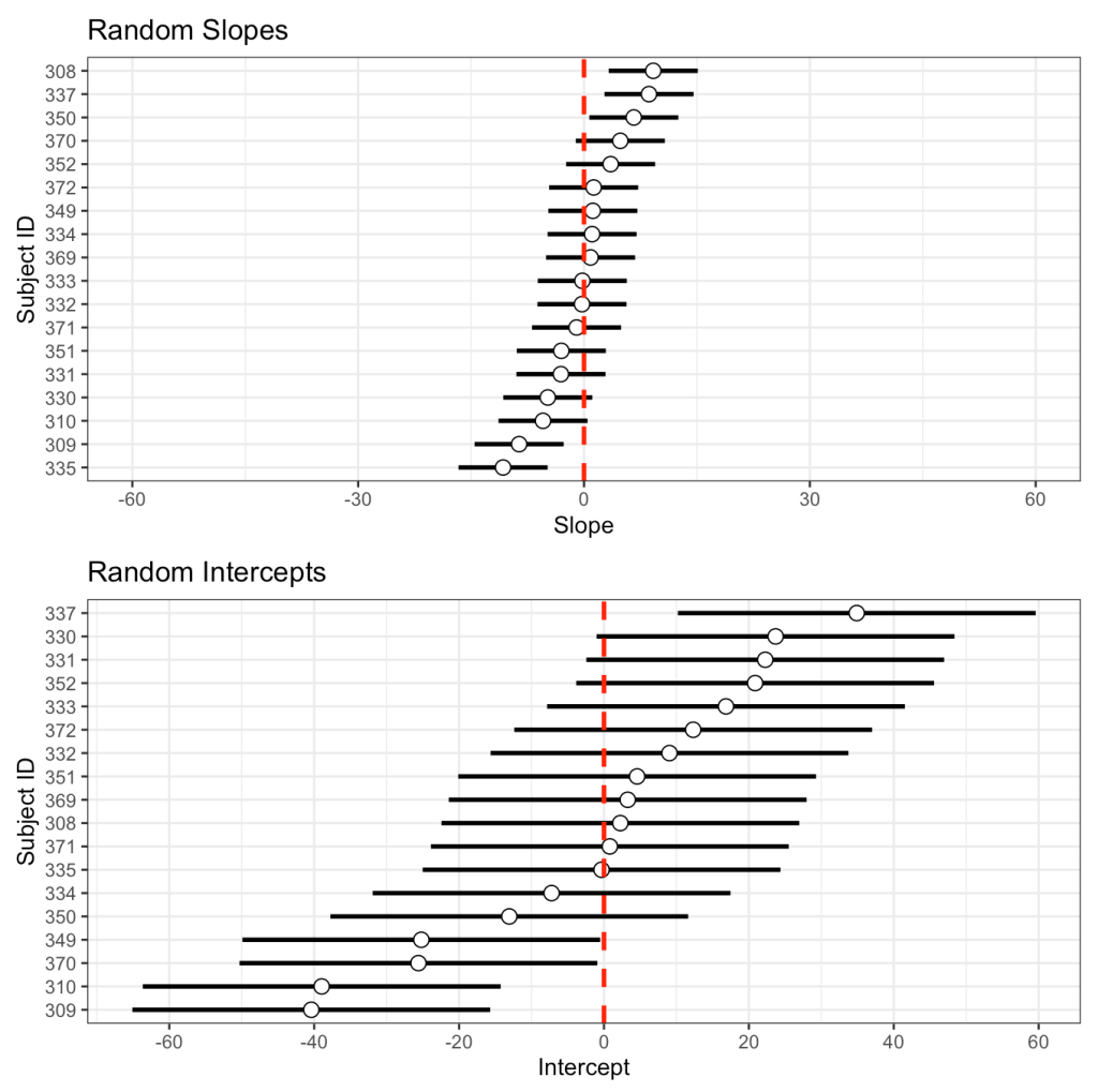
I’ll store the standard deviation of the random slope and intercept, from the model read out above, in their own element. Then, I’ll use the random effects table we made above, which contains the intercept and slope of each subject, to plot them and add the standard deviation to them as error bars.
## Make one in ggplot2
subject_intercept_sd <- 24.7
subject_days_sd <- 5.92

int_plt <- random_effects %>%
mutate(Subject = as.factor(Subject)) %>%
ggplot(aes(x = Intercept, y = reorder(Subject, Intercept))) +
geom_errorbar(aes(xmin = Intercept - subject_intercept_sd,
xmax = Intercept + subject_intercept_sd),
width = 0,
size = 1) +
geom_point(size = 3,
shape = 21,
color = "black",
fill = "white") +
geom_vline(xintercept = 0,
color = "red",
size = 1,
linetype = "dashed") +
scale_x_continuous(breaks = seq(-60, 60, 20)) +
labs(x = "Intercept",
y = "Subject ID",
title = "Random Intercepts")

slope_plt <- random_effects %>%
mutate(Subject = as.factor(Subject)) %>%
ggplot(aes(x = Days, y = reorder(Subject, Days))) +
geom_errorbar(aes(xmin = Days - subject_days_sd,
xmax = Days + subject_days_sd),
width = 0,
size = 1) +
geom_point(size = 3,
shape = 21,
color = "black",
fill = "white") +
geom_vline(xintercept = 0,
color = "red",
size = 1,
linetype = "dashed") +
xlim(-60, 60) +
labs(x = "Slope",
y = "Subject ID",
title = "Random Slopes")

slope_plt / int_plt
We get the same plot but now we have more control. We can color the dot specific subjects, or only choose to display specific subjects, or flip the x- and y-axes, etc.
Plotting the model residuals
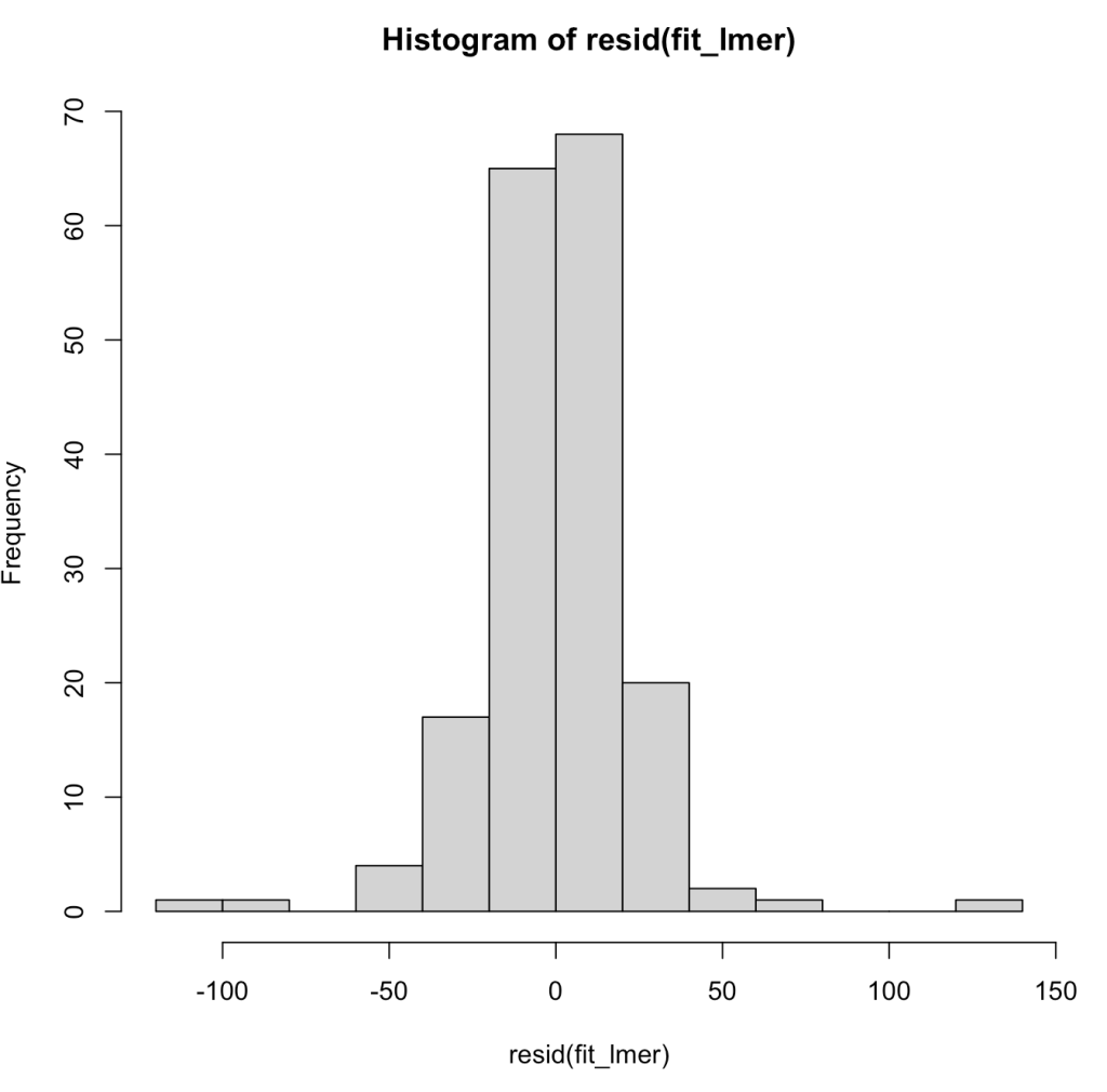
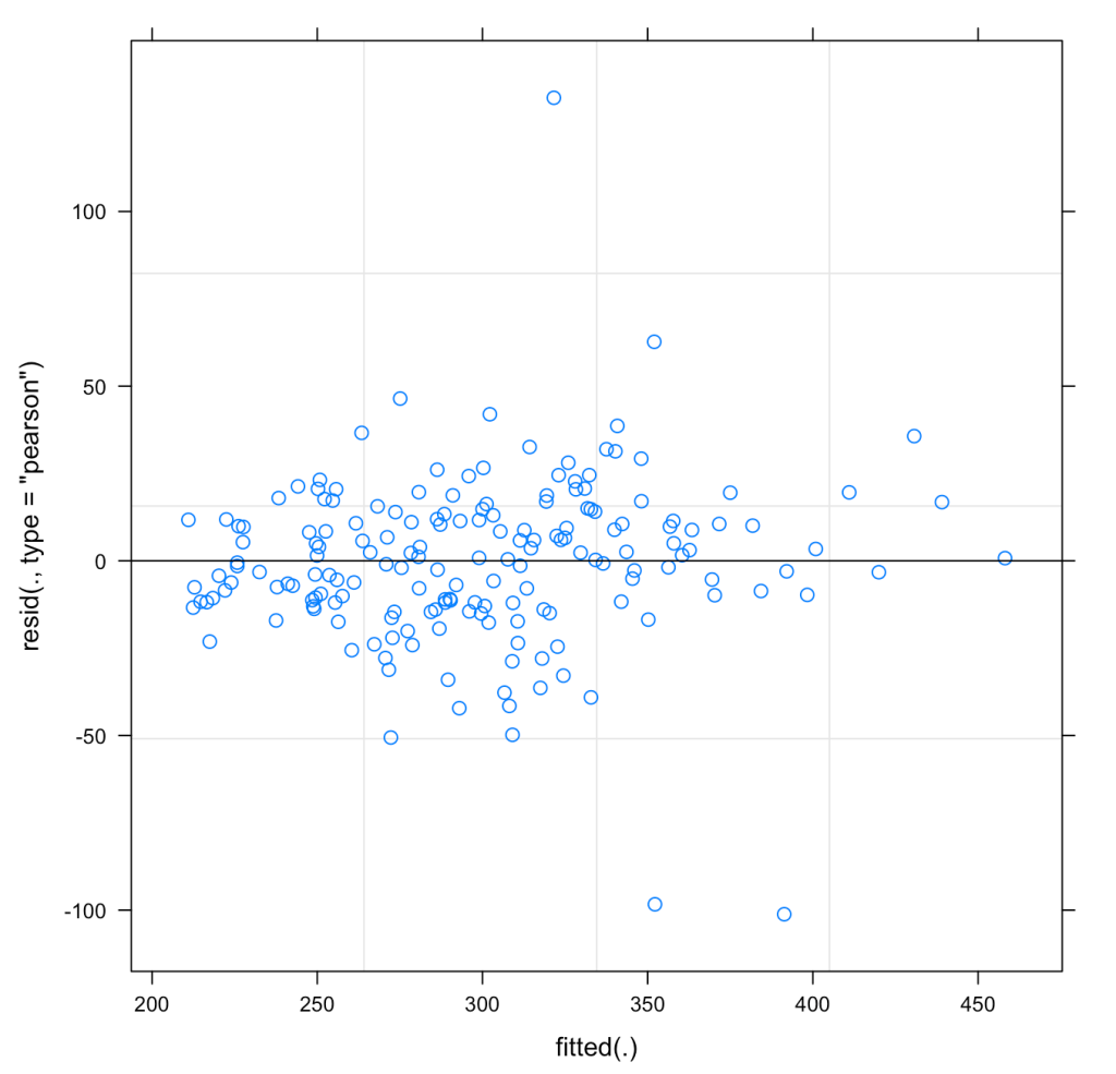
We can also plot the model residuals. Using the residual() function we can get the residuals directly from our mixed model and the plot() function with automatically plot the Residual and Fitted values. These types of plots are useful for exploring assumptions such as normality of the residuals and homoscedasticity.
## Plot Residual
plot(fit_lmer)
hist(resid(fit_lmer))
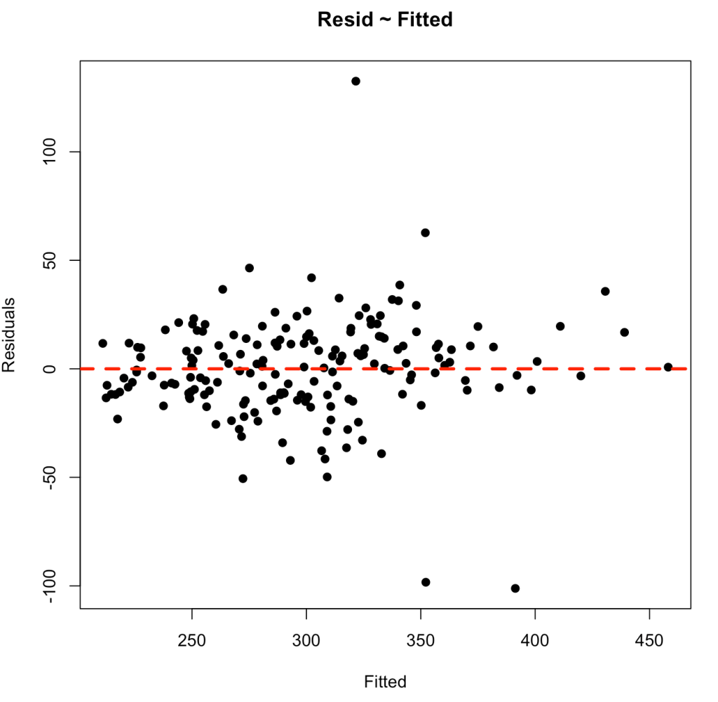
As above, perhaps we want to have more control over the bottom plot, so that we can style it however we’d like. We can extract the fitted values and residuals and build our own plot using base R.
## Plotting our own residual ~ fitted
lmer_fitted <- predict(fit_lmer, newdata = dat, re.form = ~(1 + Days|Subject))
lmer_resid <- dat$Reaction - lmer_fitted

plot(x = lmer_fitted,
     y = lmer_resid,
     pch = 19,
     main = "Resid ~ Fitted",
     xlab = "Fitted",
     ylab = "Residuals")
abline(h = 0,
       col = "red",
       lwd = 3,
       lty = 2)
Plotting Predictions
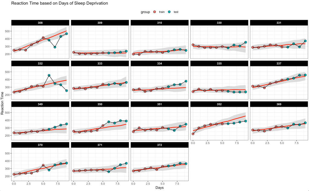
The final plot I’ll build are the predictions of Reaction time as Days of sleep deprivation increase. This is time series data, so I’m going to extract the first 6 days of sleep deprivation for each subject and build the model using that data. Then, make predictions on the next 4 days of sleep deprivation for each subject and get both a predicted point estimate and 90% prediction interval. In this way, we can observe the next 4 days of sleep deprivation for each subject and see how far outside of what we would expect (from our mixed model predictions) those values fall.
### Plotting the time series on new data
# training set
dat_train <- dat %>%
  group_by(Subject) %>%
  slice(head(row_number(), 6)) %>%
  ungroup()

# testing set
dat_test <- dat %>%
  group_by(Subject) %>%
  slice(tail(row_number(), 4)) %>%
  ungroup()

## Fit mixed model
fit_lmer2 <- lmer(Reaction ~ Days + (1 + Days|Subject), data = dat_train)
summary(fit_lmer2)

# Predict on training set
train_preds  <- merTools::predictInterval(fit_lmer2, newdata = dat_train, n.sims = 100, returnSims = TRUE, seed = 657, level = 0.9) %>%
  as.data.frame()

dat_train <- dat_train %>% bind_cols(train_preds)

dat_train$group <- "train"

# Predict on test set with 90% prediction intervals
test_preds  <- merTools::predictInterval(fit_lmer2, newdata = dat_test, n.sims = 100, returnSims = TRUE, seed = 657, level = 0.9) %>%
  as.data.frame()

dat_test <- dat_test %>% bind_cols(test_preds)

dat_test$group <- "test"

## Combine the data together
combined_dat <- bind_rows(dat_train, dat_test) %>%
  arrange(Subject, Days)

## Plot the time series of predictions and observed data
combined_dat %>%
mutate(group = factor(group, levels = c("train", "test"))) %>%
ggplot(aes(x = Days, y = Reaction)) +
  geom_ribbon(aes(ymin = lwr,
                  ymax = upr),
              fill = "light grey",
              alpha = 0.8) +
  geom_line(aes(y = fit),
            col = "red",
            size = 1) +
  geom_point(aes(fill = group),
             size = 3,
             shape = 21) +
  geom_line() +
  facet_wrap(~Subject) +
  theme(strip.background = element_rect(fill = "black"),
        strip.text = element_text(face = "bold", color = "white"),
        legend.position = "top") +
  labs(x = "Days",
       y = "Reaction Time",
       title = "Reaction Time based on Days of Sleep Deprivation")
Wrapping Up
Above are a few different plot options we have with mixed model outputs. I’m not sure what James was after or what he had in mind because he left the question very wide open. Hopefully this article provides some useful ideas for your own mixed model plotting. If there are other things you are hoping to see or have other ideas of things to plot from the mixed model output, feel free to reach out!
The complete code for this article is available on my GITHUB page.

