
Last week, two of the data scientists at Vald Performance, Josh Ruddy and Nick Murray, put out a free online tutorial on how to create a force plate reports using R with data from their Force Decks software.
It was a nice tutorial to give an overview of some of the power behind ggplot2 and the suite of packages that come with tidyverse. Since they made the data available (in the link above), I decided to pull it down and put together a quick shiny app for those that might be interested in extending the report to an interactive web app.
This isn’t the first time I’ve build a shiny app for the blog using force plate data. Interested readers might want to check out my post from a year ago where I built a shiny interactive report for force-velocity profiling.
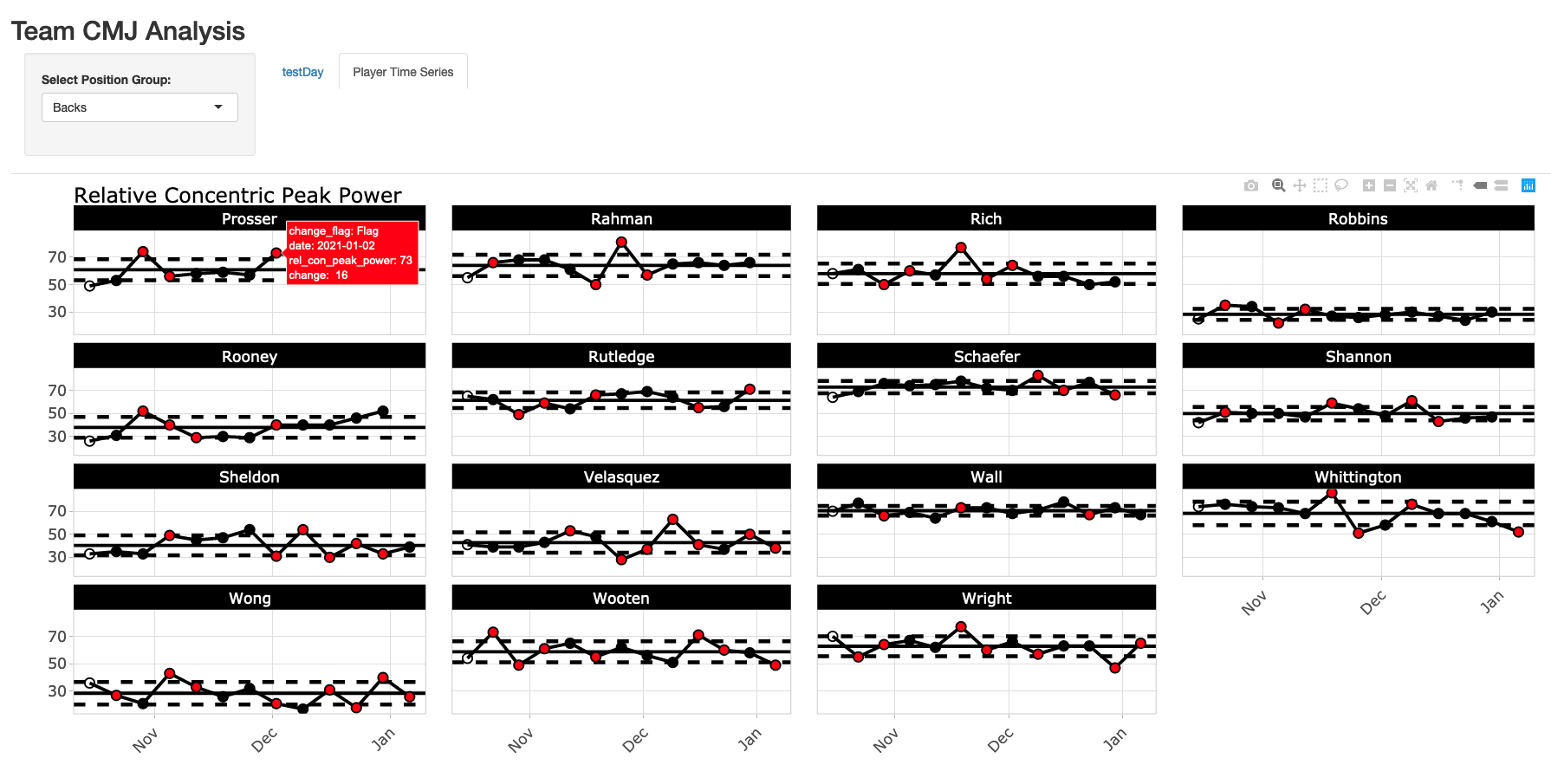
You can watch a short preview of the end product in the below video link and the screen shots below the link show a static view of what the final shiny App will look like.
A few key features:
- App always defaults to the most recent testing day on the testDay tab.
- The user can select the position group at the top and that position group will be maintained across all tabs. For example, if you select Forwards, when you switch between tabs one and two, forwards will always be there.
- The time series plots on the Player Time Series tab are done using plotly, so they are interactive, allowing the user to hover over each test session and see the change from week-to-week in the tool tip. When the change exceeds the meaningful change, the point turns red. Finally, because it is plotly, the user can slice out specific dates that they want to look at (as you can see me do in the video example), which comes in handy when there are a large number of tests over time.
All code and data s accessible through my GitHub page.

Loading and preparing the data
- I load the data in using read.csv() and file.choose(), so navigate to wherever you have the data on your computer and select it.
- There is some light cleaning to change the date in to a date variable. Additionally, there were no player positions in the original data set, so I just made some up and joined those in.
### packages ------------------------------------------------------------------
library(tidyverse)
library(lubridate)
library(psych)
library(shiny)
library(plotly)

theme_set(theme_light())

### load & clean data ---------------------------------------------------------
cmj <- read.csv(file.choose(), header = TRUE) %>%
  janitor::clean_names() %>%
  mutate(date = dmy(date))

player_positions <- data.frame(name = unique(cmj$name),
                               position = c(rep("Forwards", times = 15),
                                            rep("Mids", times = 15),
                                            rep("Backs", times = 15)))

# join position data with jump data
cmj <- cmj %>%
  inner_join(player_positions)
Determining Typical Error and Meaningful Change
- In this example, I’ll just pretend as if the first 2 sessions represented our test-retest data and I’ll work from there.
- Typical Error Measurement (TEM) was calculated as the standard deviation of differences between test 1 and 2 divided by the square root of 2.
- For the meaningful change, instead of using 0.2 (the commonly used smallest worthwhile change multiplier) I decided to use a moderate change (0.6), since 0.2 is such a small fraction of the between subject SD.
- For info on these two values, I covered them in a blog post last week using Python and a paper Anthony Turner and colleagues wrote.
change_standards <- cmj %>%
  group_by(name) %>%
  mutate(test_id = row_number()) %>%
  filter(test_id < 3) %>%
  select(name, test_id, rel_con_peak_power) %>%
  pivot_wider(names_from = test_id,
              names_prefix = "test_",
              values_from = rel_con_peak_power) %>%
  mutate(diff = test_2 - test_1) %>%
  ungroup() %>%
  summarize(TEM = sd(diff) / sqrt(2),
            moderate_change = 0.6 * sd(c(test_1, test_2)))
Building the Shiny App
- In the user interface, I first create my sidebar panel, allowing the user to select the position group of interest. You’ll notice that this sidebar panel is not within the tab panels, which is why it stands alone and allows us to select a position group that will be retained across all tabs.
- Next, I set up 2 tabs. Notice that in the first tab (testDay) I include a select input, to allow the user to select the date of interest. In the selected argument I tell shiny to always select the max(cmj$date) so that the most recent session is always shown to the user.
- The server is pretty straight forward. I commented out where each tab data is built. Basically, it is just taking the user specified information and performing simple data filtering and then ggplot2 charts to provide us with the relevant information.
- On the testDay plot, we use the meaningful change to shade the region around 0 in grey and we use the TEM around the athlete’s observed performance on a given day to specify the amount of error that we might expect for the test.
- One the Player Time Series plot we have the athlete’s average line and ±1 SD lines to accompany their data, with points changing color when the week-to-week change exceeds out meaningful change.
### Shiny App -----------------------------------------------------------------------------

## Set up user interface

ui <- fluidPage(

  ## set title of the app
  titlePanel("Team CMJ Analysis"),

  ## create a selection bar for position group that works across all tabs
  sidebarPanel(
    selectInput(inputId = "position",
                label = "Select Position Group:",
                choices = unique(cmj$position),
                selected = "Backs",
                multiple = FALSE),
    width = 2
  ),

  ## set up 2 tabs: One for team daily analysis and one for player time series
  tabsetPanel(

    tabPanel(title = "testDay",

             selectInput(inputId = "date",
                         label = "Select Date:",
                         choices = unique(cmj$date)[-1],
                         selected = max(cmj$date),
                         multiple = FALSE),

             mainPanel(plotOutput(outputId = "day_plt", width = "100%", height = "650px"),
                       width = 12)),

    tabPanel(title = "Player Time Series",

             mainPanel(plotlyOutput(outputId = "player_plt", width = "100%", height = "700px"),
                       width = 12))
  )

)


server <- function(input, output){

  ##### Day plot tab ####
  ## day plot data
  day_dat <- reactive({

    d <- cmj %>%
      group_by(name) %>%
      mutate(change_power = rel_con_peak_power - lag(rel_con_peak_power)) %>%
      filter(date == input$date,
             position == input$position)

    d

  })

  ## day plot
  output$day_plt <- renderPlot({ day_dat() %>%
      ggplot(aes(x = reorder(name, change_power), y = change_power)) +
      geom_rect(aes(ymin = -change_standards$moderate_change, ymax = change_standards$moderate_change),
                xmin = 0,
                xmax = Inf,
                fill = "light grey",
                alpha = 0.6) +
      geom_hline(yintercept = 0) +
      geom_point(size = 4) +
      geom_errorbar(aes(ymin = change_power - change_standards$TEM, ymax = change_power + change_standards$TEM),
                    width = 0.2,
                    size = 1.2) +
      theme(axis.text.x = element_text(angle = 60, vjust = 1, hjust = 1),
            axis.text = element_text(size = 16, face = "bold"),
            axis.title = element_text(size = 18, face = "bold"),
            plot.title = element_text(size = 22)) +
      labs(x = NULL,
           y = "Weekly Change",
           title = "Week-to-Week Change in Realtive Concentric Peak Power")

  })

  ##### Player plot tab ####
  ## player plot data

  player_dat <- reactive({

    d <- cmj %>%
      group_by(name) %>%
      mutate(avg = mean(rel_con_peak_power),
             sd = sd(rel_con_peak_power),
             change = rel_con_peak_power - lag(rel_con_peak_power),
             change_flag = ifelse(change >= change_standards$moderate_change | change <= -change_standards$moderate_change, "Flag", "No Flag")) %>%
      filter(position == input$position)

    d
  })

  ## player plot
  output$player_plt <- renderPlotly({

    plt <- player_dat() %>%
      ggplot(aes(x = date, y = rel_con_peak_power, label = change)) +
      geom_rect(aes(ymin = avg - sd, ymax = avg + sd),
                xmin = 0,
                xmax = Inf,
                fill = "light grey",
                alpha = 0.6) +
      geom_hline(aes(yintercept = avg - sd),
                 color = "black",
                 linetype = "dashed",
                 size = 1.2) +
      geom_hline(aes(yintercept = avg + sd),
                 color = "black",
                 linetype = "dashed",
                 size = 1.2) +
      geom_hline(aes(yintercept = avg), size = 1) +
      geom_line(size = 1) +
      geom_point(shape = 21,
                 size = 3,
                 aes(fill = change_flag)) +
      facet_wrap(~name) +
      scale_fill_manual(values = c("red", "black", "black")) +
      theme(axis.text = element_text(size = 13, face = "bold"),
            axis.text.x = element_text(angle = 45, vjust = 1, hjust = 1),
            plot.title = element_text(size = 18),
            strip.background = element_rect(fill = "black"),
            strip.text = element_text(size = 13, face = "bold"),
            legend.position = "none") +
      labs(x = NULL,
           y = NULL,
           title = "Relative Concentric Peak Power")

    ggplotly(plt)

  })


}


shinyApp(ui, server)