Category Archives: Strength & Conditioning

R {shiny} app with PDF save report capabilities

Over the previous several articles I’ve shared different approaches to sharing and communicating athlete data. Over this time I got a question about {shiny} apps and if I had a way to easily build in capabilities to save the report as a PDF for those times when you want to save the report as a PDF to email out or print the report and take it to a decision-maker.

Today I’ll go over two of the easiest ways I can think of to add some PDF save functionality to your {shiny} app. Before we jump in, if you are looking to just get started with {shiny} apps, aside from searching my blog for the various apps I’ve built (there are several!), Ellis Hughes and I did a 4 part series on building a {shiny} app from scratch:

Alright, now to jump into building a {shiny} app with the ability to save as PDF. As always, you can access the full code to the article on my GITHUB page.

Loading Packages & Data

As always, we need to load the packages that we need and some data. For this, I’ll keep things simple and just use the mtcars data that is available in base R, since I’m mainly concerned with showing how to build the app, not the actual data analysis.

1
2
3
4
5
6
7
8
9
10
11
12
13
#### packages ----------------------------------------------
library(shiny)
library(shinyscreenshot)
library(DT)
library(gridExtra)
library(ggpubr)
library(tidyverse)
 
## data ----------------------------------------------------
dat <- mtcars %>%
  mutate(cyl = as.factor(cyl),
         car_type = rownames(.)) %>%
  relocate(car_type, .before = mpg)


App 1: Printing the app output as its own report

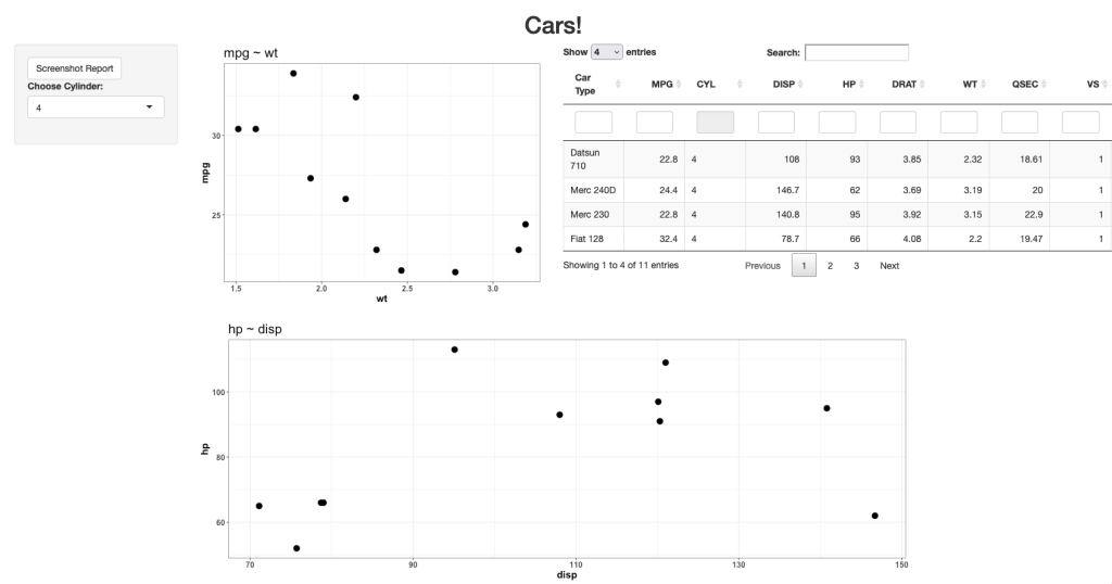
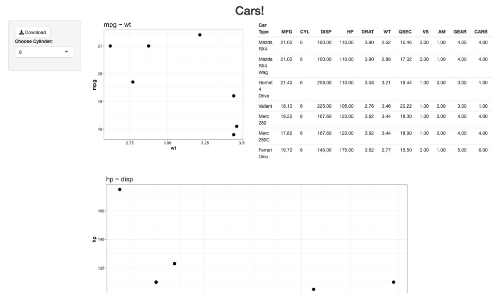
The user interface for this app will allow the user to select a Cylinder (cyl) number and the two plots and table will update with the available info.

The server of this app is where the magic happens. What the user sees on the web app is not exactly what it looks like when saved as a PDF. To make this version work, I need to store my outputs in their own elements and then take those elements and output them as an export. I do this by saving a copy within the render function for each of the outputs. I also create an empty reactive values element within the server, which sets each plot and table to NULL, but serves as a container to store the output each time the user changes the cylinder number.

You’ll notice in the output$tbl section of the server, I produce one table for viewing within the app while the second table is stored for PDF purposes. I do this because I like the ggtextable() table better than the simple base R one, as it has more customizable options. Thus, I use that one for the PDF report. Here is what the server looks like:

1
2
3
4
5
6
7
8
9
10
11
12
13
14
15
16
17
18
19
20
21
22
23
24
25
26
27
28
29
30
31
32
33
34
35
36
37
38
39
40
41
42
43
44
45
46
47
48
49
50
51
52
53
54
55
56
57
58
59
60
61
62
63
64
65
66
67
68
69
70
71
72
73
74
75
76
77
78
79
80
81
82
83
84
85
86
87
88
89
90
91
92
server <- function(input, output){
   
  ## filter cylinder
  cyl_df <- reactive({
     
    req(input$cyl)
     
    d <- dat %>%
      filter(cyl == input$cyl)
    d
     
  })
   
   
  ## output plt1
  output$plt1 <- renderPlot({
     
    vals$plt1 <- cyl_df() %>%
      ggplot(aes(x = wt, y = mpg)) +
      geom_point(size = 4) +
      theme_bw() +
      labs(x = "wt",
           y = "mpg",
           title = "mpg ~ wt") +
    theme(axis.text = element_text(size = 12, face = "bold"),
          axis.title = element_text(size = 15, face = "bold"),
          plot.title = element_text(size = 20))
     
    vals$plt1
     
     
  })
   
  ## output table
  output$tbl <- renderTable({
     
    tbl_df <- cyl_df() %>%
      setNames(c("Car Type", "MPG", "CYL", "DISP", "HP", "DRAT", "WT", "QSEC", "VS", "AM", "GEAR", "CARB"))
     
    # store table for printing
    vals$tbl <- ggtexttable(tbl_df,
                            rows = NULL,
                            cols = c("Car Type", "MPG", "CYL", "DISP", "HP", "DRAT", "WT", "QSEC", "VS", "AM", "GEAR", "CARB"),
                            theme = ttheme('minimal',
                                           base_size = 12))
     
    # return table for viewing
    tbl_df
     
  })
   
   
  ## output plt2
  output$plt2 <- renderPlot({
     
    vals$plt2 <- cyl_df() %>%
      ggplot(aes(x = disp, y = hp)) +
      geom_point(size = 4) +
      theme_bw() +
      labs(x = "disp",
           y = "hp",
           title = "hp ~ disp") +
      theme(axis.text = element_text(size = 12, face = "bold"),
            axis.title = element_text(size = 15, face = "bold"),
            plot.title = element_text(size = 20))
     
    vals$plt2
     
  })
   
   
  ## The element vals will store all plots and tables
  vals <- reactiveValues(plt1=NULL,
                         plt2=NULL,
                         tbl=NULL)
   
   
  ## clicking on the export button will generate a pdf file
  ## containing all stored plots and tables
  output$export = downloadHandler(
    filename = function() {"plots.pdf"},
    content = function(file) {
      pdf(file, onefile = TRUE, width = 15, height = 9)
      grid.arrange(vals$plt1,
                   vals$tbl,
                   vals$plt2,
                   nrow = 2,
                   ncol = 2)
       
      dev.off()
    })
}


Here is what the shiny app will look like when you run it:

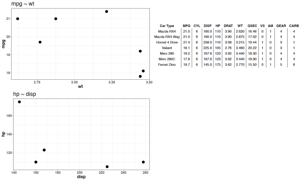
When the user clicks the Download button on the upper left, they can save a PDF, which looks like this:

Notice that we are returned the plots and table from the {shiny} app, however we don’t have the overall title. I’m sure we could remedy this within the server, but what if we want to simply produce a PDF that looks exactly like what we see in the web app?

App 2: Take a screen shot of your shiny app!

If we want to have the downloadable output look exactly like the web app, we can use the package {shinyscreentshot}.

The user interface of the app will remain the same. The server will change as you no longer need to store the plots. You simply need to add an observeEvent() function and tell R that you want to take a screenshot of the page once the button is pressed!

Since we are taking a screen shot I also took the liberty of changing the table of data to a {DT} table. I like {DT} tables better because they are interactive and have more functionality. In the previous {shiny} app it was harder to use that sort of interactive table and store it for PDF printing. Since we are taking a screenshot, it opens up a lot more options for us to customize the output.

Here is what the server looks likes:

1
2
3
4
5
6
7
8
9
10
11
12
13
14
15
16
17
18
19
20
21
22
23
24
25
26
27
28
29
30
31
32
33
34
35
36
37
38
39
40
41
42
43
44
45
46
47
48
49
50
51
52
53
54
55
56
57
server <- function(input, output){
   
  ## filter cylinder
  cyl_df <- reactive({
     
    req(input$cyl)
     
    d <- dat %>%
      filter(cyl == input$cyl)
    d
     
  })
   
   
  ## output plt1
  output$plt1 <- renderPlot({ cyl_df() %>%
      ggplot(aes(x = wt, y = mpg)) +
      geom_point(size = 4) +
      theme_bw() +
      labs(x = "wt",
           y = "mpg",
           title = "mpg ~ wt") +
    theme(axis.text = element_text(size = 12, face = "bold"),
          axis.title = element_text(size = 15, face = "bold"),
          plot.title = element_text(size = 20))
     
  })
   
  ## output table
  output$tbl <- renderDT({ cyl_df() %>%
      datatable(class = 'cell-border stripe',
                rownames = FALSE,
                filter = "top",
                options = list(pageLength = 4),
                colnames = c("Car Type", "MPG", "CYL", "DISP", "HP", "DRAT", "WT", "QSEC", "VS", "AM", "GEAR", "CARB"))
     
  })
   
  ## output plt2
  output$plt2 <- renderPlot({ cyl_df() %>%
      ggplot(aes(x = disp, y = hp)) +
      geom_point(size = 4) +
      theme_bw() +
      labs(x = "disp",
           y = "hp",
           title = "hp ~ disp") +
    theme(axis.text = element_text(size = 12, face = "bold"),
          axis.title = element_text(size = 15, face = "bold"),
          plot.title = element_text(size = 20))
     
     
  })
   
  observeEvent(input$go, {
    screenshot()
  })
}

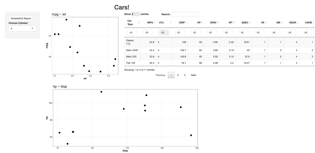
The new web app looks like this:

Looks pretty similar, just with a nicer table. If the user clicks the Screenshot Report at the upper left, R will save a png file of the report, which looks like this:

As you can see, this produces a downloadable report that is exactly like what the user sees on their screen.

Wrapping Up

There are two simple ways to build some save functions directly into your {shiny} apps. Again, if you’d like the full code, you can access it on my GITHUB page.

Collapsible interactive tables with {reactable}

Since I’ve been talking about approaches to sharing and visualizing athlete performance data lately, I decided to put together some quick code for developing collapsible tables with the {reactable} package in R.

I like Reactable tables because they offer a simple framework for quickly building interactive html reports for your end user. You can also embed these into {Rmarkdown} reports or {shiny} apps.

Why do we need collapsible tables?

  1. The collapsible nature educes the amount of real estate they take up in the end user’s report. Instead of a big long table, the user can take the information in chunks without getting distracted.
  2. When embedding a collapsible table into your {Rmarkdown} or {shiny} reports, it makes them look less busy.
  3. In meetings, if you have a large number of athletes to discuss, spread across several positions, a large table allows the meeting attendees to have “busy eyes“, as they scan up and down the table and get ahead of things. With a collapsible table, you are able to direct their attention to the aspects you are discussing.

You can access all of the code on my GITHUB page and use it as a template to construct your own collapsible interactive tables. I tried to add several different styling options to the various columns so that it covers many of the things people attempt to do when building reports (e.g., conditional formatting, conditional formatting using information contained in a secondary column, rounding numbers, converting values to percentages, hiding columns you don’t want in the table, etc.).

To play with the html table yourself, CLICK HERE >> collapsible tables with reactable

Examples of the table

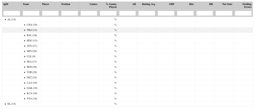
The data came from the {Lahman} baseball data set in R. I build a table that nests the players within their respective teams and the teams nested within their respective league (NL or AL). So, this table has 2 structures of collapsing. The table of the table looks like this:
Notice that all we see are the headers (which I’ve set a filterable function under) and the top level of nesting (league).

If you click one of the league drop downs, you expand out and see the second level of testing (teams):


Finally, you can click down into any team and obtain the list of players and their stat lines:

Within the code, you’ll notice that I created a simple z-score for each of the stats. The shading is relative to the z-scores; however, to de-clutter the table, I’ve hidden those columns but retain their meaning by using the conditional formatting.

If a person is at the highest level of nesting (league) and wants to just search for a player, that is also possible:

As you can see, collapsible interactive tables can be a great way to share data in a clean way and prevents the end user from being overwhelmed by long and extensive amounts of data across many rows and columns.

Highlight & Filter Events Using plotly and crosstalk

In the last three blog articles we’ve been talking about ways of displaying athletes’ test performance from both a numeric and visual stand point. Often, practitioners require these types of analysis to be placed in a report that can be used as a discussion point in meetings.

As much as I love {shiny} some colleagues work in environments where they don’t have the ability to make their web apps accessible to their decision-makers because they don’t have access to server space and don’t want to make their report public, for anyone to see (gotta retain that competitive advantage!). In these situations, I turn to Rmarkdown, plotly, and crosstalk.

Together, these three packages are massively valuable for producing interactive reports that can be saved in html format and emailed out to decision-makers and practitioners without having to worry about the data being hosted on a web application or something that might end up in the public domain. Essentially, we are just creating a report, like any other report we might email, but building it with html widgets that allow the recipients to interact directly with the data (which they often seem to appreciate and have fun with).

For this web report I am going to use data from the {Lahman} baseball database, which is freely accessible in R.

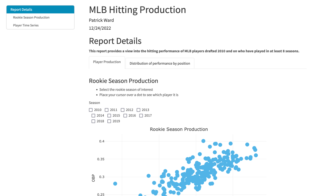
The finished product looks like this:

If you would like to view the finished product in action, CLICK HERE >> mlb_player_report.

To access the html file and play with it yourself, CLICK HERE >> mlb_player_report.

To access all the code to produce this report and build your own, go to my GITHUB page.

Some of the key features:

  • The Report Details note tells the used the type of data being used in the report (All MLB players drafted in 2010 or later who have played at least 8 seasons).
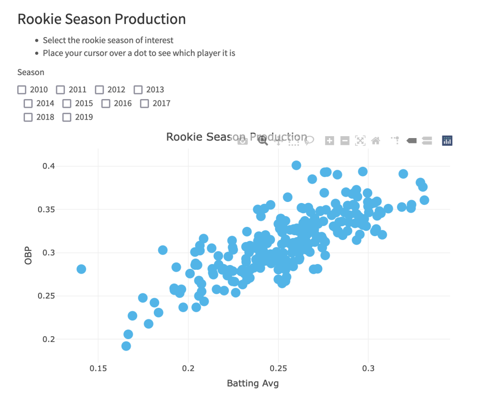
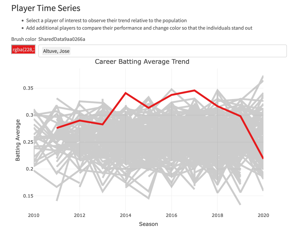
  • Each plot has a larger header section with bulleted notes indicating the ways in which the user can interact with it.
  • Notice that I have a handy table of contents that the user can click on and immediately be brought to the section of the report they are interested in.
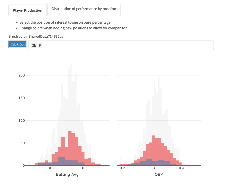
  • There are two tabs. The first tab is dedicated to evaluating players. The second tab is specific to evaluating differences between positional groups.
  • All of the plots have been built with plotly so they are completely interactive.
  • I used crosstalk to create plots that allow the user to select/filter things of interest, such as rookie seasons (plot 1), players (plot 2), or positional groups (plot 3).

Let’s look at some still photos of the plots.

Rookie Season Plot

Player Career Performance Plot

Position Comparison Plot

Displaying Performance Outcomes on a Test

Introduction

I recently had a discussion with some colleagues about displaying performance outcomes on a test for a group of athletes. The discussion was centered around percentile ranking the athletes on a team within a given season. While is one way to display such information we could alternatively display the data as a percentile using a known mean and standard deviation for the population. This latter approach works by standardizing the data (z-score) and using properties of the normal distribution. Similarly, we could take the z-score and convert it to a t-score, on a 1-100 score.

Given these different options, I figured I’d throw together a quick article to show what they look like and how to calculate them in R. The discussion is right in line with the last 2 blog articles about using boxplots and dotplots to visualize athlete testing data (Part 1 and Part 2).

Simulate Data

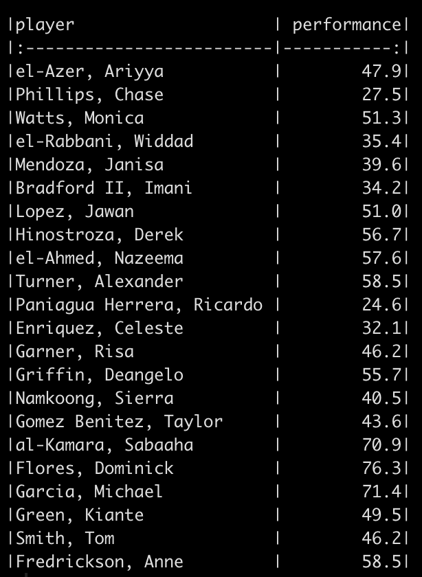
We will simulate performance test results for 22 different athletes. To do this, we take advantage of the rnorm() function in R and draw from 3 different normal distributions to produce 20 tests results. Since I used set.seed() you will be able to reproduce my results exactly. After creating 20 simulations I added 2 additional athletes to the data set and gave them test scores that were exactly the same as two other athletes in the data so that we had some athletes with the same performance outcome.

Percentile Rank

The percentile rank reflects the percentage of observations that are below a certain score. This value is displayed in 100 theoretical divisions of the observed data. Thus, the top score in the data represents 100 and every value falls below that.

To calculate the percentile rank we simply rank the observed performance values and then divide by the number of observations.

Let’s start by sorting the performance scores so that they are in order from lowest to highest.

Next, we rank these values.

Notice that when we sort the data we see that the values 58.5 and 46.2 are repeated twice. Once we rank them we see that the rank values are also correctly repeated. We can get rid of the half points for these repeated observation by using the trunc() function, which will truncate the values.

Finally, to get the percentile rank, we divide by the total number of observations.

Instead of always having to walk through these steps, we can create a function to do the steps for us in one line of code. This will come in handy when we compare all of these methods later on.

1
2
3
4
5
perc.rank <- function(x){
  trunc(rank(x))/length(x)
}
 
perc.rank(sort(df$performance))

Percentiles

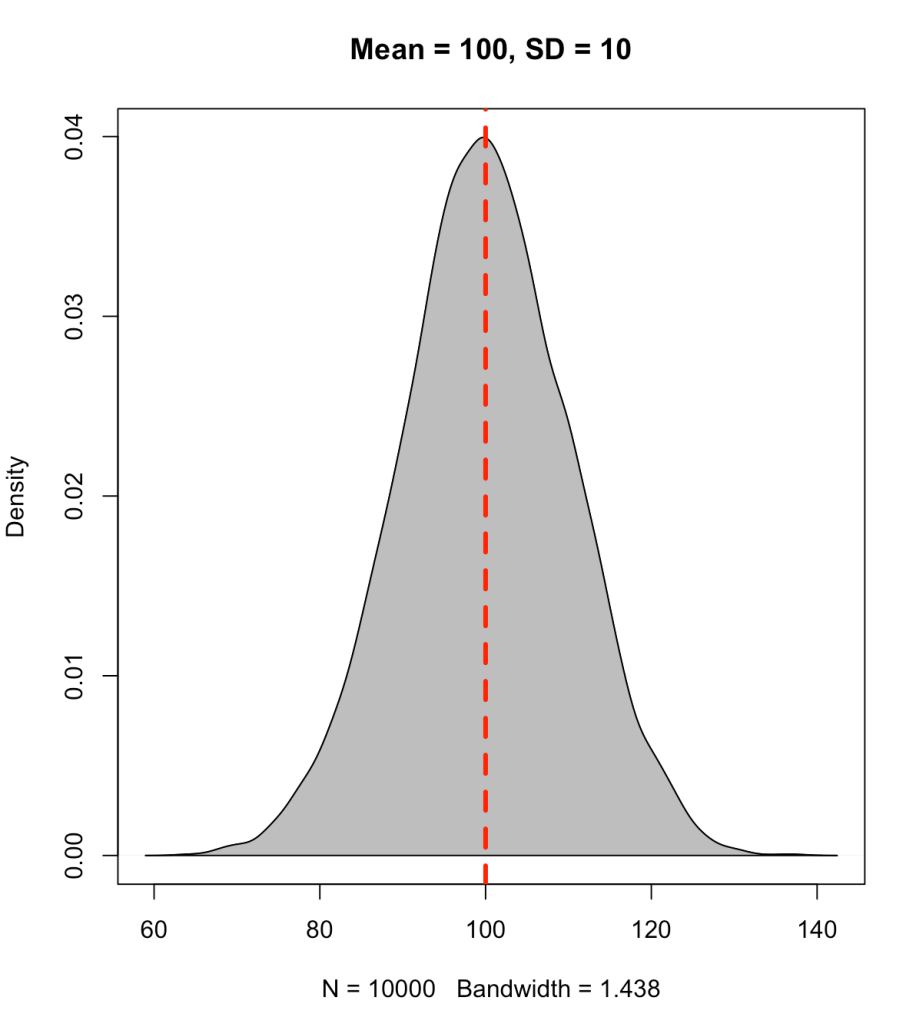
A percentile value is different than a percentile rank in that the percentile value reflects the observed score relative to a population mean and standard deviation. Often, this type of value has been used to represent how well a student has performed on a standardized test (e.g., SAT, ACT, GRE, etc.). The percentile value tells us the density of values below our observation. Thus, the percentile value represents a cumulative distribution under the normal curve, below the point of interest. For example, let’s say we have a bunch of normally distributed data with a mean of 100 and standard deviation of 10. If we plot the distribution of the data and drop a line at 100 (the mean), 50% of the data will fall below and it 50% above it.

1
2
3
4
5
6
7
set.seed(1)
y <- rnorm(n = 10000, mean = 100, sd = 10)
 
plot(density(y), col = 'black',
  main = 'Mean = 100, SD = 10')
polygon(density(y), col = 'grey')
abline(v = 100, col = 'red', lty = 2, lwd = 3)

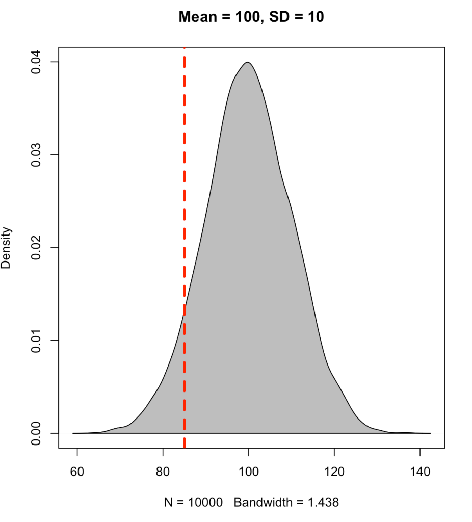
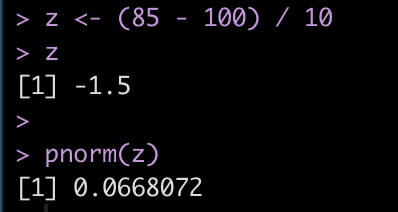
Instead, if we place the line at an observation of 85 we will see that approximately 7% of the data falls below this point (conversely, 93% of the data is above it).

To find the cumulative distribution below a specific observation we can use the pnorm() function and pass it the observation of interest, the population mean, and the standard deviation.

Alternatively, we can obtain the same value by first calculating the z-score of the point of interest and simply passing that into the pnorm() function.

z = (observation – mean) / sd

We find that the z-score for 85 is -1.5 standard deviations below the mean.

We will write a z-score function to use later on.

1
2
3
4
z_score <- function(x, avg, SD){
  z = (x - avg) / SD
  return(z)
}

T-score

As we saw above, the score of 85 led to a z-score of -1.5. Sometimes having the data scaled to a mean of 0 with values above and below it can difficult for decision-makers to interpret. As such, we can take the z-score and turn it into a a t-score, ranging from 0-100, where 50 represents average, 40 and 60 represent ± 1 standard deviation, 30 and 70 represent ± 2 standard deviation, and 20 and 80 represent ± 3 standard deviations from the mean.

t = observation*10 + 50

Therefore, using the z-score value of -1.5 we end up with a t-score of 35.

We will make a t-score function to use on our athlete simulated data.

1
2
3
4
t_score <- function(z){
  t = z * 10 + 50
  return(t)
}

Returning to the athlete simulated data

We now return to our athlete simulated data and apply all of these approaches to the performance data. For the z-score, t-score, and percentile values, I’ll start by using the mean and standard deviation of the observed data we have.

1
2
3
4
5
6
7
8
9
10
11
df_ranks_v1 <- df %>%
  mutate(percentile_rank = perc.rank(performance),
         percentile_value = pnorm(performance, mean = mean(performance), sd = sd(performance)),
         z = z_score(x = performance, avg = mean(performance), SD = sd(performance)),
         t = t_score(z)) %>%
  mutate(across(.cols = percentile_rank:t,
                ~round(.x, 2)))
 
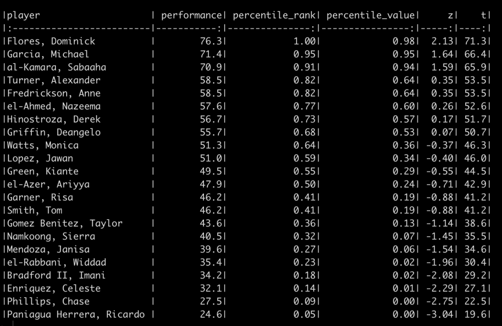
df_ranks_v1 %>%
  arrange(desc(percentile_rank)) %>%
  knitr::kable()

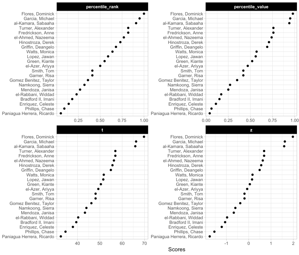
We can also plot these values to provide ourselves a visual to compare them.

We can see that the order of the athletes doesn’t change based on the method. This makes sense given that the best score for this group of athletes is always going to be the best score and the worst will always be the worst. We do see that the percentile rank approach assigns the top performance as 100%; however, the percentile value assigns the top performance a score of 98%. This is because the percent value is based on the parameters of the normal distribution (mean and standard deviation) and doesn’t rank the observations from best to worse as the percentile rank does. Similarly, the other two scores (z-score and t-score) also use the distribution parameters and thus follow the same pattern as the percentile value.

Why does this matter? The original discussion was about athletes within a given season, on one team. If all we care about is the performance of that group of athletes, on that team, in that given season, then maybe it doesn’t matter which approach we use. However, what if we want to compare the group of athletes to previous teams that we’ve had or to a population mean and standard deviation that we’ve obtained from the league (or from scientific literature)? In this instance, the percentile rank value will remain unchanged but it will end up looking different than the other three scores because it doesn’t depend on the mean and standard deviation of the population.

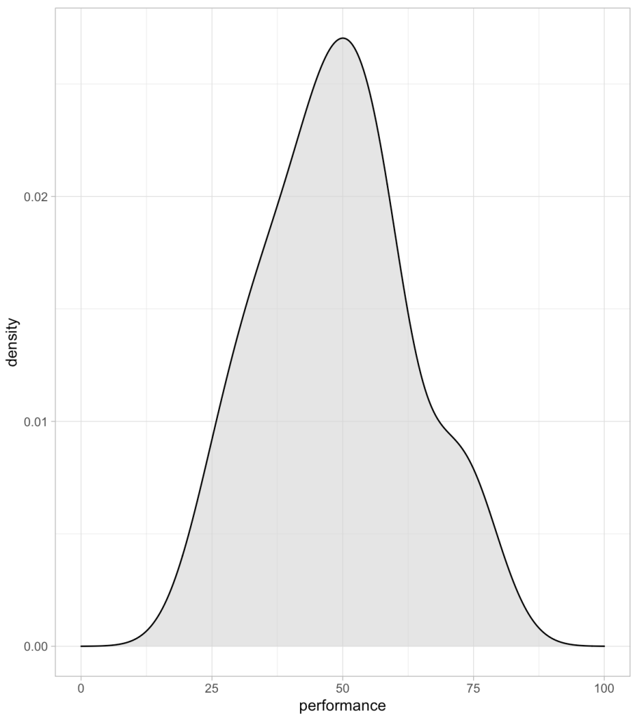
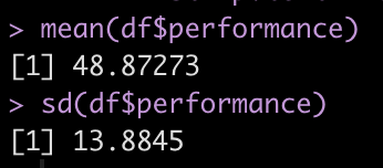
For example, the mean and standard deviation of our current team is 48.9 ± 13.9.

Perhaps our team is currently below average for what we expect from the population. Let’s assume that the population we want to compare our team to has a mean and standard of 55 ± 10.

1
2
3
4
5
6
7
8
9
10
11
df_ranks_v2 <- df %>%
  mutate(percentile_rank = perc.rank(performance),
         percentile_value = pnorm(performance, mean = 55, sd = 10),
         z = z_score(x = performance, avg = 55, SD = 10),
         t = t_score(z)) %>%
  mutate(across(.cols = percentile_rank:t,
                ~round(.x, 2)))
 
df_ranks_v2 %>%
  arrange(desc(percentile_rank)) %>%
  knitr::kable()

Again, the order of the athletes’ performance doesn’t change and thus the percentile rank of the athletes also doesn’t change. However, the percentile values, z-scores, and t-scores now tell a different story. For example, el-Azer, Ariyya scored 47.9 which has a percentile rank of 50% for the observed performance scores of this specific team. However, this value relative to our population of interest produces a z-score of -0.71, a t-score of 42.9, and a percentile value indicating that only 24% of those in the population who are taking this test are below this point. The athlete looks to be average for the team but when compared to the population they look to be below average.

Wrapping Up

There are a number of ways to display the outcomes on a test for athletes. Using percentile rank, we are looking specifically at the observations of the group that took the given test. If we use percentile value, z-scores, and t-scores, we are using properties of the normal distribution and, often comparing the observed performance to some known population norms. There probably isn’t a right or wrong approach here. Rather, it comes down to the type of story you are looking to tell with your data.

The full code for this article is available on my GITHUB page.

Box & Dotplots for Performance Visuals – Creating an Interactive Plot with plotly

Yesterday, I provided some code to make a simple boxplot with doplot in order to visualize an athlete’s performance relative to their peers.

Today, we will try and make this plot interactive. To do so, we will use the {plotly} package and save the plots as html files that can be sent to our coworkers or decision-makers so that they can interact directly with the data.

Data

We will use the same simulated data from yesterday and also load the {plotly} library.

1
2
3
4
5
6
7
8
### Load libraries -----------------------------------------------
library(tidyverse)
library(randomNames)
library(plotly)
 
### Data -------------------------------------------------------
set.seed(2022)
dat <- tibble( participant = randomNames(n = 20), performance = rnorm(n = 20, mean = 100, sd = 10))

Interactive plotly plot

Our first two plots will be the same, one vertical and one horizontal. Plotly is a little different than ggplot2 in syntax.

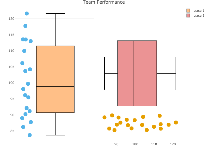
  • I start by creating a base plot, indicating I want the plot to be a boxplot. I also tell plotly that I want to group by participant, so that the dots will show up alongside the boxplot, as they did in yesterday’s visual.
  • Once I’ve specified the base plot, I indicate that I want boxpoints to add the points next to the boxplot and set some colors (again, using a colorblind friendly palette)
  • Finally, I add axis labels and a title.
  • For easy, I use the subplot() function to place the two plots next to each other so that you can compare the vertical and horizontal plot and see which you prefer.
1
2
3
4
5
6
7
8
9
10
11
12
13
14
15
16
17
18
19
20
21
22
23
24
25
26
27
28
29
30
31
### Build plotly plot -------------------------------------------
# Set plot base
perf_plt <- plot_ly(dat, type = "box") %>%
  group_by(participant)
 
# Vertical plot
vert_plt <- perf_plt %>%
  add_boxplot(y = ~performance,
              boxpoints = "all",
              line = list(color = 'black'),
              text = ~participant,
              marker = list(color = '#56B4E9',
                            size = 15)) %>%
  layout(xaxis = list(showticklabels = FALSE)) %>%
  layout(yaxis = list(title = "Performance")) %>%
  layout(title = "Team Performance")      
 
# Horizontal plot
hz_plt <- perf_plt %>%
  add_boxplot(x = ~performance,
              boxpoints = "all",
              line = list(color = 'black'),
              text = ~participant,
              marker = list(color = '#E69F00',
                            size = 15)) %>%
  layout(yaxis = list(showticklabels = FALSE)) %>%
  layout(xaxis = list(title = "Performance")) %>%
  layout(title = "Team Performance")
 
## put the two plots next to each other
subplot(vert_plt, hz_plt)


  • Statically, we can see the plot below and if you click on the red link beneath it you will be taken to the interactive version, where you can hover over the points and see the individual athlete’s name and performance on the test.

interactive_plt1


Interactive plotly with selector option

Next, we build the same plot but add a selector box so that the user can select the individual of interest and see their point relative to the boxplot (the population data).

This approach requires a few steps:

  • I have to create a highlight key to explicitly tell plotly that I want to be able to highlight the participants.
  • Next I create the base plot but this time instead of using the original data, I pass in the highlight key that I created in step 1.
  • I build the plot just like before.
  • Once the plot has been built I use the highlight() function to tell plotly how I want the plot to behave.

NOTE: This approach is super useful and easy and doesn’t require a shiny server to share the results. That said, I find this aspect of plotly to be a bit clunky and, when given the choice between this or using shiny, I take shiny because it has a lot more options to customize it exactly how you want. The downside is that you’d need a shiny server to share your results with colleagues or decision-makers, so there is a trade off.

1
2
3
4
5
6
7
8
9
10
11
12
13
14
15
16
17
18
19
20
21
22
23
24
25
26
27
28
### plotly with selection box -------------------------------------------
# set 'particpant' as the group to select
person_of_interest <- highlight_key(dat, ~participant)
 
# create a new base plotly plot using the person_of_interest_element
selection_perf_plt <- plot_ly(person_of_interest, type = "box") %>%
  group_by(participant)
 
# build the plot
plt_selector <- selection_perf_plt %>%
  group_by(participant) %>%
  add_boxplot(x = ~performance,
              boxpoints = "all",
              line = list(color = 'black'),
              text = ~participant,
              marker = list(color = '#56B4E9',
                            size = 15)) %>%
  layout(yaxis = list(showticklabels = FALSE)) %>%
  layout(xaxis = list(title = "Performance")) %>%
  layout(title = "Team Performance")  
 
# create the selector tool
plt_selector %>%
  highlight(on = 'plotly_click',
              off = 'plotly_doubleclick',
              selectize = TRUE,
              dynamic = TRUE,
              persistent = TRUE)


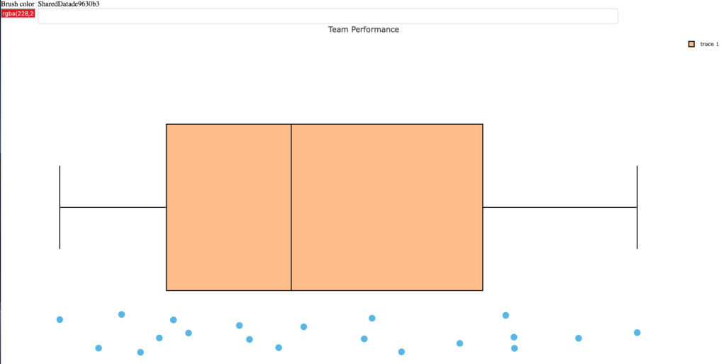
  • Statically, we can see what the plot looks like below.
  • Below the static image you can click the red link to see me walk through the interactive plot. Notice that as I select participants it selects them out. I can add as many as I want and change color to highlight certain participants over others. Additionally, once I begin to remove participants you’ll notice that plotly will create a boxplot for the selected sub population, which may be useful when communicating performance results.
  • Finally, the last red link will allow you to open the interactive tool yourself and play around with it.

interactive_plt2_video

interactive_plt2

Wrapping Up

Today’s article provided some interactive options for the static plots that were created in yesterday’s blog article.

As always, the complete code for this article is available on my GITHUB page.