Category Archives: Sports Analytics

Displaying Tables & Plots Together Part 2: Adding Titles & Captions

Yesterday’s post about creating single page reports with tables and plots in the same display window got a lot of follow up questions and comments (which is great!). In particular, Lyle Danley brought up a good point that adding titles to these reports, while important, can sometimes be tricky with these types of displays. So, I decided to do a quick follow up to show how to add titles and captions to your reports (in case you want to point out some key things to your colleagues or the practitioners you are working with).

I’m going to use the exact same code as yesterday, so check out that article to see the general approach to building these reports. As always, all of the code for yesterday’s article and today’s are on my GITHUB page.

Review

Recall that yesterday we  constructed the below plot using both ggarrange() and the {patchwork} package.

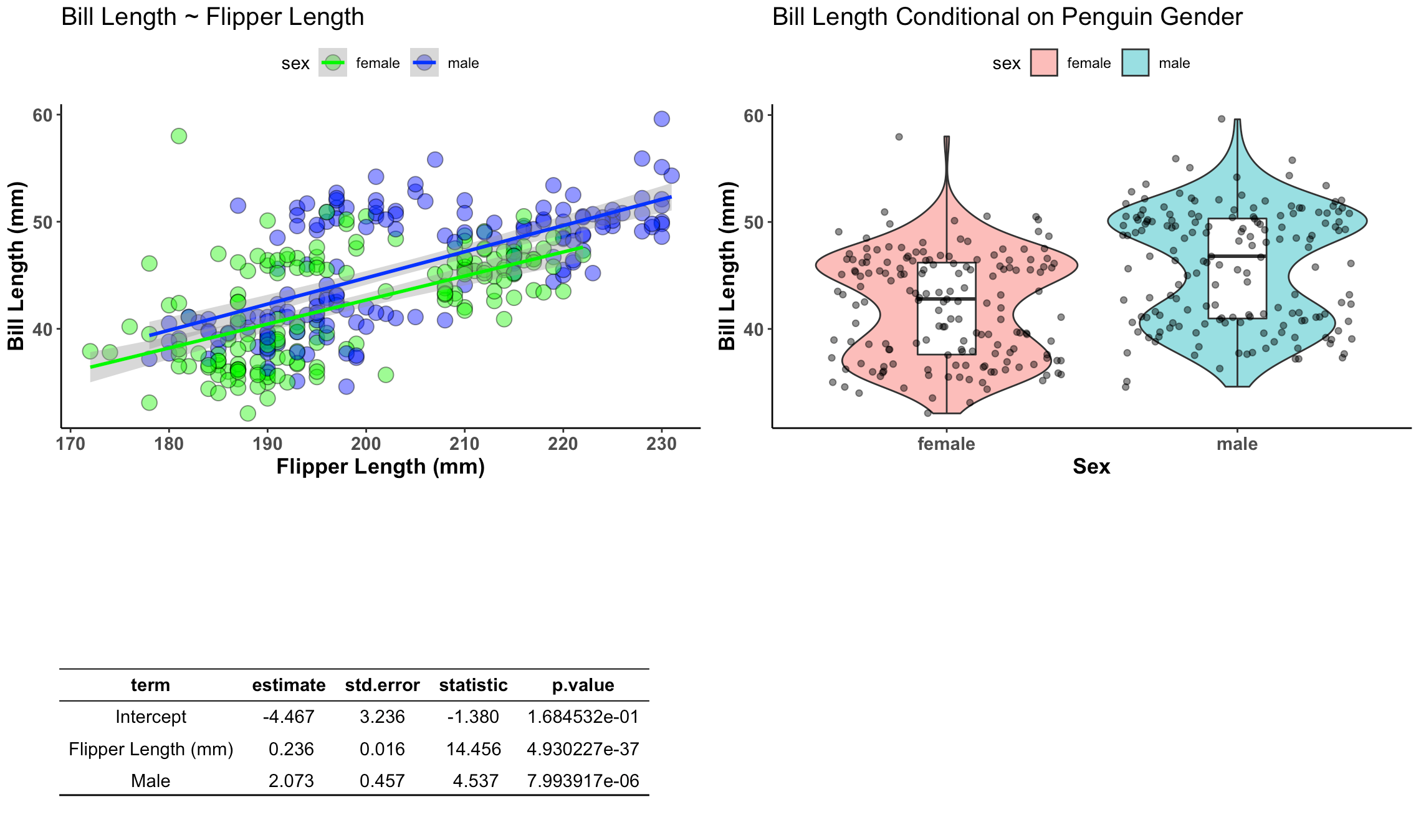
I’m going to use both approaches and add a title and a bullet point caption box in the bottom right.

Titles & Captions with ggarrange()

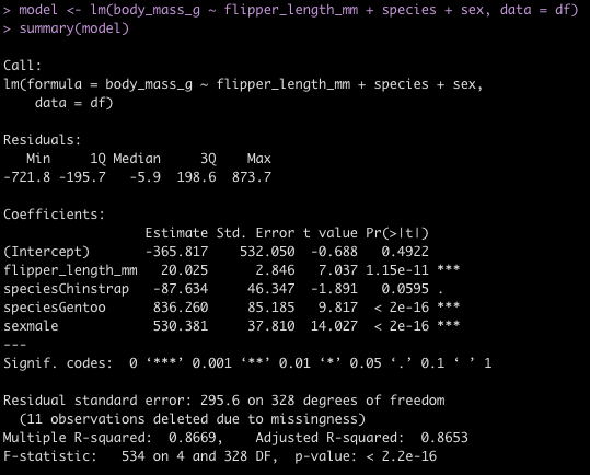
I wont rehash all of the code from yesterday, but the ggarrange() table that we created with was constructed with the following code.

## Build table into a nice ggtextable() to visualize it
tbl <- ggtexttable(fit, rows = NULL, theme = ttheme("blank")) %>%
  tab_add_hline(at.row = 1:2, row.side = "top", linewidth = 2) %>%
  tab_add_hline(at.row = 4, row.side = "bottom", linewidth = 3, linetype = 1)

To create a bullet point caption box I need to first create a string of text that I want to display, using the paste() function. I then wrap this text into the ggparagraph() function so that it can be appropriately displayed on the plot. Then, similar to yesterday, I use the ggarrange() function to put the two plots, the table, and the caption box, into a single canvas.

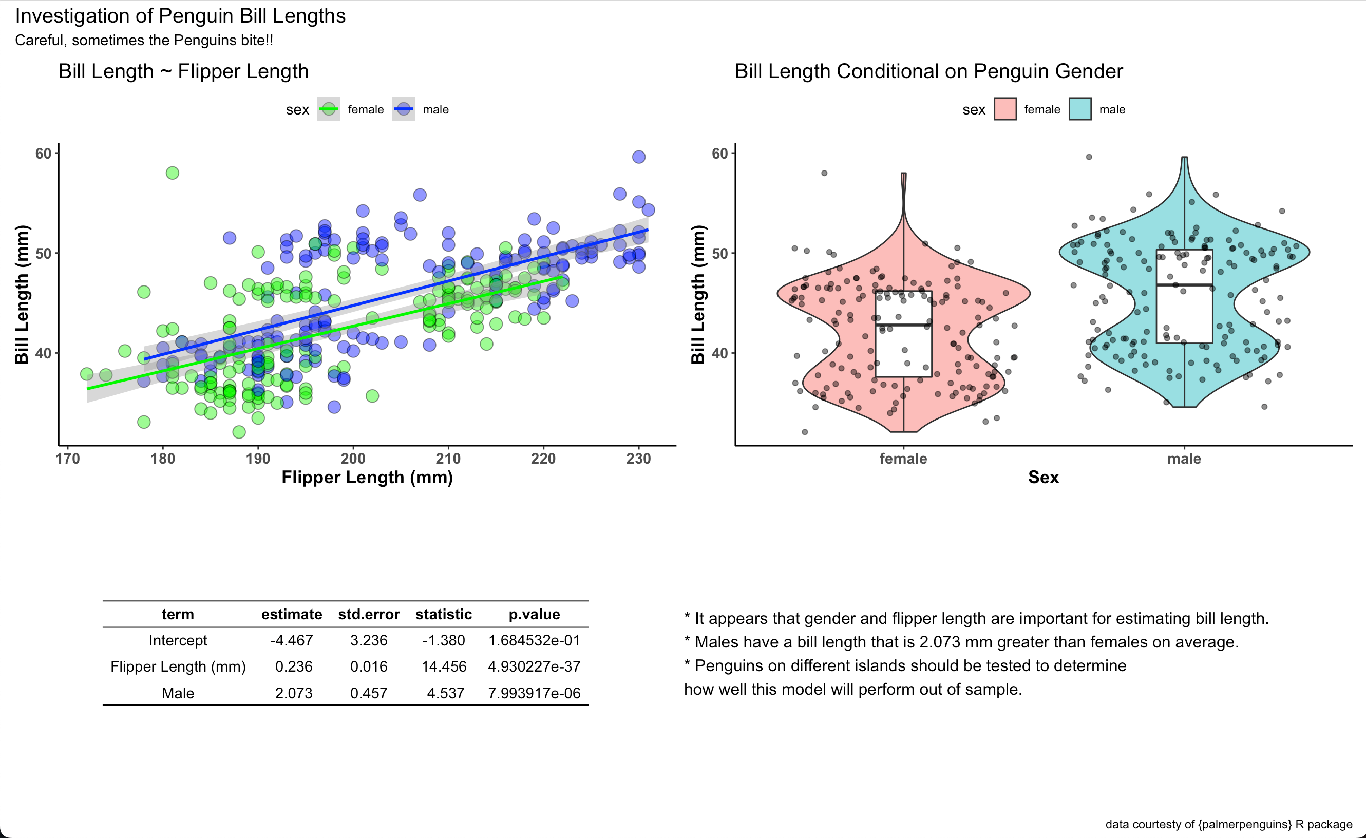
## Create text for a caption
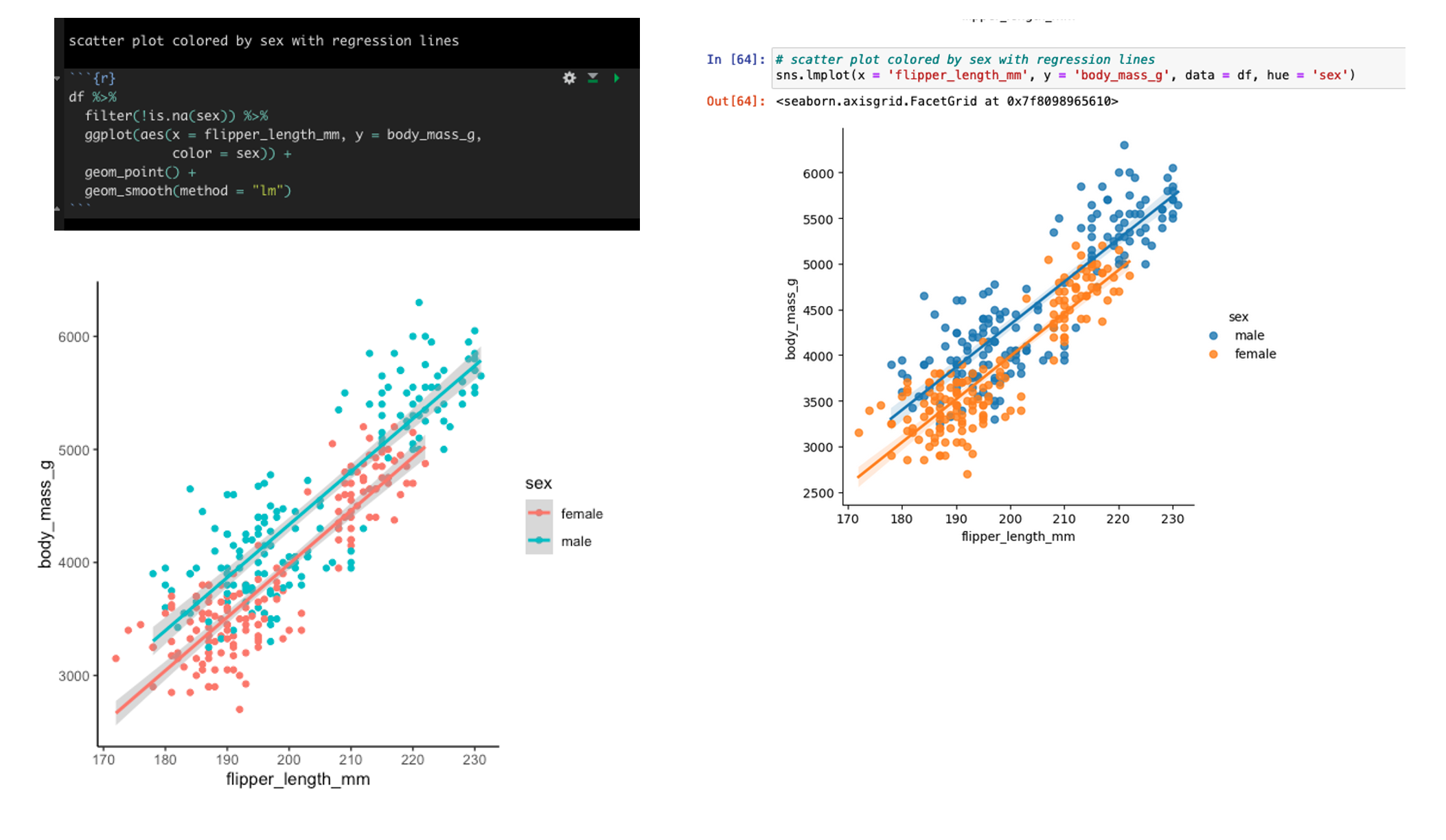
text <- paste("* It appears that gender and flipper length are important for estimating bill length.",
              " ",
              "* Males have a bill length that is 2.073 mm greater than females on average.",
              " ",
              "* Penguins on different islands should be tested to determine how well this model will perform out of sample.",
              sep = "\n")

text.p <- ggparagraph(text = text, 
                      #face = "italic", 
                      size = 12,
                      color = "black") + 
  theme(plot.margin = unit(c(t = 1, b = -3, r = 1, l = 2),"cm"))


## Plots & Table together with the caption using ggarange()
final_display <- ggarrange(plt1, plt2, tbl, text.p,
          ncol = 2, nrow = 2)

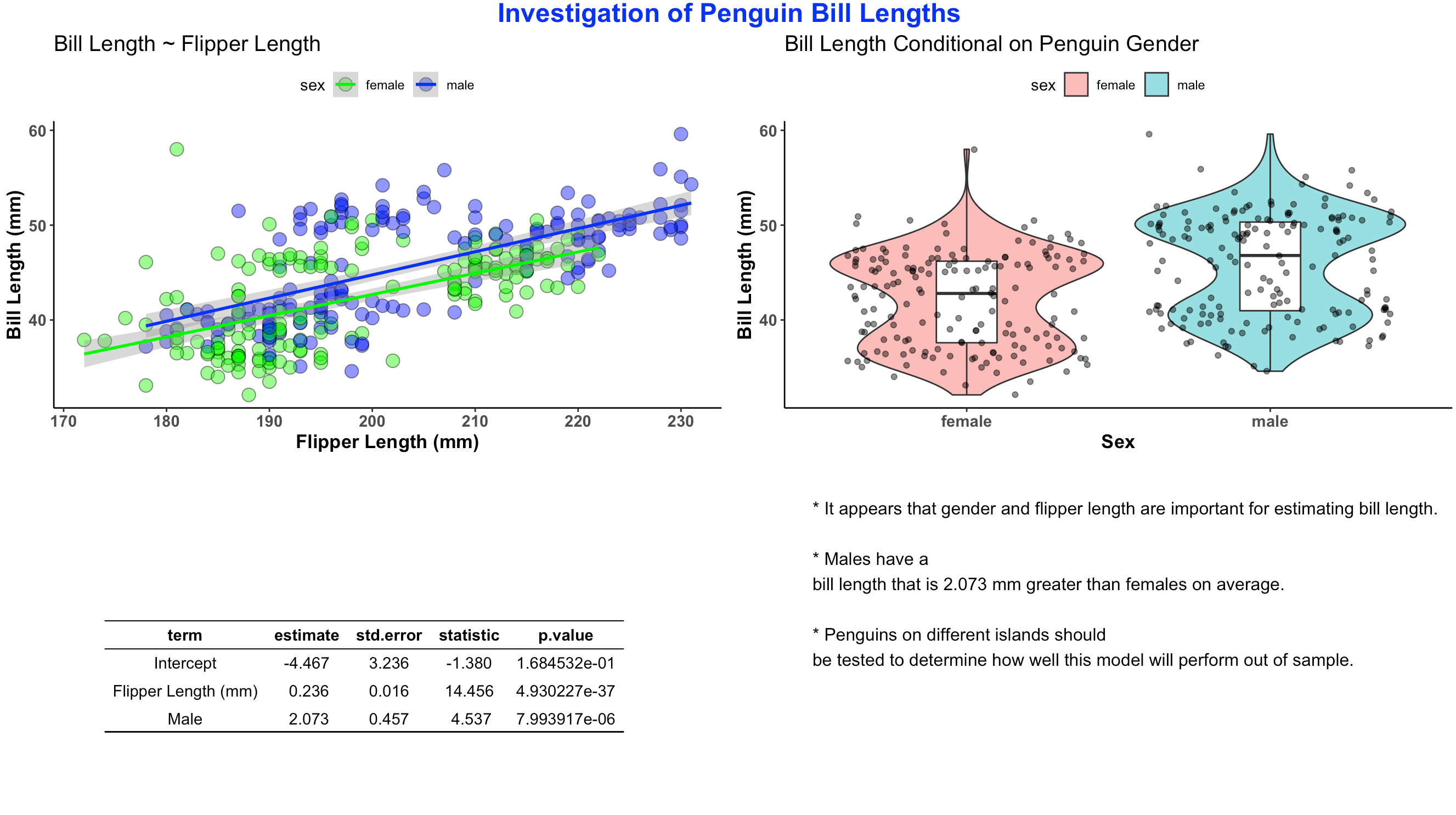
I saved the canvas as final_display which I can now wrap in the annotate_figure() function to add the common title to the report.

## add a common title
annotate_figure(final_display, top = text_grob("Investigation of Penguin Bill Lengths", 
                                      color = "blue", face = "bold", size = 18))

The finished product looks like this:

Titles & Captions with patchwork

Now, we will do the same thing with {patchwork}. Just like yesterday, to use {patchwork} we need to change the table from a ggtextable to a tableGrob. After that we can wrap it together with our two plots.

# Need to build the table as a tableGrob() instead of ggtextable
# to make it work with patch work
tbl2 <- tableGrob(fit, rows = NULL, theme = ttheme("blank")) %>%
  tab_add_hline(at.row = 1:2, row.side = "top", linewidth = 2) %>%
  tab_add_hline(at.row = 4, row.side = "bottom", linewidth = 3, linetype = 1)

# now visualize together
final_display2 <- wrap_plots(plt1, plt2, tbl2, 
           ncol = 2,
           nrow = 2)

We stored the final canvas in the element final_display2. We can add a title, subtitle, caption, and bullet point box to this using patchwork’s plot_annotation() function by simply specifying the text that we would like.

final_display2 + plot_annotation(
  title = "Investigation of Penguin Bill Lengths",
  subtitle = "Careful, sometimes the Penguins bite!!",
  caption = "data courtesty of {palmerpenguins} R package") + 
  grid::textGrob(hjust = 0, x = 0,
                   "* It appears that gender and flipper length are important for estimating bill length.\n* Males have a bill length that is 2.073 mm greater than females on average.\n* Penguins on different islands should be tested to determine\nhow well this model will perform out of sample.")

Ads here is our final report:

Wrapping up

There are two simple ways using two different R packages to create single page reports with plots, data tables, and even bullet point notes for the reader. Happy report constructing!

For the complete code to the blog article check out my GITHUB page.

Displaying Tables & Plots Together

A common question that I get asked is for a simple way of displaying tables and plots together in the same one-page report. Most in the sport science space that are new to R will copy and paste their plot and table outputs into a word document and then share that with their colleagues. But, this creates extra work — copying, pasting, making sure you don’t mess up and forget to paste the latest plot, etc. So, today’s blog article will walk through a really easy way to create a single page document for combining tables and plots into a single report, which you can save to PDF or jpeg directly from RStudio. This same approach is also useful for researchers looking to combine tables and plots into a single figure for publication. I’ll show how to do this using both ggarange() and {patchwork}.

As always, the full code is available on my GITHUB page.

Load Libraries and Set a Plotting Theme

### Load libraries
library(tidyverse)
library(ggpubr)
library(gridExtra)
library(patchwork)
library(broom)
library(palmerpenguins)

## set plot theme
theme_set(theme_classic() +
            theme(axis.text = element_text(size = 11, face = "bold"),
                  axis.title = element_text(size = 13, face = "bold"),
                  plot.title = element_text(size = 15),
                  legend.position = "top"))


Load Data

We will use the {palmerpenguins} data that is freely available in R.

## load data
data("penguins")
d <- penguins %>%
  na.omit()


Build the Plots & Table

First we will build our plots. We are going to create two plots and one table. The table will store the information from a linear regression which regresses bill length on flipper length and penguin sex. The plots will be our visualization of these relationships.

## Create Plots
plt1 <- d %>%
  ggplot(aes(x = flipper_length_mm, y = bill_length_mm)) +
  geom_point(aes(fill = sex),
             size = 4,
             shape = 21,
             color = "black",
             alpha = 0.5) +
  geom_smooth(method = "lm",
              aes(color = sex)) +
  scale_fill_manual(values = c("female" = "green", "male" = "blue")) +
  scale_color_manual(values = c("female" = "green", "male" = "blue")) +
  labs(x = "Flipper Length (mm)",
       y = "Bill Length (mm)",
       title = "Bill Length ~ Flipper Length")


plt2 <- d %>%
  ggplot(aes(x = sex, y = bill_length_mm)) +
  geom_violin(alpha = 0.5,
              aes(fill = sex)) +
  geom_boxplot(width = 0.2) +
  geom_jitter(alpha = 0.5) +
  labs(x = "Sex",
       y = "Bill Length (mm)",
       title = "Bill Length Conditional on Penguin Gender")


## Create table
fit <- d %>%
  lm(bill_length_mm ~ flipper_length_mm + sex, data = .) %>%
  tidy() %>%
  mutate(across(.cols = estimate:statistic,
                ~round(.x, 3)),
         term = case_when(term == "(Intercept)" ~ "Intercept",
                          term == "flipper_length_mm" ~ "Flipper Length (mm)",
                          term == "sexmale" ~ "Male"))

Convert the table into a ggtextable format

Right now the table is in a tibble/data frame format. To get it into a format that is usable within the display grid we will convert it to a ggtextable and use some styling to make it look pretty.

## Build table into a nice ggtextable() to visualize it
tbl <- ggtexttable(fit, rows = NULL, theme = ttheme("blank")) %>%
  tab_add_hline(at.row = 1:2, row.side = "top", linewidth = 2) %>%
  tab_add_hline(at.row = 4, row.side = "bottom", linewidth = 3, linetype = 1)

Display the Table and Plots using ggarrange

We simply add our plot and table elements to the ggarrange() function and get a nice looking report.

## Plots & Table together using ggarange()
ggarrange(plt1, plt2, tbl,
          ncol = 2, nrow = 2)

Display the Table and Plots using patchwork

We can accomplish the same goal using the {patchwork} package. The only trick here is that we can’t pass a ggarrange element into patchwork. We need to convert the table into a tableGrob() to make this work. A tableGrob() is simple a way for us to capture all of the information that is required for the table structure we’d like. Also note that we can pass the same tableGrob() into ggarrange above and it will work.

## Plots & Table together using patchwork
# Need to build the table as a tableGrob() instead of ggtextable
# to make it work with patch work
tbl2 <- tableGrob(fit, rows = NULL, theme = ttheme("blank")) %>%
  tab_add_hline(at.row = 1:2, row.side = "top", linewidth = 2) %>%
  tab_add_hline(at.row = 4, row.side = "bottom", linewidth = 3, linetype = 1)

Now we wrap the tableGrob and our plots into the wrap_plots() function and we are all set!

# now visualize together
wrap_plots(plt1, plt2, tbl2, 
           ncol = 2,
           nrow = 2)

Wrapping Up

Instead of copying and pasting tables and plots into word, try using these two simple approaches to creating a single report page that stores all of the necessary information that you colleagues need to see!

All of the code is available on my GITHUB page.

Using randomized controlled trials in the sports medicine and performance environment: is it time to reconsider and think outside the methodological box?

I recently had the chance to work on a fun view point paper for the Journal of Orthopaedic & Sports Physical Therapy about ideas around analyzing data in the applied sports and rehab environments. While randomized controlled trials are considered a gold standard in medicine, the applied environment is a bit messy due to the lack of ability to control a host of factors and having the daily cadence and structure dictated by coaches and other decision-makers.

Given these constraints, practitioners often lament that, “Research deals with group analysis but I deal with N-of-1!”. Indeed, it can be challenging to sometimes see the connection between group-based research and the person standing in front of you, whose performance and health you are in charge of managing. I discussed this issue a bit back in 2018 with Aaron Coutts, Richard Pruna, and Allan McCall, in our paper Putting the ‘i’ back in  team, where we laid out some approaches to handling individual-based analysis.

In this recent view point myself and a group of great collaborators (Garrett Bullock, Tom Hughes, Charles A Thigpen, Chad E Cook, and Ellen Shanley) discuss ideas around natural experiments and N-of-1 methodology as it applies to the sports and rehabilitation environments.

Using randomized controlled trials in the sports medicine and performance environment: is it time to reconsider and think outside the methodological box?

Rolling Mean and SD not including the most recent observation

A colleague recently asked me a good question regarding some feature engineering for some data he was working with. He was collecting training load data and wanted to create a z-score for each observation, BUT, he didn’t want the most recent observation to be included into the calculation of the mean and standard deviation. Basically, he wanted to represent the z-score for the most recent observation normalized to the observations that came before it.

This is an interesting issue because it makes me think of sports science research that uses z-scores to calculate the relationship between training load and injury. If the z-score is calculated retrospectively on the season then the observed z-scores and their relationship to the outcome of interest (injury) is a bit misleading as the mean and standard deviation of the full season data is not information one would have had on the day in which the injury occurred. All the practitioner would know, as the season progresses along, is the mean and standard deviation of the data up to the most recent observation.

So, let’s calculate some lagged mean and standard deviation values! The full code is available on my GITHUB page.

Loading Packages and Simulating Data

Aside from loading {tidyverse} we will also load the {zoo} package, which is a common package used for constructing rolling window functions (this is useful as it prevents us from having to write our own custom function).

We will start with a simple data set of just 10 training load observations.

## Load Libraries
library(tidyverse)
library(zoo)

## Simulate Data
set.seed(45)
d <- tibble(
  day = 1:10,
  training_load = round(rnorm(n = 10, min = 250, max = 350), 0)
)

d


Calculate the z-score with the mean and standard deviation of all data that came before it

To do this we use the rollapplyr() function from the {zoo} package. If we want to include the most recent observation in the mean and standard deviation we can run the function as is. However, because we want the mean and standard deviation of all data previous to, but not including, the most recent observation we wrap this entire function in the lag() function, which will take the data in the row directly above the recent observation. The width argument indicates the width of the window we want to calculate the function over. In this case, since we have a day variable we can use that number as our window width to ensure we are getting all observed data prior to the most recent observation.

d <- d %>%
  mutate(lag_mean = lag(rollapplyr(data = training_load, width = day, FUN = mean, fill = NA)),
         lag_sd = lag(rollapplyr(data = training_load, width = day, FUN = sd, fill = NA)),
         z_score = (training_load - lag_mean) / lag_sd)

d


This looks correct. As a sanity check, let’s calculate the mean and standard deviation of the first 4 rows of training load observations and see if those values correspond to what is in the lag_mean and lag_sd columns at row 5.

first_four <- d %>%
  slice(1:4) %>%
  pull(training_load)

mean(first_four)
sd(first_four)

It worked!

A more complicated example

Okay, that was an easy one. We had one athlete and we had a training day column, which we could use for the window with, already built for us. What if we have a data set with multiple athletes and only training dates, representing the day that training happened?

To make this work we will group_by() the athlete, and use the row_number() function to calculate a training day variable that represents our window width. Then, we simply use the same code above.

Let’s simulate some data.

set.seed(67)
d <- tibble(
  training_date = rep(seq(as.Date("2023-01-01"),as.Date("2023-01-05"), by = 1), times = 3),
  athlete = rep(c("Karl", "Bonnie", "Thomas"), each = 5),
  training_load = round(runif(n = 15, min = 250, max = 350), 0)
)

d

Now we run all of our functions for each athlete.

d <- d %>%
  group_by(athlete) %>%
  mutate(training_day = row_number(), 
         lag_mean = lag(rollapplyr(data = training_load, width = training_day, FUN = mean, fill = NA)),
         lag_sd = lag(rollapplyr(data = training_load, width = training_day, FUN = sd, fill = NA)),
         z_score = (training_load - lag_mean) / lag_sd)


d

Wrapping Up

There we have it, a simple way of calculating rolling z-scores while using the mean and standard deviation of the observations that came before the most recent observation!

If you’d like the entire code, check out my GITHUB page.

From tidyverse to python

Anyone who reads this blog or watches our Tidy Explained Screen Cast knows that I am a massive R user and R fan. I can work fast in it and I find it to be one of the best tools for building statistical models. That said, there are times when python comes in handy and there are a number of software and web applications that interact and play nicer with python compared to R. For example, R can be run within AWS Sagemaker, but python seems to be more efficient. I’ve recently been doing a few projects in Databricks as well and, while I can use R within their system, I’ve been trying to code the projects using python.

For those of us trying to learn a bit of python to be somewhat useful in that language (or for pythonistas who may need to learn a little bit of R) I’ve put together the following tutorial that shows how to do some of the common stuff you’d use R’s tidyverse for, in python.

The codes for both the RMarkdown file and the Jupyter Notebook are available on my GITHUB page. The codes has many more examples than I will go over here (for space reasons), so be sure to check it out!

Load Libraries and Data

We will be using the famous Palmer Penguins data. Here is a side-by-side look at how we load the libraries and data set in tidyverse and what those same steps look like in Python.

Exploratory Data Analysis

One of the most popular features of the suite of tidyverse libraries is the ability to nicely summarize and plot data.

I won’t go through every possible EDA example contained in the notebooks but here are a few side-by-side.

Create a Count of the Number of Samplers for Each Species

Create a barplot of the count of Species types

Scatter plot of flipper length and body mass colored by sex with linear regression lines

Group By Summarize

In tidyverse we often will group our data by a specific condition and then summarize data points relative to that condition. In tidyverse we use pipes, %>%, to connect together lines of code. In the pandas library (the common python library for working with data frames) we use dots to connect these lines of code.

Group By Mutate

In addition to summarizing by group, sometimes we need to add additional columns to the existing data set but those columns need to have the new data conditional on a specific grouping variable. In tidyverse we use mutate and in pandas we use transform.

We can also build columns using grouping and custom functions. In tidyverse we do this inside of the mutate but in pandas we need to set up a lambda function. For example, we can build the z-score of each sample grouped by Species (meaning the observation is divided by the mean and standard deviation for that Species population).

ifelse / case_when

Another task commonly performed in data cleaning is to assign values to specific cases. For example, we have three Islands in the data set and we want to assign them Island1, Island2, and Island3. In tidyverse we could use either ifelse or case_when() to solve this task. In pandas we need to either set up a custom function and then map that function to the data set or we can use the numpy library, which has a function called where(), which behaves like case_when() in tidyverse.

Linear Regression Model

To finish, I’ll provide some code to write a linear model in both languages.

Wrapping Up

Hopefully the tutorial will help with folks going from R to Python or vice versa. Generally, I suggest picking one or the other and trying to really dig into being good at it. But, there are times where you might need to delve into another language and produce some code. This tutorial provides a mirror image of code between R and Python.

As stated earlier, there are a number of extra code examples in the RMarkdown and Jupyter Notebook files available on my GITHUB page.