Although most journals require authors to include confidence intervals into their papers it isn’t mandatory for all journal (merely a recommendation). Additionally, there may be occasions when you are reading an older paper from a time when this mandate/recommendation was not enforced. Finally, sometimes abstracts (due to word count limits) might only present p-values and estimates, in which case you might want to quickly obtain the confidence intervals to help organize your thoughts prior to diving into the paper. In these instances, you might be curious as to how you can get a confidence interval around the observed effect when all you have is a p-value.
Bland & Altman wrote a short piece of deriving confidence interval from only an estimate and a p-value in a 2011 paper in the British Medical Journal:
Altman, DG. Bland, JM. (2011). How to obtain the confidence interval from a p-value. BMJ, 343: 1-2.
Before going through the approach, it is important to note that they indicate a limitation of this approach is that it wont be as accurate in smaller samples, but the method can work well in larger studies (~60 subjects or more).
The Steps
The authors’ list 3 easy steps to derive the confidence interval from an estimate and p-value:
- Calculate the test statistic for a normal distribution from the p-value.
- Calculate the standard error (ignogre the minus sign).
- Calculate the 95% CI using the standard error and a z-critical value for the desired level of confidence.
- When doing this approach for a ratio (e.g., Risk Ratio, Odds Ratio, Hazard Ratio), the formulas should be used with the estimate on the log scale (if it already isn’t) and then exponentiate (antilog) the confidence intervals to put the results back to the normal scale.
Calculating the test statistic
To calculate the test statistic use the following formula:
z = -0.862 + sqrt(0.743 – 2.404 * log(p.value))
Calculating the standard error
To calculate the standard error use the following formula (remember that we are ignoring the sign of the estimate):
se = abs(estimate) / z
If we are dealing with a ratio, make sure that you are working on the log scale:
se = abs(log(estimate)) / z
Calculating the 95% Confidence Limits
Once you have the standard error, the 95% Confidence Limits can be calculated by multiplying the standard error by the z-critical value of 1.96:
CL.95 = 1.96 * se
From there, the 95% Confidence Interval can be calculated:
low95 = Estimate – CL.95
high95 = Estimate + CL.95
Remember, if you are working with rate statistics and you want to get the confidence interval on the natural scale, you will need to take the antilog:
low95 = exp(Estimate – CL.95)
high95 = exp(Estimate + CL.95)
Writing a function
To make this simple, I’ll write everything into a function. The function will take three arguments, which you will need to obtain from the paper:
- p-value
- The estimate (e.g., difference in means, risk ratio, odds ratio, hazard ratio, etc)
The function will default to log = FALSE but if you are working with a rate statistic you can change the argument to log = TRUE to get the results on both the log and natural scales. The function also takes a sig_digits argument, which defaults to 3 but can be changed depending on how many significant digits you need.
estimate_ci_95 <- function(p_value, estimate, log = FALSE, sig_digits = 3){

  if(log == FALSE){

    z <- -0.862 + sqrt(0.743 - 2.404 * log(p_value))
    z

    se <- abs(estimate) / z
    se

    cl <- 1.96 * se

    low95 <- estimate - cl
    high95 <- estimate + cl

    list('Standard Error' = round(se, sig_digits),
         '95% CL' = round(cl, sig_digits),
         '95% CI' = paste(round(low95, sig_digits), round(high95, sig_digits), sep = ", "))

  } else {

    if(log == TRUE){

      z <- -0.862 + sqrt(0.743 - 2.404 * log(p_value))
      z

      se <- abs(estimate) / z
      se

      cl <- 1.96 * se

      low95_log_scale <- estimate - cl
      high95_log_scale <- estimate + cl

      low95_natural_scale <- exp(estimate - cl)
      high95_natural_scale <- exp(estimate + cl)

      list('Standard Error (log scale)' = round(se, sig_digits),
           '95% CL (log scale)' = round(cl, sig_digits),
           '95% CL (natural scale)' = round(exp(cl), sig_digits),
           '95% CI (log scale)' = paste(round(low95_log_scale, sig_digits), round(high95_log_scale, sig_digits), sep = ", "),
           '95% CI (natural scale)' = paste(round(low95_natural_scale, sig_digits), round(high95_natural_scale, sig_digits), sep = ", "))

    }

  }

}
Test the function out
The paper provides two examples, one for a difference in means and the other for risk ratios.
Example 1
Example 1 states:
“the abstract of a report of a randomised trial included the statement that “more patients in the zinc group than in the control group recovered by two days (49% v 32%,P=0.032).” The difference in proportions was Est = 17 percentage points, but what is the 95% confidence interval (CI)?
estimate_ci_95(p_value = 0.032, estimate = 17, log = FALSE, sig_digits = 1)

Example 2
Example 2 states:
“the abstract of a report of a cohort study includes the statement that “In those with a [diastolic blood pressure] reading of 95-99 mm Hg the relative risk was 0.30 (P=0.034).” What is the confidence interval around 0.30?”
Here we change the argument to log = TRUE since this is a ratio statistic needs to be on the log scale.
estimate_ci_95(p_value = 0.034, estimate = log(0.3), log = TRUE, sig_digits = 2)

Try the approach out on a different data set to confirm the confidence intervals are calculated properly
Below, we build a simple logistic regression model for the PimaIndiansDiabetes data set from the {mlbench} package.
- The odds ratios are already on the log scale so we set the argument log = TRUE to ensure we get results reported back to us on the natural scale, as well.
- We use the summary() function to obtain the model estimates and p-values.
- We use the confint() function to get the 95% Confidence Intervals from the model.
- To get the confidence intervals on the natural scale we also take the exponent, exp(confint()).
- We use our custom function, estimate_ci_95(), to see how well the results compare.
## get data
library(mlbench)
data("PimaIndiansDiabetes")
df <- PimaIndiansDiabetes

## turn outcome variable into a numeric (0 = negative for diabetes, 1 = positive for diabetes)
df$diabetes_num <- ifelse(df$diabetes == "pos", 1, 0)
head(df)

## simple model
diabetes_glm <- glm(diabetes_num ~ pregnant + glucose + insulin, data = df, family = "binomial")

## model summary
summary(diabetes_glm)
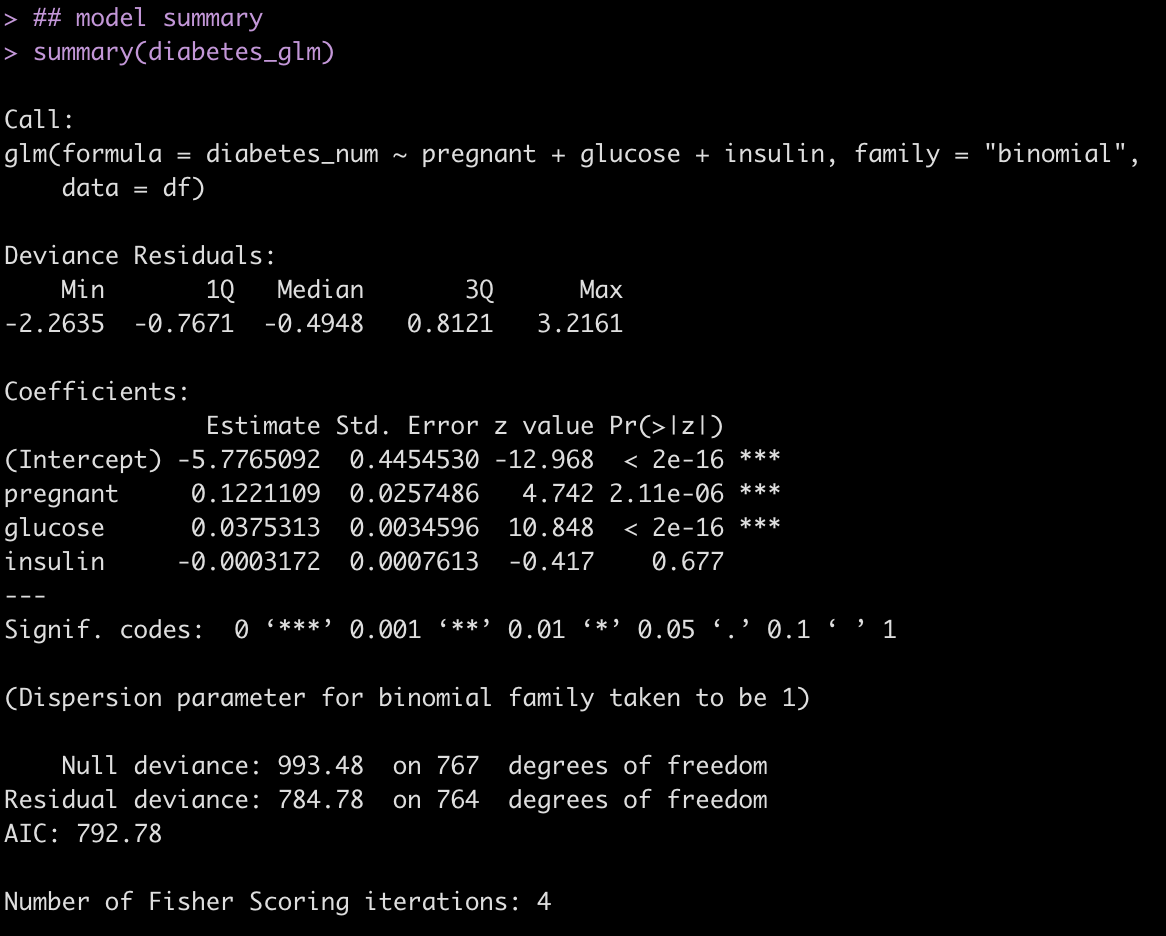
Calculate 95% CI from the p-values and odds ratio estimates.
Pregnant Coefficient
## 95% CI for the pregnant coefficient
estimate_ci_95(p_value = 2.11e-06, estimate = 0.122, log = TRUE, sig_digits = 3)

Glucose Coefficient
## 95% CI for the glucose coefficient
estimate_ci_95(p_value = 2e-16, estimate = 0.0375, log = TRUE, sig_digits = 3)

Insulin Coefficient
## 95% CI for the insulin coefficient
estimate_ci_95(p_value = 0.677, estimate = -0.0003, log = TRUE, sig_digits = 5)

Evaluate the results from the custom function to those calculated with the confint() function.
## Confidence Intervals on the Log Scale
confint(diabetes_glm)

## Confidence Intervals on the Natural Scale
exp(confint(diabetes_glm))
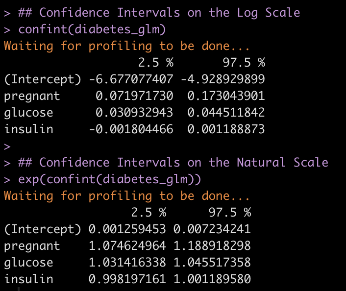
We get nearly the same results with a bit of rounding error!
Hopefully this function will be of use to some people as they read papers or abstracts.
You can find the complete code in a cleaned up markdown file on my GITHUB page.