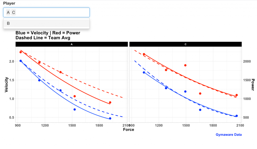
A colleague of mine was asking about how he could produce plots of force-velocity-power profiles for his coaches based on their Gymaware testing. Rather than plotting static plots for this stuff it is sometimes easier to build out a nice shiny app so that the coaches can interact with it or the practitioner can quickly change between players or position groups when giving a presentation to the staff.
All code and data is available at my GITHUB page (R Script and Data).
This tutorial will cover:
1) Building polynomial regression to represent the average team trend
2) Iterative approaches to building static plots
3) Iterative approaches to building Shiny web apps
This tutorial has a number of different iterations of plots and web apps so working through the R-code on your own is advised so you can see how every step is performed.
Data
After loading the two required packages, {tidyverse} and {shiny}, we load in the data set and we see that it consists of Force, Power, and Velocity values across 5 different external loads for 3 different athletes:
If you want to use the R-script to produce reports for yourself going forward just ensure that your data has the above columns (named the same way, since R is case-sensitive). If you have data with different column names, your two choices are: (1) change my code to match the column names of your data; or, (2) once you pull the data into R change the columns names in your code to match mine.
Average Trend Line (2nd Order Polynomial)
Eventually, we are going to want to compare our athletes to the team average (or position group average if your sport is more heterogeneous). This type of data is often modeled as a. 2nd order polynomial regression. Thus, we will build this type of regression to predict both Velocity and Power from Force. Once I have these two regressions built I can create a data frame that consists of a sequence of Force values (from the minimum to the maximum observed in the team’s data) and predict the velocity and power at each unit of force.
fit_velo <- lm(Velocity ~ poly(Force, 2), data = fv_profile)
fit_power <- lm(Power ~ poly(Force, 2), data = fv_profile)

avg_tbl <- data.frame(Force = seq(from = min(fv_profile$Force),
                                  to = max(fv_profile$Force),
                                  by = 0.5))

avg_tbl$Velocity_Avg <- predict(fit_velo, newdata = avg_tbl)
avg_tbl$Power_Avg <- predict(fit_power, newdata = avg_tbl)
colnames(avg_tbl)[1] <- "Force_Grp"
Static Plots
I’ll walk through a few iterations of static plots. See the GITHUB code to walk through how these were produced.
1) All athletes with an average team trend line
This plot gives us a sense for the trend in Velocity as it relates to increasing amounts of force. Below you will see one with a solid trend line and one with a dashed trend line. Feel free to use which ever one you prefer.
2) Team trend for Velocity and Power
The common way this type of data is visualized in the sports science literature it is a bit tricky in R because it requires a dual y-axis. To obtain this, within my ggplot call I shrink Power down to a scale more similar to Velocity (the main y-axis) by dividing it by 1000. Then when I call the second y-axis with the sec_axis() function I multiply Power by 1000 to put it back on its normal scale.
3) Accounting for individuals
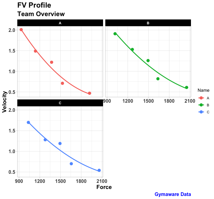
The above plots are a look at the entire team (in this case only 3 athletes). However, we may want to look at the individuals more explicitly. As such, we build four plots to show individual differences:
1) All athletes all on the same plot with their corresponding individualized trend lines (NOTE: if you have a lot of athletes, this plot can get pretty busy and ultimately become useless).
2) Plot each individual as a facet to look at the athletes separately.
3) Create the same plot as #2 but add in the group average trend line (which we created using our 2nd order polynomial regression) to allow us to compare each athlete to the groupx.
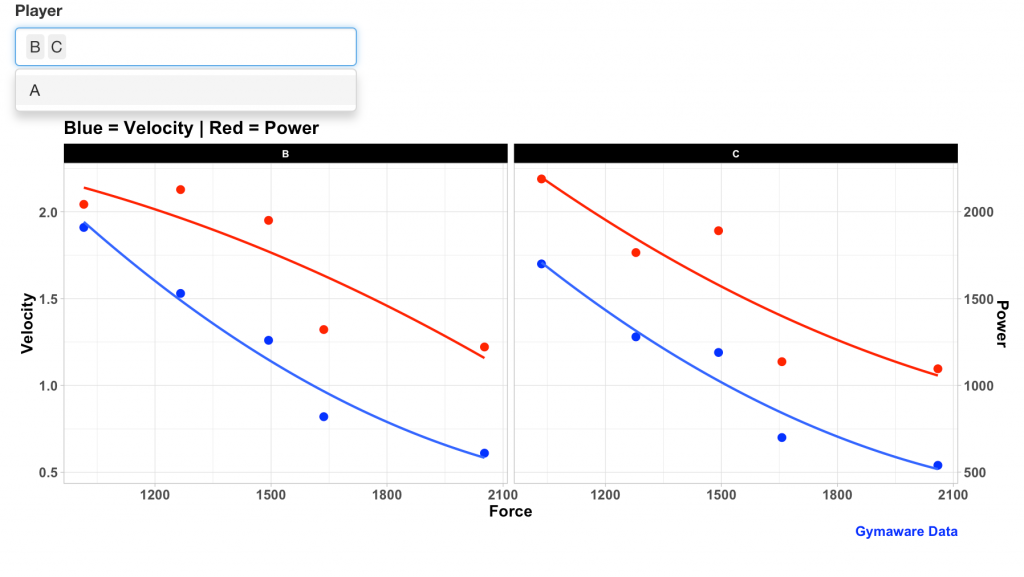
4) Plot each individual as a facet with velocity and power on separate y-axes.
Shiny App Development
The still figures above are nice but making things interactive is much more useful. I have four {shiny} web iterations that we can go through. Again, using the R code while reading this will help you understand what is going on under the hood. Additionally, you’ll want to run these in R so that R can open up the webpage on your computer and allow you to play with the app. Below is just still shots of each app iteration.
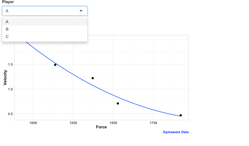
1) Version 1: Independent Player Plots
This version allows you to select one player at a time.
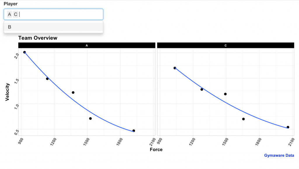
2) Version 2: Add Players to Facets
This version lets you select however many players you want and it will add them in as facets. This is a useful app if you are presenting to the staff and want to select or de-select several players to show how they compare to each other.
3) Version 3: Same as Version 2 but add Power to the Plot on a second y-axis
4) Version 4: Combine all plot details
Version 4 combines everything from this tutorial in one single web app. You can select the force-velocity-power profile for individual athletes (added to the plot as facets) and see the team average trend line (added to the plot as a dashed line) for velocity and power, to allow you to make comparisons between each player and to the group average.
Conclusion
{tidyverse} makes it incredibly easy to manipulate data and quickly iterate plots to our liking while {shiny} offers an easy way for us to turn our plots into an interactive webpage.
Again, for the code and data see my GITHUB page (R Script and Data).


