Some friends were discussing Philadelphia 76er’s point guard, Tyrese Maxey’s, three point% today. They were discussing how well he has performed over 72 games with a success rate of 43% behind the arc (at the time this data was scraped, 4/6/2022). While his percentage from 3pt range is very impressive I did notice that he has 294 attempts, which is less than 3 out of the 4 player’s that are ahead of him (Kyrie only has 214 attempts and he is ranked 3rd at the time of this writing) and Steph Curry is just behind Maxey in the ranking (42.4% success) with nearly 70 more attempts.
The question becomes, how can we be of Maxey’s three point percentage relative to those with more attempts? We will take a Bayesian approach, using a beta conjugate, to consider the success rate of these players relative to what we believe the average three point success rate is for an NBA shooter (our prior), which we will determine from observing 3 point shooting over previous 3 seasons.
NOTE: On basketball-reference.com, they have a nice check box that automatically will filter out players that are non-qualifiers for rate stats. After playing around with this, it appears that 200 attempts is their cut off. So, I will keep that and filter the data down to only those with 200 or more 3pt attempts.
All of the code, web scrapping, and csv files of the data (if you are looking to run it prior to when I scrapped it) are available on my GITHUB PAGE.
Exploratory Data Analysis
First, let’s view the top 10 three point shooters this season (size of the dot represents the number of three point attempts taken).

Visualize the distribution of three point attempts and three point% for the 2022 season, so far.

Establishing Our Prior
Since we are dealing with a binary outcome of successes (made the shot) and failures (missed the shot) we will use the beta distribution, which is the conjugate prior for the binomial distribution.
The beta distribution has two parameters, alpha and beta. To determine what these parameters should be, we will use the method of moments with the data from the previous three seasons.
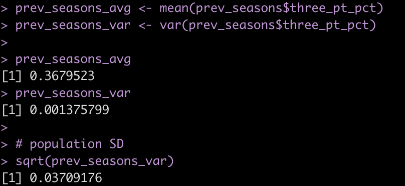
To do this, we need to first find the mean and variance for the previous three seasons.
Next, we create a function that calculates alpha and beta based on the mean and variance from our observed data.
# function for calculating alpha and beta
beta_parameters <- function(dist_avg, dist_var){
  alpha <- dist_avg * (dist_avg * (1 - dist_avg)/dist_var - 1)
  beta <- alpha * (1 - dist_avg)/dist_avg
  list(alpha = alpha,
       beta = beta)
}

The function works to produce the two parameters we need. The data is returned in list format, so we will call each element of the list and store the respective values in their own variable.
The function works to produce the two parameters we need. The data is returned in list format, so we will call each element of the list and store the respective values in their own variable.

The alpha and beta parameters derived from our method of moments function appear to produce the mean and standard deviation correctly. We can plot this distribution to see what it looks like.
Update the 3pt% of the players in the 2022 season with our meta prior
We calculate our Bayes adjusted three point percentage for the players by adding their successes to `alpha` and their failures to `beta` and then calculating the new posterior percentage as
alpha / (alpha + beta)
and the posterior standard deviation as
sqrt((alpha * beta) / ((alpha + beta)^2 * (alpha + beta + 1)))
tbl2022 <- tbl2022 %>%
  mutate(three_pt_missed = three_pt_att - three_pt_made,
         posterior_alpha = three_pt_made + alpha,
         posterior_beta = three_pt_missed + beta,
         posterior_three_pt_pct = posterior_alpha / (posterior_alpha + posterior_beta),
         posterior_three_pt_sd = sqrt((posterior_alpha * posterior_beta) / ((posterior_alpha + posterior_beta)^2 * (posterior_alpha + posterior_beta + 1))))
Have any of the players in the top 10 changes following in the adjustment?
- We see that Desmond Bane has jumped Kyrie, who only had 214 attempts. Kyrie dropped from 3rd to 6th.
- Tyrese Maxey moves up one spot to 4.
- Grant Williams drops out of the top 10 while Tyrese Haliburton moves up into the top 10
We can plot the results of these top 10 players showing the posterior Bayes three point% relative to their observed three point%.

Show the uncertainty in Tyrese Maxies Performance versus Luke Kennard, who has 409 attempts
kennard <- tbl2022 %>%
  filter(player == "Luke Kennard")

maxey <- tbl2022 %>%
  filter(player == "Tyrese Maxey")

plot(density(rbeta(n = 1e6, shape1 = maxey$posterior_alpha, shape2 = maxey$posterior_beta)),
     col = "blue",
     lwd = 4,
     ylim = c(0, 20),
     xlab = "3pt %",
     main = "Bayes Adjusted 3pt%\nBlue = Tyrese Maxey | Red = Luke Kennard")
lines(density(rbeta(n = 1e6, shape1 = kennard$posterior_alpha, shape2 = kennard$posterior_beta)),
      col = "red",
      lwd = 4)

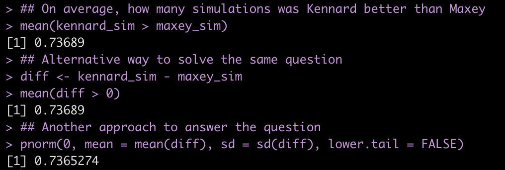
If we sample from the posterior for both players, how much better is Kennard?
maxey_sim <- rbeta(n = 1e6, shape1 = maxey$posterior_alpha, shape2 = maxey$posterior_beta)

kennard_sim <- rbeta(n = 1e6, shape1 = kennard$posterior_alpha, shape2 = kennard$posterior_beta)

plot(density(kennard_sim - maxey_sim),
     lwd = 4,
     col = "black",
     main = "Kennard Posterior Sim - Maxie Posterior Sim",
     xlab = "Difference between Kennard & Maxie")
abline(v = 0,
       lwd = 4,
       lty = 2,
       col = "red")

On average, Kennard was better in ~74% of the 1,000,000 simulations.
Long story short, Tyrese Maxey has been a solid 3pt shooter, he just happens to play on a team where James Harden takes many of the shots (maybe he should distribute the ball more?).
One last thing…..Shrinkage
So, what happened? Basically, the Bayesian adjustment created “shrinkage” whereby the players that are above average are pulled down slightly towards the population average and the players below average are pulled up slightly towards the population average. The amount of shrinkage depends on the number of attempts the player has had (the size of their sample). More attempts leads to less shrinkage (more certainty about their performance) and smaller attempts leads to more shrinkage (more certainty about their). Basically, if we haven’t seen you shoot very much then our best guess is that you are probably closer to average until we are provided more evidence to believe otherwise.
Since we were originally dealing with only players that have had 200 or more three point attempts, let’s scrape all players from the 2022 season and apply the same approach to see what shrinkage looks like.
url2022 <- read_html("https://www.basketball-reference.com/leagues/NBA_2022_totals.html")

tbl2022a <- html_nodes(url2022, 'table') %>%
  html_table(fill = TRUE) %>%
  pluck(1) %>%
  janitor::clean_names() %>%
  select("player", three_pt_att = "x3pa", three_pt_made = "x3p", three_pt_pct = "x3p_percent") %>%
  filter(player != "Player") %>%
  mutate(across(.cols = three_pt_att:three_pt_pct,
                ~as.numeric(.x))) %>%
  filter(!is.na(three_pt_pct)) %>%
  arrange(desc(three_pt_pct)) %>%
  mutate(three_pt_missed = three_pt_att - three_pt_made,
         posterior_alpha = three_pt_made + alpha,
         posterior_beta = three_pt_missed + beta,
         posterior_three_pt_pct = posterior_alpha / (posterior_alpha + posterior_beta),
         posterior_three_pt_sd = sqrt((posterior_alpha * posterior_beta) / ((posterior_alpha + posterior_beta)^2 * (posterior_alpha + posterior_beta + 1))))


tbl2022a %>%
  mutate(pop_avg = alpha / (alpha + beta)) %>%
  ggplot(aes(x = three_pt_pct, y = posterior_three_pt_pct, size = three_pt_att)) +
  geom_point(color = "black",
             alpha = 0.8) +
  geom_hline(aes(yintercept = pop_avg),
             color = "green",
             size = 1.2,
             linetype = "dashed") +
  geom_abline(intercept = 0,
              slope = 1,
              size = 1.2,
              color = "green") +
  labs(x = "Observed 3pt%",
       y = "Bayesian Adjusted 3pt%",
       size = "Attempts",
       title = "Shirnkage of 3pt% using Beta-Conjugate",
       caption = "Data Source: https://www.basketball-reference.com/leagues/NBA_2022_totals.html")
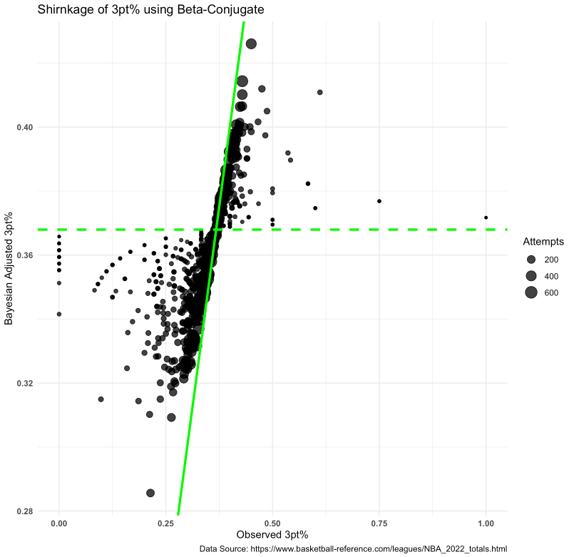
What does this tell us?
- Points closest to the diagonal line (the line of equality — points on this line represent 0 difference between Bayes adjusted and Observed 3pt%) see much almost no shrinkage towards the observed 3pt%.
- Notice that the points nearest the line also have tend to be larger, meaning we have more observations are more certainty of that player’s true skill.
- The horizontal dashed line represents the population average (determined from the alpha and beta parameters obtained from previous 3 seasons).
- Notice that the smaller points (less observations) get shrunk towards this line given we haven’t seen enough from that player to believe differently. For example, the tiny dot to the far right indicates the player has an observed 3pt% of 100%, which we wouldn’t really believe to be sustainable for the full season (maybe the player took one or two shots and got lucky?). So that point is pulled downwards towards the dashed line as our best estimate is that the player ie closer to an average shooter.


