Box & Dotplots for Performance Visuals – Creating an Interactive Plot with plotly

Yesterday, I provided some code to make a simple boxplot with doplot in order to visualize an athlete’s performance relative to their peers.

Today, we will try and make this plot interactive. To do so, we will use the {plotly} package and save the plots as html files that can be sent to our coworkers or decision-makers so that they can interact directly with the data.

Data

We will use the same simulated data from yesterday and also load the {plotly} library.

### Load libraries -----------------------------------------------
library(tidyverse)
library(randomNames)
library(plotly)

### Data -------------------------------------------------------
set.seed(2022)
dat <- tibble( participant = randomNames(n = 20), performance = rnorm(n = 20, mean = 100, sd = 10)) 

Interactive plotly plot

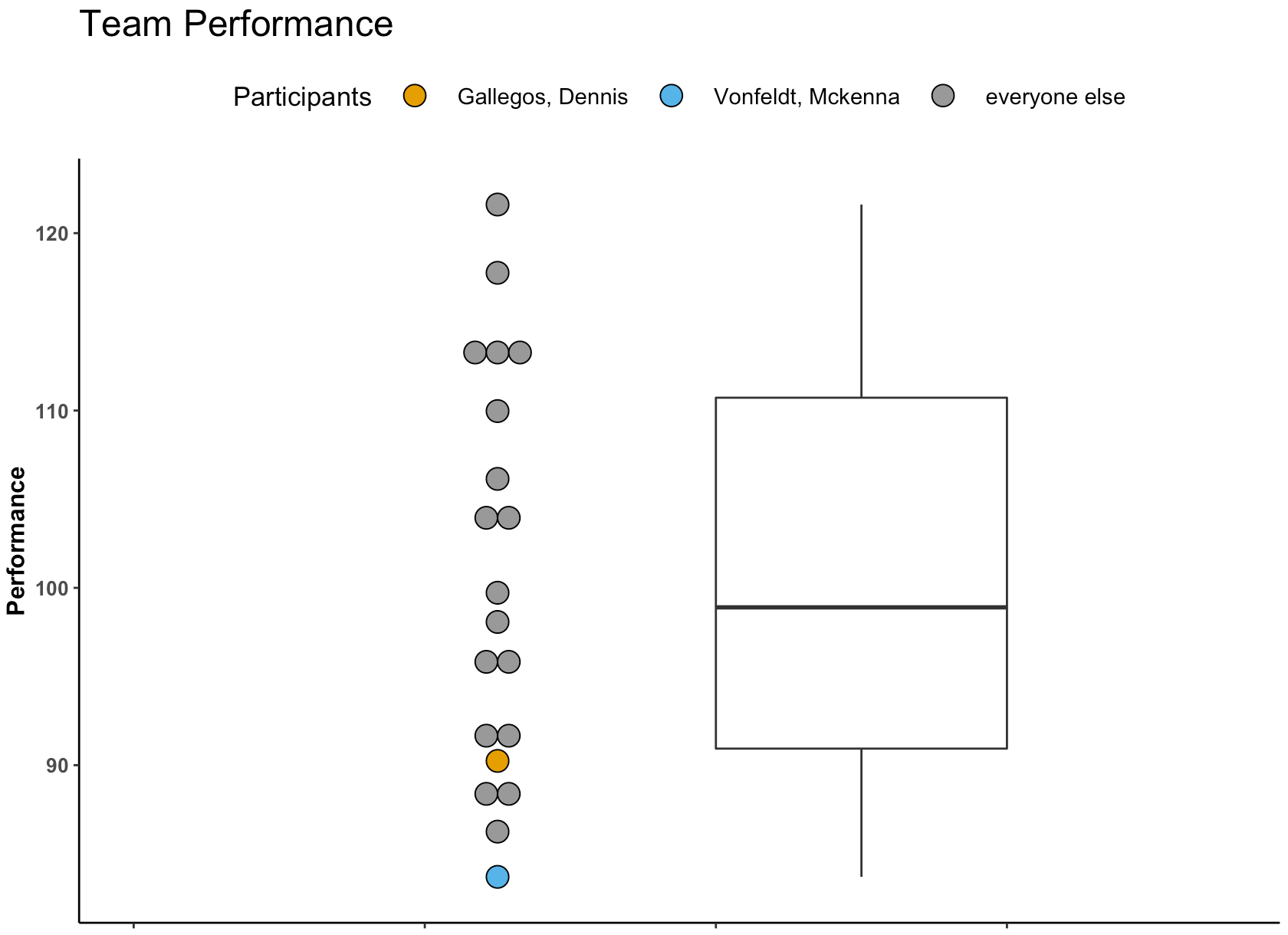
Our first two plots will be the same, one vertical and one horizontal. Plotly is a little different than ggplot2 in syntax.

  • I start by creating a base plot, indicating I want the plot to be a boxplot. I also tell plotly that I want to group by participant, so that the dots will show up alongside the boxplot, as they did in yesterday’s visual.
  • Once I’ve specified the base plot, I indicate that I want boxpoints to add the points next to the boxplot and set some colors (again, using a colorblind friendly palette)
  • Finally, I add axis labels and a title.
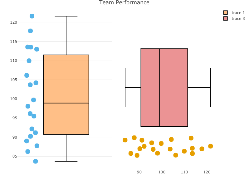
  • For easy, I use the subplot() function to place the two plots next to each other so that you can compare the vertical and horizontal plot and see which you prefer.
### Build plotly plot -------------------------------------------
# Set plot base
perf_plt <- plot_ly(dat, type = "box") %>%
  group_by(participant)

# Vertical plot
vert_plt <- perf_plt %>%
  add_boxplot(y = ~performance,
              boxpoints = "all",
              line = list(color = 'black'),
              text = ~participant,
              marker = list(color = '#56B4E9',
                            size = 15)) %>% 
  layout(xaxis = list(showticklabels = FALSE)) %>%
  layout(yaxis = list(title = "Performance")) %>%
  layout(title = "Team Performance")       

# Horizontal plot
hz_plt <- perf_plt %>%
  add_boxplot(x = ~performance,
              boxpoints = "all",
              line = list(color = 'black'),
              text = ~participant,
              marker = list(color = '#E69F00',
                            size = 15)) %>% 
  layout(yaxis = list(showticklabels = FALSE)) %>%
  layout(xaxis = list(title = "Performance")) %>%
  layout(title = "Team Performance") 

## put the two plots next to each other
subplot(vert_plt, hz_plt)


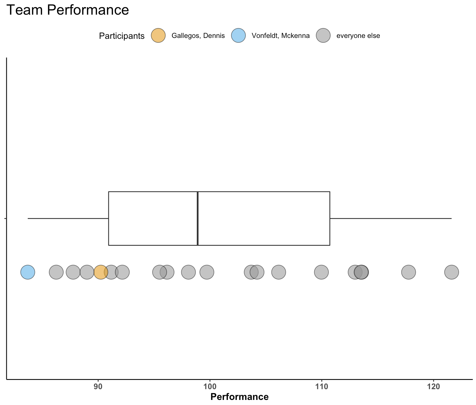
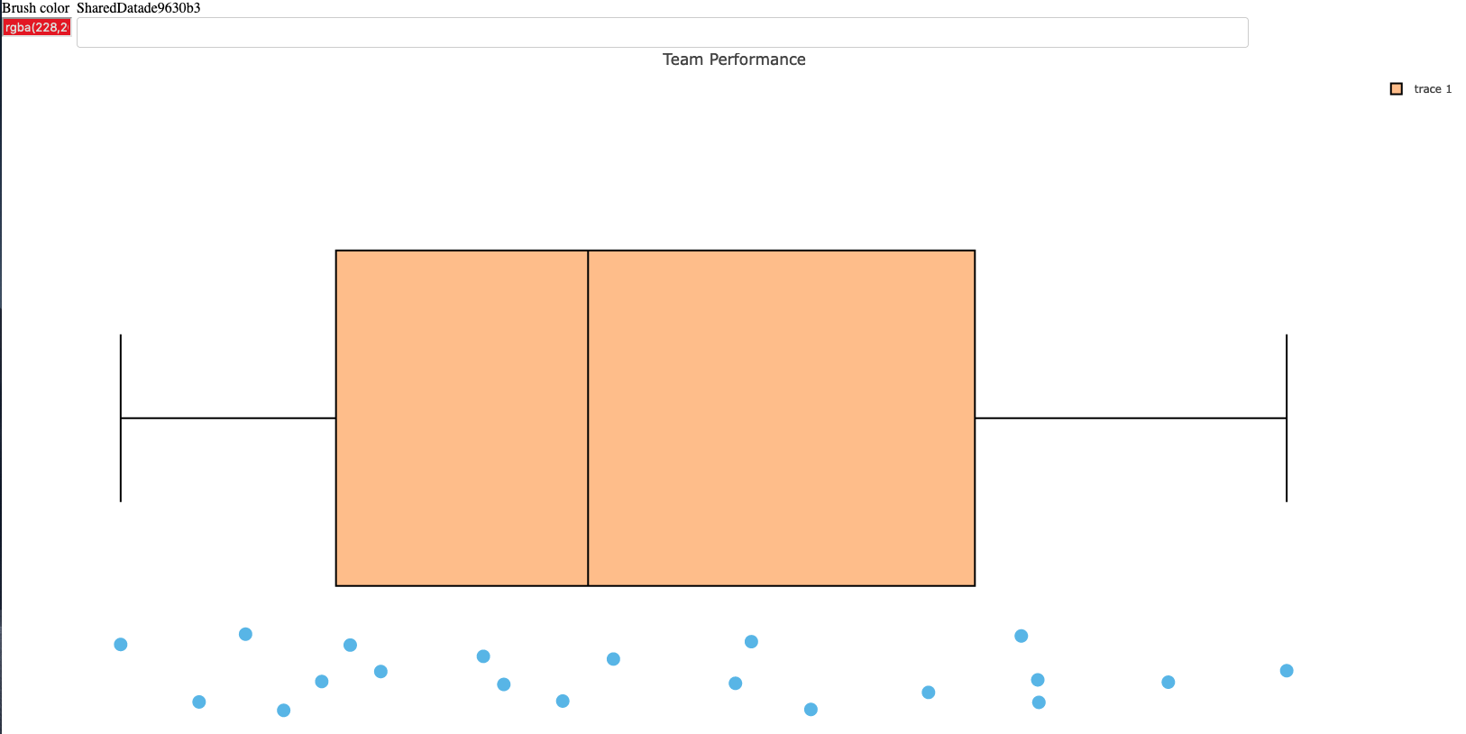
  • Statically, we can see the plot below and if you click on the red link beneath it you will be taken to the interactive version, where you can hover over the points and see the individual athlete’s name and performance on the test.

interactive_plt1


Interactive plotly with selector option

Next, we build the same plot but add a selector box so that the user can select the individual of interest and see their point relative to the boxplot (the population data).

This approach requires a few steps:

  • I have to create a highlight key to explicitly tell plotly that I want to be able to highlight the participants.
  • Next I create the base plot but this time instead of using the original data, I pass in the highlight key that I created in step 1.
  • I build the plot just like before.
  • Once the plot has been built I use the highlight() function to tell plotly how I want the plot to behave.

NOTE: This approach is super useful and easy and doesn’t require a shiny server to share the results. That said, I find this aspect of plotly to be a bit clunky and, when given the choice between this or using shiny, I take shiny because it has a lot more options to customize it exactly how you want. The downside is that you’d need a shiny server to share your results with colleagues or decision-makers, so there is a trade off.

### plotly with selection box -------------------------------------------
# set 'particpant' as the group to select
person_of_interest <- highlight_key(dat, ~participant)

# create a new base plotly plot using the person_of_interest_element
selection_perf_plt <- plot_ly(person_of_interest, type = "box") %>%
  group_by(participant)

# build the plot
plt_selector <- selection_perf_plt %>%
  group_by(participant) %>%
  add_boxplot(x = ~performance,
              boxpoints = "all",
              line = list(color = 'black'),
              text = ~participant,
              marker = list(color = '#56B4E9',
                            size = 15)) %>% 
  layout(yaxis = list(showticklabels = FALSE)) %>%
  layout(xaxis = list(title = "Performance")) %>%
  layout(title = "Team Performance")   

# create the selector tool
plt_selector %>%
  highlight(on = 'plotly_click',
              off = 'plotly_doubleclick',
              selectize = TRUE,
              dynamic = TRUE,
              persistent = TRUE)


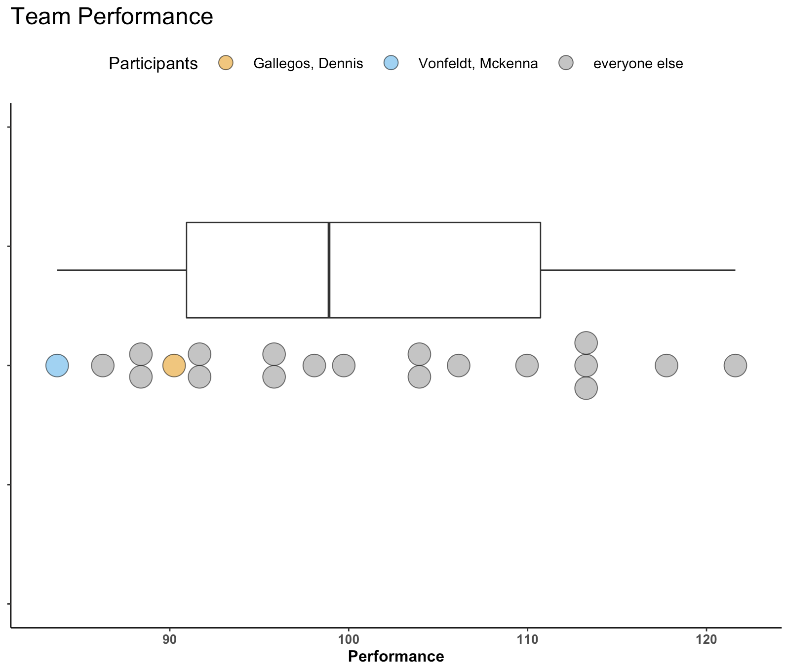
  • Statically, we can see what the plot looks like below.
  • Below the static image you can click the red link to see me walk through the interactive plot. Notice that as I select participants it selects them out. I can add as many as I want and change color to highlight certain participants over others. Additionally, once I begin to remove participants you’ll notice that plotly will create a boxplot for the selected sub population, which may be useful when communicating performance results.
  • Finally, the last red link will allow you to open the interactive tool yourself and play around with it.

interactive_plt2_video

interactive_plt2

Wrapping Up

Today’s article provided some interactive options for the static plots that were created in yesterday’s blog article.

As always, the complete code for this article is available on my GITHUB page.

Box & Dotplots for Performance Visuals

A colleague recently asked me about visualizing athlete performance of athletes relative to their teammates. More specifically, they wanted something that showed some sort of team average and normal range and then a way to highlight where the individual athlete of interest resided within the population.

Immediately, my mind went to some type of boxplot visualization combined with a dotplot where the athlete can clearly identified. Here are a few examples I quickly came up with.

Simulate Performance Data

First we will simulate some performance data for a group of athletes.

### Load libraries -----------------------------------------------
library(tidyverse)
library(randomNames)

### Data -------------------------------------------------------
set.seed(2022)
dat <- tibble(
  participant = randomNames(n = 20),
  performance = rnorm(n = 20, mean = 100, sd = 10))

Plot 1 – Boxplot with Points

The first plot is a simple boxplot plot with dots below it.

A couple of notes:

  • I’ve selected a few athletes to be our “of_interest” players for the plot.
  • This plot doesn’t have a y-axis, since all I am doing is plotting the boxplot for the distribution of performance. Therefore, I set the y-axis variable to a factor, so that is simply identifies a space within the grid to organize my plot.
  • I’m using a colorblind friendly palette to ensure that the colors are viewable to a broad audience.
  • Everything else after that is basic {ggplot2} code with some simple theme styling for the plot space and the legend position.
dat %>%
  mutate(of_interest = case_when(participant %in% c("Gallegos, Dennis", "Vonfeldt, Mckenna") ~ participant,
                                 TRUE ~ "everyone else")) %>%
  ggplot(aes(x = performance, y = factor(0))) +
  geom_boxplot(width = 0.2) +
  geom_point(aes(x = performance, y = factor(0),
                  fill = of_interest),
              position = position_nudge(y = -0.2),
              shape = 21,
              size = 8,
              color = "black",
              alpha = 0.6) +
  scale_fill_manual(values = c("Gallegos, Dennis" = "#E69F00", "Vonfeldt, Mckenna" = "#56B4E9", "everyone else" = "#999999")) +
  labs(x = "Performance",
       title = "Team Performance",
       fill = "Participants") +
  theme_classic() +
  theme(axis.text.y = element_blank(),
        axis.title.y = element_blank(),
        axis.text.x = element_text(size = 10, face = "bold"),
        axis.title.x = element_text(size = 12, face = "bold"),
        plot.title = element_text(size = 18),
        legend.position = "top")

Not too bad! You might have more data than we’ve simulated and thus the inline dots might start to get busy. We can use geom_dotplot() to create separation between dots in areas where there is more density and expose that density of performance scores a bit better.

Plot 2 – Boxplot with Dotplots

Swapping out geom_point() with geom_dotplot() allows us to produce the same plot above just with a dotplot.

  • Here, I set “y = positional” since, as before, we don’t have a true y-axis. Doing so allows me to specify where on the y-axis I want to place by boxplot and dotplot in their respective aes().
# Horizontal
dat %>%
  mutate(of_interest = case_when(participant %in% c("Gallegos, Dennis", "Vonfeldt, Mckenna") ~ participant,
                                 TRUE ~ "everyone else")) %>%
  ggplot(aes(x = performance, y = positional)) +
  geom_boxplot(aes(y = 0.2),
    width = 0.2) +
  geom_dotplot(aes(y = 0, 
                   fill = of_interest),
              color = "black",
              stackdir="center",
              binaxis = "x",
              alpha = 0.6) +
  scale_fill_manual(values = c("Gallegos, Dennis" = "#E69F00", "Vonfeldt, Mckenna" = "#56B4E9", "everyone else" = "#999999")) +
  labs(x = "Performance",
       title = "Team Performance",
       fill = "Participants") +
  theme_classic() +
  theme(axis.text.y = element_blank(),
        axis.title.y = element_blank(),
        axis.text.x = element_text(size = 10, face = "bold"),
        axis.title.x = element_text(size = 12, face = "bold"),
        plot.title = element_text(size = 18),
        legend.position = "top",
        legend.title = element_text(size = 13),
        legend.text = element_text(size = 11),
        legend.key.size = unit(2, "line")) 

If you don’t like the idea of a horizontal plot you can also do it in vertical.

# vertical
dat %>%
  mutate(of_interest = case_when(participant %in% c("Gallegos, Dennis", "Vonfeldt, Mckenna") ~ participant,
                                 TRUE ~ "everyone else")) %>%
  ggplot(aes(x=positional, y= performance)) +
  geom_dotplot(aes(x = 1.75, 
                   fill = of_interest), 
               binaxis="y", 
               stackdir="center") +
  geom_boxplot(aes(x = 2), 
               width=0.2) +
  scale_fill_manual(values = c("Gallegos, Dennis" = "#E69F00", "Vonfeldt, Mckenna" = "#56B4E9", "everyone else" = "#999999")) +
  labs(y = "Performance",
       title = "Team Performance",
       fill = "Participants") +
  theme_classic() +
  theme(axis.text.x = element_blank(),
        axis.title.x = element_blank(),
        axis.text.y = element_text(size = 10, face = "bold"),
        axis.title.y = element_text(size = 12, face = "bold"),
        plot.title = element_text(size = 18),
        legend.position = "top",
        legend.title = element_text(size = 13),
        legend.text = element_text(size = 11),
        legend.key.size = unit(2, "line")) +
  xlim(1.5, 2.25)

Wrapping Up

Visualizing an athlete’s performance relative to their team or population can be a useful for communicating data. Boxplots with dotplots can be a compelling way to show where an athlete falls when compared to their peers. Other options could have been to show a density plot with points below it (like a Raincloud plot). However, I often feel like people have a harder time grasping a density plot whereas the the boxplot clearly gives them an average (line inside of the box) and some “normal” range (interquartile range, referenced by the box) to anchor themselves to. Finally, this plot can easily be built into an interactive plot using Shiny.

All of the code for this article is available on my GITHUB page.

TidyX 128: Advent of Code Day 1 – Tricks with setting indexes

This week, Ellis Hughes and I go over Advent of Code Day 1. For those that don’t know, Advent of Code is a fun thing to do around the holidays. The producer creates a new computer science type problem to solve each day and you can solve it in whatever computer language you would like.

We decided to tackle the first day of Advent of Code, where you were provided a bunch of data that required you to create summary statistics. The catch is that the data didn’t have any indexes to it. It was simply a text file with spaces that indicated where one group of observations end and another group of observations begin. To handle this, Ellis and I show two different options for how to identify indexes for the groups of unique observations and build a usable data frame for answering the problem statement.

To watch our screen cast, CLICK HERE.

To access our code, CLICK HERE.

TidyX 127: Fuzzy Name Joining

This week, Ellis Hughes and I tackle a question from one of our patreon viewers. The individual was curious about name matching when dealing with a large amount of public sports data sets. For anyone working in analysis and dealing with public data sets, name matching can be the bane of your existence. Each website seems to have its own unique way of spelling the names for people. To work this out, we create a small sample of data and talk through two different way to to handle the issue.

To watch our screen cast, CLICK HERE.

To access our code, CLICK HERE.

TidyX 126: Keeping duplicates when pivoting wider

Working more on data engineering/data cleaning steps, Ellis and I talk about the pivot_wider() function within {tidyverse}. One of the issues is that when pivoting a data set to a wide format, if you have duplicate rows in the id columns pivot_wider() will collapse them into a list. This may be problematic if you are needing to retain all rows in the original data set. Thus, Ellis and I discuss a method to pivot_wider() while retaining all rows of data, even when there are duplicate values in the id_cols.

To view the screen cast, CLICK HERE.

To access our code, CLICK HERE.