Category Archives: Sports Analytics

Two Group Comparison – Frequentist vs Bayes – Part 1

One of the more common types of analysis conducted in science is the comparison of two groups (e.g., a treatment group and a control group) to identify whether an intervention had a desired effect. The problem, in sport science and other fields, is often a lack of participants (small sample sizes) and an inability to combine prior knowledge (e.g., outcomes from previous research or domain expertise) with the observed data in order to make a broader statement of our findings (IE, a Bayesian approach). Consequently, this leaves us analyzing the data on hand and reporting whatever potential findings shake out.

This tutorial will step through a two group comparison of some simulated data from both a frequentist (t-test) and Bayesian approach.

All code is accessible on my GITHUB page.

Two Groups – Simulated Data

We are conducting a study on the effect of a new strength training program. Participants are randomly allocated into a control group (n = 17), receiving a normal training program, or an experimental group (n = 22), receiving the new training program.

The data consists of the change in strength score observed for each participant in their respective groups. (NOTE: For the purposes of this example, the strength score is a made up number describing a participants strength).

Simulate the data

library(tidyverse)
library(patchwork)

theme_set(theme_classic())

set.seed(6677)
df <- data.frame( subject = 1:39, group = c(rep("control", times = 17), rep("experimental", times = 22)), strength_score_change = c(round(rnorm(n = 17, mean = 0, sd = 0.5), 1), round(rnorm(n = 22, mean = 0.5, sd = 0.5), 1)) ) %>%
  mutate(group = factor(group, levels = c("experimental", "control")))


Summary Statistics

df %>%
  group_by(group) %>%
  summarize(N = n(),
            Avg = mean(strength_score_change),
            SD = sd(strength_score_change),
            SE = SD / sqrt(N))
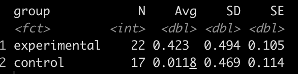

It looks like the new strength training program led to a greater improvement in strength, on average, than the normal strength training program.

Plot the data

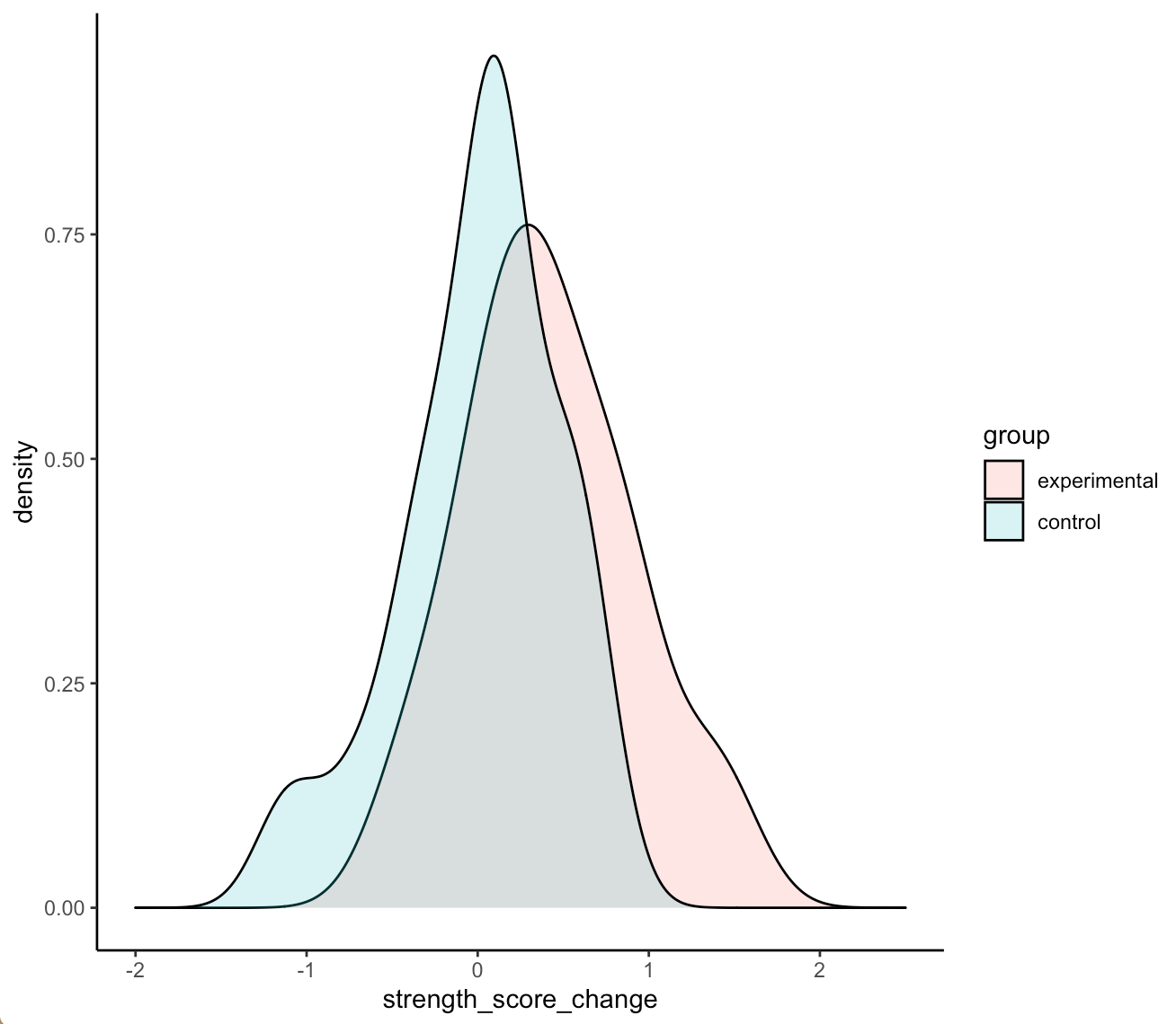
Density plots of the two distributions

df %>%
  ggplot(aes(x = strength_score_change, fill = group)) +
  geom_density(alpha = 0.2) +
  xlim(-2, 2.5)

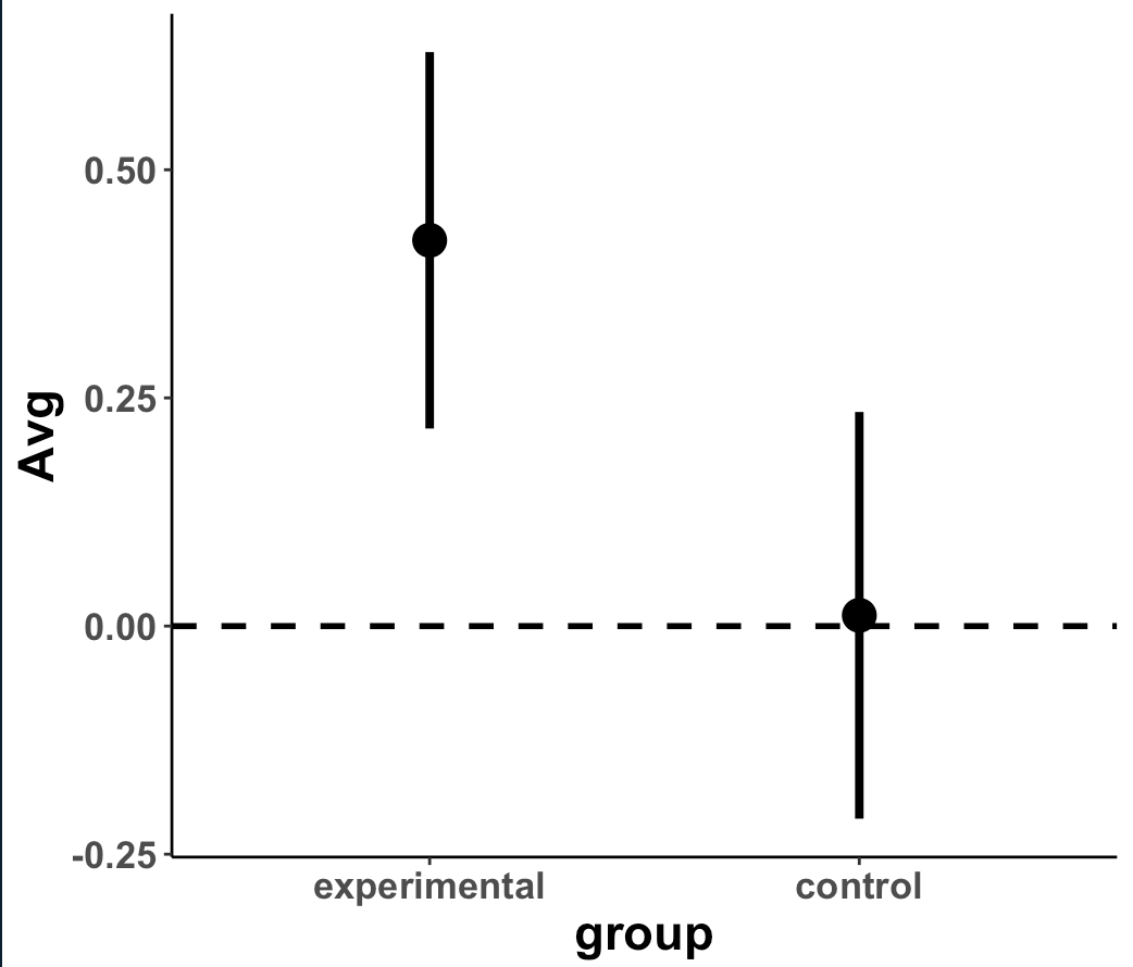
Plot the means and 95% CI to compare visually

df %>%
  group_by(group) %>%
  summarize(N = n(),
            Avg = mean(strength_score_change),
            SD = sd(strength_score_change),
            SE = SD / sqrt(N)) %>%
  ggplot(aes(x = group, y = Avg)) +
  geom_hline(yintercept = 0,
             size = 1,
             linetype = "dashed") +
  geom_point(size = 5) +
  geom_errorbar(aes(ymin = Avg - 1.96 * SE, ymax = Avg + 1.96 * SE),
                width = 0,
                size = 1.4) +
  theme(axis.text = element_text(face = "bold", size = 13),
        axis.title = element_text(face = "bold", size = 17))
Plot the 95% CI for the difference in means

df %>%
  mutate(group = factor(group, levels = c("control", "experimental"))) %>%
  group_by(group) %>%
  summarize(N = n(),
            Avg = mean(strength_score_change),
            SD = sd(strength_score_change),
            SE = SD / sqrt(N),
            SE2 = SE^2,
            .groups = "drop") %&amp;gt;%
  summarize(diff = diff(Avg),
            se_diff = sqrt(sum(SE2))) %&amp;gt;%
  mutate(group = 'Group\nDifference') %&amp;gt;%
  ggplot(aes(x = diff, y = 'Group\nDifference')) +
  geom_vline(aes(xintercept = 0),
             linetype = "dashed",
             size = 1.2) +
  geom_point(size = 5) +
  geom_errorbar(aes(xmin = diff - 1.96 * se_diff,
                    xmax = diff + 1.96 * se_diff),
                width = 0,
                size = 1.3) +
  xlim(-0.8, 0.8) +
  labs(y = NULL,
       x = "Average Difference in Strengh Score",
       title = "Difference in Strength Score",
       subtitle = "Experimental - Control (Mean Difference ± 95% CI)") +
  theme(axis.text = element_text(face = "bold", size = 13),
        axis.title = element_text(face = "bold", size = 17),
        plot.title = element_text(size = 20),
        plot.subtitle = element_text(size = 18))

Initial Observations

  • We can see that the two distributions have a decent amount of overlap
  • The mean change in strength for the experimental group appears to be larger than the mean change in strength for the control group
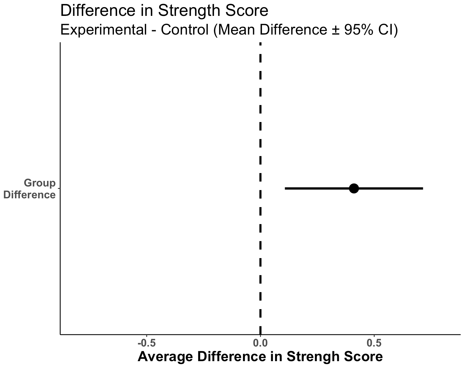
  • When visually comparing the group means and their associated confidence intervals, there is an observable difference. Additionally, looking at the mean difference plot, that difference appears to be significant based on the fact that the confidence interval does not cross zero.

So, it seems like something is going on here with the new strength training program. Let’s do some testing to see just how large the difference is between our two groups.

Group Comparison: T-test

First, let’s use a frequentist approach to evaluating the difference in strength score change between the two groups. We will use a t-test to compare the mean differences.

diff_t_test <- t.test(strength_score_change ~ group,
       data = df,
       alternative = "two.sided")

## store some of the main values in their own elements to use later
t_test_diff  <- as.vector(round(diff_t_test$estimate[1] - diff_t_test$estimate[2], 2))

se_diff <- 0.155    # calculated above when creating the plot

diff_t_test
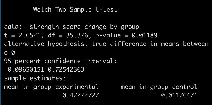
  • The test is statistically significant, as the p-value is less than the magic 0.05 (p = 0.01) with a mean difference in strength score of 0.41 and a 95% Confidence Interval of 0.1 to 0.73.

Here, the null hypothesis was that the difference in strength improvement between the two groups is 0 (no difference) while the alternative hypothesis is that the difference is not 0. In this case, we did a two sided test so we are stating that we want to know if the change in strength from the new training program is either better or worse than the normal training program. If we were interested in testing the difference in a specific direction, we could have done a one sided test in the direction of our hypothesis, for example, testing whether the new training program is better than the normal program.

But, what if we just got lucky with our sample in the experimental group, and they happened to respond really well to the new program, and got unlucky in our control group, and they happened to not change as much to the normal training program? This could certainly happen. Also, had we collected data on a few more participants, it is possible that the group means could have changed and no effect was observed.

The t-test only allows us to compare the group means. It doesn’t tell us anything about the differences in variances between groups (we could do an F-test for that). The other issue is that rarely is the difference between two groups exactly 0. It makes more sense for us to compare a full distribution of the data and make an inference about how much difference there is between the two groups. Finally, we are only dealing with the data we have on hand (the data collected for our study). What if we want to incorporate prior information/knowledge into the analysis? What if we collect data on a few more participants and want to add that to what we have already observed to see how it changes the distribution of our data? For that, we can use a Bayesian approach.

Group Comparison: Bayes

The two approaches we will use are:

  1. Group comparison with a known variance, using conjugate priors
  2. Group comparisons without a know variance, estimating the mean and SD distributions jointly

Part 1: Group Comparison with known variance

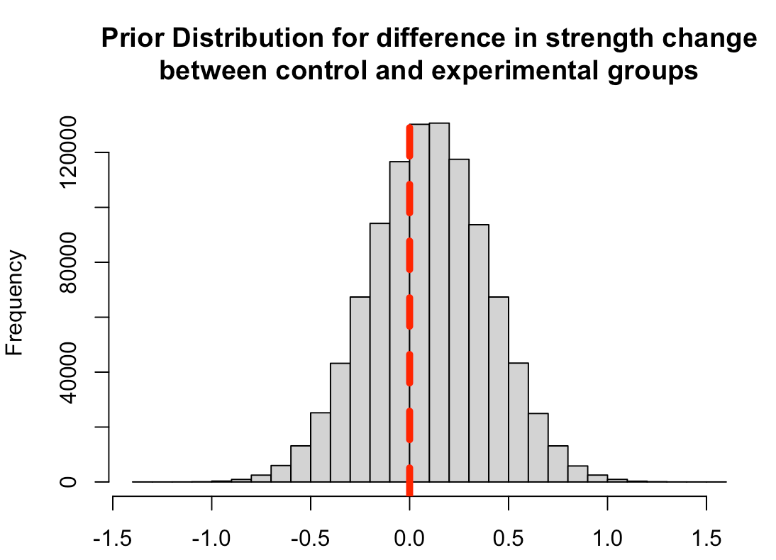
First, we need to set some priors. Let’s say that we are skeptical about the effect of the new strength training program. It is a new training stimulus that the subjects have never been exposed to, so perhaps we believe that it will improve strength but not much more than the traditional program. We will set our prior belief about the mean improvement of any strength training program to be 0.1 with a standard deviation of 0.3, for our population.  Thus, we will look to combine this average/expected improvement (prior knowledge) with the observations in improvement that we see in our respective groups. Finally, we convert the standard deviation of the mean to precision, calculated as 1/sd^2, for our equations going forward.

prior_mu <- 0.1
prior_sd <- 0.3
prior_var <- prior_sd^2
prior_precision <- 1 / prior_var

Plot the prior distribution for the mean difference

hist(rnorm(n = 1e6, mean = prior_mu, sd = prior_sd),
     main = "Prior Distribution for difference in strength change\nbetween control and experimental groups",
     xlab = NULL)
abline(v = 0,
       col = "red",
       lwd = 5,
       lty = 2)
Next, to make this conjugate approach work we need to have a known standard deviation. In this example, we will not be estimating the joint posterior distributions (mean and SD). Rather, we are saying that we are interested in knowing the mean and the variability around it but we are going to have a fixed/known SD.

Let’s say we looked at some previously published scientific literature and also tried out the new program in a small pilot study of athletes and we the improvements of a strength training program are normally distributed with a known SD of 0.6.

known_sd <- 0.6
known_var <- known_sd^2

Finally, let’s store the summary statistics for each group in their own elements. We can type these directly in from our summary table.

df %>%
  group_by(group) %>%
  summarize(N = n(),
            Avg = mean(strength_score_change),
            SD = sd(strength_score_change),
            SE = SD / sqrt(N))

experimental_N <- 22
experimental_mu <- 0.423
experimental_sd <- 0.494
experimental_var <- experimental_sd^2
experimental_precision <- 1 / experimental_var

control_N <- 17
control_mu <- 0.0118
control_sd <- 0.469
control_var <- control_sd^2
control_precision <- 1 / control_var

Now we are ready to update the observed study data for each group with our prior information and obtain posterior estimates. We will use the updating rules provided by William Bolstad in Chapter 13 of his book, Introduction to Bayesian Statistics, 2nd Ed.

##### Update the control group observations ######
## SD
posterior_precision_control <- prior_precision + control_N / known_var
posterior_var_control <- 1 / posterior_precision_control
posterior_sd_control <- sqrt(posterior_var_control)

## mean
posterior_mu_control <- prior_precision / posterior_precision_control * prior_mu + (control_N / known_var) / posterior_precision_control * control_mu

posterior_mu_control
posterior_sd_control

##### Update the experimental group observations ######
## SD
posterior_precision_experimental <- prior_precision + experimental_N / known_var
posterior_var_experimental <- 1 / posterior_precision_experimental
posterior_sd_experimental <- sqrt(posterior_var_experimental)

## mean
posterior_mu_experimental <- prior_precision / posterior_precision_experimental * prior_mu + (experimental_N / known_var) / posterior_precision_experimental * experimental_mu

posterior_mu_experimental
posterior_sd_experimental

Compare the posterior difference in strength change

# mean
mu_diff <- posterior_mu_experimental - posterior_mu_control
mu_diff

# sd = sqrt(var1 + var2)
sd_diff <- sqrt(posterior_var_experimental + posterior_var_control)
sd_diff

# 95% Credible Interval
mu_diff + qnorm(p = c(0.025, 0.975)) * sd_diff

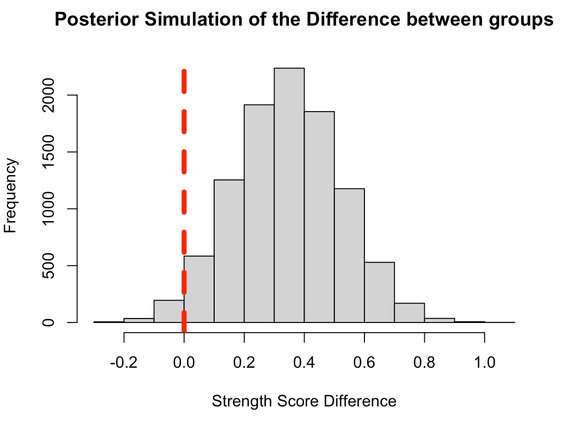
  • Combining the observations for each group with our prior, it appears that the new program was more effective than the normal program on average (0.34 difference in change score between experimental and control) but the credible interval suggests the data is consistent with the new program having no extra benefit [95% Credible Interval: -0.0003 to 0.69].

Next, we can take the posterior parameters and perform a Monte Carlo Simulation to compare the posterior distributions.

Monte Carlo Simulation is an approach that uses random sampling from a defined distribution to solve a problem. Here, we will use Monte Carlo Simulation to sample from the normal distributions of the control and experimental groups as well as a simulation for the difference between the two. To do this, we will create a random draw of 10,000 values with the mean and standard deviation being defined as the posterior mean and standard deviation from the respective groups.

## Number of simulations
N <- 10000

## Monte Carlo Simulation
set.seed(9191)
control_posterior <- rnorm(n = N, mean = posterior_mu_control, sd = posterior_sd_control)
experimental_posterior <- rnorm(n = N, mean = posterior_mu_experimental, sd = posterior_sd_experimental)
diff_posterior <- rnorm(n = N, mean = mu_diff, sd = sd_diff)

## Put the control and experimental groups into a data frame
posterior_df <- data.frame(
  group = c(rep("control", times = N), rep("experimental", times = N)),
  posterior_sim = c(control_posterior, experimental_posterior)
)

Plot the mean and 95% CI for both simulated groups

posterior_df %>%
  group_by(group) %>%
  summarize(Avg = mean(posterior_sim),
            SE = sd(posterior_sim)) %>%
  ggplot(aes(x = group, y = Avg)) +
  geom_hline(yintercept = 0,
             size = 1,
             linetype = "dashed") +
  geom_point(size = 5) +
  geom_errorbar(aes(ymin = Avg - 1.96 * SE, ymax = Avg + 1.96 * SE),
                width = 0,
                size = 1.4) +
  labs(x = NULL,
       y = "Mean Diff",
       title = "Difference in Strength Score",
       subtitle = "Monte Carlo Simulation of Posterior Mean and SD") +
  theme(axis.text = element_text(face = "bold", size = 13),
        axis.title = element_text(face = "bold", size = 17),
        plot.title = element_text(size = 20),
        plot.subtitle = element_text(size = 17))
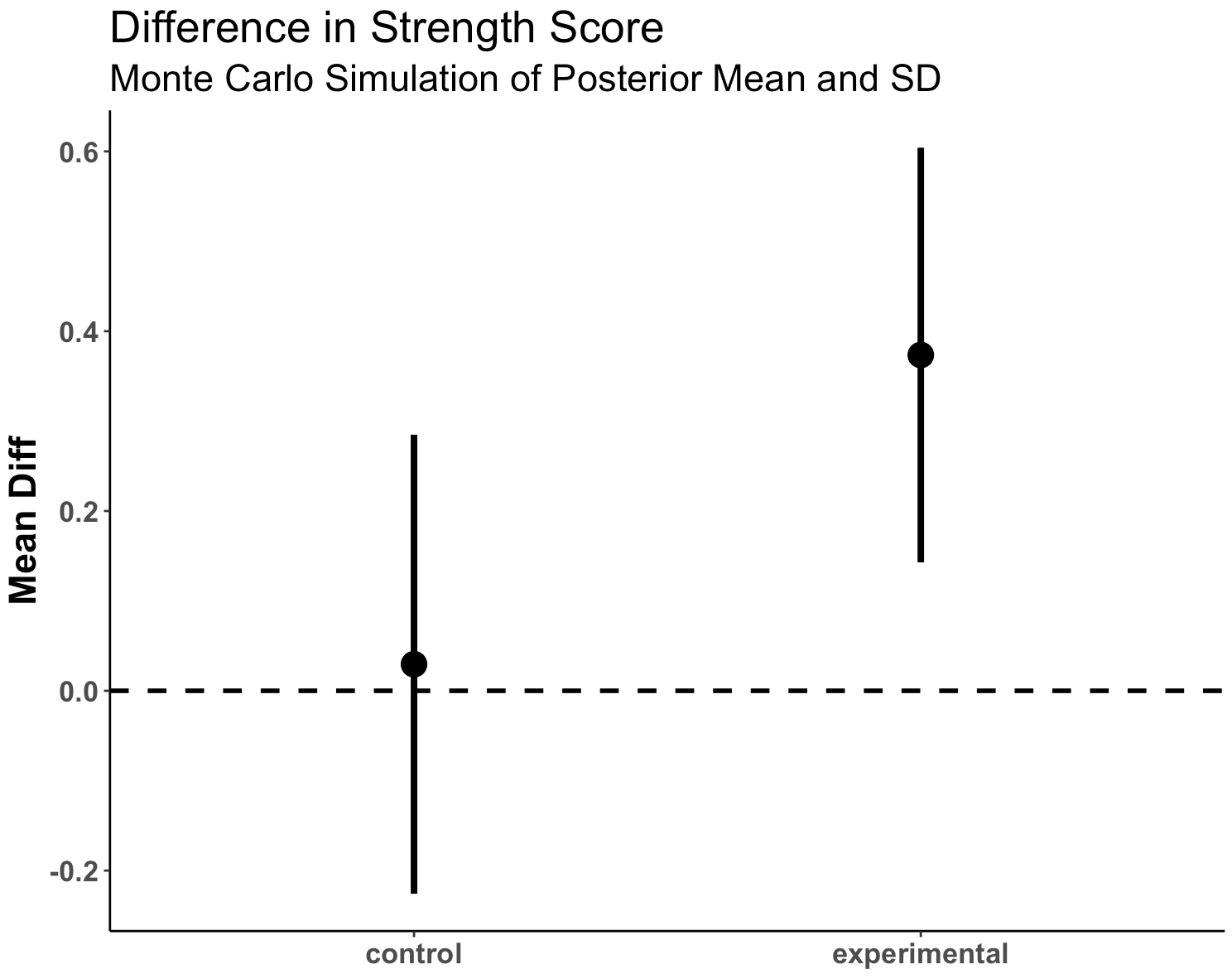
  • We see more overlap here than we did when we were just looking at the observed data. Part of this is due to the priors that we set.

Plot the posterior simulation for the difference

hist(diff_posterior,
     main = "Posterior Simulation of the Difference between groups",
     xlab = "Strength Score Difference")
abline(v = 0,
       col = "red",
       lwd = 5,
       lty = 2)
Compare these results to the observed data and the t-test results

data.frame(
  group = c("control", "experimental", "difference"),
  observed_avg = c(control_mu, experimental_mu, t_test_diff),
  posterior_sim_avg = c(posterior_mu_control, posterior_mu_experimental, mu_diff),
  observed_standard_error = c(control_sd / sqrt(control_N), experimental_sd / sqrt(experimental_N), se_diff),
  posterior_sim_standard_error = c(posterior_sd_control, posterior_sd_experimental, sd_diff)
  )

  • Recall that we set out prior mean to 0.1 and our prior SD to 0.3
  • Also notice that, because this conjugate approach is directed at the means, I convert the observed standard deviations into standard errors (the standard deviation of the mean given the sample size). Remember, we set the SD to be known for this approach to work, so we are not able to say anything about it following our Bayesian procedure. To do so, we’d need to estimate both parameters (mean and SD) jointly. We will do this in part 2.
  • Above, we see that, following the Bayesian approach, the mean value of the control group gets pulled up closer to our prior while the mean value of the experimental group gets pulled down closer to that prior.
  • The posterior for the difference between the two groups, which is what we are interested in, has come down towards the prior, considerably. Had we had a larger sample of data in our two groups, the movement towards the prior would have been less extreme. But, since this was a relatively small study we get more movement towards the prior, placing less confidence in the observed sample of participants we had. We also see that the standard error around the mean difference increased, since our prior SD was 0.3. So, the mean difference decreased a bit and the standard error around that mean increased a bit. Both occurrences lead to less certainty in our observed outcomes.

Compare the Observed Difference to the Bayesian Posterior Difference

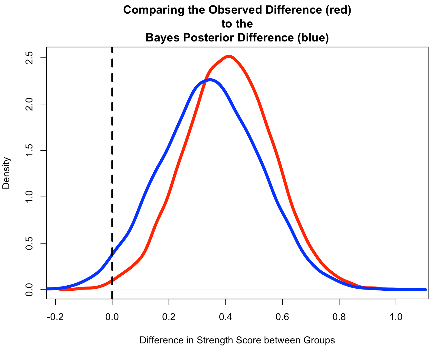
  • Start by creating a Monte Carlo Simulation of the observed difference from the original data.
  • Notice that the Bayesian Posterior Difference (blue) is pulled down towards our prior, slightly.
  • We also see that the Bayesian Posterior has more overlap of 0 than the Observed Difference (red) from the original data, which had a small sample size and hadn’t combined any prior knowledge that we might have had.
N <- 10000

set.seed(8945)
observed_diff <- rnorm(n = N, mean = t_test_diff, sd = se_diff)

plot(density(observed_diff),
     lwd = 5,
     col = "red",
     main = "Comparing the Observed Difference (red)\nto the\nBayes Posterior Difference (blue)",
     xlab = "Difference in Strength Score between Groups")
lines(density(diff_posterior),
      lwd = 5,
      col = "blue")
abline(v = 0,
       lty = 2,
       lwd = 3,
       col = "black")
Wrapping Up

That’s it for part 1. We’ve computed a frequentist t-test of the observed data in our study and compared those results to Bayesian estimation where we combined the observed data with some prior knowledge that we accessed from previous research and domain expertise. In this example, we used a conjugate approach and therefore were required to specify a known standard deviation for the data. Unfortunately, this may not always make sense to do and we may instead need to jointly estimating both the mean and standard deviation simultaneously. In part 2, we will discuss how to do this.

The code for this article is accessible on my GITHUB page.

If you see any code or mathematical errors, please email me.
Neural Networks….It’s regression all the way down!

Yesterday, I talked about how t-test and ANOVA are fundamentally just linear regression. But what about something more complex? What about something like a neural network?

Whenever people bring up neural networks I always say, “The most basic neural network is a sigmoid function. It’s just logistic regression!!” Of course, neural networks can get very complex and there is a lot more than can be added to them to maximize their ability to do the job. But fundamentally, they look like regression models and  when you add several hidden layers (deep learning) you end up just stacking a bunch of regression models on top of each other (I know I’m over simplifying this a little bit).

Let’s see if we can build a simple neural network to prove it. As always, you can access the full code on my GITHUB page.

Loading packages, functions, and data

We will load {tidyverse} for data cleaning, {neuralnet} for building our neural network, and {mlbench} to access the Boston housing data.

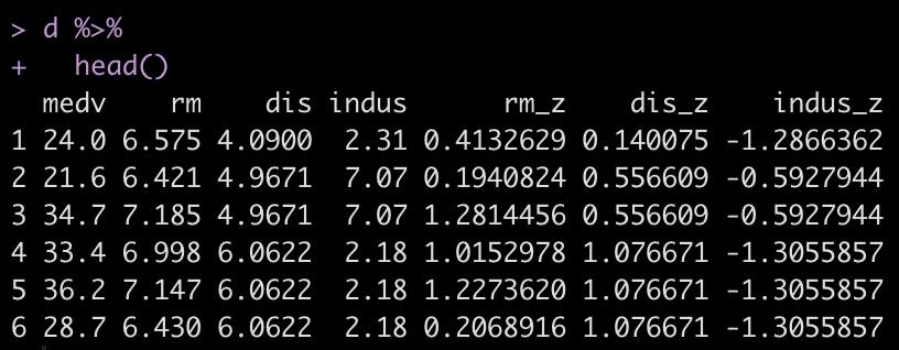
I create a z-score function that will be used to standardize the features for our model. We will keep this simple and attempt to predict Boston housing prices (mdev) using three features (rm, dis, indus). To read more about what these features are, in your R console type ?BostonHousing. Once we’ve selected those features out of the data set, we apply our z-score function to them.

## Load packages
library(tidyverse)
library(neuralnet)
library(mlbench)

## z-score function
z_score <- function(x){
  z <- (x - mean(x, na.rm = TRUE)) / sd(x, na.rm = TRUE)
  return(z)
}

## get data
data("BostonHousing")

## z-score features
d <- BostonHousing %>%
  select(medv, rm, dis, indus) %>%
  mutate(across(.cols = rm:indus,
                ~z_score(.x),
                .names = "{.col}_z"))
  
d %>% 
  head()

Train/Test Split

There isn’t much of a train/test split here because I’m not building a full model to be tested. I’m really just trying to show how a neural network works. Thus, I’ll select the first row of data as my “test” set and retain the rest of the data for training the model.

## remove first observation for making a prediction on after training
train <- d[-1, ]
test <- d[1, ]

Neural Network Model

We build a simple model with 1 hidden layer and then plot the output. In the plot we see various numbers. The numbers in black refer to our weights and the numbers in blue refer to the biases.

## Simple neural network with one hidden layer
set.seed(9164)
fit_nn <- neuralnet(medv ~ rm_z + dis_z + indus_z,
                    data = train,
                    hidden = 1,
                    err.fct = "sse",
                    linear.output = TRUE)

## plot the neural network
plot(fit_nn)

Making Predictions — It’s linear regression all the way down!

As stated above, we have weights (black numbers) and biases (blue numbers). If we are trying to frame up the neural network as being a bunch of stacked together linear regressions then we can think about the weights as functioning like regression coefficients and the biases functioning like the linear model intercept.

Let’s take each variable from the plot and store them in their own elements so that we can apply them directly to our test observation and write out the equation by hand.

## Predictions are formed using the weights (black) and biases
# Store the weights and biases from the plot and put them into their own elements
rm_weight <- 1.09872
dis_weight <- -0.05993
indus_weight <- -0.49887

# There is also a bias in the hidden layer
hidden_weight <- 35.95032

bias_1 <- -1.68717
bias_2 <- 14.85824

With everything stored, we are ready to make a prediction on the test observations

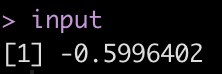
We begin at the input layer by multiplying each z-scored value by the corresponding weight from the plot above. We sum those together and add in the first bias — just like we would with a linear regression.

# Start by applying the weights to their z-scored values, sum them together and add
# in the first bias
input <- bias_1 + test$rm_z * rm_weight + test$dis_z * dis_weight + test$indus_z * indus_weight
input

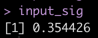
One regression down, one more to go! But before we can move to the next regression, we need to transform this input value. The neural network is using a sigmoid function to make this transformation as the input value moves through the hidden layer. So, we should apply the sigmoid function before moving on.

# transform input -- the neural network is using a sigmoid function
input_sig <- 1/(1+exp(-input))
input_sig


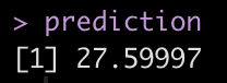
We take this transformed input and multiply it by the hidden weight and then add it to the second bias. This final regression equation produces the predicted value of the home.
prediction <- bias_2 + input_sig * hidden_weight
prediction


The prediction here is in the thousands, relative to census data from the 1970’s.

Let’s compare the prediction we got by hand to what we get when we run the predict() function.

## Compare the output to what we would get if we used the predict() function
predict(fit_nn, newdata = test)

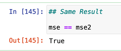
Same result!

Again, if you’d like the full code, you can access it on by GITHUB page.

Wrapping Up

Yesterday we talked about always thinking regression whenever you see a t-test or ANOVA. Today, we learn that we can think regression whenever we see a neural network, as well! By stacking two regression-like equations together we produced a neural network prediction. Imagine if we stacked 20 hidden layers together!

The big take home, though, is that regression is super powerful. Fundamentally, it is the workhorse that helps to drive a number of other machine learning approaches. Imagine if you spent a few years really studying regression models? Imagine what you could learn about data analysis? If you’re up for it, one of my all time favorite books on the topic is Gelman, Hill, and Vehtari’s Regression and Other Stories. I can’t recommend it enough!

t-test…ANOVA…It’s linear regression all the way down!

I had someone ask me a question the other day about t-tests. The question was regarding how to get the residuals from a t-test. The thing we need to remember about t-tests and ANOVA is that they are general linear models. As such, an easier way of thinking about them is that they are a different way of looking at a regression output. In this sense, a t-test is just a simple linear regression with a single categorical predictor (independent) variable  that has two levels (e.g., Male & Female) while ANOVA is a simple linear regression with a single predictor variable that has more than two levels (e.g., Cat, Dog, Fish).

Let’s look at an example!

Complete code is available on my GITHUB page.

Load Data

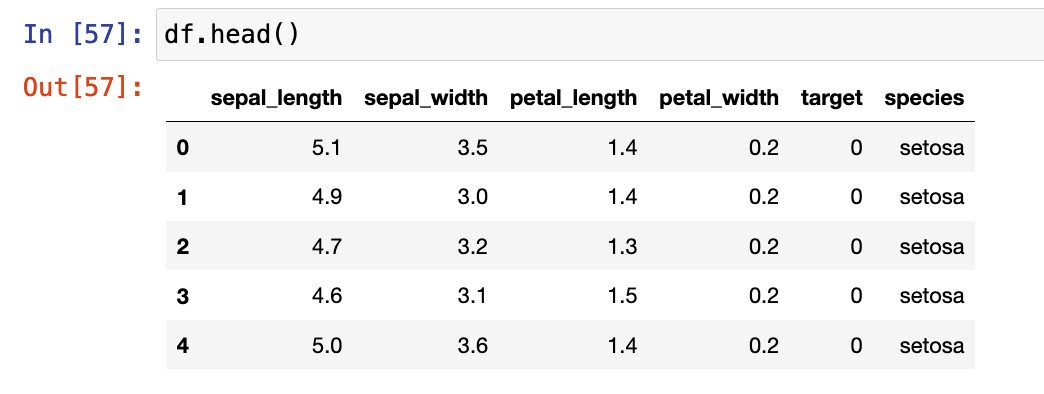
The data we will use is the iris data set, available in the numpy library.

Exploratory Data Analysis

The Jupyter Notebook I’ve made available on GITHUB has a number of EDA steps. For this tutorial the variable we will look at is Sepal Length, which appears to different between Species.

T-test

We will start by conducting a t-test. Since a t-test is a comparison of means between two groups, I’ll create a data set with only the setosa and versicolor species.

## get two groups to compare
two_groups = ["setosa", 'versicolor']

## create a data frame of the two groups
df2 = df[df['species'].isin(two_groups)]

First I build the t-test in two common stats libraries in python, statsmodels and scipy.

## t-test in statsmodels.api
smf.stats.ttest_ind(x1 = df2[df['species'] == 'setosa']['sepal_length'],
                    x2 = df2[df['species'] == 'versicolor']['sepal_length'],
                   alternative="two-sided")

## t-test in scipy
stats.ttest_ind(a = df2[df['species'] == 'setosa']['sepal_length'],
                b = df2[df['species'] == 'versicolor']['sepal_length'],
                alternative="two-sided")

Unfortunately, the output of both of these approaches leaves a lot to be desired. They simply return the t-statistics, p-value, and degrees of freedom.

To get a better look at the underlying comparison, I’ll instead fit the t-test using the researchpy library.

## t-test in reserachpy
rp.ttest(group1 = df2[df['species'] == 'setosa']['sepal_length'],
         group2 = df2[df['species'] == 'versicolor']['sepal_length'])

This output is more informative. We can see the summary stats for both groups at the top. the t-test results follow below. We see the observed difference, versicolor has a sepal length 0.93 (5.006 – 5.936) longer that setosa, on average. We also get the degrees of freedom, t-statistic, and p-value, along with several measures of effect size.

Linear Regression

Now that we see what the output looks like, let’s confirm that this is indeed just linear regression!

We fit our model using the statsmodels library.

## Linear model to compare results with t-test (convert the species types of dummy variables)
X = df2[['species']]
X = pd.get_dummies(X['species'], drop_first = True)

y = df2[['sepal_length']]

## add an intercept constant, since it isn't done automatically
X = smf.add_constant(X)

# Build regression model
fit_lm = smf.OLS(y, X).fit()

# Get model output

fit_lm.summary()

Notice that the slope coefficient for versicolor is 0.93, indicating it’s sepal length is, on average, 0.93 greater than setosa’s sepal length. This is the same result we obtained with our t-test above.

The intercept coefficient is 5.006, which means that when versicolor is set to “0” in the model (0 * 0.93 = 0) all we are left with is the intercept, which is the mean value for setosa’s sepal length, the same as we saw in our t-test.

What about the residuals?

The question original question was about residuals from the t-test. Recall, the residuals are the difference between actual/observed value and the predicted value. When we have a simple linear regression with two levels (a t-test) the predicted value is simply the overall mean value for that group.

We can add predictions from the linear regression model into our data set and calculate the residuals, plot the residuals, and then calculate the mean squared error.

## Add the predictions back to the data set
df2['preds'] = fit_lm.predict(X)

## Calculate the residual
resid = df2['sepal_length'] - df2['preds']

## plot the residuals
sns.kdeplot(resid,shade = True)
plt.axvline(x = 0,linewidth=4, linestyle = '--', color='r')

In the code, you will find the same approach taken by just applying the group mean as the “predicted” value, which is the same value that the model predicts. At the bottom of the code, we will find that the outcome of the MSE is the same.

Wrapping Up

In summary, whenever you think t-test or ANOVA, just think linear regression. The intercept will end up reflecting the mean value for the reference class while the coefficient(s) for the other classes of that variable will represent the difference between their mean value and the reference class. If you want to make a comparison to a different reference class, you can change the reference class before specifying your model and you will obtain a different set of coefficients (given that they are compared to a new reference class) but the predicted values, residuals, and MSE will end up being the same.

Again, if you’d like the full code, you can access it HERE.

First time collecting new data on your team? Bayesian updating can help!

A few weeks ago I was speaking with some athletic trainers and strength coaches who work for a university football team. They asked me the following question:

“We are about to start using GPS to collect data on our team. But we have never collected anything in the past. How do we even start to understand whether the training sessions we are doing are normal or not? Do we need to tell the coach that we have to collect data for a full season before we know anything meaningful?”

This is a fascinating question and it is an issue that we all face at some point in the applied setting. Whenever we start with a new data collection method or a new technology it can be daunting to think about how many observations we need in order to start making sense of our data and establishing what is “normal”.

We always have some knowledge!

My initial reaction to the question was, “Why do you believe that you have NOTHING to make a decision on?”

Sure, you currently have no data on your specific team, but that doesn’t mean that you have no prior knowledge or expectations! This is where Bayes can help us out. We can begin collecting data on day 1, combine it with our prior knowledge, and continually update our knowledge until we get to a point where we have enough data on our own team that we no longer need the prior.

Where does our prior knowledge come from?

Establishing the prior in this case can be done in two ways:

  1. Get some video of practices, sit there and watch a few players in each position group and record, to the best you can estimate, the amount of distance they covered for each rep they perform in each training drill.
  2. Pull some of the prior research on college football and try and make a logical estimation of what you’d assume a college football practice to be with respect to various training metrics (total distance, sprints, high speed running, accelerations, etc).

Option 1 is a little time consuming (though you probably wont need to do as many practices as you think) and probably not the option most people want to hear (Side Note, I’ve done this before and, yes, it does take some time but you learn a good deal about practice by manually notating it. When trying to do total distance always remember that if a WR runs a route they have to always run back to the line of scrimmage once the play is over, so factor that into the distance covered in practice).

Option 2 is reasonably simple. Off the top of my head, the two papers that could be useful here are from DeMartini et al (2011) and Wellman et al (2016). The former quantifies training demands in collegiate football practices while the latter is specific to the quantification of competitive demands during games. To keep things brief for the purposes of this blog post, I’ll stick to total distance. I’ve summarized the findings from these papers in the table below.

Notice that the DeMartini paper uses a broader position classification — Linemen or Non-Linemen. As such, it is important to consider that the mean’s and standard deviations might be influenced by the different ergonomic demands of the groups that have been pooled together. Also, DeMartini’s paper is of practice demands, so the overall total distance may differ compared to what we would see in games, which is what Wellman’s data is showing us. All that aside, we can still use this information to get a general sense for a prior.

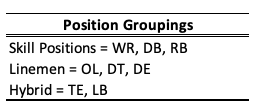
Let’s bin the players into groups that compete against each other and therefore share some level of physical attributes.

Rather than getting overly complicated with Markov Chain Monte Carlo, will use normal-normal conjugate (which we discussed in TidyX 102). This approach provides us a with simple shortcut for performing Bayesian inference when dealing with data coming from a normal distribution. To make this approach work, we need three pieces of prior information from our data:

  1. A prior mean (prior mu)
  2. A prior standard deviation for the mean (sigma) which we will convert to precision (1 / sigma^2)
  3. An assumed/known standard deviation for the data

The first two are rather easy to wrap our heads around. We need to establish a reasonable prior estimate for the average total distance and some measure of variability around that mean. The third piece of information is the standard deviation of the data and we need to assume that it is known and fixed.

We are dealing with a Normal distribution, which is a two parameter distribution, possessing a Mean and Standard Deviation. Both of these parameters have variability around them (they have their own measures of center and dispersion). The Mean is what we are trying to figure out for our team, so we set a prior center (mu) and dispersion (sigma) around it. Because we are stating up front that the Standard Deviation for the population is known, we are not concerned with the dispersion around that variable (if we don’t want to make this assumption we will need to resort to an approach that allows us to determine both of these parameters, such as GIBBS sampling).

Setting Priors

Let’s stick with the Skill Positions for the rest of this article. We can take an average of the WR, DB, and RB distances to get a prior mean. The dispersion around this mean is tricky and Wellman’s paper only tells us the total number of athletes in their sample, not the number of athletes per position. From the table above we see that the WR group has a standard deviation of 996. We will make the assumption that there were 5 WR’s that were tracked and thus the standard error of the mean (the dispersion around the mean) ends up being 996 / sqrt(5) = 445. Since we also have DB’s and RB’s in our skill grouping lets just round that up to 500. Finally, just eyeballing the standard deviations in the table above, I set the known SD for the population of skill positions to be 750. My priors for all three of our position groups are as follows:

Bayesian Updating

Looking at the Skill Positions, what we want to do is observe each training session for our team and update our prior knowledge about the normal amount of total running distance we expect skill position players to do given what we know.

First, let’s specify our priors and then create a table of 10 training sessions that we’ve collected on our team. I’ve also created a column that provides a running/cumulative total distance for all of the sessions as we will need this for our normal-normal conjugate equation.

library(tidyverse)

## set a prior for the mean
mu_prior <- 4455
mu_sd <- 500
tau_prior <- 1/mu_sd^2

## To use the normal-normal conjugate we will make an assumption that the standard deviation is "known"
assumed_sd <- 750
assumed_tau <- 1 / assumed_sd^2

## Create a data frame of observations
df <- data.frame(
  training_day = 1:10,
  dist = c(3800, 3250, 3900, 3883, 3650, 3132, 3300, 3705, 3121, 3500)
)

## create a running/cumulative sum of the outcome of interest
df <- df %>%
  mutate(total_dist = cumsum(dist))

df


We discussed the equation for updating our prior mean in TidyX 102. We will convert the standard deviations to precision (1/sd^2) for the equations below. The equation for updating our knowledge about the average running distance in practice for our skill players is as follows:


Because we want to do this in-line, we will want to update our knowledge about our team’s training after every training sessions. As such, the mu_prior and tau_prior will be updated with the row above them and session 1 will be updated with the initial priors. To make this work, we will program a for() loop in R which will update our priors after each new observation.

First, we create a few vectors to store our values. NOTE: The vectors need to be 1 row longer than the number of observations we have in the data set since we will be starting with priors before observing any data.

## Create a vector to store results from the normal-normal conjugate model
N <- length(df$dist) + 1
mu <- c(mu_prior, rep(NA, N - 1))
tau <- c(tau_prior, rep(NA, N - 1))
SD <- c(assumed_sd, rep(NA, N - 1))

Next, we are ready to run our for() loop and then put the output after each observation into the original data set (NOTE: remember to remove the first element of each output vector since it just contains our priors, before observing any data).

## For loop to continuously update the prior with every new observation
for(i in 2:N){

## Set up vectors for the variance, denominator, and newly observed values
numerator <- tau[i - 1] * mu[i - 1] + assumed_tau * df$total_dist[i - 1]
denominator <- tau[i - 1] + df$training_day[i - 1] * assumed_tau

mu[i] <- numerator / denominator
tau[i] <- denominator
SD[i] <- sqrt(1 / denominator)

}

df$mu_posterior <- round(mu[-1], 0)
df$SD_posterior <- round(SD[-1], 0)
df$tau_posterior <- tau[-1]

df

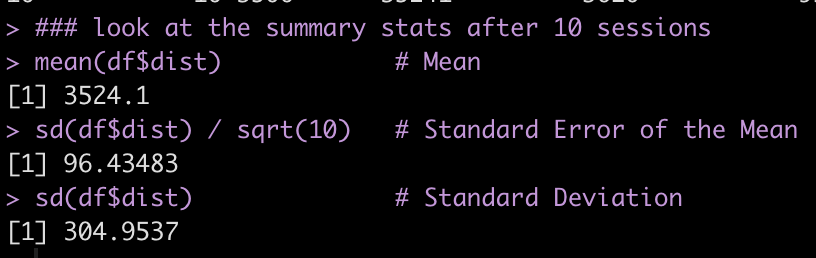
The final row in our data set represents the most up to date knowledge we have about our skill players average total running distance (mu_posterior = 3620 ± 99 yards) at practice. We can compare these results to summary statistics produced on the ten rows of our distance data:

### look at the summary stats after 10 sessions
mean(df$dist)            # Mean
sd(df$dist) / sqrt(10)   # Standard Error of the Mean
sd(df$dist)              # Standard Deviation

The posterior mean (mu_posterior) and posterior SD of the mean (SD_posterior) are relatively similar to what we have observed for our skill players after 10 training sessions (3524 with a standard error of 96). Our assumed SD was rather large to begin with (750) but the standard deviation for our skill players over the 10 observed sessions is much lower (305).

We’ve effectively started with prior knowledge of how much average total distance per training session we expect our skill players to perform and updated that knowledge, after each session, to learn as we go rather than waiting for enough data to begin having discussions with coaches.

Plot the data

Finally, let’s make a plot of the data to see what it looks like.

The grey shaded region shows the 95% confidence intervals around the posterior mean (red line) which are being updated after each training session. Notice that after about 8 sessions the data has nearly converged to something that is bespoke to our team’s skill players. The dashed line represents the average of our skill players’ total distance after 10 sessions. Note that we would not be able to compute this line until after the 10 sessions (for a team that practices 3 times a week, that would take 3 weeks!). Also note that taking a rolling average over such a short time period (e.g., a rolling average of every 3 or 4 sessions) wouldn’t have produced the amount of learning that we were able to obtain with the Bayesian updating approach.

Wrapping Up

After the first 3 sessions we’d be able to inform the coach that our skill players are performing less total running distance than what we initially believed skill players in college football would do, based on prior research. This is neither good nor bad — it just is. It may be more a reflection of the style of practice or the schematics that our coach employs compared to those of the teams that the original research is calculated on.

After about 6 sessions we are able to get a clearer picture of the running demands of our skill players and help the coach make a more informed decision about the total distance being performed by our skill players and hopefully assist with practice planning and weekly periodization. After about 9 or 10 sessions the Bayesian updating approach has pretty much converged with the nuances of our own team and we can begin to use our own data to make informed decisions.

Most importantly, we were able to update our knowledge about the running demands of our skill players, in real time, without waiting several weeks to figure out what training looks like for our team.

How much less running are our skill players doing compared to those of the players reported in the study?

This is a logical next question a coach might ask. For this we’d have to use a different type of Bayesian approach to compare what we are observing to our prior parameters and then estimate the magnitude of the difference. We will save this one for another blog post, though.

Finally, this Bayesian updating approach is not only useful when just starting to collect new data on your team. You can use priors from this season at the start of training camp next season to compare work rates to what you’d believe to be normal for your own team. You can also use this approach for the start of new training phases or for return to play, when a player begins a running program. Any time you start collecting new data on new people there is an opportunity to start out with your prior knowledge and beliefs and update as you go along. You always have some knowledge — usually more than you think!

All of the code for this article is available on my GITHUB page.

Confidence Intervals vs Prediction Intervals – A Frequentist & Bayesian Example

We often construct models for the purpose of estimating some future value or outcome. While point estimates for a forecasting future outcomes are interesting it is important to remember that the future contains a lot of uncertainty. As such, a reflection of this uncertainty is often conveyed using confidence intervals (which make a statement about the uncertainty of a population mean) or prediction intervals (which make a statement about a new/future observation for an individual within the population).

This tutorial will walk through how to calculate confidence intervals and prediction intervals by hand and then show the corresponding R functions for obtaining these values. We will finish by building the same model using a Bayesian framework and calculate the highest posterior density intervals and prediction intervals.

All of code is accessible through my GITHUB page.

Loading Packages & Data

We will use the Lahman baseball data set. For the purposes of this example, we will constrain our data to all MLB seasons after 2009 and players who had at least 250 At Bats in those seasons.

library(tidyverse)
library(broom)
library(Lahman)

theme_set(theme_minimal())

data(Batting)

df <- Batting %>%
  filter(yearID >= 2010,
         AB >= 250)


EDA

Let’s explore the relationship between Hits (H) and Runs Batted In (RBI) in our data set.


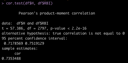
cor.test(df$H, df$RBI)

We see a very positive correlation suggesting that as a player gets more hits they tend to also have more RBI’s.

A Simple Regression Model

We will build a simple model that regresses RBI’s on Hits.

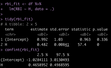
rbi_fit <- df %>%
  lm(RBI ~ H, data = .)

tidy(rbi_fit)
confint(rbi_fit)

  • Using tidy() from the broom package, we see that for every additional Hit we estimate a player to increase their RBI, on average, by 0.482.
  • We use the confint() function to produce the confidence intervals around the model coefficients.


Estimating Uncertainty

We can use the above model to forecast the expected number of RBI’s for a player given a number of hits.

For example, a player that has 100 hits would be estimated to produce approximately 49 RBI’s.


hits <- 100
pred_rbi <-  round(rbi_fit$coef[1] + rbi_fit$coef[2]*hits, 1)
pred_rbi

49 RBI’s is rather precise. There is always going to be some uncertainty around a number like this. For example, a player could be a good hitter but play on a team with poor hitters who don’t get on base thus limiting the possibility for all the hits he is getting to lead to RBI’s.

There are two types of questions we may choose to answer around our prediction:

  1. Predict the average RBI’s for players who get 100 hits.
  2. Predict the average RBI’s for a single player who gets 100 hits.

The point estimate, which we calculated above, will be the same for these two questions. Where they will differ is in the uncertainty we have around that estimate. Question 1 is a statement about the population (the average RBIs for all players who had 100 hits) while question 2 is a statement about an individual (the average RBI’s for a single player). Consequently, the confidence interval that we calculate to estimate our uncertainty for question 1 will be smaller than the prediction interval that we calculate to estimate our uncertainty for question 2.

Necessary Information for Computing Confidence Intervals & Prediction Intervals

In order to calculate the confidence interval and prediction interval by hand we need the following pieces of data:

  1. The model degrees of freedom.
  2. A t-critical value corresponding to the level of uncertainty we are interested in (here we will use 95%).
  3. The average number of hits (our independent variable) observed in our data.
  4. The standard deviation of hits observed in our data.
  5. The residual standard error of our model.
  6. The total number of observations in our data set.


## Model degrees of freedom
model_df <- rbi_fit$df.residual

## t-critical value for a 95% level of certainty
level_of_certainty <- 0.95
alpha <- 1 - (1 - level_of_certainty) / 2
t_crit <- qt(p = alpha, df = model_df)
t_crit

## Average &amp; Standard Deviation of Hits
avg_h <- mean(df$H)
sd_h <- sd(df$H)

## Residual Standard Error of the model and Total Number of Observations
rse <- sqrt(sum(rbi_fit$residuals^2) / model_df)
N <- nrow(df)


Calculating the Confidence Interval

We can calculate the 95% confidence level by hand using the following equation:

CL95 = t.crit * rse * sqrt(1/N + ((hits – avg.h)^2) / ((N – 1) * sd.h^2))


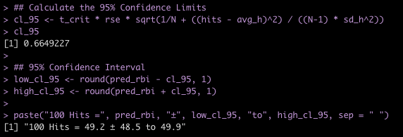
## Calculate the 95% Confidence Limits
cl_95 <- t_crit * rse * sqrt(1/N + ((hits - avg_h)^2) / ((N-1) * sd_h^2))
cl_95

## 95% Confidence Interval
low_cl_95 <- round(pred_rbi - cl_95, 1)
high_cl_95 <- round(pred_rbi + cl_95, 1)

paste("100 Hits =", pred_rbi, "±", low_cl_95, "to", high_cl_95, sep = " ")

If we don’t want to calculate the Confidence Interval by hand we can simply use the predict() function in R. We obtain the same result.


round(predict(rbi_fit, newdata = data.frame(H = hits), interval = "confidence", level = 0.95), 1)

Calculating the Prediction Interval

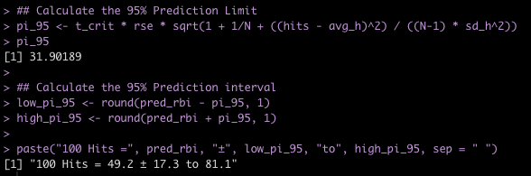
Notice below that the prediction interval uses the same equation as the confidence interval with the exception of adding 1 before 1/N. As such, the prediction interval will be wider as there is more uncertainty when attempting to make a prediction for a single individual within the population.

PI95 = t.crit * rse * sqrt(1 + 1/N + ((hits – avg.h)^2) / ((N – 1) * sd.h^2))


## Calculate the 95% Prediction Limit
pi_95 <- t_crit * rse * sqrt(1 + 1/N + ((hits - avg_h)^2) / ((N-1) * sd_h^2))
pi_95

## Calculate the 95% Prediction interval
low_pi_95 <- round(pred_rbi - pi_95, 1)
high_pi_95 <- round(pred_rbi + pi_95, 1)

paste("100 Hits =", pred_rbi, "±", low_pi_95, "to", high_pi_95, sep = " ")

Again, if we don’t want to do the math by hand, we can simply use the the predict() function and change the interval argument from confidence to prediction.

round(predict(rbi_fit, newdata = data.frame(H = hits), interval = "prediction", level = 0.95), 1)

Visualizing the 95% Confidence Interval and Prediction Interval

Instead of deriving the point estimate, confidence interval, and prediction interval for a single observation of hits, let’s derive them a variety of number of hits and then plot the intervals over our data to see what they look like.

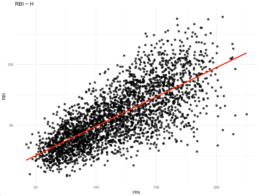
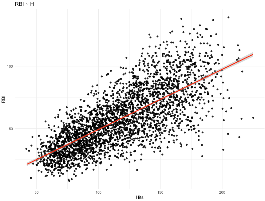
We could simply use ggplot2 to draw a regression line with 95% confidence intervals over top of our data.

Notice how narrow the 95% confidence interval is around the regression line. The lightly grey shaded region is barely visible because the interval is so tight.

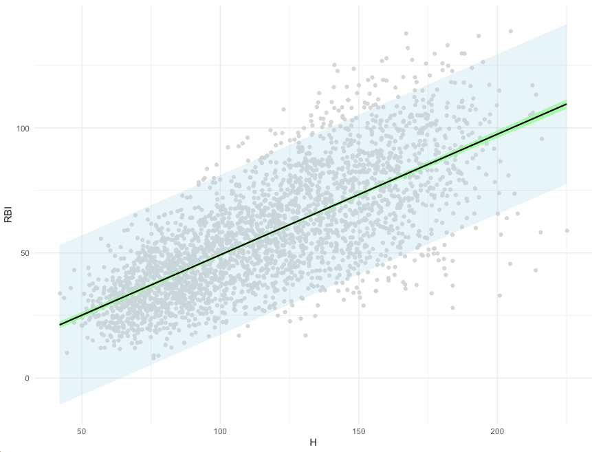
While plotting the data like this is simple, it might help us understand what is going on better if we constructed our own data frame of predictions and intervals and then overlaid those onto the original data set.

We begin by creating a data frame that has a single column, H, representing the range of hits observed in our data set. We then can create predictions and our 95% Prediction and Confidence Intervals across the vector of hits data that we just created.

Similar to our first plot, we see that the 95% confidence interval (green) is very tight to the regression line (black). Also, the prediction interval (light blue) is substantially larger than the confidence interval across the entire range of values.


A Bayesian Perspective

We now take a Bayesian approach to constructing intervals. First, we need to specify our regression model. To do so I will be using the rethinking package which serves as a supplement to Richard McElreath’s brilliant textbook, Statistical Rethinking: A Bayesian Course with Examples in R and Stan.

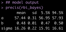
To create our Bayesian model we will need to specify a few priors. Before specifying these, however, I am going to mean center the independent variable, Hits, and create a new variable called hits_c. Doing so helps with interpretation of the model output and it should be noted that the intercept will now reflect the expected value of RBIs when there is an average number of hits (which would be hits_c = 0).

For my priors:

  • Intercept = N(70, 25) — represents my prior belief of the number of RBI’s when a batter has an average number of hits.
  • Beta Coefficient = N(0, 20) — This prior represent the amount of change in RBI for a unit of change in a batter’s hits relative to the average number of hits for the population.
  • Sigma = Unif(0, 20) — this represents my prior for the model standard error.


library(rethinking)

## What is the average number of hits?
mean(df$H)

## Mean center hits
df <- df %>%
  mutate(hits_c = H - mean(H))

## Fit the linear model and specify the priors
rbi_bayes <- map(
  alist(
    RBI ~ dnorm(mu, sigma),     # dependent variable (RBI)
    mu <- a + b*hits_c,				  # linear model regressing RBI on H
    a ~ dnorm(70, 25),          # prior for the intercept
    b ~ dnorm(0, 20),           # prior for the beta coefficient
    sigma ~ dunif(0, 20)),      # prior for the model standard error
  data = df)

## model output
precis(rbi_bayes)

Predict the number of RBI for our batter with 100 hits

The nice part of the Bayesian framework is that we can sample from the posterior distribution of our model and build simulations.

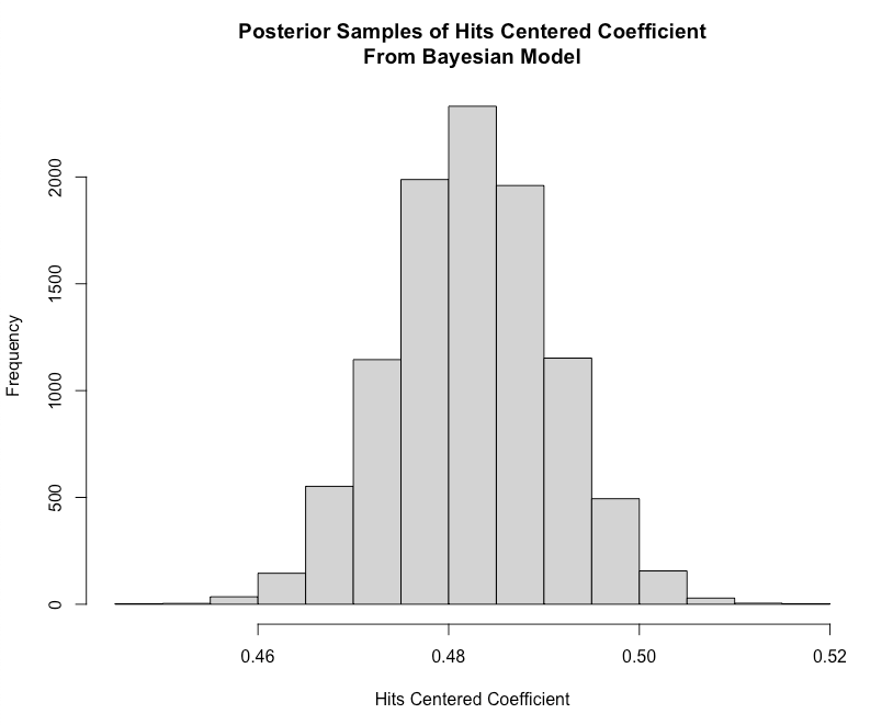
We start by extracting samples from our model fit. We can also then plot these samples and get a clearer understanding of the certainty we have around our model output.


coef_sample <-extract.samples(rbi_bayes)
coef_sample[1:10, ]

## plot the beta coefficient
hist(coef_sample$b,
     main = "Posterior Samples of Hits Centered Coefficient\nFrom Bayesian Model",
     xlab = "Hits Centered Coefficient")


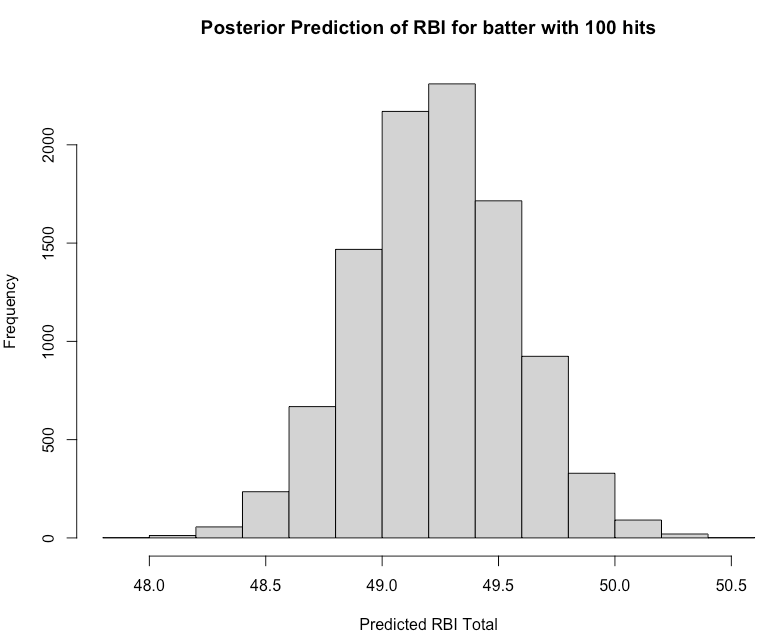
Our batter had 100 hits. Remember, since our model independent variable is now centered to the population mean we will need to center the batter’s 100 hits to that value prior to using our model to predict the number of RBI’s we’d expect. We will then plot the full sample of the predicted number of RBI’s to reflect our uncertainty around the batter’s performance.


## Hypothetical batter with 100 hits
hits <- 100
hits_centered <- hits - mean(df$H)

## Predict RBI total from the model
rbi_sample <- coef_sample$a + coef_sample$b * hits_centered

## Plot the posterior sample
hist(rbi_sample,
     main = "Posterior Prediction of RBI for batter with 100 hits",
     xlab = "Predicted RBI Total")


Highest Density Posterior Interval (HDPI)

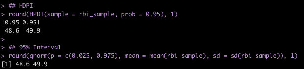
We now create an interval around the RBI samples. Bayesians often discuss intervals around a point estimate under various different names (e.g., Credible Intervals, Quantile Intervals, Highest Density Posterior Intervals, etc.). Here, we will use Richard McElreath’s HDPI() function to calculate the highest density posterior interval. I’ll also use qnorm() to show how to obtain the 95% interval of the sample.


## HDPI
round(HPDI(sample = rbi_sample, prob = 0.95), 1)

## 95% Interval
round(qnorm(p = c(0.025, 0.975), mean = mean(rbi_sample), sd = sd(rbi_sample)), 1)

Prediction Interval

We can also use the samples to create a prediction interval for a single batter (remember, this will be larger than the confidence interval). To do so, we first simulate from our Bayesian model for the number of hits the batter had (100) and center that to the population average for hits.


## simulate from the posterior
rbi_sim <- sim(rbi_bayes, data = data.frame(hits_c = hits_centered))

## 95% Prediction interval
PI(rbi_sim, prob = 0.95)

Plotting Intervals Across All of the Data

Finally, we will plot our confidence intervals and prediction intervals across the range of our entire data. We will need to make sure and center the vector of hits that we create to the mean of hits for our original data set.


## Create a vector of hits
hit_df <- data.frame(H = seq(from = min(df$H), to = max(df$H), by = 1))

## Center the hits to the average number of hits in the original data
hit_df <- hit_df %>%
  mutate(hits_c = H - mean(df$H))

## Use link() to calculate a mean value across all simulated values from the posterior distribution of the model
mus <- link(rbi_bayes, data = hit_df)

## get the average and highest density interval from our mus
mu_avg <- apply(X = mus, MARGIN = 2, FUN = mean)
mu_hdpi <- apply(mus, MARGIN = 2, FUN = HPDI, prob = 0.95)

## simulate from the posterior across our vector of centered hits
sim_rbi_range <- sim(rbi_bayes, data = hit_df)

## calculate the prediction interval over this simulation
rbi_pi <- apply(sim_rbi_range, 2, PI, prob = 0.95)


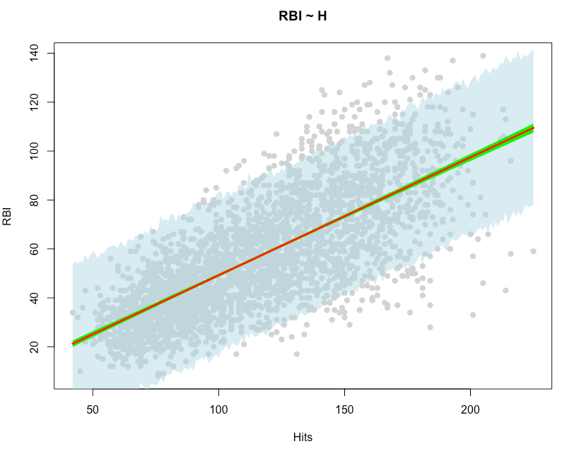
## create a plot of confidence intervals and prediction intervals
plot(df$H, df$RBI, pch = 19, 
     col = "light grey",
     main = "RBI ~ H",
     xlab = "Hits",
     ylab = "RBI")
shade(rbi_pi, hit_df$H, col = col.alpha("light blue", 0.5))
shade(mu_hdpi, hit_df$H, col = "green")
lines(hit_df$H, mu_avg, col = "red", lwd = 3)


Similar to our frequentist intervals, we see that the 95% HDPI interval (green) is very narrow and close to the regression line (red). We also see that the 95% prediction interval (light blue) is much larger than the HDPI, as it is accounting for more uncertainty when attempting to make a prediction for a single individual within the population.

Wrapping Up

When making predictions it is always important to reflect the uncertainty that you have around your model’s outcome. Confidence intervals and prediction intervals are two ways to present your uncertainty for two different objectives. Confidence intervals say something about the uncertainty for the population average while prediction intervals attempt to provide uncertainty for an individual within the population. As a consequence, prediction intervals end up being wider than confidence intervals. The approach to sharing your model’s uncertainty can be done from either a frequentist or Bayesian perspective.

To access all of the code for this blog article, CLICK HERE.