Category Archives: Sports Analytics

From tidyverse to python

Anyone who reads this blog or watches our Tidy Explained Screen Cast knows that I am a massive R user and R fan. I can work fast in it and I find it to be one of the best tools for building statistical models. That said, there are times when python comes in handy and there are a number of software and web applications that interact and play nicer with python compared to R. For example, R can be run within AWS Sagemaker, but python seems to be more efficient. I’ve recently been doing a few projects in Databricks as well and, while I can use R within their system, I’ve been trying to code the projects using python.

For those of us trying to learn a bit of python to be somewhat useful in that language (or for pythonistas who may need to learn a little bit of R) I’ve put together the following tutorial that shows how to do some of the common stuff you’d use R’s tidyverse for, in python.

The codes for both the RMarkdown file and the Jupyter Notebook are available on my GITHUB page. The codes has many more examples than I will go over here (for space reasons), so be sure to check it out!

Load Libraries and Data

We will be using the famous Palmer Penguins data. Here is a side-by-side look at how we load the libraries and data set in tidyverse and what those same steps look like in Python.

Exploratory Data Analysis

One of the most popular features of the suite of tidyverse libraries is the ability to nicely summarize and plot data.

I won’t go through every possible EDA example contained in the notebooks but here are a few side-by-side.

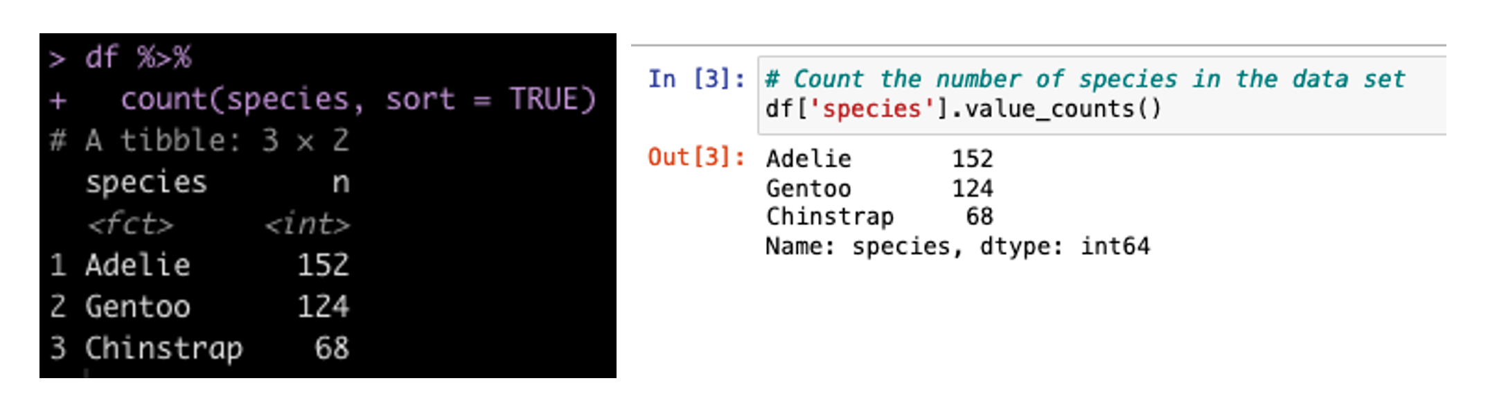
Create a Count of the Number of Samplers for Each Species
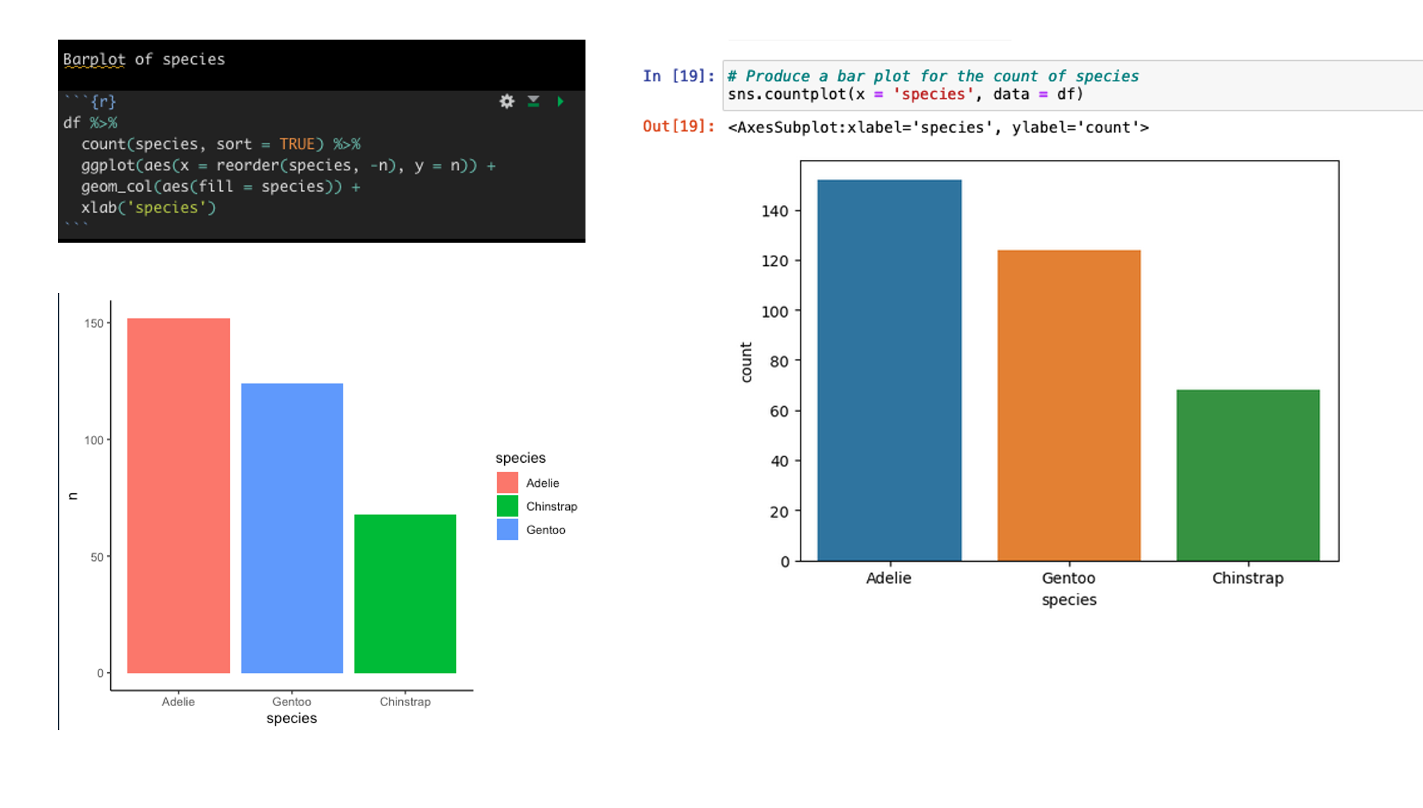
Create a barplot of the count of Species types
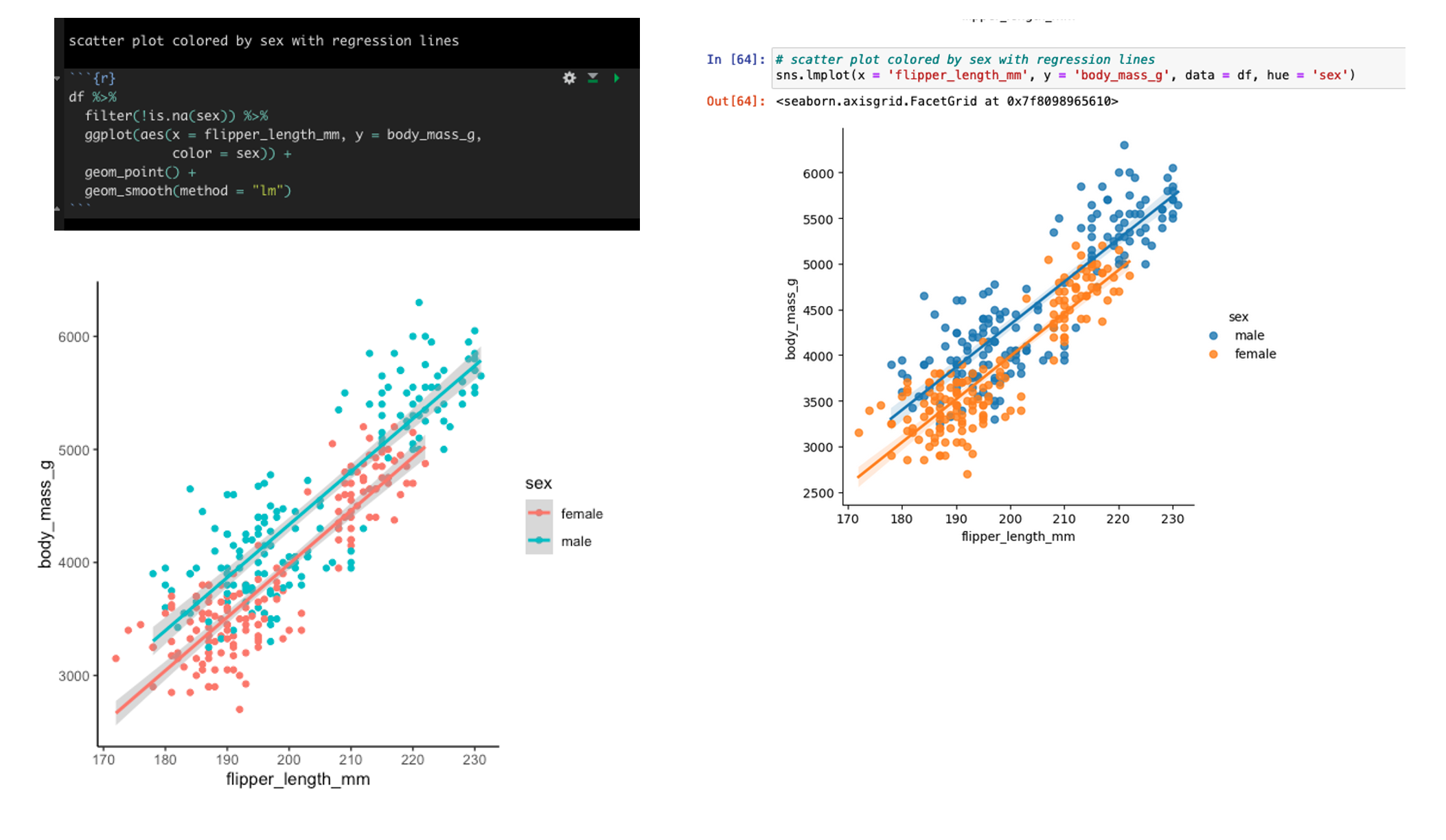
Scatter plot of flipper length and body mass colored by sex with linear regression lines
Group By Summarize

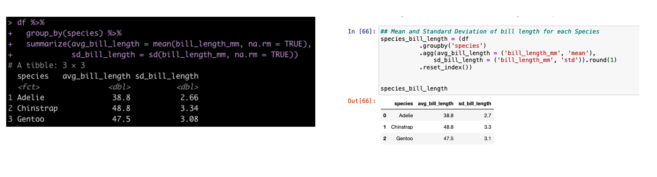
In tidyverse we often will group our data by a specific condition and then summarize data points relative to that condition. In tidyverse we use pipes, %>%, to connect together lines of code. In the pandas library (the common python library for working with data frames) we use dots to connect these lines of code.
Group By Mutate

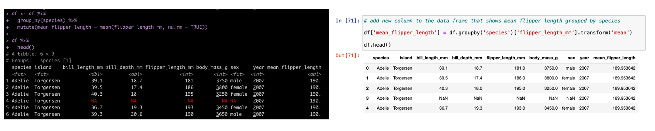
In addition to summarizing by group, sometimes we need to add additional columns to the existing data set but those columns need to have the new data conditional on a specific grouping variable. In tidyverse we use mutate and in pandas we use transform.
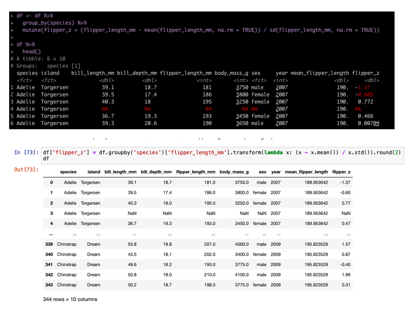
We can also build columns using grouping and custom functions. In tidyverse we do this inside of the mutate but in pandas we need to set up a lambda function. For example, we can build the z-score of each sample grouped by Species (meaning the observation is divided by the mean and standard deviation for that Species population).
ifelse / case_when

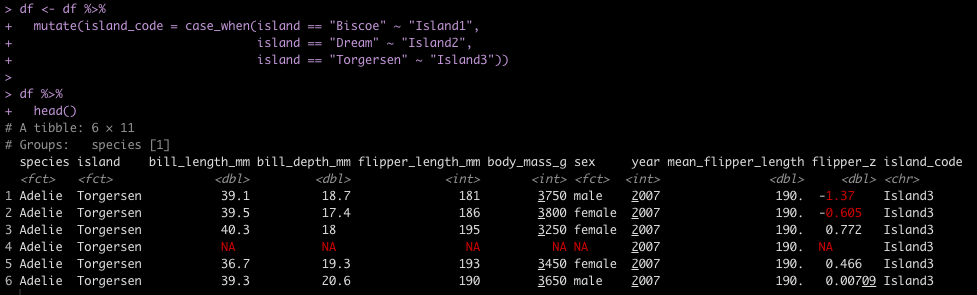
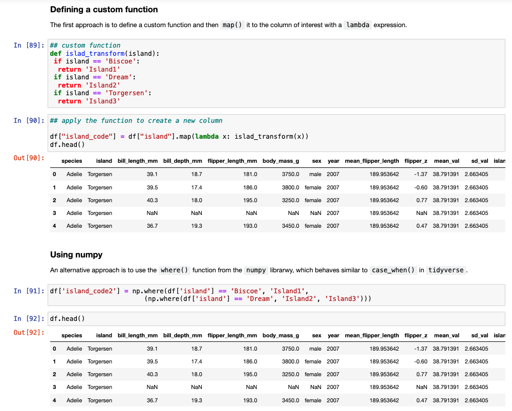
Another task commonly performed in data cleaning is to assign values to specific cases. For example, we have three Islands in the data set and we want to assign them Island1, Island2, and Island3. In tidyverse we could use either ifelse or case_when() to solve this task. In pandas we need to either set up a custom function and then map that function to the data set or we can use the numpy library, which has a function called where(), which behaves like case_when() in tidyverse.
Linear Regression Model

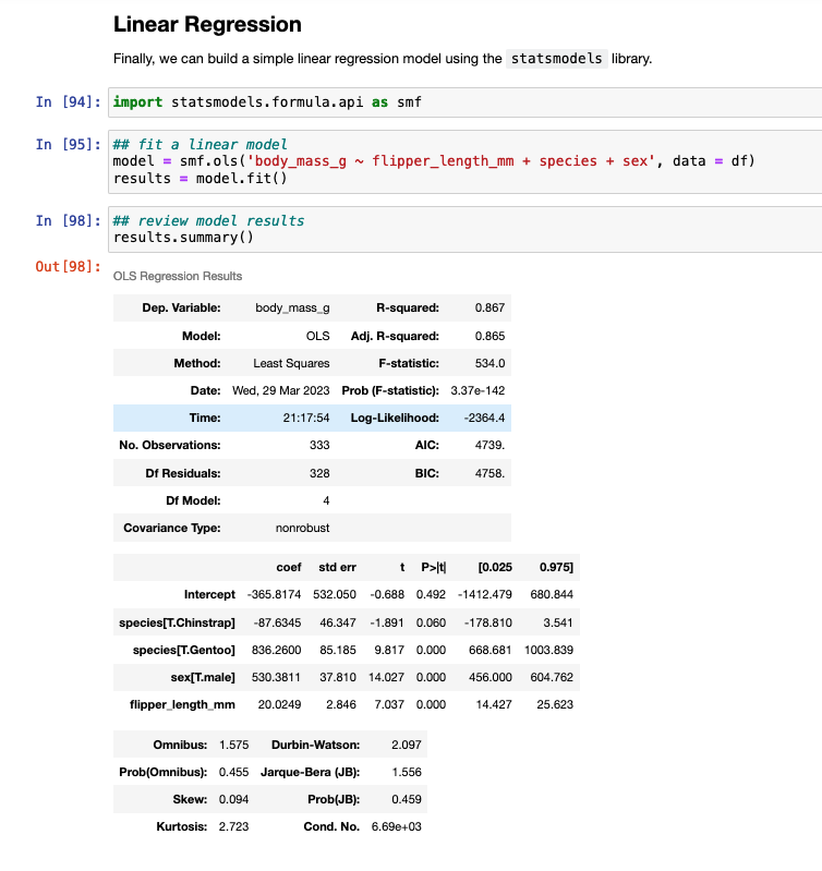
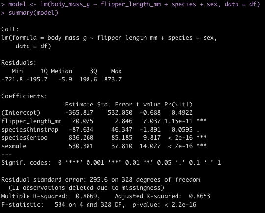
To finish, I’ll provide some code to write a linear model in both languages.
Wrapping Up

Hopefully the tutorial will help with folks going from R to Python or vice versa. Generally, I suggest picking one or the other and trying to really dig into being good at it. But, there are times where you might need to delve into another language and produce some code. This tutorial provides a mirror image of code between R and Python.

As stated earlier, there are a number of extra code examples in the RMarkdown and Jupyter Notebook files available on my GITHUB page.

Removing columns with NA for fluid table building in shiny

One of the most frustrating aspects of building {shiny} apps is dealing with columns that have NAs when outputting tables. This is common in sport when dealing with players from different position groups who may have different stats that describe performance for those positions. Rather than writing a long series of if/else statements, I prefer to streamline the process by dropping those columns prior to returning the table of data. Not only does this make the app run smoothly but it also is easier to debug or add additional table information without having to deal with a lot of nested if/else statements.

The full code is accessible on my GITHUB page.
Load Packages & Simulate Data

## Removing columns with NA for fluid table building in shiny

## packages ---------------------------------------------------
library(tidyverse)
library(shiny)

## simulate data ----------------------------------------------
d <- tribble(
  ~player, ~position, ~stat1, ~stat2, ~stat3,
  'Frank', 'Pitcher', 10, NA, 33,
  'Tom', 'Batter', NA, 14, 12,
  'Jeff', 'Batter', NA, 5, NA,
  'Harold', 'Pitcher/Batter', 12, 33, 9
)

d

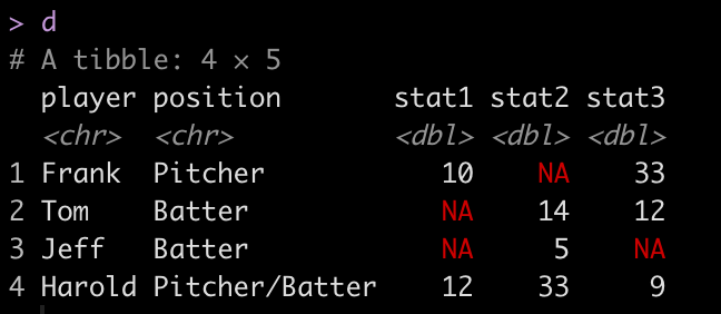
We can see from our little data set that different players have different stats populated. We really don’t want our users to deal with having to see NA in the table output. So, we need to devise a way to drop the columns with NA’s once a specific player has been selected.

Dropping Columns with NA in Base R

Let’s select on player and attempt to drop their columns with NA. In base R we will use the colSums() function to produce a count of the number of NA’s in each column.

## remove columns with NA for Frank, using Base R --------------------------

frank <- d %>% 
  filter(player == 'Frank')

# colSums() can be used to count the NA's in each column
colSums(is.na(frank))

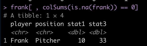
We can see that stat2 has 1 NA while the other 4 columns are complete. We can use this information to retain those four columns and drop stat2.

frank[ , colSums(is.na(frank)) == 0]

Dropping Columns with NA in {dplyr}

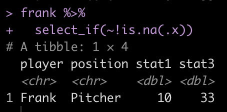
We can perform a similar task using the select_if() function within the {dplyr} package and indicating that we want to select all columns without an NA.

frank %>%
  select_if(~!is.na(.x))

Build a shiny app that fluidly retains the columns without NA

Now that we have a few strategies for removing columns with NA, we can build a {shiny} app that allows the user to select a player and then the server fluidly will drop the columns with NA so that we don’t need to use a messy if/else chain.

Notice that prior to dropping columns with NA I set the names of all of the columns in the table so that they look nicer when the table gets rendered. We can see from the figures that no matter which player is selected, the server intelligently drops columns with missing data, allowing the user to see only the statistics that are meaningful for the individual.

# UI
ui <- fluidPage(
  
  sidebarPanel(
    
    selectInput(inputId = 'player',
                label = "Select Player",
                choices = sort(unique(d$player)),
                selected = FALSE,
                multiple = FALSE)
    
  ),
  
  mainPanel(
    
    tableOutput(outputId = 'tbl')
  )
)

# Server
server <- function(input, output){
  
  # get selected player
  dat_tbl <- reactive({ d %>%
      filter(player == input$player)
    
  })
  
  # build table
  output$tbl <- renderTable({ dat_tbl() %>%
      setNames(c("Player", "Position", "Stat 1", "Stat 2", "Stat 3")) %>%
      select_if(~!is.na(.x))
    
  })
  
}


# deploy
shinyApp(ui, server)

Wrapping Up

Instead of having users see columns with NA, make your renderTable() function fluid and automatically drop columns with missing values to improve the user experience.

The full code is accessible on my GITHUB page.

Loop function to save multiple plots as SVG files

I’ve discussed using loops for a number of statistical tasks (simulation, optimization, Gibbs sampling) as well as data processing tasks, such as writing data outputs to separate excel tabs within one excel file and creating a multiple page PDF with a plot on each page.

Today, I want to expand the loop function to produce separate SVG file plots and have R save those directly to a folder stored on my computer. The goal here is to have the separate plots in one place so that I can upload those files directly to a web app and allow them to be viewable for a decision-maker.

NOTE: You can save these files in other formats (e.g., jpeg, png). I chose SVG because it was the primary file type I had been working with.

Data

To keep the example simple, we will be using the {mtcars} data set, which is freely available in R. I’m going to set the cylinder (cyl) variable to be a factor as that is the variable that we will build our separate plot files for. In the sport setting, you can think of this as player names or player IDs, where you are building a plot for each individual, looping over them and producing a separate plot file.

library(tidyverse)
library(patchwork)

theme_set(theme_bw())

## data
dat <- mtcars %>%
  mutate(cyl = as.factor(cyl))


Example Plots

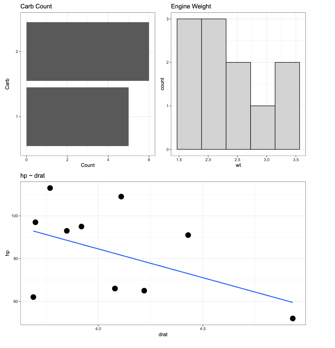
Here is an example of the three types of plots we will build. We will wrap the three plots together using the {patchwork} package. The below plot is using all of the data but our goal will be to produce a loop function that creates the same plot layout using data for each of the three cylinder types.

p1 <- dat %>%
  ggplot(aes(x = drat, y = hp)) +
  geom_point(size = 5) +
  geom_smooth(method = "lm",
              se = FALSE) +
  ggtitle("hp ~ drat")

p2 <- dat %>%
  count(carb) %>%
  mutate(carb = as.factor(carb)) %>%
  ggplot(aes(x = n, y = reorder(carb, n))) +
  geom_col() +
  labs(x = "Count",
       y = "Carb",
       title = "Carb Count")

p3 <- dat %>%
  ggplot(aes(x = wt)) +
  geom_histogram(fill = "light grey",
                 color = "black",
                 bins = 5) +
  ggtitle("Engine Weight")


(p2 | p3) / p1

Creating the loop for plotting

First, we create a function that produces the plots above. Basically, I’m taking the plotting code from above and wrapping it in a function. The function takes in input, i, and runs through the three plots for that input, at the end using the ggsave() function to save each plot to the dedicated file path.


# create a plot function for each cyl
plt_func <- function(i){
  p1 <- i %>%
    ggplot(aes(x = drat, y = hp)) +
    geom_point(size = 5) +
    geom_smooth(method = "lm",
                se = FALSE) +
    ggtitle("hp ~ drat")
  
  p2 <- i %>%
    count(carb) %>%
    mutate(carb = as.factor(carb)) %>%
    ggplot(aes(x = n, y = reorder(carb, n))) +
    geom_col() +
    labs(x = "Count",
         y = "Carb",
         title = "Carb Count")
  
  p3 <- i %>%
    ggplot(aes(x = wt)) +
    geom_histogram(fill = "light grey",
                   color = "black",
                   bins = 5) +
    ggtitle("Engine Weight")
  
  three_plt <- (p2 | p3) / p1
  
  
  ggsave(three_plt, file = paste0(unique(i$cyl), ".svg"))
}

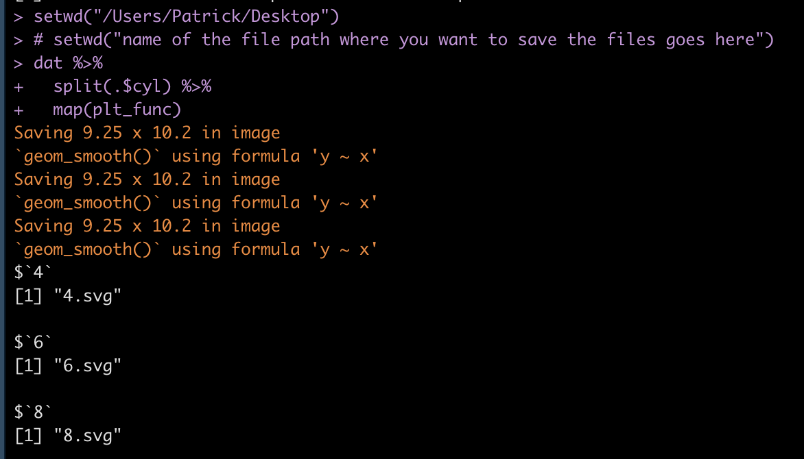
Then, we use the split() function to split the data frame into a named list with each cylinder type being it’s own list that contains a data frame. The map() function then creates the loop over that list and for each element of the list (for each cylinder type) it runs our plot function above and saves the results. Notice that I’ve specified setwd() to indicate where I want the files to be saved to. If you are saving thousands of files at once and you don’t specify this and have your working directory defaulted to your desktop, it becomes a mess pretty quick (trust me!).

# setwd("name of the file path where you want to save the files goes here")
dat %>% 
  split(.$cyl) %>% 
  map(plt_func)

Once you’ve run the loop, your R output should look like this, where we see that each list element (cylinder) is being saved as an SVG file.

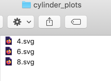
Our folder has the plot outputs:

If I click on any one of the SVG files I get the desired plot.

The above is for a 4 cylinder vehicle. Notice that I didn’t specify this at the top of the plot because my initial assumption was that I would be uploading the individual SVG files to a web application where there is a webpage dedicated to each cylinder type. Therefore, naming the plots by cylinder type would be redundant. However, if you want to add a plot to the {pathwork} layout about, you can use the plot_annotation() function.

(p2 | p3) / p1 + plot_annotation(title = "Engine cylinders")

We can add the plot_annotation() function to the loop but instead of a generic title, like above, we will need to create a bespoke title within the loop that stores each cylinder type. To do this, we use the paste() function to add the cylinder number in front of the word “cylinder” in our plot title name.

plt_func <- function(i){
  p1 <- i %>%
    ggplot(aes(x = drat, y = hp)) +
    geom_point(size = 5) +
    geom_smooth(method = "lm",
                se = FALSE) +
    ggtitle("hp ~ drat")
  
  p2 <- i %>%
    count(carb) %>%
    mutate(carb = as.factor(carb)) %>%
    ggplot(aes(x = n, y = reorder(carb, n))) +
    geom_col() +
    labs(x = "Count",
         y = "Carb",
         title = "Carb Count")
  
  p3 <- i %>%
    ggplot(aes(x = wt)) +
    geom_histogram(fill = "light grey",
                   color = "black",
                   bins = 5) +
    ggtitle("Engine Weight")
  
  cyl_name <- i %>% 
    select(cyl) %>%
    distinct(cyl) %>%
    pull(cyl)
  
  three_plt <- (p2 | p3) / p1 + plot_annotation(title = paste(cyl_name, "cylinder", sep = " ")) ggsave(three_plt, file = paste0(unique(i$cyl), ".svg")) } # setwd("name of the file path where you want to save the files goes here") dat %>% 
  split(.$cyl) %>% 
  map(plt_func)

Now we have plots with named titles.

Wrapping Up

During those times where you need to produce several individual plots, rather than doing them one-by-one, leverage R’s loop functions to rapidly produce multiple plots in one shot.

The full code is accessible on my GITHUB page.

R {shiny} app with PDF save report capabilities

Over the previous several articles I’ve shared different approaches to sharing and communicating athlete data. Over this time I got a question about {shiny} apps and if I had a way to easily build in capabilities to save the report as a PDF for those times when you want to save the report as a PDF to email out or print the report and take it to a decision-maker.

Today I’ll go over two of the easiest ways I can think of to add some PDF save functionality to your {shiny} app. Before we jump in, if you are looking to just get started with {shiny} apps, aside from searching my blog for the various apps I’ve built (there are several!), Ellis Hughes and I did a 4 part series on building a {shiny} app from scratch:

Alright, now to jump into building a {shiny} app with the ability to save as PDF. As always, you can access the full code to the article on my GITHUB page.

Loading Packages & Data

As always, we need to load the packages that we need and some data. For this, I’ll keep things simple and just use the mtcars data that is available in base R, since I’m mainly concerned with showing how to build the app, not the actual data analysis.

#### packages ----------------------------------------------
library(shiny)
library(shinyscreenshot)
library(DT)
library(gridExtra)
library(ggpubr)
library(tidyverse)

## data ----------------------------------------------------
dat <- mtcars %>%
  mutate(cyl = as.factor(cyl),
         car_type = rownames(.)) %>%
  relocate(car_type, .before = mpg)


App 1: Printing the app output as its own report

The user interface for this app will allow the user to select a Cylinder (cyl) number and the two plots and table will update with the available info.

The server of this app is where the magic happens. What the user sees on the web app is not exactly what it looks like when saved as a PDF. To make this version work, I need to store my outputs in their own elements and then take those elements and output them as an export. I do this by saving a copy within the render function for each of the outputs. I also create an empty reactive values element within the server, which sets each plot and table to NULL, but serves as a container to store the output each time the user changes the cylinder number.

You’ll notice in the output$tbl section of the server, I produce one table for viewing within the app while the second table is stored for PDF purposes. I do this because I like the ggtextable() table better than the simple base R one, as it has more customizable options. Thus, I use that one for the PDF report. Here is what the server looks like:

server <- function(input, output){
  
  ## filter cylinder
  cyl_df <- reactive({
    
    req(input$cyl)
    
    d <- dat %>%
      filter(cyl == input$cyl)
    d
    
  })
  
  
  ## output plt1
  output$plt1 <- renderPlot({
    
    vals$plt1 <- cyl_df() %>%
      ggplot(aes(x = wt, y = mpg)) +
      geom_point(size = 4) +
      theme_bw() +
      labs(x = "wt",
           y = "mpg",
           title = "mpg ~ wt") +
    theme(axis.text = element_text(size = 12, face = "bold"),
          axis.title = element_text(size = 15, face = "bold"),
          plot.title = element_text(size = 20))
    
    vals$plt1
    
    
  })
  
  ## output table
  output$tbl <- renderTable({
    
    tbl_df <- cyl_df() %>%
      setNames(c("Car Type", "MPG", "CYL", "DISP", "HP", "DRAT", "WT", "QSEC", "VS", "AM", "GEAR", "CARB"))
    
    # store table for printing
    vals$tbl <- ggtexttable(tbl_df,
                            rows = NULL,
                            cols = c("Car Type", "MPG", "CYL", "DISP", "HP", "DRAT", "WT", "QSEC", "VS", "AM", "GEAR", "CARB"),
                            theme = ttheme('minimal',
                                           base_size = 12))
    
    # return table for viewing
    tbl_df
    
  })
  
  
  ## output plt2
  output$plt2 <- renderPlot({
    
    vals$plt2 <- cyl_df() %>%
      ggplot(aes(x = disp, y = hp)) +
      geom_point(size = 4) +
      theme_bw() +
      labs(x = "disp",
           y = "hp",
           title = "hp ~ disp") +
      theme(axis.text = element_text(size = 12, face = "bold"),
            axis.title = element_text(size = 15, face = "bold"),
            plot.title = element_text(size = 20))
    
    vals$plt2
    
  })
  
  
  ## The element vals will store all plots and tables
  vals <- reactiveValues(plt1=NULL,
                         plt2=NULL,
                         tbl=NULL)
  
  
  ## clicking on the export button will generate a pdf file 
  ## containing all stored plots and tables
  output$export = downloadHandler(
    filename = function() {"plots.pdf"},
    content = function(file) {
      pdf(file, onefile = TRUE, width = 15, height = 9)
      grid.arrange(vals$plt1,
                   vals$tbl,
                   vals$plt2,
                   nrow = 2,
                   ncol = 2)
      
      dev.off()
    })
}


Here is what the shiny app will look like when you run it:

When the user clicks the Download button on the upper left, they can save a PDF, which looks like this:

Notice that we are returned the plots and table from the {shiny} app, however we don’t have the overall title. I’m sure we could remedy this within the server, but what if we want to simply produce a PDF that looks exactly like what we see in the web app?

App 2: Take a screen shot of your shiny app!

If we want to have the downloadable output look exactly like the web app, we can use the package {shinyscreentshot}.

The user interface of the app will remain the same. The server will change as you no longer need to store the plots. You simply need to add an observeEvent() function and tell R that you want to take a screenshot of the page once the button is pressed!

Since we are taking a screen shot I also took the liberty of changing the table of data to a {DT} table. I like {DT} tables better because they are interactive and have more functionality. In the previous {shiny} app it was harder to use that sort of interactive table and store it for PDF printing. Since we are taking a screenshot, it opens up a lot more options for us to customize the output.

Here is what the server looks likes:

server <- function(input, output){
  
  ## filter cylinder
  cyl_df <- reactive({
    
    req(input$cyl)
    
    d <- dat %>%
      filter(cyl == input$cyl)
    d
    
  })
  
  
  ## output plt1
  output$plt1 <- renderPlot({ cyl_df() %>%
      ggplot(aes(x = wt, y = mpg)) +
      geom_point(size = 4) +
      theme_bw() +
      labs(x = "wt",
           y = "mpg",
           title = "mpg ~ wt") +
    theme(axis.text = element_text(size = 12, face = "bold"),
          axis.title = element_text(size = 15, face = "bold"),
          plot.title = element_text(size = 20))
    
  })
  
  ## output table
  output$tbl <- renderDT({ cyl_df() %>%
      datatable(class = 'cell-border stripe',
                rownames = FALSE,
                filter = "top",
                options = list(pageLength = 4),
                colnames = c("Car Type", "MPG", "CYL", "DISP", "HP", "DRAT", "WT", "QSEC", "VS", "AM", "GEAR", "CARB"))
    
  })
  
  ## output plt2
  output$plt2 <- renderPlot({ cyl_df() %>%
      ggplot(aes(x = disp, y = hp)) +
      geom_point(size = 4) +
      theme_bw() +
      labs(x = "disp",
           y = "hp",
           title = "hp ~ disp") +
    theme(axis.text = element_text(size = 12, face = "bold"),
          axis.title = element_text(size = 15, face = "bold"),
          plot.title = element_text(size = 20))
    
    
  })
  
  observeEvent(input$go, {
    screenshot()
  })
}

The new web app looks like this:

Looks pretty similar, just with a nicer table. If the user clicks the Screenshot Report at the upper left, R will save a png file of the report, which looks like this:

As you can see, this produces a downloadable report that is exactly like what the user sees on their screen.

Wrapping Up

There are two simple ways to build some save functions directly into your {shiny} apps. Again, if you’d like the full code, you can access it on my GITHUB page.

Collapsible interactive tables with {reactable}

Since I’ve been talking about approaches to sharing and visualizing athlete performance data lately, I decided to put together some quick code for developing collapsible tables with the {reactable} package in R.

I like Reactable tables because they offer a simple framework for quickly building interactive html reports for your end user. You can also embed these into {Rmarkdown} reports or {shiny} apps.

Why do we need collapsible tables?

  1. The collapsible nature educes the amount of real estate they take up in the end user’s report. Instead of a big long table, the user can take the information in chunks without getting distracted.
  2. When embedding a collapsible table into your {Rmarkdown} or {shiny} reports, it makes them look less busy.
  3. In meetings, if you have a large number of athletes to discuss, spread across several positions, a large table allows the meeting attendees to have “busy eyes“, as they scan up and down the table and get ahead of things. With a collapsible table, you are able to direct their attention to the aspects you are discussing.

You can access all of the code on my GITHUB page and use it as a template to construct your own collapsible interactive tables. I tried to add several different styling options to the various columns so that it covers many of the things people attempt to do when building reports (e.g., conditional formatting, conditional formatting using information contained in a secondary column, rounding numbers, converting values to percentages, hiding columns you don’t want in the table, etc.).

To play with the html table yourself, CLICK HERE >> collapsible tables with reactable

Examples of the table

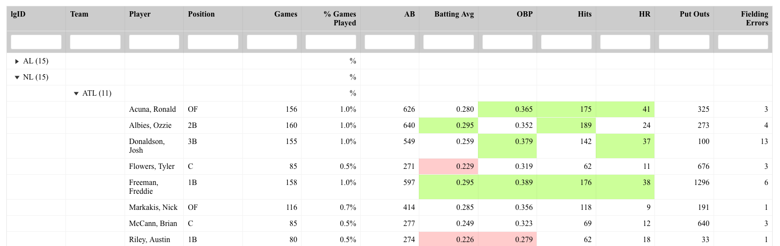
The data came from the {Lahman} baseball data set in R. I build a table that nests the players within their respective teams and the teams nested within their respective league (NL or AL). So, this table has 2 structures of collapsing. The table of the table looks like this:
Notice that all we see are the headers (which I’ve set a filterable function under) and the top level of nesting (league).

If you click one of the league drop downs, you expand out and see the second level of testing (teams):


Finally, you can click down into any team and obtain the list of players and their stat lines:

Within the code, you’ll notice that I created a simple z-score for each of the stats. The shading is relative to the z-scores; however, to de-clutter the table, I’ve hidden those columns but retain their meaning by using the conditional formatting.

If a person is at the highest level of nesting (league) and wants to just search for a player, that is also possible:

As you can see, collapsible interactive tables can be a great way to share data in a clean way and prevents the end user from being overwhelmed by long and extensive amounts of data across many rows and columns.