Category Archives: Model Building in R

Optimization Algorithms in R – returning model fit metrics

Introduction

A colleague had asked me if I knew of a way to obtain model fit metrics, such as AIC or r-squared, from the optim() function. First, optim() provides a general-purpose method of optimizing an algorithm to identify the best weights for either minimizing or maximizing whatever success metric you are comparing your model to (e.g., sum of squared error, maximum likelihood, etc.). From there, it continues until the model coefficients are optimal for the data.

To make optim() work for us, we need to code the aspects of the model we are interested in optimizing (e.g., the regression coefficients) as well as code a function that calculates the output we are comparing the results to (e.g., sum of squared error).

Before we get to model fit metrics, let’s walk through how optim() works by comparing our results to a simple linear regression. I’ll admit, optim() can be a little hard to wrap your head around (at least for me, it was), but building up a simple example can help us understand the power of this function and how we can use it later on down the road in more complicated analysis.

Data

We will use data from the Lahman baseball data base. I’ll stick with all years from 2006 on and retain only players with a minimum of 250 at bats per season.

library(Lahman)
library(tidyverse)

data(Batting)

df <- Batting %>% 
  filter(yearID >= 2006,
         AB >= 250)

head(df)


Linear Regression

First, let’s just write a linear regression to predict HR from Hits, so that we have something to compare our optim() function against.

fit_lm <- lm(HR ~ H, data = df)
summary(fit_lm)

plot(df$H, df$HR, pch = 19, col = "light grey")
abline(fit_lm, col = "red", lwd = 2)

The above model is a simple linear regression model that fits a line of best fit based on the squared error of predictions to the actual values.

(NOTE: We can see from the plot that this relationship is not really linear, but it will be okay for our purposes of discussion here.)

We can also use an optimizer to solve this.

Optimizer

To write an optimizer, we need two functions:

  1.  A function that allow us to model the relationship between HR and H and identify the optimal coefficients for the intercept and the slope that will help us minimize the residual between the actual and predicted values.
  2.  A function that helps us keep track of the error between actual and predicted values as optim() runs through various iterations, attempting a number of possible coefficients for the slope and intercept.

Function 1: A linear function to predict HR from hits

hr_from_h <- function(H, a, b){
  return(a + b*H)
}

This simple function is just a linear equation and takes the values of our independent variable (H) and a value for the intercept (a) and slope (b). Although, we can plug in numbers and use the function right now, the values of a and b have not been optimized yet. Thus, the model will return a weird prediction for HR. Still, we can plug in some values to see how it works. For example, what if the person has 30 hits.

hr_from_h(H = 30, a = 1, b = 1)

Not a really good prediction of home runs!

Function 2: Sum of Squared Error Function

Optimizers will try and identify the key weights in the function by either maximizing or minimizing some value. Since we are using a linear model, it makes sense to try and minimize the sum of the squared error.

The function will take 3 inputs:

  1.  A data set of our dependent and independent variables
  2.  A value for our intercept (a)
  3.  A value for the slope of our model (b)
sum_sq_error <- function(df, a, b){
  
  # make predictions for HR
  predictions <- with(df, hr_from_h(H, a, b))
  
  # get model errors
  errors <- with(df, HR - predictions)
  
  # return the sum of squared errors
  return(sum(errors^2))
  
}


Let’s make a fake data set of a few values of H and HR and then assign some weights for a and b to see if the sum_sq_error() produces a single sum of squared error value.

fake_df <- data.frame(H = c(35, 40, 55), 
                        HR = c(4, 10, 12))

sum_sq_error(fake_df,
             a = 3, 
             b = 1)

It worked! Now let’s write an optimization function to try and find the ideal weights for a and b that minimize that sum of squared error. One way to do this is to create a large grid of values, write a for loop and let R plug along, trying each value, and then find the optimal values that minimize the sum of squared error. The issue with this is that if you have models with more independent variables, it will take really long. A more efficient way is to write an optimizer that can take care of this for us.

We will use the optim() function from base R.

The optim() function takes 2 inputs:

  1.  A numeric vector of starting points for the parameters you are trying to optimize. These can be any values.
  2.  A function that will receive the vector of starting points. This function will contain all of the parameters that we want to optimize. This function will take our sum_sq_error() function and it will get passed the starting values for a and b and then find their values that minimize the sum of squared error.
optimizer_results <- optim(par = c(0, 0),
                           fn = function(x){
                             sum_sq_error(df, x[1], x[2])
                             }
                           )

Let’s have a look at the results.

In the output:

  • value tells us the sum of the squared error
  • par tells us the weighting for a (intercept) and b (slope)
  • counts tells us how many times the optimizer ran the function. The gradient is NA here because we didn’t specify a gradient argument in our optimizer
  • convergence tells us if the optimizer found the optimal values (when it goes to 0, that means everything worked out)
  • message is any message that R needs to inform us about when running the optimizer

Let’s focus on par and value since those are the two values we really want to know about.

First, notice how the values for a and b are nearly the exact same values we got from our linear regression.

a_optim_weight <- optimizer_results$par[1]
b_optim_weight <- optimizer_results$par[2]

a_reg_coef <- fit_lm$coef[1]
b_reg_coef <- fit_lm$coef[2]

a_optim_weight
a_reg_coef

b_optim_weight
b_reg_coef

Next, we can see that the sum of squared error from the optimizer is the same as the sum of squared error from the linear regression.

sse_optim <- optimizer_results$value
sse_reg <- sum(fit_lm$residuals^2)

sse_optim
sse_reg

We can finish by plotting the two regression lines over the data and show that they produce the same fit.

plot(df$H, 
     df$HR,
     col = "light grey",
     pch = 19,
     xlab = "Hits",
     ylab = "Home Runs")
title(main = "Predicting Home Runs from Hits",
     sub = "Red Line = Regression | Black Dashed Line = Optimizer")
abline(fit_lm, col = "red", lwd = 5)
abline(a = a_optim_weight,
       b = b_optim_weight,
       lty = 2,
       lwd = 3,
       col = "black")

Model Fit Metrics

The value parameter from our optimizer output returned the sum of squared error. What if we wanted to return a model fit metric, such as AIC or r-squared, so that we can compare several models later on?

Instead of using the sum of squared errors function, we can attempt to minimize AIC by writing our own AIC function.

aic_func <- function(df, a, b){
  
  # make predictions for HR
  predictions <- with(df, hr_from_h(H, a, b))
  
  # get model errors
  errors <- with(df, HR - predictions)
  
  # calculate AIC
  aic <- nrow(df)*(log(2*pi)+1+log((sum(errors^2)/nrow(df)))) + ((length(c(a, b))+1)*2)
  return(aic)
  
}

We can try out the new function on the fake data set we created above.

aic_func(fake_df,
             a = 3, 
             b = 1)

Now, let’s run the optimizer with the AIC function instead of the sum of square error function.

optimizer_results <- optim(par = c(0, 0),
                           fn = function(x){
                             aic_func(df, x[1], x[2])
                             }
                           )

optimizer_results

We get the same coefficients with the difference being that the value parameter now returns AIC. We can check that this AIC compares to our original linear model.

AIC(fit_lm)

If we instead wanted to obtain an r-squared, we can write an r-squared function. In the optimizer, since a higher r-squared is better, we need to indicate that we are wanting to maximize this value (optim defaluts to minimization). To do this we set the fnscale argument to -1. The only issue I have with this function is that it doesn’t return the coefficients properly in the par section of the results. Not sure what is going on here but if anyone has any ideas, please reach out. I am able to produce the exact result of r-squared from the linear model, however.

## r-squared function
r_sq_func <- function(df, a, b){
  
  # make predictions for HR
  predictions <- with(df, hr_from_h(H, a, b))
  
  # r-squared between predicted and actual HR values
  r2 <- cor(predictions, df$HR)^2
  return(r2)
  
}

## run optimizer
optimizer_results <- optim(par = c(0.1, 0.1),
                           fn = function(x){
                             r_sq_func(df, x[1], x[2])
                             },
      control = list(fnscale = -1)
 )

## get results
optimizer_results

## Compare results to what was obtained from our linear regression
summary(fit_lm)$r.squared

Wrapping up

That was a short tutorial on writing an optimizer in R. There is a lot going on with these types of functions and they can get pretty complicated very quickly. I find that starting with a simple example and building from there is always useful. We additionally looked at having the optimizer return us various model fit metrics.

If you notice any errors in the code, please reach out!

Access to the full code is available on my GitHub page.

Mixed Models in Sport Science – Frequentist & Bayesian

Intro

Tim Newans and colleagues recently published a nice paper discussing the value of mixed models compared to repeated measures ANOVA in sport science research (1). I thought the paper highlighted some key points, though I do disagree slightly with the notion that sport science research hasn’t adopted mixed models, as I feel like they have been relatively common in the field over the past decade. That said, I wanted to do a blog that goes a bit further into mixed models because I felt like, while the aim of the paper was to show their value compared with repeated measures ANOVA, there are some interesting aspects of mixed models that weren’t touched upon in the manuscript. In addition to building up several mixed models, it might be fun to extend the final model to a Bayesian mixed model to show the parallels between the two and some of the additional things that we can learn with posterior distributions. The data used by Newans et al. had independent variables that were categorical, level of competition and playing position. The data I will use here is slightly different in that the independent variable is a continuous variable, but the concepts still apply.


Obtain the Data and Perform EDA

For this tutorial, I’ll use the convenient sleepstudy data set in the {lme4} package. This study is a series of repeated observations of reaction time on subjects that were being sleep deprived over 10 days. This sort of repeated nature of data is not uncommon in sport science as serial measurements (e.g., GPS, RPE, Wellness, HRV, etc) are frequently recorded in the applied environment. Additionally, many sport and exercise studies collect time point data following a specific intervention. For example, measurements of creatine-kinase or force plate jumps at intervals of 0, 24, and 48 hours following a damaging bout of exercise or competition.

knitr::opts_chunk$set(echo = TRUE)
library(tidyverse)
library(lme4)
library(broom)
library(gt)
library(patchwork)
library(arm)

theme_set(theme_bw())

dat <- sleepstudy dat %>% head()

The goal here is to obtain an estimate about the change in reaction time (longer reaction time means getting worse) following a number of days of sleep deprivation. Let’s get a plot of the average change in reaction time for each day of sleep deprivation.


dat %>%
  group_by(Days) %>%
  summarize(N = n(),
            avg = mean(Reaction),
            se = sd(Reaction) / sqrt(N)) %>%
  ggplot(aes(x = Days, y = avg)) +
  geom_ribbon(aes(ymin = avg - 1.96*se, ymax = avg + 1.96*se),
              fill = "light grey",
              alpha = 0.8) +
  geom_line(size = 1.2) +
  scale_x_continuous(labels = seq(from = 0, to = 9, by = 1),
                     breaks = seq(from = 0, to = 9, by = 1)) +
  labs(x = "Days of Sleep Deprivation",
       y = "Average Reaction Time",
       title = "Reaction Time ~ Days of Sleep Deprivation",
       subtitle = "Mean ± 95% CI")

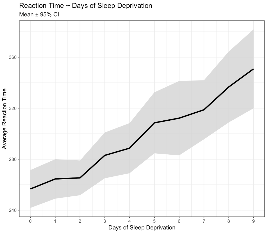
Okay, we can clearly see that something is going on here. As the days of sleep deprivation increase the reaction time in the test is also increasing, a fairly intuitive finding.

However, we also know that we are dealing with repeated measures on a number of subjects. As such, some subjects might have differences that vary from the group. For example, some might have a worse effect than the population average while others might not be that impacted at all. Let’s tease this out visually.


dat %>%
  ggplot(aes(x = Days, y = Reaction)) +
  geom_line(size = 1) +
  geom_point(shape = 21,
             size = 2,
             color = "black",
             fill = "white") +
  geom_smooth(method = "lm",
              se = FALSE) +
  facet_wrap(~Subject) +
  scale_x_continuous(labels = seq(from = 0, to = 9, by = 3),
                     breaks = seq(from = 0, to = 9, by = 3)) +
  labs(x = "Days of Sleep Deprivation",
       y = "Average Reaction Time",
       title = "Reaction Time ~ Days of Sleep Deprivation")

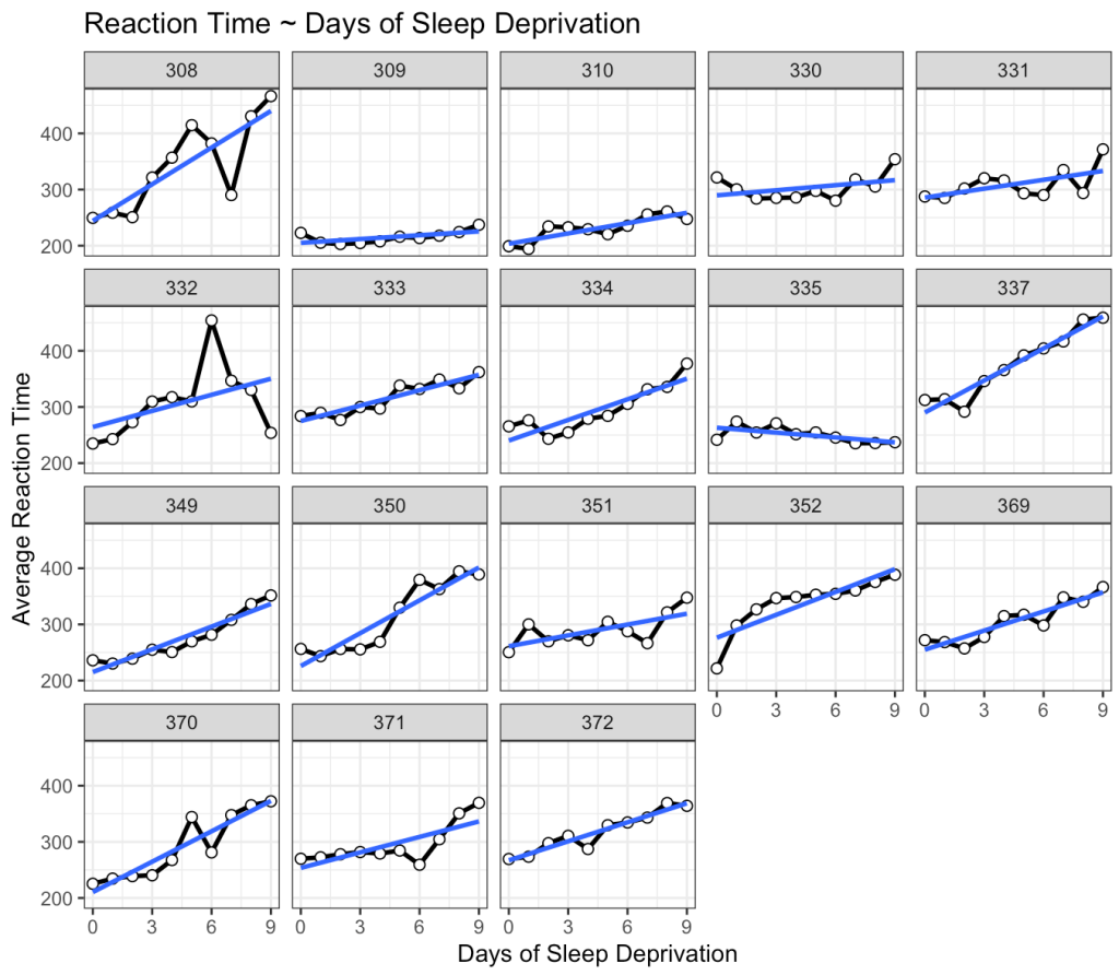
This is interesting. While we do see that many of the subjects exhibit an increase reaction time as the number of days of sleep deprivation increase there are a few subjects that behave differently from the norm. For example, Subject 309 seems to have no real change in reaction time while Subject 335 is showing a slight negative trend!

Linear Model

Before we get into modeling data specific to the individuals in the study, let’s just build a simple linear model. This is technically “the wrong” model because it violates assumptions of independence. After all, repeated measures on each individual means that there is going to be a level of correlation from one test to the next for any one individual. That said, building a simple model, even if it is the wrong model, is sometimes a good place to start just to help get your bearings, understand what is there, and have a benchmark to compare future models against. Additionally, the simple model is easier to interpret, so it is a good first step.


fit_ols <- lm(Reaction ~ Days, data = dat)
summary(fit_ols)

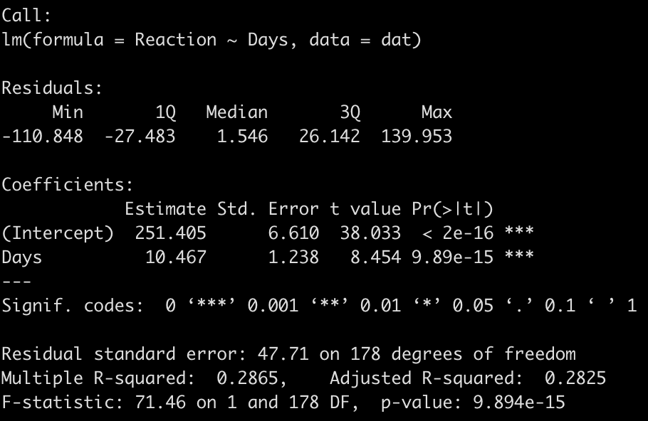
We end up with a model that suggests that for every one unit increase in a day of sleep deprivation, on average, we see about a 10.5 second increase in reaction time. The coefficient for the Days variable also has a standard error of 1.238 and the model r-squared indicates that days of sleep deprivation explain about 28.7% of the variance in reaction time.

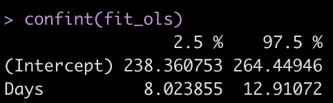
Let’s get the confidence intervals for the model intercept and Days coefficient.


confint(fit_ols)

Summary Measures Approach

Before moving to the mixed model approach, I want to touch on simple approach that was written about in 1990 by Matthews and Altman (2). I was introduced to this approach by one of my former PhD supervisors, Matt Weston, as he used it to analyze data in 2011 for a paper with my former lead PhD supervisor, Barry Drust, where they were quantifying the intensity of Premier League match-play for players and referees. This approach is extremely simple and, while you may be asking yourself, “Why not just jump into the mixed model and get on with it?”, just bear with me for a moment because this will make sense later when we begin discussing pooling effects in mixed models and Bayesian mixed models.

The basic approach suggested by Matthews (2) for this type of serially collected data is to treat each individual as the unit of measure and identify a single number, which summarizes that subject’s response over time. For our analysis here, the variable that we are interested in for each subject is the Days slope coefficient, as this value tells us the rate of change in reaction time for every passing day of sleep deprivation. Let’s construct a linear regression for each individual subject in the study and place their slope coefficients into a table.


ind_reg <- dat %>%
  group_by(Subject) %>%
  group_modify(~ tidy(lm(Reaction ~ Days, data = .x)))


ind_days_slope <- ind_reg %>%
  filter(term == "Days")

ind_days_slope %>%
  ungroup() %>%
  gt() %>%
  fmt_number(columns = estimate:statistic,
             decimals = 2) %>%
  fmt_number(columns = p.value,
             decimals = 3)

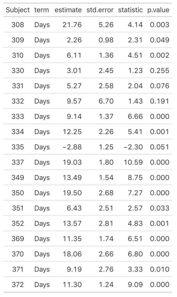
As we noticed in our visual inspection, Subject 335 had a negative trend and we can confirm their negative slope coefficient (-2.88). Subject 309 had a relatively flat relationship between days of sleep deprivation and reaction time. Here we see that their coefficient is 2.26 however the standard error, 0.98, indicates rather large uncertainty [95% CI: 0.3 to 4.22].

Now we can look at how each Subject’s response compares to the population. If we take the average of all of the slopes we get basically the same value that we got from our OLS model above, 10.47. I’ll build two figures, one that shows each Subject’s difference from the population average of 10.47 and one that shows each Subject’s difference from the population centered at 0 (being no difference from the population average). Both tell the same story, but offer different ways of visualizing the subjects relative to the population.


pop_avg

plt_to_avg <- ind_days_slope %>%
  mutate(pop_avg = pop_avg,
         diff = estimate - pop_avg) %>%
  ggplot(aes(x = estimate, y = as.factor(Subject))) +
  geom_vline(xintercept = pop_avg) +
  geom_segment(aes(x = diff + pop_avg, 
                   xend = pop_avg, 
                   y = Subject, 
                   yend = Subject),
               size = 1.2) +
  geom_point(size = 4) +
  labs(x = NULL,
       y = "Subject",
       title = "Difference compared to population\naverage change in reaction time (10.47 sec)")


plt_to_zero <- ind_days_slope %>%
  mutate(pop_avg = pop_avg,
         diff = estimate - pop_avg) %>%
  ggplot(aes(x = diff, y = as.factor(Subject))) +
  geom_vline(xintercept = 0) +
  geom_segment(aes(x = 0, 
                   xend = diff, 
                   y = Subject, 
                   yend = Subject),
               size = 1.2) +
  geom_point(size = 4) +
    labs(x = NULL,
       y = "Subject",
       title = "Difference compared to population\naverage reflected against a 0 change")

plt_to_avg | plt_to_zero

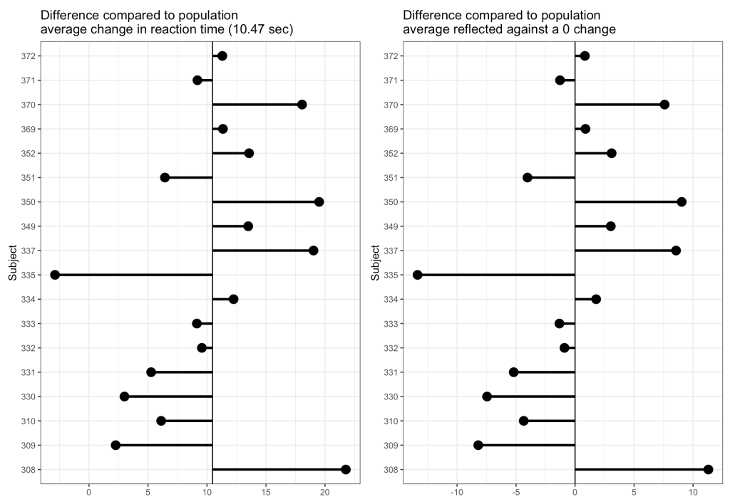
From the plots, it is clear to see how each individual behaves compared to the population average. Now let’s build some mixed models and compare the results.

Mixed Models

The aim of the mixed model here is to in someway acknowledge that we have these repeated measures on each individual and we need to account for that. In the simple linear model approach above, the Subjects shared the same variance, which isn’t accurate given that each subject behaves slightly differently, which we saw in our initial plot and in the individual linear regression models we constructed in the prior section. Our goal is to build a model that allows us to make an inference about the way in which the amount of sleep deprivation, measured in days, impacts a human’s reaction time performance. Therefore, we wouldn’t want to add each subject into a single regression model, creating a coefficient for each individual within the model, as that would be akin to making comparisons between each individual similar to what we would do in an ANOVA (and it will also use a lot of degrees of freedom). So, we want to acknowledge that there are individual subjects that may vary from the population, while also modeling our question of interest (Reaction Time ~ Days of Sleep Deprivation).

Intercept Only Model

We begin with a simple model that has an intercept only but allows that intercept to vary by subject. As such, this model is not accounting for days of sleep deprivation. Rather, it is simply telling us the average reaction time response for the group and how each subject varies from that response.

fit1 <- lmer(Reaction ~ 1 + (1|Subject), data = dat)
display(fit1)


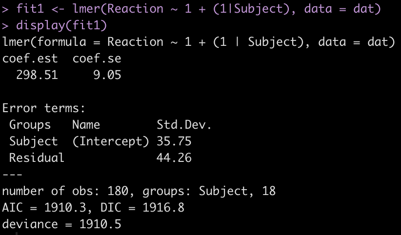
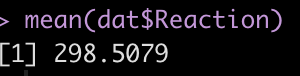
The output provides us with an average estimate for reaction time of 298.51. Again, this is simply the group average for reaction time. We can confirm this easily.

mean(dat$Reaction)


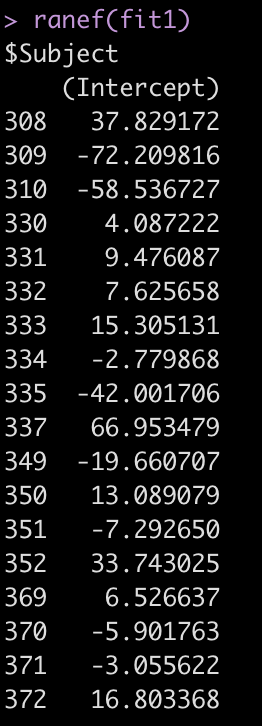
The Error terms in our output above provide us with the standard deviation around the population intercept, 35.75, which is the between-subject variability. The residual here represents our within-subject standard variability. We can extract the actual values for each subject. Using the ranef() function we get the difference between each subject and the population average intercept (the fixed effect intercept).

ranef(fit1)

One Fixed Effect plus Random Intercept Model

We will now extend the above mixed model to reflect our simple linear regression model except with random effects specified for each subject. Again, the only thing we are allowing to vary here is the individual subject’s intercept for reaction time.

fit2 <- lmer(Reaction ~ Days + (1|Subject), data = dat)
display(fit2)

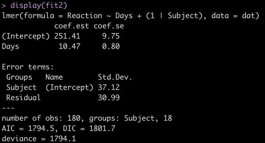
Adding the independent variable, Days, has changed the intercept, decreasing it from 298.51 to 251.41. The random effects have also changed from the first model. In the intercept only model we had an intercept standard deviation of 35.75 with a residual standard deviation of 44.26. In this model, accounting for days of sleep deprivation, the random effects intercept is now 37.12 and the residual (within subject) standard deviation has dropped to 30.99. The decline in the residual standard deviation tells us the model is picking up some of the individual differences that we have observed in plot of each subjects’ data.

Let’s look at the random effects intercept for each individual relative to the fixed effect intercept.

ranef(fit2)


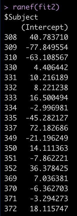
For example, Subject 309 has an intercept that is 77.8 seconds below the fixed effect intercept, while Subject 308 is 40.8 seconds above the fixed effect intercept.

If we use the coef() function we get returned the actual individual linear regression equation for each subject. Their difference compared to the population will be added to the fixed effect intercept, to create their individual intercept, and we will see the days coefficient, which is the same for each subject because we haven’t specified a varying slope model (yet).

coef(fit2)

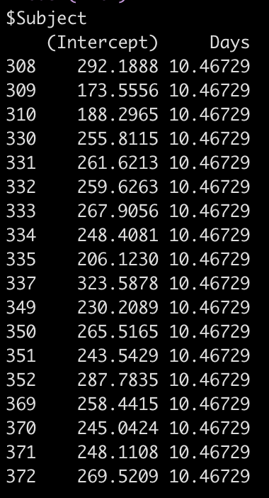
So, for example, the equation for Subject 308 has an equation of:

292.19 + 10.47*Days

Let’s also compare the results of this model to our original simple regression model. I’ll put all of the model results so far into a single data frame that we can keep adding to as we go, allowing us to compare the results.

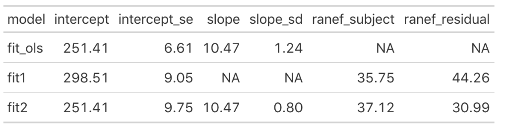
We can see that once we add the day variable to the model (in fit_ols, and fit2) the model intercept for reaction time changes to reflect its output being dependent on this information. Notice that the intercept and slope values between the simple linear regression model and the fit2 model are the same. The mean result hasn’t changed but notice that the standard error for the intercept and slope as been altered. In particular, notice how much the standard error of the slope variable has declined once we moved from a simple regression to a mixed model. This is due do the fact that the model now knows that there are individuals with repeated measurements being recorded.

Looking at the random effects changes between fit1 (intercept only model) and fit2, we see that we’ve increased in standard deviation for the intercept (35.75 to 37.12), which represents the between-subject variability. Additionally, we have substantially decreased the residual standard deviation (44.26 to 30.99), which represents our within-subject variability. Again, because we have not explicitly told the model that certain measurements are coming from certain individuals, there appears to be more variability between subjects and less variability within-subject. Basically, there is some level of autocorrelation to the individual’s reaction time performance whereby they are more similar to themselves than they are to other people. This makes intuitive sense — if you can’t agree with yourself, who can you agree with?!

Random Slope and Intercept Model

The final mixed model we will build will allow not only the intercept to vary randomly between subjects but also the slope. Recall above that the coefficient for Days was the same across all subjects. This is because that model allowed the subjects to have different model intercepts but it made the assumption that they had the same model slope. However, we may have reason to believe that the slopes also differ between subjects after looking at the individual subject plots in section 1.

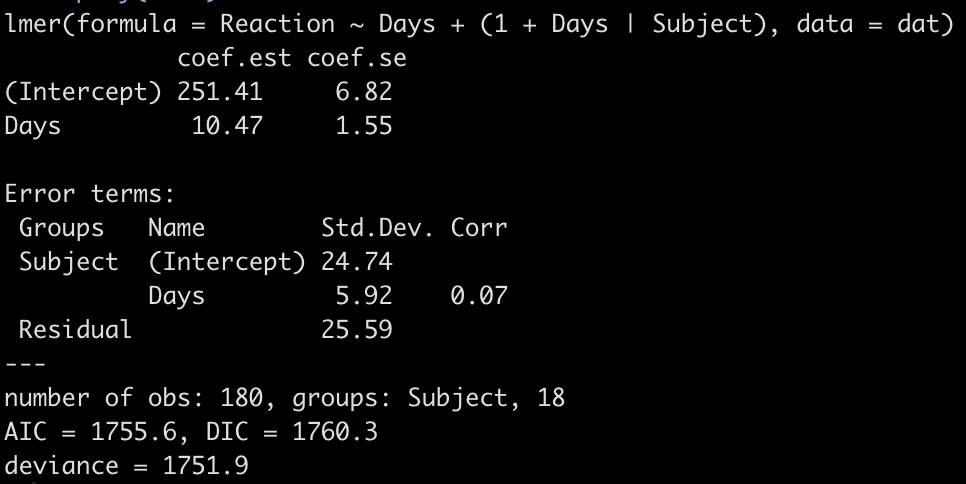
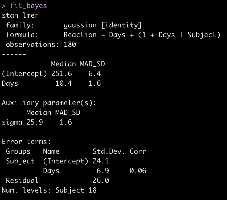
fit3 <- lmer(Reaction ~ Days + (1 + Days|Subject), data = dat)
display(fit3)

Let’s take a look at the regression model for each individual.

coef(fit3)

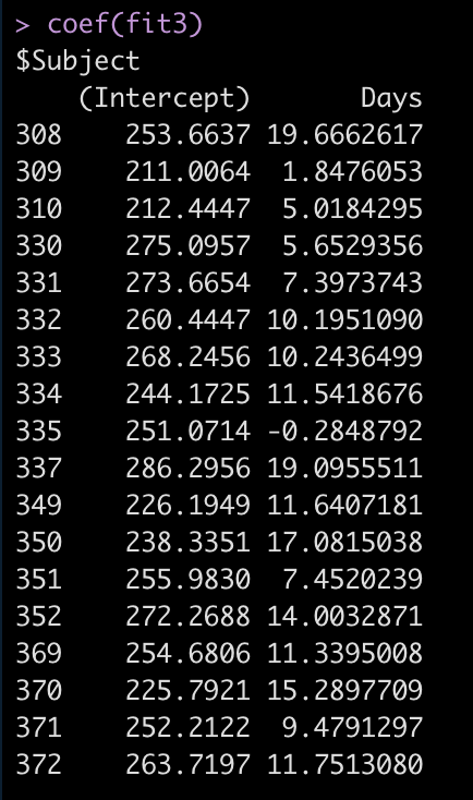
Now we see that the coefficient for the Days variable is different for each Subject. Let’s add the results of this model to our results data frame and compare everything.

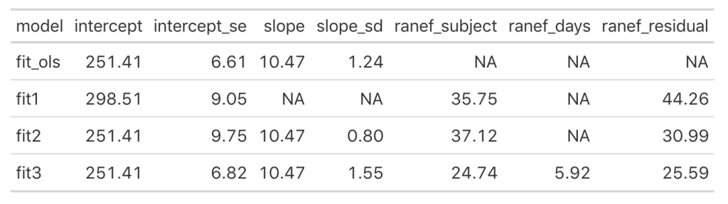
Looking at this latest model we see that the intercept and slope coefficients have remained unchanged relative to the other models. Again, the only difference in fixed effects comes at the standard error for the intercept and the slope. This is because the variance in the data is being partitioned between the population estimate fixed effects and the individual random effects. Notice that for the random effects in this model, fit3, we see a substantial decline in the between-subject intercept, down to 24.74 from the mid 30’s in the previous two models. We also see a substantial decline the random effect residual, because we are now seeing less within individual variability as we account for the random slope. The addition here is the random effect standard deviation for the slope coefficient, which is 5.92.

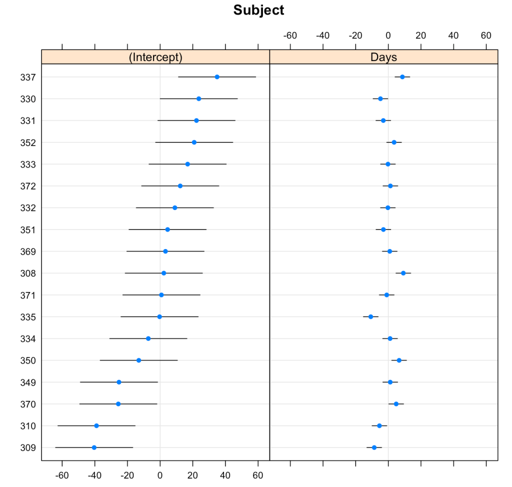
We can plot the results of the varying intercepts and slopes across subjects using the {lattice} package.

lattice::dotplot(ranef(fit3, condVar = T))

Comparing the models

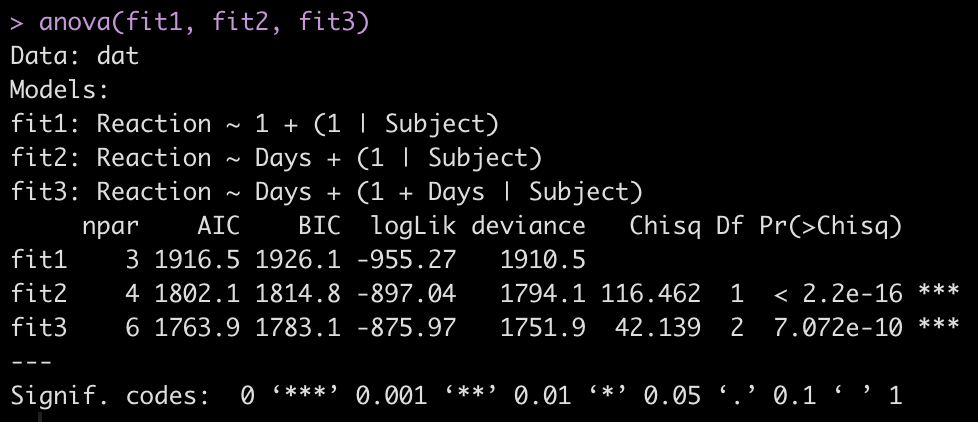
To make model comparisons, Newans and colleagues used Akaike Information Criterion (AIC) to determine which model fit the data best. With the anova() function we simply pass our three mixed models in as arguments and we get returned several model comparison metrics including AIC, BIC, and p-values. These values are lowest for fit3, indicating it is the better model at explaining the underlying data. Which shouldn’t be too surprising given how individual the responses looked in the initial plot of the data.

anova(fit1, fit2, fit3)

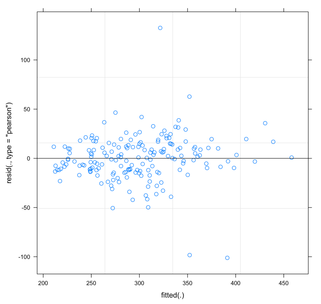
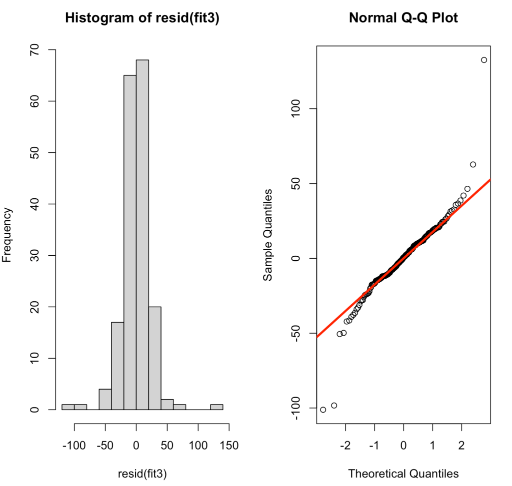
We can also plot the residuals of fit3 to see whether they violate any assumptions of homoscedasticity or normality.

plot(fit3)

par(mfrow = c(1,2))
hist(resid(fit3))
qqnorm(resid(fit3))
qqline(resid(fit3), col = "red", lwd = 3)

Pooling Effects

So what’s going on here? The mixed model is really helping us account for the repeated measures and the correlated nature of an individuals data. In doing so, it allows us to make an estimate of a population effect (fixed effect), while adjusting the standard errors to be more reasonable given the violation of independence assumption. The random effects allow us to see how much variance there is for each individual measured within the population. In a way, I tend to think about mixed models as a sort of bridge to Bayesian analysis. In my mind, the fixed effects seem to look a bit like priors and the random effects are the adjustment we make to those priors having seen some data for an individual. In our example here, each of the 18 subjects have 10 reaction time measurements. If we were dealing with a data set that had different numbers of observations for each individual, however, we would see that those with less observations are pulled closer towards the population average (the fixed effect coefficients) while those with a larger number of observations are allowed to deviate further from the population average, if they indeed are different. This is because with more observations we have more confidence about what we are observing for that individual. In effect, this is called pooling.

In their book, Data Analysis Using Regression and Multilevel/Hierarchical Models, Gelman and Hill (4) discuss no-, complete-, and partial-pooling models.

  • No-pooling models occur when the data from each subject are analyzed separately. This model ignores information in the data and could lead to poor inference.
  • Complete-pooling disregards any variation that might occur between subjects. Such suppression of between-subject variance is missing the point of conducting the analysis and looking at individual difference.
  • Partial-pooling strikes a balance between the two, allowing for some pooling of population data (fixed effects) while honoring the fact that there are individual variations occurring within the repeated measurements. This type of analysis is what we obtain with a mixed model.

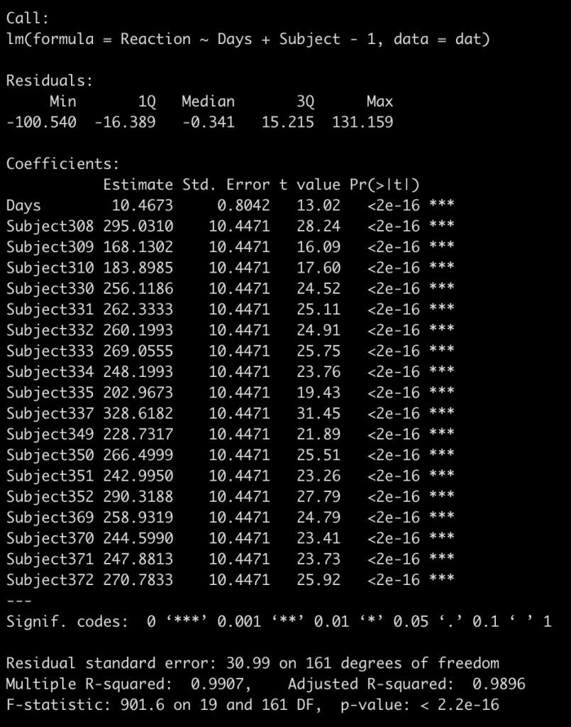
I find it easiest to understand this by visualizing it. We already have a complete-pooling model (fit_ols) and a partial-pooling model (fit3). We need to fit the no-pooling model, which is a regression equation with each subject entered as a fixed effect. As a technical note, I will also add to the model -1 to have a coefficient for each subject returned instead of a model intercept.

fit_no_pool <- lm(Reaction ~ Days + Subject - 1, data = dat)
summary(fit_no_pool)


To keep the visual small, we will fit each of our three models to 4 subjects (308, 309, 335, and 331) and then plot the respective regression lines. In addition, I will also plot the regression line from the individualized regression/summary measures approach that we built first, just to show the difference.

## build a data frame for predictions to be stored
Subject <- as.factor(c(308, 309, 335, 331))
Days <- seq(from = 0, to = 9, by = 1)
pred_df <- crossing(Subject, Days)
pred_df

## complete pooling predictions
pred_df$complete_pool_pred <- predict(fit_ols, newdata = pred_df)

## no pooling predictions
pred_df$no_pool_pred <- predict(fit_no_pool, newdata = pred_df)

## summary measures/individual regression
subject_coefs <- ind_reg %>%
  filter(Subject %in% unique(pred_df$Subject)) %>%
  dplyr::select(Subject, term, estimate) %>%
  mutate(term = ifelse(term == "(Intercept)", "Intercept", "Days")) %>%
  pivot_wider(names_from = term,
              values_from = estimate)

subject_coefs %>%
  as.data.frame()

pred_df <- pred_df %>%
  mutate(ind_reg_pred = ifelse(
    Subject == 308, 244.19 + 21.8*Days,
    ifelse(
      Subject == 309, 205.05 + 2.26*Days,
    ifelse(
      Subject == 331, 285.74 + 5.27*Days,
    ifelse(Subject == 335, 263.03 - 2.88*Days, NA)
    )
    )
  ))


## partial pooling predictions
pred_df$partial_pool_pred <- predict(fit3, 
        newdata = pred_df,
        re.form = ~(1 + Days|Subject))


## get original results and add to the predicted data frame
subject_obs_data <- dat %>%
  filter(Subject %in% unique(pred_df$Subject)) %>%
  dplyr::select(Subject, Days, Reaction)

pred_df <- pred_df %>%
  left_join(subject_obs_data)


## final predicted data set with original observations
pred_df %>%
  head()

## plot results
pred_df %>%
  pivot_longer(cols = complete_pool_pred:partial_pool_pred,
               names_to = "model_pred") %>%
  arrange(model_pred) %>%
  ggplot(aes(x = Days, y = Reaction)) +
  geom_point(size = 4,
             shape = 21,
             color = "black",
             fill = "white") +
  geom_line(aes(y = value, color = model_pred),
            size = 1.1) +
  facet_wrap(~Subject)

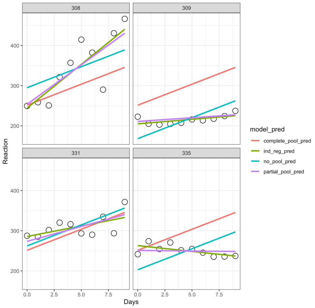
Let’s unpack this a bit:

  • The complete-pooling line (orange) has the same intercept and slope for each of the subjects. Clearly it does not fit the data well for each subject.
  • The no-pooling line (dark green) has the same slope for each subject but we notice that the intercept varies as it is higher for some subject than others.
  • The partial-pooling line (purple) comes from the mixed model and we can see that it has a slope and intercept that is unique to each subject.
  • Finally, the independent regression/summary measures line (light green) is similar to the partial-pooling line, as a bespoke regression model was built for each subject. Note, that in this example the two lines have very little difference but, if we were dealing with subjects who had varying levels of sample size, this would not be the case. The reason is because those with lower sample size will have an independent regression line completely estimated from their observed data, however, their partial pooling line will be pulled more towards the population average, given their lower sample.

Bayesian Mixed Models

Since I mentioned that I tend to think of mixed models as sort of a bridge to the Bayesian universe, let’s go ahead at turn our mixed model into a Bayes model and see what else we can do with it.

I’ll keep things simple here and allow the {rstanarm} library to use the default, weakly informative priors.

library(rstanarm)

fit_bayes <- stan_lmer(Reaction ~ Days + (1 + Days|Subject), data = dat)
fit_bayes

# If you want to extract the mean, sd and 95% Credible Intervals
# summary(fit_bayes,
#         probs = c(0.025, 0.975),
#         digits = 2)

Let’s add the model output to our comparison table.

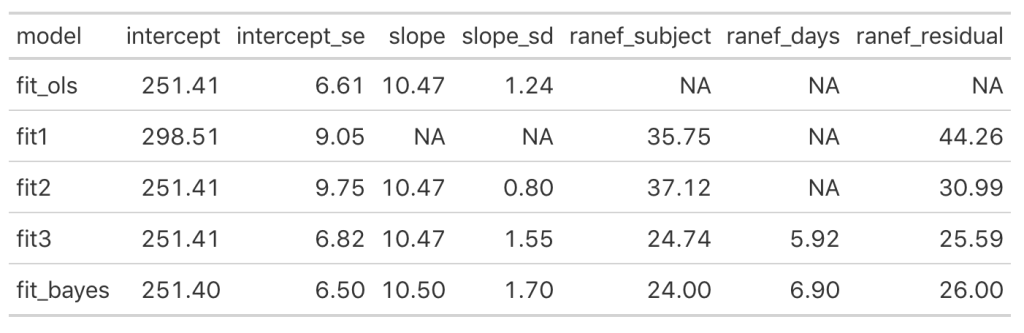
We see some slight changes between fit3 and fit_bayes, but nothing that drastic.

Let’s see what the posterior draws for all of the parameters in our model look like.

# Extract the posterior draws for all parameters
post_sims <- as.matrix(fit_bayes)
dim(post_sims)
head(post_sims)


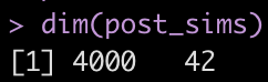
Yikes! That is a large matrix of numbers (4000 rows x 42 columns). Each subject gets, by default, 4000 draws from the posterior and each column represents a posterior sample from each of the different parameters in the model.

What if we slim this down to see what is going on? Let’s see what possible parameters in our matrix are in our matrix we might be interested in extracting.

colnames(post_sims)

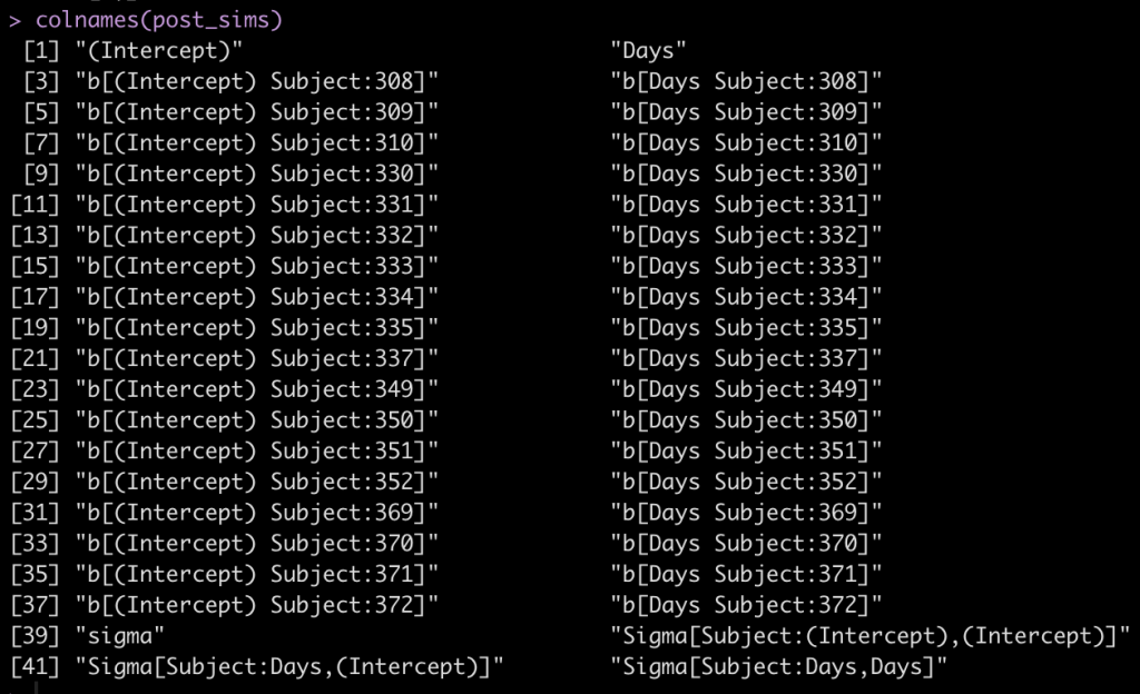
The first two columns are the fixed effect intercept and slope. Following that, we see that each subject has an intercept value and a Days value, coming from the random effects. Finally, we see that column names 39 to 42 are specific to the sigma values of the model.

Let’s keep things simple and see what we can do with the individual subject intercepts. Basically, we want to extract the posterior distribution of the fixed effects intercept and the posterior distribution of the random effects intercept per subject and combine those to reflect the posterior distribution of reaction time by subject.

## posterior draw from the fixed effects intercept
fixed_intercept_sims <- as.matrix(fit_bayes, 
                       pars = "(Intercept)")

## posterior draws from the individual subject intercepts
subject_ranef_intercept_sims <- as.matrix(fit_bayes, 
                    regex_pars = "b\\[\\(Intercept\\) Subject\\:")


## combine the posterior draws of the fixed effects intercept with each individual
posterior_intercept_sims <- as.numeric(fixed_intercept_sims) + subject_ranef_intercept_sims
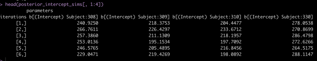
head(posterior_intercept_sims[, 1:4])

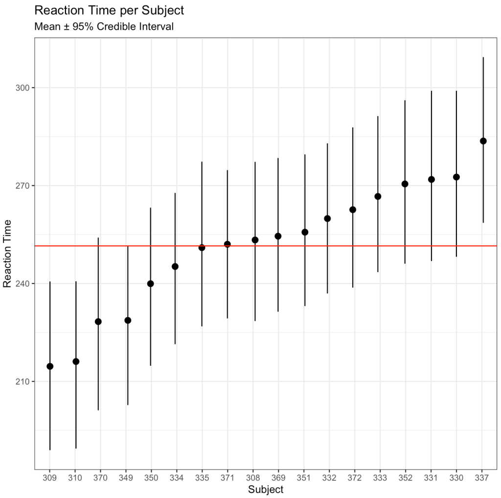
After drawing our posterior intercepts, we can get the mean, standard deviation, median, and 95% Credible Interval of the 4000 simulations for each subject and then graph them in a caterpillar plot.

## mean per subject
intercept_mean <- colMeans(posterior_intercept_sims)

## sd per subject
intercept_sd <- apply(X = posterior_intercept_sims,
              MARGIN = 2,
              FUN = sd)

## median and 95% credible interval per subject
intercept_ci <- apply(X = posterior_intercept_sims, 
                 MARGIN = 2, 
                 FUN = quantile, 
                 probs = c(0.025, 0.50, 0.975))

## summary results in a single data frame
intercept_ci_df <- data.frame(t(intercept_ci))
names(intercept_ci_df) <- c("x2.5", "x50", "x97.5")

## Combine summary statistics of posterior simulation draws
bayes_df <- data.frame(intercept_mean, intercept_sd, intercept_ci_df)
round(head(bayes_df), 2)

## Create a column for each subject's ID
bayes_df$subject <- rownames(bayes_df)
bayes_df$subject <- extract_numeric(bayes_df$subject)


## Catepillar plot
ggplot(data = bayes_df, 
       aes(x = reorder(as.factor(subject), intercept_mean), 
           y = intercept_mean)) +
  geom_pointrange(aes(ymin = x2.5, 
                      ymax = x97.5),
                  position = position_jitter(width = 0.1, 
                                             height = 0)) + 
  geom_hline(yintercept = mean(bayes_df$intercept_mean), 
             size = 0.5, 
             col = "red") +
  labs(x = "Subject",
       y = "Reaction Time",
       title = "Reaction Time per Subject",
       subtitle = "Mean ± 95% Credible Interval")

We can also use the posterior distributions to compare two individuals. For example, let’s compare Subject 308 (column 1 of our posterior sim matrix) to Subject 309 (column 2 of our posterior sim matrix).

## create a difference between distributions
compare_dist <- posterior_intercept_sims[, 1] - posterior_intercept_sims[, 2]

# summary statistics of the difference
mean_diff <- mean(compare_dist)
sd_diff <- sd(compare_dist)

quantile_diff <- quantile(compare_dist, probs = c(0.025, 0.50, 0.975))
quantile_diff <- data.frame(t(quantile_diff))
names(quantile_diff) <- c("x2.5", "x50", "x97.5")

diff_df <- data.frame(mean_diff, sd_diff, quantile_diff)
round(diff_df, 2)

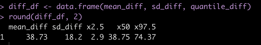
Subject 308 exhibits a 38.7 second higher reaction time than Subject 309 [95% Credible Interval 2.9 to 74.4].

We can plot the posterior differences as well.

# Histogram of the differences
hist(compare_dist, 
     main = "Posterior Distribution Comparison\n(Subject 308 - Subject 309)",
     xlab = "Difference in 4000 posterior simulations")
abline(v = 0,
       col = "red",
       lty = 2,
       lwd = 2)
abline(v = mean_diff,
       col = "black",
       lwd = 2)
abline(v = quantile_diff$x2.5,
       col = "black",
       lty = 2,
       lwd = 2)
abline(v = quantile_diff$x97.5,
       col = "black",
       lty = 2,
       lwd = 2)


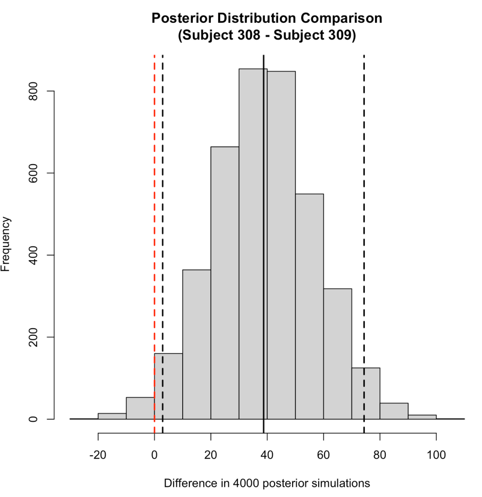
We can also use the posterior distributions to make a probabilistic statement about how often, in the 4000 posterior draws, Subject 308 had a higher reaction time than Subject 309.

prop.table(table(posterior_intercept_sims[, 1] > posterior_intercept_sims[, 2]))


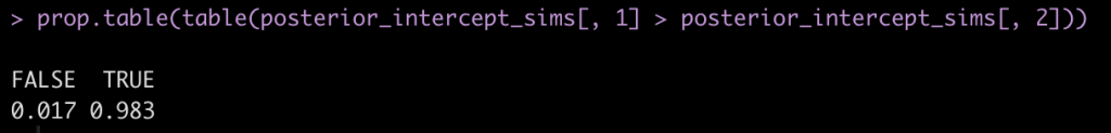
Here we see that mean posterior probability that Subject 308 has a higher reaction time than Subject 309 is 98.3%.

Of course we could (and should) go through and do a similar work up for the slope coefficient for the Days variable. However, this is getting long, so I’ll leave you to try that out on your own.

Wrapping Up

Mixed models are an interesting way of handling data consisting of multiple measurements taken on different individuals, as common in sport science. Thanks to Newans et al (1) for sharing their insights into these models. Hopefully this blog was useful in explaining a little bit about how mixed models work and how extending them to a Bayesian framework offers some additional ways of looking at the data. Just note that if you run the code on your own, the Bayesian results might be slightly different than mine as the Monte Carlo component of the Bayesian model produces some randomness in each simulation (and I didn’t set a seed prior to running the model).

The entire code is available on my GitHub page.

If you notice any errors in the code, please reach out!

References

1. Newans T, Bellinger P, Drovandi C, Buxton S, Minahan C. (2022). The utility of mixed models in sport science: A call for further adoption in longitudinal data sets. Int J Sports Phys Perf. Published ahead of print.

2. Matthews JNS, Altman DG, Campbell MJ, Royston P. (1990). Analysis of serial measurements in medical research. Br Med J; 300: 230-235.

3. Weston M, Drust B, Gregson W. (2011). Intensities of exercise during match-play in FA Premier League Referees and players. J Sports Sc; 29(5): 527-532.

4. Gelman A, Hill J. (2009). Data Analysis Using Regression and Multilevel/Hierarchical Models. Cambridge University Press.

Two Group Comparison – Frequentist vs Bayes – Part 1

One of the more common types of analysis conducted in science is the comparison of two groups (e.g., a treatment group and a control group) to identify whether an intervention had a desired effect. The problem, in sport science and other fields, is often a lack of participants (small sample sizes) and an inability to combine prior knowledge (e.g., outcomes from previous research or domain expertise) with the observed data in order to make a broader statement of our findings (IE, a Bayesian approach). Consequently, this leaves us analyzing the data on hand and reporting whatever potential findings shake out.

This tutorial will step through a two group comparison of some simulated data from both a frequentist (t-test) and Bayesian approach.

All code is accessible on my GITHUB page.

Two Groups – Simulated Data

We are conducting a study on the effect of a new strength training program. Participants are randomly allocated into a control group (n = 17), receiving a normal training program, or an experimental group (n = 22), receiving the new training program.

The data consists of the change in strength score observed for each participant in their respective groups. (NOTE: For the purposes of this example, the strength score is a made up number describing a participants strength).

Simulate the data

library(tidyverse)
library(patchwork)

theme_set(theme_classic())

set.seed(6677)
df <- data.frame( subject = 1:39, group = c(rep("control", times = 17), rep("experimental", times = 22)), strength_score_change = c(round(rnorm(n = 17, mean = 0, sd = 0.5), 1), round(rnorm(n = 22, mean = 0.5, sd = 0.5), 1)) ) %>%
  mutate(group = factor(group, levels = c("experimental", "control")))


Summary Statistics

df %>%
  group_by(group) %>%
  summarize(N = n(),
            Avg = mean(strength_score_change),
            SD = sd(strength_score_change),
            SE = SD / sqrt(N))


It looks like the new strength training program led to a greater improvement in strength, on average, than the normal strength training program.

Plot the data

Density plots of the two distributions

df %>%
  ggplot(aes(x = strength_score_change, fill = group)) +
  geom_density(alpha = 0.2) +
  xlim(-2, 2.5)


Plot the means and 95% CI to compare visually

df %>%
  group_by(group) %>%
  summarize(N = n(),
            Avg = mean(strength_score_change),
            SD = sd(strength_score_change),
            SE = SD / sqrt(N)) %>%
  ggplot(aes(x = group, y = Avg)) +
  geom_hline(yintercept = 0,
             size = 1,
             linetype = "dashed") +
  geom_point(size = 5) +
  geom_errorbar(aes(ymin = Avg - 1.96 * SE, ymax = Avg + 1.96 * SE),
                width = 0,
                size = 1.4) +
  theme(axis.text = element_text(face = "bold", size = 13),
        axis.title = element_text(face = "bold", size = 17))

Plot the 95% CI for the difference in means

df %>%
  mutate(group = factor(group, levels = c("control", "experimental"))) %>%
  group_by(group) %>%
  summarize(N = n(),
            Avg = mean(strength_score_change),
            SD = sd(strength_score_change),
            SE = SD / sqrt(N),
            SE2 = SE^2,
            .groups = "drop") %&amp;gt;%
  summarize(diff = diff(Avg),
            se_diff = sqrt(sum(SE2))) %&amp;gt;%
  mutate(group = 'Group\nDifference') %&amp;gt;%
  ggplot(aes(x = diff, y = 'Group\nDifference')) +
  geom_vline(aes(xintercept = 0),
             linetype = "dashed",
             size = 1.2) +
  geom_point(size = 5) +
  geom_errorbar(aes(xmin = diff - 1.96 * se_diff,
                    xmax = diff + 1.96 * se_diff),
                width = 0,
                size = 1.3) +
  xlim(-0.8, 0.8) +
  labs(y = NULL,
       x = "Average Difference in Strengh Score",
       title = "Difference in Strength Score",
       subtitle = "Experimental - Control (Mean Difference ± 95% CI)") +
  theme(axis.text = element_text(face = "bold", size = 13),
        axis.title = element_text(face = "bold", size = 17),
        plot.title = element_text(size = 20),
        plot.subtitle = element_text(size = 18))


Initial Observations

  • We can see that the two distributions have a decent amount of overlap
  • The mean change in strength for the experimental group appears to be larger than the mean change in strength for the control group
  • When visually comparing the group means and their associated confidence intervals, there is an observable difference. Additionally, looking at the mean difference plot, that difference appears to be significant based on the fact that the confidence interval does not cross zero.

So, it seems like something is going on here with the new strength training program. Let’s do some testing to see just how large the difference is between our two groups.

Group Comparison: T-test

First, let’s use a frequentist approach to evaluating the difference in strength score change between the two groups. We will use a t-test to compare the mean differences.

diff_t_test <- t.test(strength_score_change ~ group,
       data = df,
       alternative = "two.sided")

## store some of the main values in their own elements to use later
t_test_diff  <- as.vector(round(diff_t_test$estimate[1] - diff_t_test$estimate[2], 2))

se_diff <- 0.155    # calculated above when creating the plot

diff_t_test

  • The test is statistically significant, as the p-value is less than the magic 0.05 (p = 0.01) with a mean difference in strength score of 0.41 and a 95% Confidence Interval of 0.1 to 0.73.

Here, the null hypothesis was that the difference in strength improvement between the two groups is 0 (no difference) while the alternative hypothesis is that the difference is not 0. In this case, we did a two sided test so we are stating that we want to know if the change in strength from the new training program is either better or worse than the normal training program. If we were interested in testing the difference in a specific direction, we could have done a one sided test in the direction of our hypothesis, for example, testing whether the new training program is better than the normal program.

But, what if we just got lucky with our sample in the experimental group, and they happened to respond really well to the new program, and got unlucky in our control group, and they happened to not change as much to the normal training program? This could certainly happen. Also, had we collected data on a few more participants, it is possible that the group means could have changed and no effect was observed.

The t-test only allows us to compare the group means. It doesn’t tell us anything about the differences in variances between groups (we could do an F-test for that). The other issue is that rarely is the difference between two groups exactly 0. It makes more sense for us to compare a full distribution of the data and make an inference about how much difference there is between the two groups. Finally, we are only dealing with the data we have on hand (the data collected for our study). What if we want to incorporate prior information/knowledge into the analysis? What if we collect data on a few more participants and want to add that to what we have already observed to see how it changes the distribution of our data? For that, we can use a Bayesian approach.

Group Comparison: Bayes

The two approaches we will use are:

  1. Group comparison with a known variance, using conjugate priors
  2. Group comparisons without a know variance, estimating the mean and SD distributions jointly

Part 1: Group Comparison with known variance

First, we need to set some priors. Let’s say that we are skeptical about the effect of the new strength training program. It is a new training stimulus that the subjects have never been exposed to, so perhaps we believe that it will improve strength but not much more than the traditional program. We will set our prior belief about the mean improvement of any strength training program to be 0.1 with a standard deviation of 0.3, for our population.  Thus, we will look to combine this average/expected improvement (prior knowledge) with the observations in improvement that we see in our respective groups. Finally, we convert the standard deviation of the mean to precision, calculated as 1/sd^2, for our equations going forward.

prior_mu <- 0.1
prior_sd <- 0.3
prior_var <- prior_sd^2
prior_precision <- 1 / prior_var

Plot the prior distribution for the mean difference

hist(rnorm(n = 1e6, mean = prior_mu, sd = prior_sd),
     main = "Prior Distribution for difference in strength change\nbetween control and experimental groups",
     xlab = NULL)
abline(v = 0,
       col = "red",
       lwd = 5,
       lty = 2)

Next, to make this conjugate approach work we need to have a known standard deviation. In this example, we will not be estimating the joint posterior distributions (mean and SD). Rather, we are saying that we are interested in knowing the mean and the variability around it but we are going to have a fixed/known SD.

Let’s say we looked at some previously published scientific literature and also tried out the new program in a small pilot study of athletes and we the improvements of a strength training program are normally distributed with a known SD of 0.6.

known_sd <- 0.6
known_var <- known_sd^2

Finally, let’s store the summary statistics for each group in their own elements. We can type these directly in from our summary table.

df %>%
  group_by(group) %>%
  summarize(N = n(),
            Avg = mean(strength_score_change),
            SD = sd(strength_score_change),
            SE = SD / sqrt(N))

experimental_N <- 22
experimental_mu <- 0.423
experimental_sd <- 0.494
experimental_var <- experimental_sd^2
experimental_precision <- 1 / experimental_var

control_N <- 17
control_mu <- 0.0118
control_sd <- 0.469
control_var <- control_sd^2
control_precision <- 1 / control_var

Now we are ready to update the observed study data for each group with our prior information and obtain posterior estimates. We will use the updating rules provided by William Bolstad in Chapter 13 of his book, Introduction to Bayesian Statistics, 2nd Ed.

##### Update the control group observations ######
## SD
posterior_precision_control <- prior_precision + control_N / known_var
posterior_var_control <- 1 / posterior_precision_control
posterior_sd_control <- sqrt(posterior_var_control)

## mean
posterior_mu_control <- prior_precision / posterior_precision_control * prior_mu + (control_N / known_var) / posterior_precision_control * control_mu

posterior_mu_control
posterior_sd_control

##### Update the experimental group observations ######
## SD
posterior_precision_experimental <- prior_precision + experimental_N / known_var
posterior_var_experimental <- 1 / posterior_precision_experimental
posterior_sd_experimental <- sqrt(posterior_var_experimental)

## mean
posterior_mu_experimental <- prior_precision / posterior_precision_experimental * prior_mu + (experimental_N / known_var) / posterior_precision_experimental * experimental_mu

posterior_mu_experimental
posterior_sd_experimental

Compare the posterior difference in strength change

# mean
mu_diff <- posterior_mu_experimental - posterior_mu_control
mu_diff

# sd = sqrt(var1 + var2)
sd_diff <- sqrt(posterior_var_experimental + posterior_var_control)
sd_diff

# 95% Credible Interval
mu_diff + qnorm(p = c(0.025, 0.975)) * sd_diff

  • Combining the observations for each group with our prior, it appears that the new program was more effective than the normal program on average (0.34 difference in change score between experimental and control) but the credible interval suggests the data is consistent with the new program having no extra benefit [95% Credible Interval: -0.0003 to 0.69].

Next, we can take the posterior parameters and perform a Monte Carlo Simulation to compare the posterior distributions.

Monte Carlo Simulation is an approach that uses random sampling from a defined distribution to solve a problem. Here, we will use Monte Carlo Simulation to sample from the normal distributions of the control and experimental groups as well as a simulation for the difference between the two. To do this, we will create a random draw of 10,000 values with the mean and standard deviation being defined as the posterior mean and standard deviation from the respective groups.

## Number of simulations
N <- 10000

## Monte Carlo Simulation
set.seed(9191)
control_posterior <- rnorm(n = N, mean = posterior_mu_control, sd = posterior_sd_control)
experimental_posterior <- rnorm(n = N, mean = posterior_mu_experimental, sd = posterior_sd_experimental)
diff_posterior <- rnorm(n = N, mean = mu_diff, sd = sd_diff)

## Put the control and experimental groups into a data frame
posterior_df <- data.frame(
  group = c(rep("control", times = N), rep("experimental", times = N)),
  posterior_sim = c(control_posterior, experimental_posterior)
)

Plot the mean and 95% CI for both simulated groups

posterior_df %>%
  group_by(group) %>%
  summarize(Avg = mean(posterior_sim),
            SE = sd(posterior_sim)) %>%
  ggplot(aes(x = group, y = Avg)) +
  geom_hline(yintercept = 0,
             size = 1,
             linetype = "dashed") +
  geom_point(size = 5) +
  geom_errorbar(aes(ymin = Avg - 1.96 * SE, ymax = Avg + 1.96 * SE),
                width = 0,
                size = 1.4) +
  labs(x = NULL,
       y = "Mean Diff",
       title = "Difference in Strength Score",
       subtitle = "Monte Carlo Simulation of Posterior Mean and SD") +
  theme(axis.text = element_text(face = "bold", size = 13),
        axis.title = element_text(face = "bold", size = 17),
        plot.title = element_text(size = 20),
        plot.subtitle = element_text(size = 17))

  • We see more overlap here than we did when we were just looking at the observed data. Part of this is due to the priors that we set.

Plot the posterior simulation for the difference

hist(diff_posterior,
     main = "Posterior Simulation of the Difference between groups",
     xlab = "Strength Score Difference")
abline(v = 0,
       col = "red",
       lwd = 5,
       lty = 2)

Compare these results to the observed data and the t-test results

data.frame(
  group = c("control", "experimental", "difference"),
  observed_avg = c(control_mu, experimental_mu, t_test_diff),
  posterior_sim_avg = c(posterior_mu_control, posterior_mu_experimental, mu_diff),
  observed_standard_error = c(control_sd / sqrt(control_N), experimental_sd / sqrt(experimental_N), se_diff),
  posterior_sim_standard_error = c(posterior_sd_control, posterior_sd_experimental, sd_diff)
  )

  • Recall that we set out prior mean to 0.1 and our prior SD to 0.3
  • Also notice that, because this conjugate approach is directed at the means, I convert the observed standard deviations into standard errors (the standard deviation of the mean given the sample size). Remember, we set the SD to be known for this approach to work, so we are not able to say anything about it following our Bayesian procedure. To do so, we’d need to estimate both parameters (mean and SD) jointly. We will do this in part 2.
  • Above, we see that, following the Bayesian approach, the mean value of the control group gets pulled up closer to our prior while the mean value of the experimental group gets pulled down closer to that prior.
  • The posterior for the difference between the two groups, which is what we are interested in, has come down towards the prior, considerably. Had we had a larger sample of data in our two groups, the movement towards the prior would have been less extreme. But, since this was a relatively small study we get more movement towards the prior, placing less confidence in the observed sample of participants we had. We also see that the standard error around the mean difference increased, since our prior SD was 0.3. So, the mean difference decreased a bit and the standard error around that mean increased a bit. Both occurrences lead to less certainty in our observed outcomes.

Compare the Observed Difference to the Bayesian Posterior Difference

  • Start by creating a Monte Carlo Simulation of the observed difference from the original data.
  • Notice that the Bayesian Posterior Difference (blue) is pulled down towards our prior, slightly.
  • We also see that the Bayesian Posterior has more overlap of 0 than the Observed Difference (red) from the original data, which had a small sample size and hadn’t combined any prior knowledge that we might have had.
N <- 10000

set.seed(8945)
observed_diff <- rnorm(n = N, mean = t_test_diff, sd = se_diff)

plot(density(observed_diff),
     lwd = 5,
     col = "red",
     main = "Comparing the Observed Difference (red)\nto the\nBayes Posterior Difference (blue)",
     xlab = "Difference in Strength Score between Groups")
lines(density(diff_posterior),
      lwd = 5,
      col = "blue")
abline(v = 0,
       lty = 2,
       lwd = 3,
       col = "black")

Wrapping Up

That’s it for part 1. We’ve computed a frequentist t-test of the observed data in our study and compared those results to Bayesian estimation where we combined the observed data with some prior knowledge that we accessed from previous research and domain expertise. In this example, we used a conjugate approach and therefore were required to specify a known standard deviation for the data. Unfortunately, this may not always make sense to do and we may instead need to jointly estimating both the mean and standard deviation simultaneously. In part 2, we will discuss how to do this.

The code for this article is accessible on my GITHUB page.

If you see any code or mathematical errors, please email me.

Neural Networks….It’s regression all the way down!

Yesterday, I talked about how t-test and ANOVA are fundamentally just linear regression. But what about something more complex? What about something like a neural network?

Whenever people bring up neural networks I always say, “The most basic neural network is a sigmoid function. It’s just logistic regression!!” Of course, neural networks can get very complex and there is a lot more than can be added to them to maximize their ability to do the job. But fundamentally, they look like regression models and  when you add several hidden layers (deep learning) you end up just stacking a bunch of regression models on top of each other (I know I’m over simplifying this a little bit).

Let’s see if we can build a simple neural network to prove it. As always, you can access the full code on my GITHUB page.

Loading packages, functions, and data

We will load {tidyverse} for data cleaning, {neuralnet} for building our neural network, and {mlbench} to access the Boston housing data.

I create a z-score function that will be used to standardize the features for our model. We will keep this simple and attempt to predict Boston housing prices (mdev) using three features (rm, dis, indus). To read more about what these features are, in your R console type ?BostonHousing. Once we’ve selected those features out of the data set, we apply our z-score function to them.

## Load packages
library(tidyverse)
library(neuralnet)
library(mlbench)

## z-score function
z_score <- function(x){
  z <- (x - mean(x, na.rm = TRUE)) / sd(x, na.rm = TRUE)
  return(z)
}

## get data
data("BostonHousing")

## z-score features
d <- BostonHousing %>%
  select(medv, rm, dis, indus) %>%
  mutate(across(.cols = rm:indus,
                ~z_score(.x),
                .names = "{.col}_z"))
  
d %>% 
  head()

Train/Test Split

There isn’t much of a train/test split here because I’m not building a full model to be tested. I’m really just trying to show how a neural network works. Thus, I’ll select the first row of data as my “test” set and retain the rest of the data for training the model.

## remove first observation for making a prediction on after training
train <- d[-1, ]
test <- d[1, ]

Neural Network Model

We build a simple model with 1 hidden layer and then plot the output. In the plot we see various numbers. The numbers in black refer to our weights and the numbers in blue refer to the biases.

## Simple neural network with one hidden layer
set.seed(9164)
fit_nn <- neuralnet(medv ~ rm_z + dis_z + indus_z,
                    data = train,
                    hidden = 1,
                    err.fct = "sse",
                    linear.output = TRUE)

## plot the neural network
plot(fit_nn)

Making Predictions — It’s linear regression all the way down!

As stated above, we have weights (black numbers) and biases (blue numbers). If we are trying to frame up the neural network as being a bunch of stacked together linear regressions then we can think about the weights as functioning like regression coefficients and the biases functioning like the linear model intercept.

Let’s take each variable from the plot and store them in their own elements so that we can apply them directly to our test observation and write out the equation by hand.

## Predictions are formed using the weights (black) and biases
# Store the weights and biases from the plot and put them into their own elements
rm_weight <- 1.09872
dis_weight <- -0.05993
indus_weight <- -0.49887

# There is also a bias in the hidden layer
hidden_weight <- 35.95032

bias_1 <- -1.68717
bias_2 <- 14.85824

With everything stored, we are ready to make a prediction on the test observations

We begin at the input layer by multiplying each z-scored value by the corresponding weight from the plot above. We sum those together and add in the first bias — just like we would with a linear regression.

# Start by applying the weights to their z-scored values, sum them together and add
# in the first bias
input <- bias_1 + test$rm_z * rm_weight + test$dis_z * dis_weight + test$indus_z * indus_weight
input

One regression down, one more to go! But before we can move to the next regression, we need to transform this input value. The neural network is using a sigmoid function to make this transformation as the input value moves through the hidden layer. So, we should apply the sigmoid function before moving on.

# transform input -- the neural network is using a sigmoid function
input_sig <- 1/(1+exp(-input))
input_sig


We take this transformed input and multiply it by the hidden weight and then add it to the second bias. This final regression equation produces the predicted value of the home.

prediction <- bias_2 + input_sig * hidden_weight
prediction


The prediction here is in the thousands, relative to census data from the 1970’s.

Let’s compare the prediction we got by hand to what we get when we run the predict() function.

## Compare the output to what we would get if we used the predict() function
predict(fit_nn, newdata = test)

Same result!

Again, if you’d like the full code, you can access it on by GITHUB page.

Wrapping Up

Yesterday we talked about always thinking regression whenever you see a t-test or ANOVA. Today, we learn that we can think regression whenever we see a neural network, as well! By stacking two regression-like equations together we produced a neural network prediction. Imagine if we stacked 20 hidden layers together!

The big take home, though, is that regression is super powerful. Fundamentally, it is the workhorse that helps to drive a number of other machine learning approaches. Imagine if you spent a few years really studying regression models? Imagine what you could learn about data analysis? If you’re up for it, one of my all time favorite books on the topic is Gelman, Hill, and Vehtari’s Regression and Other Stories. I can’t recommend it enough!

Deriving a Confidence Interval from an Estimate and a p-value

Although most journals require authors to include confidence intervals into their papers it isn’t mandatory for all journal (merely a recommendation). Additionally, there may be occasions when you are reading an older paper from a time when this mandate/recommendation was not enforced. Finally, sometimes abstracts (due to word count limits) might only present p-values and estimates, in which case you might want to quickly obtain the confidence intervals to help organize your thoughts prior to diving into the paper. In these instances, you might be curious as to how you can get a confidence interval around the observed effect when all you have is a p-value.

Bland & Altman wrote a short piece of deriving confidence interval from only an estimate and a p-value in a 2011 paper in the British Medical Journal:

Altman, DG. Bland, JM. (2011). How to obtain the confidence interval from a p-value. BMJ, 343: 1-2.

Before going through the approach, it is important to note that they indicate a limitation of this approach is that it wont be as accurate in smaller samples, but the method can work well in larger studies (~60 subjects or more).

The Steps

The authors’ list 3 easy steps to derive the confidence interval from an estimate and p-value:

  1. Calculate the test statistic for a normal distribution from the p-value.
  2. Calculate the standard error (ignogre the minus sign).
  3. Calculate the 95% CI using the standard error and a z-critical value for the desired level of confidence.
  4. When doing this approach for a ratio (e.g., Risk Ratio, Odds Ratio, Hazard Ratio), the formulas should be used with the estimate on the log scale (if it already isn’t) and then exponentiate (antilog) the confidence intervals to put the results back to the normal scale.

Calculating the test statistic

To calculate the test statistic use the following formula:

z = -0.862 + sqrt(0.743 – 2.404 * log(p.value))

Calculating the standard error

To calculate the standard error use the following formula (remember that we are ignoring the sign of the estimate):

se = abs(estimate) / z

If we are dealing with a ratio, make sure that you are working on the log scale:

se = abs(log(estimate)) / z

Calculating the 95% Confidence Limits

Once you have the standard error, the 95% Confidence Limits can be calculated by multiplying the standard error by the z-critical value of 1.96:

CL.95 = 1.96 * se

From there, the 95% Confidence Interval can be calculated:

low95 = Estimate – CL.95
high95 = Estimate + CL.95

Remember, if you are working with rate statistics and you want to get the confidence interval on the natural scale, you will need to take the antilog:

low95 = exp(Estimate – CL.95)
high95 = exp(Estimate + CL.95)


Writing a function

To make this simple, I’ll write everything into a function. The function will take three arguments, which you will need to obtain from the paper:

  1. p-value
  2. The estimate (e.g., difference in means, risk ratio, odds ratio, hazard ratio, etc)

The function will default to log = FALSE but if you are working with a rate statistic you can change the argument to log = TRUE to get the results on both the log and natural scales. The function also takes a sig_digits argument, which defaults to 3 but can be changed depending on how many significant digits you need.

estimate_ci_95 <- function(p_value, estimate, log = FALSE, sig_digits = 3){
  
  if(log == FALSE){
    
    z <- -0.862 + sqrt(0.743 - 2.404 * log(p_value))
    z

    se <- abs(estimate) / z
    se
    
    cl <- 1.96 * se
    
    low95 <- estimate - cl
    high95 <- estimate + cl
    
    list('Standard Error' = round(se, sig_digits),
         '95% CL' = round(cl, sig_digits),
         '95% CI' = paste(round(low95, sig_digits), round(high95, sig_digits), sep = ", "))
    
  } else {
    
    if(log == TRUE){
      
      z <- -0.862 + sqrt(0.743 - 2.404 * log(p_value))
      z
      
      se <- abs(estimate) / z
      se
      
      cl <- 1.96 * se
      
      low95_log_scale <- estimate - cl
      high95_log_scale <- estimate + cl
      
      low95_natural_scale <- exp(estimate - cl)
      high95_natural_scale <- exp(estimate + cl)
      
      list('Standard Error (log scale)' = round(se, sig_digits),
           '95% CL (log scale)' = round(cl, sig_digits),
           '95% CL (natural scale)' = round(exp(cl), sig_digits),
           '95% CI (log scale)' = paste(round(low95_log_scale, sig_digits), round(high95_log_scale, sig_digits), sep = ", "),
           '95% CI (natural scale)' = paste(round(low95_natural_scale, sig_digits), round(high95_natural_scale, sig_digits), sep = ", "))
      
    }
    
  }
  
}

 Test the function out

The paper provides two examples, one for a difference in means and the other for risk ratios.

Example 1

Example 1 states:

“the abstract of a report of a randomised trial included the statement that “more patients in the zinc group than in the control group recovered by two days (49% v 32%,P=0.032).” The difference in proportions was Est = 17 percentage points, but what is the 95% confidence interval (CI)?

estimate_ci_95(p_value = 0.032, estimate = 17, log = FALSE, sig_digits = 1)


Example 2

Example 2 states:

“the abstract of a report of a cohort study includes the statement that “In those with a [diastolic blood pressure] reading of 95-99 mm Hg the relative risk was 0.30 (P=0.034).” What is the confidence interval around 0.30?”

Here we change the argument to log = TRUE since this is a ratio statistic needs to be on the log scale.

estimate_ci_95(p_value = 0.034, estimate = log(0.3), log = TRUE, sig_digits = 2)

Try the approach out on a different data set to confirm the confidence intervals are calculated properly

Below, we build a simple logistic regression model for the PimaIndiansDiabetes data set from the {mlbench} package.

  • The odds ratios are already on the log scale so we set the argument log = TRUE to ensure we get results reported back to us on the natural scale, as well.
  • We use the summary() function to obtain the model estimates and p-values.
  • We use the confint() function to get the 95% Confidence Intervals from the model.
  • To get the confidence intervals on the natural scale we also take the exponent, exp(confint()).
  • We use our custom function, estimate_ci_95(), to see how well the results compare.
## get data
library(mlbench)
data("PimaIndiansDiabetes")
df <- PimaIndiansDiabetes

## turn outcome variable into a numeric (0 = negative for diabetes, 1 = positive for diabetes)
df$diabetes_num <- ifelse(df$diabetes == "pos", 1, 0)
head(df)

## simple model
diabetes_glm <- glm(diabetes_num ~ pregnant + glucose + insulin, data = df, family = "binomial")

## model summary
summary(diabetes_glm)


Calculate 95% CI from the p-values and odds ratio estimates.

Pregnant Coefficient

## 95% CI for the pregnant coefficient
estimate_ci_95(p_value = 2.11e-06, estimate = 0.122, log = TRUE, sig_digits = 3)


Glucose Coefficient

## 95% CI for the glucose coefficient
estimate_ci_95(p_value = 2e-16, estimate = 0.0375, log = TRUE, sig_digits = 3)


Insulin Coefficient

## 95% CI for the insulin coefficient
estimate_ci_95(p_value = 0.677, estimate = -0.0003, log = TRUE, sig_digits = 5)


Evaluate the results from the custom function to those calculated with the confint() function.

## Confidence Intervals on the Log Scale
confint(diabetes_glm)

## Confidence Intervals on the Natural Scale
exp(confint(diabetes_glm))

We get nearly the same results with a bit of rounding error!

Hopefully this function will be of use to some people as they read papers or abstracts.

You can find the complete code in a cleaned up markdown file on my GITHUB page.