A colleague recently asked me about visualizing athlete performance of athletes relative to their teammates. More specifically, they wanted something that showed some sort of team average and normal range and then a way to highlight where the individual athlete of interest resided within the population.
Immediately, my mind went to some type of boxplot visualization combined with a dotplot where the athlete can clearly identified. Here are a few examples I quickly came up with.
Simulate Performance Data
First we will simulate some performance data for a group of athletes.
### Load libraries -----------------------------------------------
library(tidyverse)
library(randomNames)

### Data -------------------------------------------------------
set.seed(2022)
dat <- tibble(
  participant = randomNames(n = 20),
  performance = rnorm(n = 20, mean = 100, sd = 10))
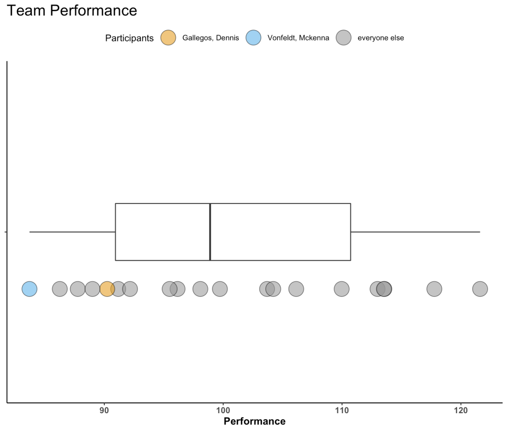
Plot 1 – Boxplot with Points
The first plot is a simple boxplot plot with dots below it.
A couple of notes:
- I’ve selected a few athletes to be our “of_interest” players for the plot.
- This plot doesn’t have a y-axis, since all I am doing is plotting the boxplot for the distribution of performance. Therefore, I set the y-axis variable to a factor, so that is simply identifies a space within the grid to organize my plot.
- I’m using a colorblind friendly palette to ensure that the colors are viewable to a broad audience.
- Everything else after that is basic {ggplot2} code with some simple theme styling for the plot space and the legend position.
dat %>%
  mutate(of_interest = case_when(participant %in% c("Gallegos, Dennis", "Vonfeldt, Mckenna") ~ participant,
                                 TRUE ~ "everyone else")) %>%
  ggplot(aes(x = performance, y = factor(0))) +
  geom_boxplot(width = 0.2) +
  geom_point(aes(x = performance, y = factor(0),
                  fill = of_interest),
              position = position_nudge(y = -0.2),
              shape = 21,
              size = 8,
              color = "black",
              alpha = 0.6) +
  scale_fill_manual(values = c("Gallegos, Dennis" = "#E69F00", "Vonfeldt, Mckenna" = "#56B4E9", "everyone else" = "#999999")) +
  labs(x = "Performance",
       title = "Team Performance",
       fill = "Participants") +
  theme_classic() +
  theme(axis.text.y = element_blank(),
        axis.title.y = element_blank(),
        axis.text.x = element_text(size = 10, face = "bold"),
        axis.title.x = element_text(size = 12, face = "bold"),
        plot.title = element_text(size = 18),
        legend.position = "top")
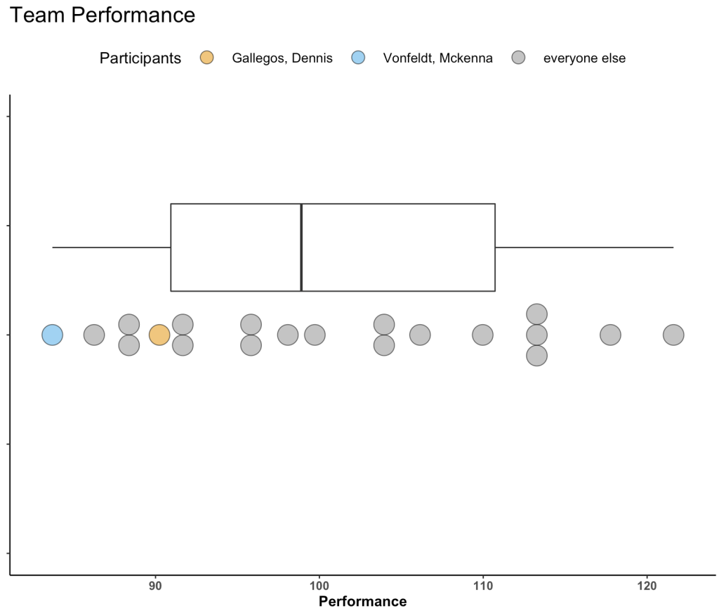
Not too bad! You might have more data than we’ve simulated and thus the inline dots might start to get busy. We can use geom_dotplot() to create separation between dots in areas where there is more density and expose that density of performance scores a bit better.
Plot 2 – Boxplot with Dotplots
Swapping out geom_point() with geom_dotplot() allows us to produce the same plot above just with a dotplot.
- Here, I set “y = positional” since, as before, we don’t have a true y-axis. Doing so allows me to specify where on the y-axis I want to place by boxplot and dotplot in their respective aes().
# Horizontal
dat %>%
  mutate(of_interest = case_when(participant %in% c("Gallegos, Dennis", "Vonfeldt, Mckenna") ~ participant,
                                 TRUE ~ "everyone else")) %>%
  ggplot(aes(x = performance, y = positional)) +
  geom_boxplot(aes(y = 0.2),
    width = 0.2) +
  geom_dotplot(aes(y = 0,
                   fill = of_interest),
              color = "black",
              stackdir="center",
              binaxis = "x",
              alpha = 0.6) +
  scale_fill_manual(values = c("Gallegos, Dennis" = "#E69F00", "Vonfeldt, Mckenna" = "#56B4E9", "everyone else" = "#999999")) +
  labs(x = "Performance",
       title = "Team Performance",
       fill = "Participants") +
  theme_classic() +
  theme(axis.text.y = element_blank(),
        axis.title.y = element_blank(),
        axis.text.x = element_text(size = 10, face = "bold"),
        axis.title.x = element_text(size = 12, face = "bold"),
        plot.title = element_text(size = 18),
        legend.position = "top",
        legend.title = element_text(size = 13),
        legend.text = element_text(size = 11),
        legend.key.size = unit(2, "line"))
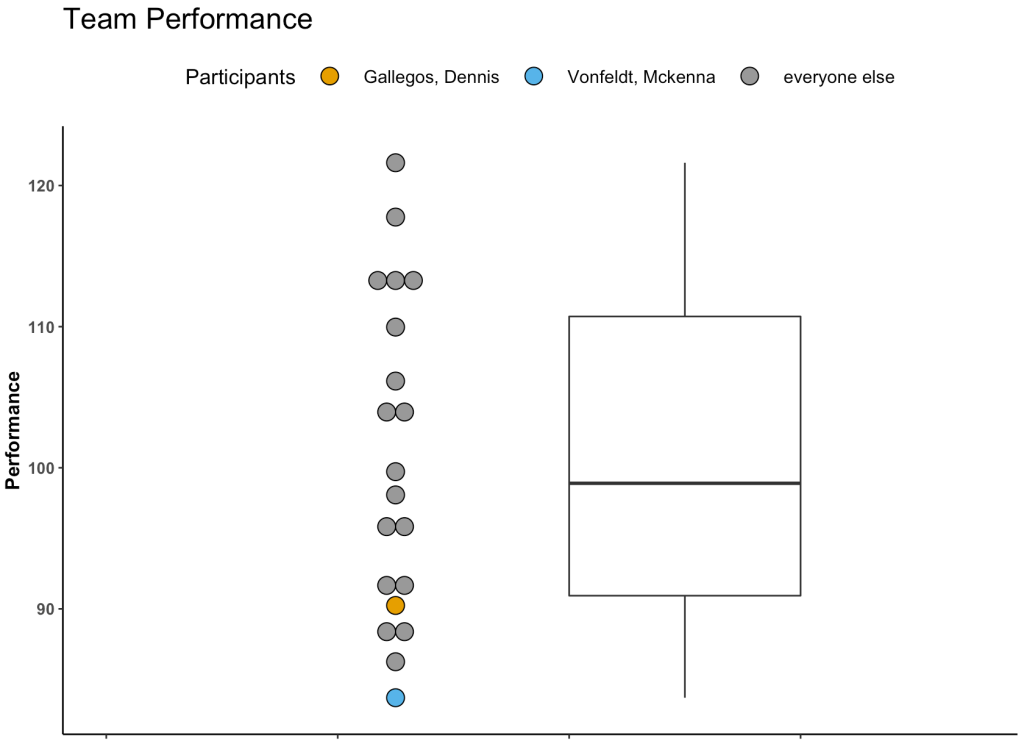
If you don’t like the idea of a horizontal plot you can also do it in vertical.
# vertical
dat %>%
  mutate(of_interest = case_when(participant %in% c("Gallegos, Dennis", "Vonfeldt, Mckenna") ~ participant,
                                 TRUE ~ "everyone else")) %>%
  ggplot(aes(x=positional, y= performance)) +
  geom_dotplot(aes(x = 1.75,
                   fill = of_interest),
               binaxis="y",
               stackdir="center") +
  geom_boxplot(aes(x = 2),
               width=0.2) +
  scale_fill_manual(values = c("Gallegos, Dennis" = "#E69F00", "Vonfeldt, Mckenna" = "#56B4E9", "everyone else" = "#999999")) +
  labs(y = "Performance",
       title = "Team Performance",
       fill = "Participants") +
  theme_classic() +
  theme(axis.text.x = element_blank(),
        axis.title.x = element_blank(),
        axis.text.y = element_text(size = 10, face = "bold"),
        axis.title.y = element_text(size = 12, face = "bold"),
        plot.title = element_text(size = 18),
        legend.position = "top",
        legend.title = element_text(size = 13),
        legend.text = element_text(size = 11),
        legend.key.size = unit(2, "line")) +
  xlim(1.5, 2.25)
Wrapping Up
Visualizing an athlete’s performance relative to their team or population can be a useful for communicating data. Boxplots with dotplots can be a compelling way to show where an athlete falls when compared to their peers. Other options could have been to show a density plot with points below it (like a Raincloud plot). However, I often feel like people have a harder time grasping a density plot whereas the the boxplot clearly gives them an average (line inside of the box) and some “normal” range (interquartile range, referenced by the box) to anchor themselves to. Finally, this plot can easily be built into an interactive plot using Shiny.
All of the code for this article is available on my GITHUB page.


