Author Archives: Patrick

TidyX 24: Waffle Plots, Shiny Apps, and Wide Receiver Target Shares

This week, Ellis Hughes and I break down code that Jared Braggins wrote to construct waffle plots describing plant extinction in Africa using data from TidyTuesday.

For those that are unfamiliar, a waffle plot is a great way for showing counts of data and the relative contribution of one value to a group. This type of plot lends itself well to the number of targets each receiver on an NFL team receives relative to other receivers on that team. So, we took Jared’s idea, used the {waffle} package, and constructed our own waffle plot. We then extended this out into an interactive {shiny} app so that the user can select a team of interest and get returned back a waffle plot for that team along with a team of data providing the receiver statistics for that given season. Finally, we provide the option to download the output as a PDF report directly from the {shiny} app. When it is all done, it looks a little something like this:

To watch the screen cast, CLICK HERE.

To obtain our code, CLICK HERE.

TidyX 23: for loops & functions

This week, Ellis Hughes and I delve into our mailbag and answer a viewer’s question about writing for loops and custom functions. To explain these two topics we walk through our script on how to optimize the exponent in Bill James’ Pythagorean Win Formula for baseball.

To watch our screen cast, CLICK HERE.

To get our code, CLICK HERE.

If you have any questions or topics you’d like to have explained, feel free to reach out to us a tidy.explained@gmail.com or connect with us on Twitter at @tidy_explained.

TidyX 22: Dumbbell Plots for NBA Player Stats

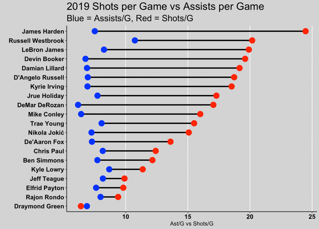
This week, Ellis Hughes and I go over how to create dumbbell plots. Dumbbell plots are a nice way of showing differences between two time points or between two variables that are on the same scale within a group or within individual.

To explain dumbbell plots, we first go through code provided by Kelly Cotton, who used this data visualization technique on the latest TidyTuesday data set to show changes in energy production over time within different European countries.

Ellis and I then take Kelly’s approach and apply it to NBA players to show differences between their Assists per Game and Shots per Game within the 2019 season. A report we termed the “Ball Hog Report”.

To watch our screen cast, CLICK HERE.

To access our code, CLICK HERE.

TidyX Episode 21: Pairs Plots for Exploring Data

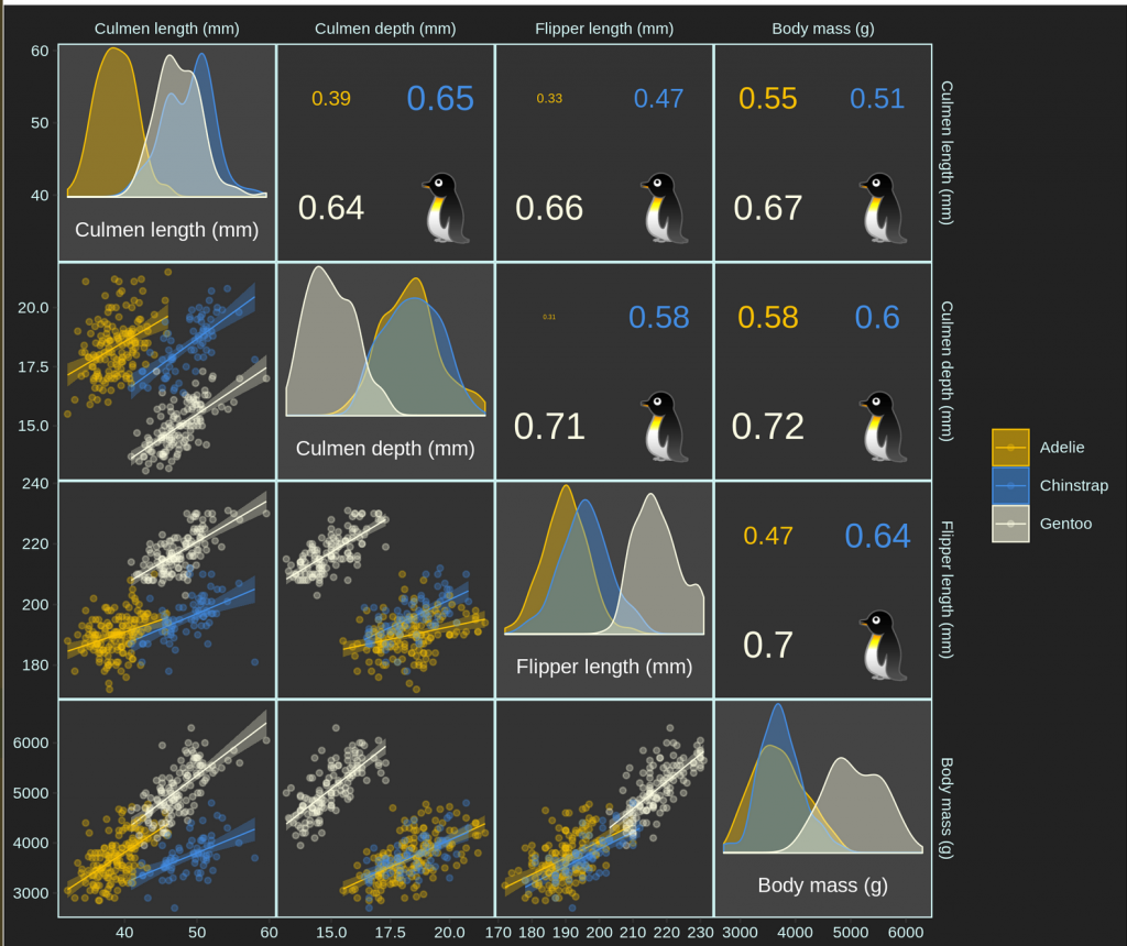
Pairs plots are plots of data in a matrix format to allow one to visualize as many numeric relationships as they would like. Oftentimes the data are plotted as scatter plots, however, this format can be extended to include other visualizations such as histograms, boxplots, and even correlation coefficients.

This week, Ellis Hughes and I explore these types of plots using the {palmerpenguins} data set pulled together by Allison Horst for the TidyTuesday Project.

This is a really fun data set for starting out in R because the data is very clean and has a few columns with nice relationships that can be exploited with statistical models. Ellis and I discuss some potential use cases for modeling this data and then we create a number of plots of the data to show various statistical relationships. We create pair plots using the {GGally} package and then we build some interactive {plotly} graphics with the data and explain how to build interactive visualizations of regression coefficients from a linear model.

Finally, we wrap up by going through the code of Roman Link. Roman created his own package, {corrmorant}, for creating pairs plots. This package offers a ton of flexibility and allows you to style the visualization in a more customized way. We had a lot of fun playing around with the package and the final project that Roman created using the {palmerpenguins} data set was this:

To listen to the screen cast, CLICK HERE.

To check out our code, CLICK HERE.

TidyX Episode 20: Special Guest David Robinson

This week, Ellis Hughes and I are joined by someone who has had a big influence on both of us, David Robinson!

For those that don’t know, David has been the developer of several R packages, such as {broom}, {tidytext}, {fuzzyjoin}, and {widyr}. Additionally, each week David does a live screen cast of himself working through the TidyTuesday data set from scratch. For anyone that has never watched these, they are excellent. David covers a lot of ground in 60 minutes of these live screen casts and shows you how he quickly extracts as much information as possible from a data set that he is seeing for the first time ever.

Today, we walk through one of David’s TidyTuesday screen casts where he does some text analysis of a data set consisting of cocktail ingredients. The screen cast features the use of his newest R package, {widyr}. After some exploratory data analysis and data cleaning, David calculates correlations between categorical variables (phi coefficient) and shows us how to plot the results in a network graph. The screen cast wraps up with David showing us how {widyr} can be used for Principal Components Analysis and then a short discussion on David’s journey into data science and how blogging and public work can be incredibly valuable for developing your professional network and career.

To check out the screen cast, CLICK HERE.

To check out David’s blog, CLICK HERE.