Author Archives: Patrick

TidyX 35: Visualizing dimensions & Washington State Hikes

This week, Ellis Hughes and I discuss code from Henry Wakefield, who made an interesting plot of height and weight data of Ikea furniture (data provided by Tidy Tuesday).

This was a unique way of showing the relationship between two variables. Thus, we scraped several thousand hikes in the state of Washington and plotted the length relative to the elevation gain for each. We took it a step further and used {plotly} to give the visualization an interactive component.

To watch the screen cast, CLICK HERE.
To access our code, CLICK HERE.

Accessing Garmin Data For Building Your Own Running Report

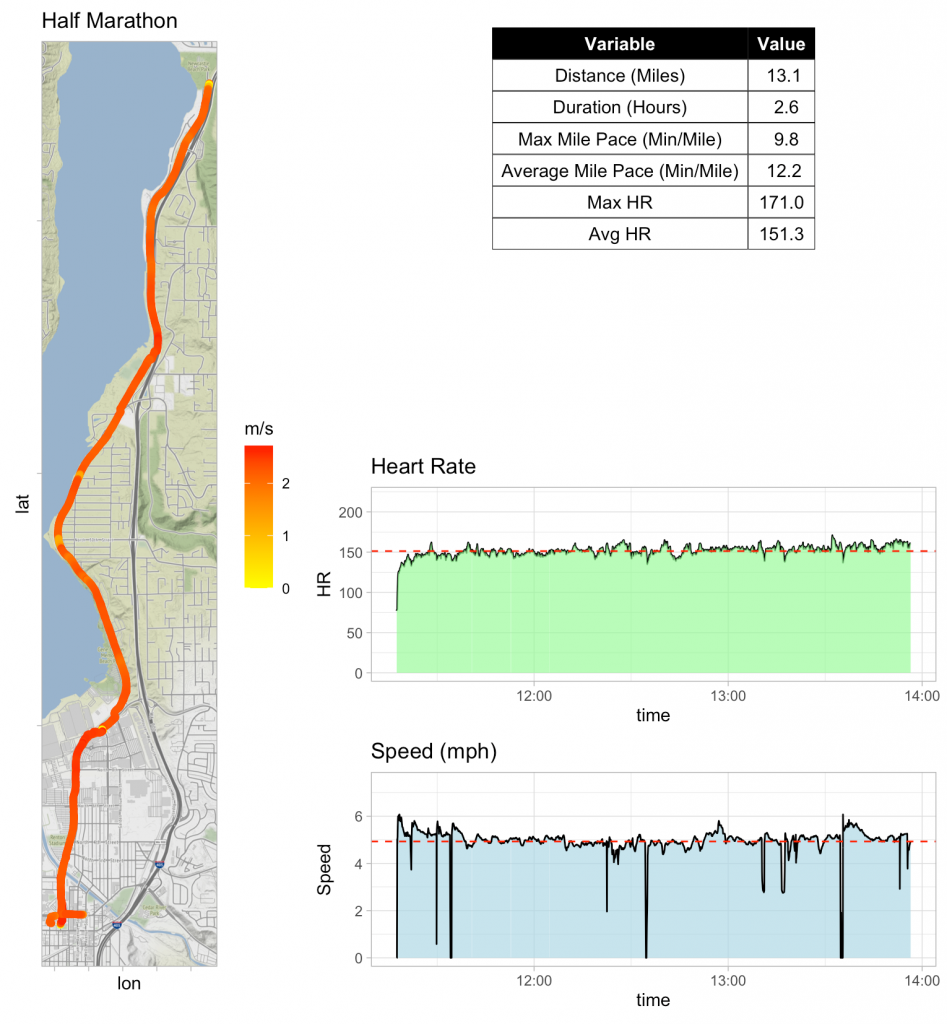
In our most recent screen cast (TidyX 34) Ellis Hughes and I discussed how to create your own Garmin running report from the raw data collected on your watch.

You might be asking yourself, “Where did they get the raw data from?”

Therefore, I figured I’d put together a short tutorial on accessing raw Garmin data from your account.

  1. First log into your Garmin Connect account. Go HERE.
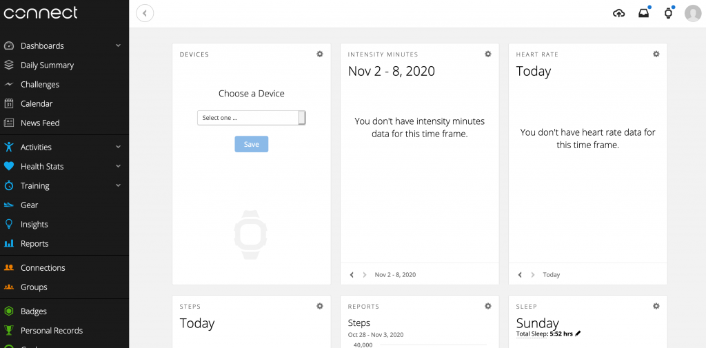
  2. Once you are signed in, you’ll see a dashboard
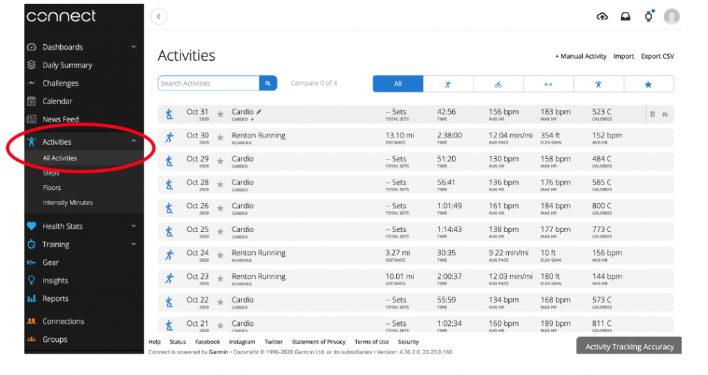
  3. Click the Activities drop down and select All Activities to see your workouts
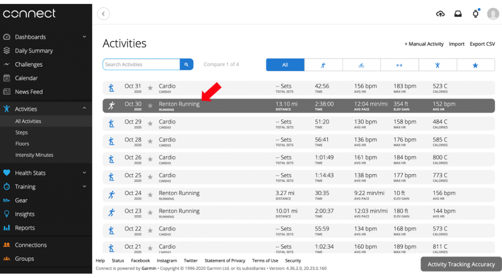
  4. Click on the activity that you want to obtain raw data for
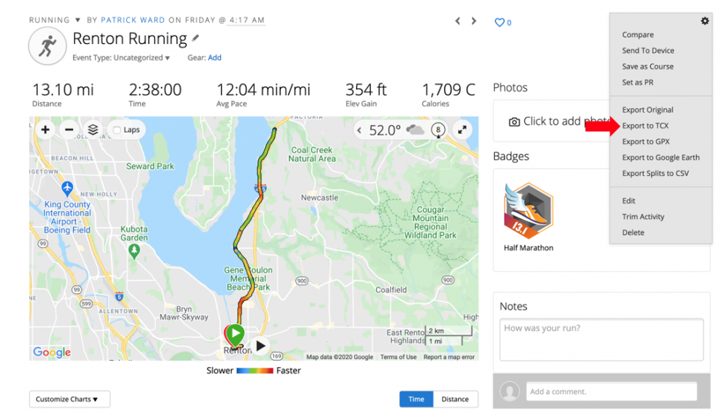
  5. Once inside the activity, click the gear in the upper right of the screen and select Export to TCX

That’s it! Now you have the raw data for that session and you are ready to create your own running reports!

TidyX 34: Map Visualizations for Garmin Running Data

Following up last week’s screen cast on maps, Ellis Hughes and I continue looking at visualizations for maps by discussing an R script from Florcence Dubois. Florence built a really cool plot using data from TidyTuesday about Canadian wind turbines. She also pulled in some political data from a research article to help give the plot more context.

We then follow this up by discussing how to use Garmin running data to build your own running report and track your progress.

To view the screen cast, CLICK HERE.

To access our code, CLICK HERE.

TidyX 33: Beer, Web Scraping, and State Maps

This week, Ellis Hughes and I discuss a TidyTuesday submission from Richard Bamattre. Richard visualized craft beers by state using the {statebins} package. This approach produces a very clean method of displaying data across the USA.

We follow up our discussion of Richard’s R code by giving a short web scraping tutorial to acquire more data about beer production across the USA and then create our own state map visualization.

To watch our screen cast, CLICK HERE.

To access our code, CLICK HERE.
TidyX 32: {shiny}, {golem}, and our interview with Eric Nantz

This week, Ellis Hughes and I are joined by Eric Nantz.

Not only is Eric a statistician and a massive contributor to the R community, but he is also the host of the R-Podcast and the Shiny Developer Series, two brilliant resources for those who work in R.

Eric joined us to walk through his {shiny} app for this week’s TidyTuesday data of the DataSaurus data set. Eric also introduces us to the {golem} package, which helps speed up the development process by creating a framework for you to use, right from the start.

Click the video in Eric’s tweet below to see a quick demo of his app.

To watch the entire screen cast, CLICK HERE.

To get Eric’s code for this cool app, CLICK HERE.

https://twitter.com/i/status/1317920405387157505