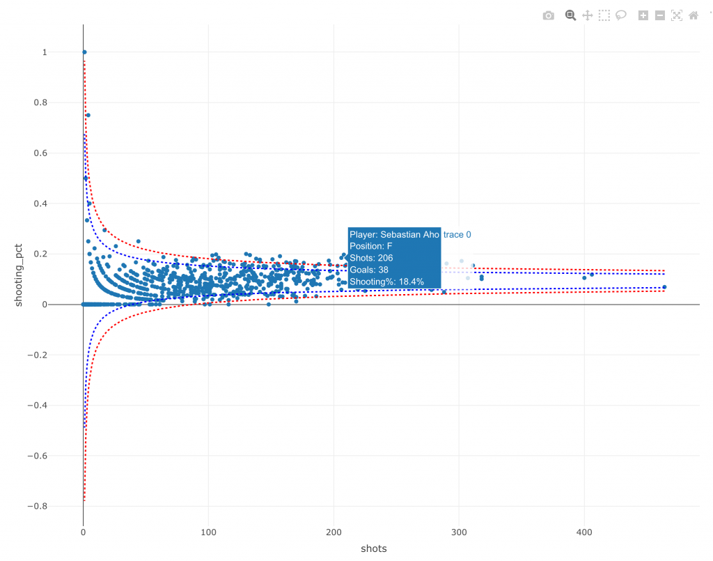
This week, Ellis Hughes and I continue our work in {plotly}. Using the same player shooting data that we used in TidyX 42, we build an interactive funnel plot to visualize player shooting% relative to sample size, allowing us to explore player’s abilities while acknowledging uncertainty in those who have taken less shots.
To watch the screen cast, CLICK HERE.
To access our code, CLICK HERE.

