Velocity-based training (VBT) is a method employed by strength coaches to prescribe training intensity and volume based off of an individual athlete’s load-velocity profiles. I discussed VBT last year when I used {shiny} to build an interactive web application for visualizing and comparing athlete outputs.
Specific to this topic, I recently read the following publication: Weakley, Mann, Banyard, McLaren, Scott, and Garcia-Ramos. (2022). Velocity-based training: From theory to application. Strength Cond J; 43(2): 31-49.
The paper aimed to provide some solutions for analyzing, visualizing, and presenting feedback around training prescription and performance improvement when using VBT. I enjoyed the paper and decided to write an R Markdown file to provide code that can accompany it and (hopefully) assist strength coaches in applying some of the concepts in practice. I’ll summarize some notes and thoughts below, but if you’d like to read the full R Markdown file that explains and codes all of the approaches in the paper, CLICK HERE>> Weakley–2021—-Velocity-Based-Training—From-Theory-to-Application—Strength-Cond-J.
If you’d like the CODE and DATA to run the analysis yourself, they are available on my GitHub page.
Paper/R Markdown Overview
Technical Note: I don’t have the actual data from the paper. Therefore, I took a screen shot of Figure 3 in the text and used an open source web application for extracting data from figures in research papers. This requires me to go through and manually click on the points of the plot itself. Consequently, I’m not 100% perfect, so there may be subtle differences in my data set compared to what was used for the paper.
The data used in the paper reflect 17-weeks of mean concentric velocity (MCV) in the 100-kg back squat for a competitive powerlifter, tested once a week. The two main figures, which, along with the analysis, I will recreate are Figure 3 and Figure 5.
Figure 3 is a time series visual of the athlete while Figure 5 provides an analysis and visual for the athlete’s change across the weeks in the training phase.
Figure 3
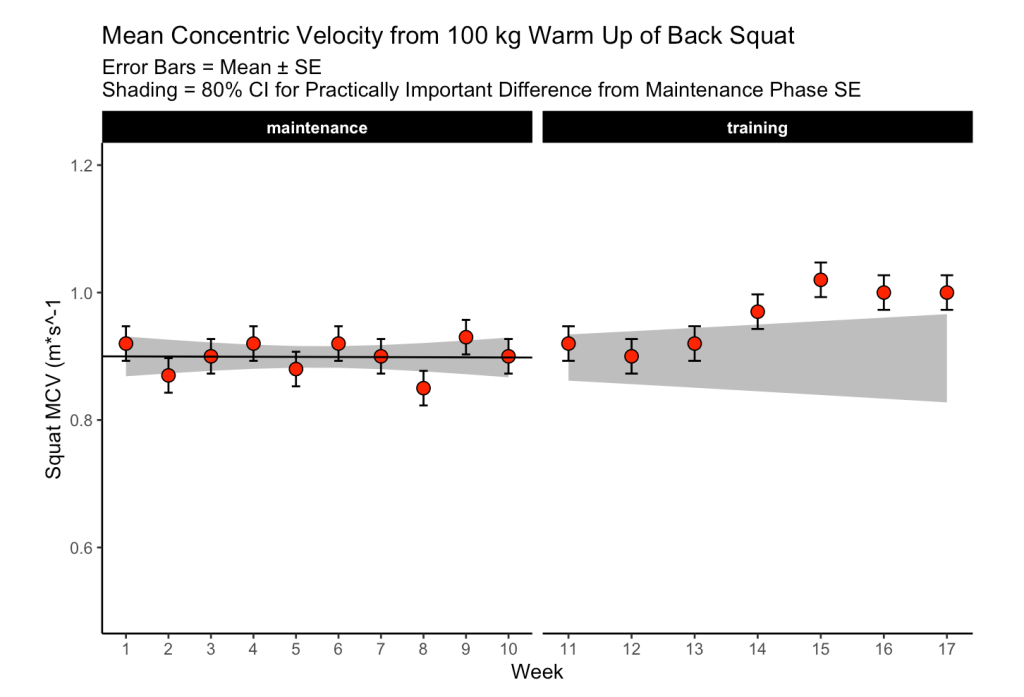
The first 10-weeks represent the maintenance phase for the athlete, which was followed by a 7-week training phase. The maintenance phase sessions were used to build a linear regression model which was then used to visualize the athlete’s change over time along with corresponding confidence interval around each MCV observation. The model output looks like this:

The standard (typical) error was used to calculate confidence intervals around the observations. To calculate the standard error, the authors’ recommend one of two approaches:
1) If you have group-based test-retest data, they recommend taking the difference between the test-retest outcomes and calculating the standard error as follows:
- SE.group = sd(differences) / sqrt(2)
2) If you have individual observations, they recommend calculating the standard error like this:
- SE.individual = sqrt(sum.squared.residuals) / (n−2))
Since we have individual athlete data, we will use the second option, along with the t-critical value for 80% CI, to produce Figure 3 from the paper :
The plot provides a nice visual of the athlete over time. We see that, because the linear model is calculated for the maintenance phase, as time goes on, the shaded standard error region gets wider. The confidence intervals around each point estimate are there to encourage us to think past just a point estimate and recognize that there is some uncertainty in every test outcome that cannot be captured in a single value.
Figure 5
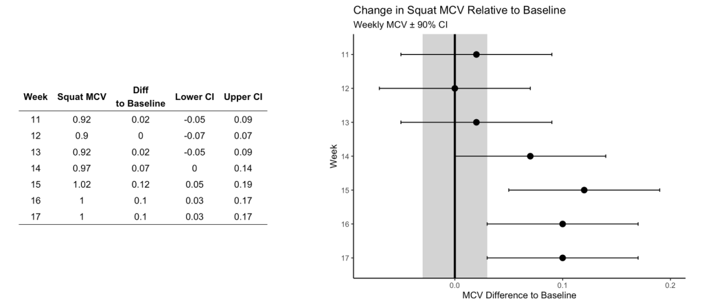
This figure visualizes the change in squat velocity for the powerlifter in weeks 11-17 (the training phase) relative to the mean squat velocity form the maintenance phase, representing the athlete’s baseline performance.
Producing this plot requires five pieces of information:
- Baseline average for the maintenance phase
- The difference between the observed MVC in each training week and the maintenance average
- Calculate the t-critical value for the 90% CI
- Calculate the Lower 90% CI
- Calculate the Upper 90% CI
Obtaining this information allows us to produce the following table of results and figure:
Are the changes meaningful?
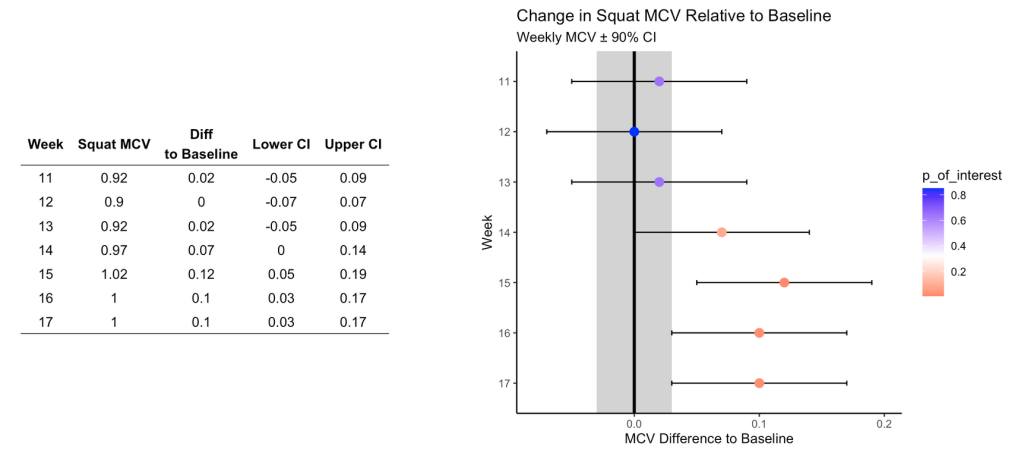
One thing the authors’ mention in the paper are some approaches to evaluating whether the observed changes are meaningful. They recommend using either equivalence tests or second generation p-values. However, they don’t go into calculating such things on their data. I honestly am not familiar with the latter option, so I’ll instead create an example of using an equivalence test for the data and show how we can color the points within the plot to represent their meaningfulness.
Equivalence testing has been discussed by Daniel Lakens and colleagues in their tutorial paper, Lakens, D., Scheel, AM., Isager, PM. (2018). Equivalence testing for psychological reserach: A tutorial. Advances in Methods and Practices in Psychological Science. 2018; 1(2): 259-269.
Briefly, equivalence testing uses one-sided t-tests to evaluate whether the observed effect is larger or smaller than a pre-specified range of values surrounding the effect of interest, termed the smallest effect size of interest (SESOI).
In our above plot, we can consider the shaded range of values around 0 (-0.03 to 0.03, NOTE: The value 0.03 was provided in the text as the meaningful change for this athlete to see an ~1% increase in his 1-RM max) as the region where an observed effect would not be deemed interesting. Outside of those ranges is a change in performance that we would be most interested in. In addition to being outside of the SESOI region, the observed effect should be substantially large enough relative to the standard error around each point, which we calculated from our regression model earlier.
Putting all of this together, we obtain a the same figure above but now with the points colored specific to the p-value provided from our equivalence test:
Warpping Up
Again, if you’d like the full markdown file with code (click the ‘code’ button to display each code chunk) CLICK HERE >> Weakley–2021—-Velocity-Based-Training—From-Theory-to-Application—Strength-Cond-J
There are always a number of ways that analysis can unfold and provide valuable insights and this paper reflects just one approach. As with most things, I’m left with more questions than answers.
For example, Figure 3, I’m not sure if linear regression is the best approach. As we can see, the grey shaded region increases in width overtime because time is on the x-axis (independent variable) and the model was built on a small portion (the first 10-weeks) of the data. As such, with every subsequent week, uncertainty gets larger. How long would one continue to use the baseline model? At some point, the grey shaded region would be so wide that it would probably be useless. Are we too believe that the baseline model is truly representative of the athlete’s baseline? What if the baseline phase contained some amount of trend — how would the model then be used to quantify whatever takes place in the training phase? Maybe training isn’t linear? Maybe there is other conditional information that could be used?
In Figure 5, I wonder about the equivalence testing used in this single observation approach. I’ve generally thought of equivalence testing as a method comparing groups to determine if the effect from an intervention in one group is larger or smaller than the SESOI. Can it really work in an example like this, for an individual? I’m not sure. I need to think about it a bit. Maybe there is a different way such an analysis could be conceptualized? A lot of these issues come back to the problem of defining the baseline or some group of comparative observations that we are checking our most recent observation against.
My ponderings aside, I enjoyed the paper and the attempt to provide practitioners with some methods for delivering feedback when using VBT.


