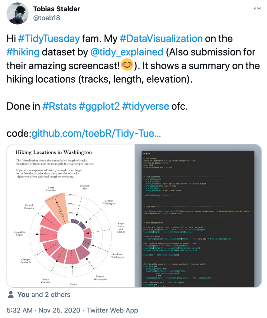
This week, Ellis Hughes submitted the Washington State hiking trail data that we used in TidyX 35 to the TidyTuesday Project. We were excited to see all of the great visualizations that people shared on Twitter, making it really hard to chose whose code to discuss.
The polar plot that Tobias Stalder created was really clean looking and also seemed to be very popular, with over 200 “likes” and some good discussion about it. With that much excitement, we felt like it was the hands down favorite to discuss! We follow our code review with a short philosophical discussion about the difference between data visualization for information transfer versus data visualization as art, as this was a topic of discussion in response to Tobias’ Tweet of his plot.
To watch out screen cast, CLICK HERE.
To access our code, CLICK HERE.

