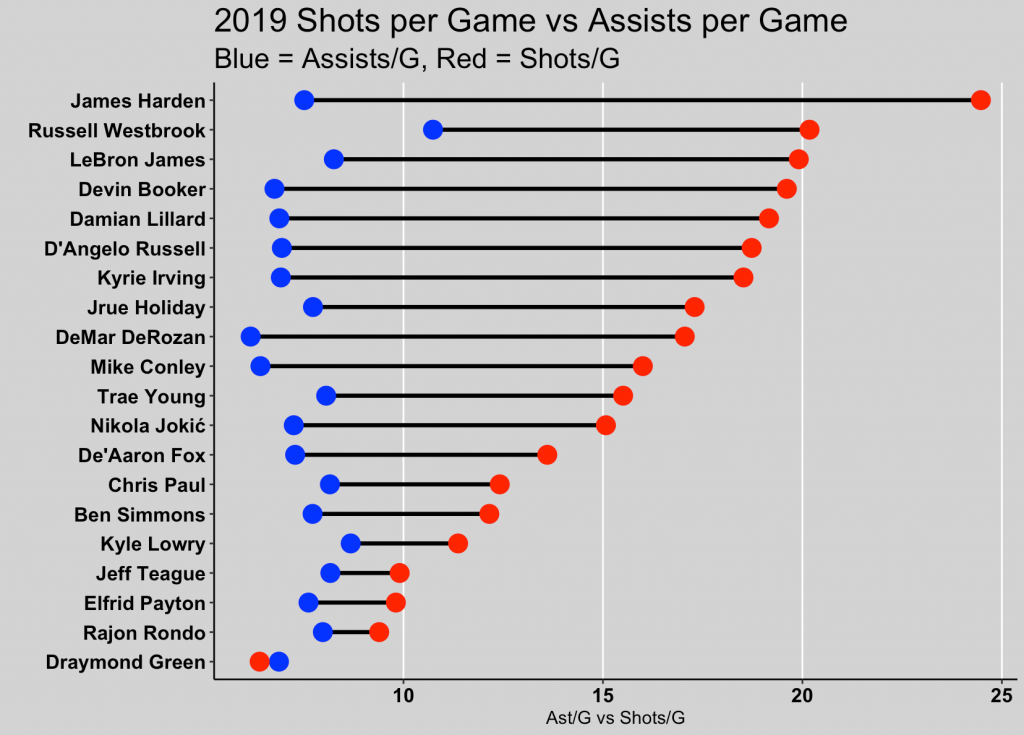
This week, Ellis Hughes and I go over how to create dumbbell plots. Dumbbell plots are a nice way of showing differences between two time points or between two variables that are on the same scale within a group or within individual.
To explain dumbbell plots, we first go through code provided by Kelly Cotton, who used this data visualization technique on the latest TidyTuesday data set to show changes in energy production over time within different European countries.
Ellis and I then take Kelly’s approach and apply it to NBA players to show differences between their Assists per Game and Shots per Game within the 2019 season. A report we termed the “Ball Hog Report”.
To watch our screen cast, CLICK HERE.
To access our code, CLICK HERE.

