Last week, scientist David Borg posted an article to twitter talking about regression to the mean in epidemiological research (1). Regression to the Mean is a statistical phenomenon where extreme observations tend to move closer towards the population mean in subsequent observations, due simply to natural variation. To steal Galton’s example, tall parents will often have tall children but those children, while taller than the average child, will tend to be shorter than their parents (regressed to the mean). It’s also one of the reasons why clinicians have such a difficult time understanding whether their intervention actually made the patient better or whether observed improvements are simply due to regression to the mean over the course of treatment (something that well designed studies attempt to rule out by using randomized controlled experiments).
Of course, this phenomenon is not unique to epidemiology or biostatistics. In fact, the phrase is commonly used in sport when discussing players or teams that have extremely high or low performances in a season and there is a general expectation that they will be more normal next year. An example of this could be the sophomore slump exhibited by rookies who perform at an extremely high level in their first season.
Given that this phenomenon is so common in our lives, the goal with this blog article is to show what regression to the mean looks like for team wins in baseball from one year to the next.
Data
We will use data from the Lahman baseball database (freely available in R) and concentrate on team wins in the 2015 and 2016 MLB seasons.
library(tidyverse)
library(Lahman)
library(ggalt)

theme_set(theme_bw())

data(Teams)

dat <- Teams %>%
  select(yearID, teamID, W) %>%
  arrange(teamID, yearID) %>%
  filter(yearID %in% c(2015, 2016)) %>%
  group_by(teamID) %>%
  mutate(yr_2 = lead(W)) %>%
  rename(yr_1 = W) %>%
  filter(!is.na(yr_2)) %>%
  ungroup()

dat %>%
  head()
Exploratory Data Analysis
dat %>%
  ggplot(aes(x = yr_1, y = yr_2, label = teamID)) +
  geom_point() +
  ggrepel::geom_text_repel() +
  geom_abline(intercept = 0,
              slope = 1,
              color = "red",
              linetype = "dashed",
              size = 1.1) +
  labs(x = "2015 wins",
       y = "2016 wins")
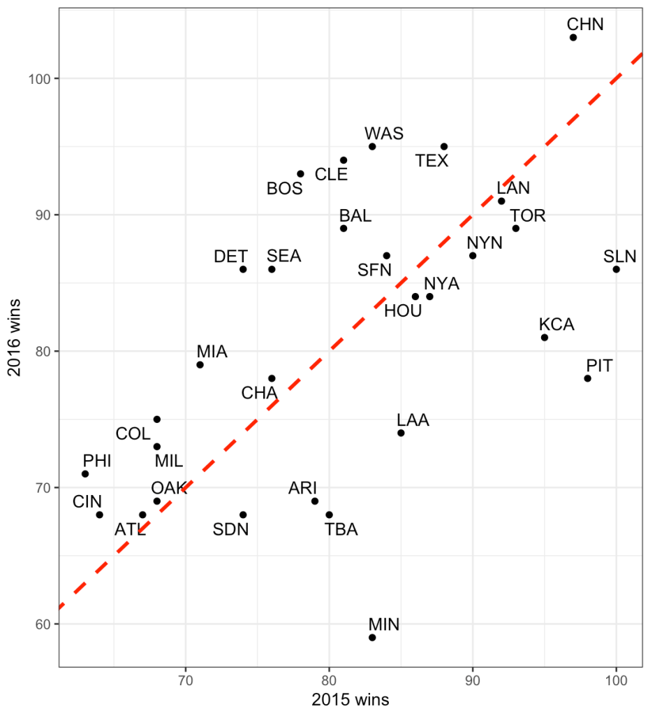
The dashed line is the line of equality. A team that lies exactly on this line would be a team that had the exact number of wins in 2015 as they did in 2016. While no team lies exactly on this line, looking at the chart, what we can deduce is that teams below the red line had more wins in 2015 and less in 2016 while the opposite is true for those that lie above the line. Minnesota had a large decline in performance going from just over 80 wins in 2015 to below 60 wins in 2017.
The correlation between wins in 2015 to wins in 2016 is 0.54.
cor.test(dat$yr_1, dat$yr_2)
Plotting changes in wins from 2015 to 2016
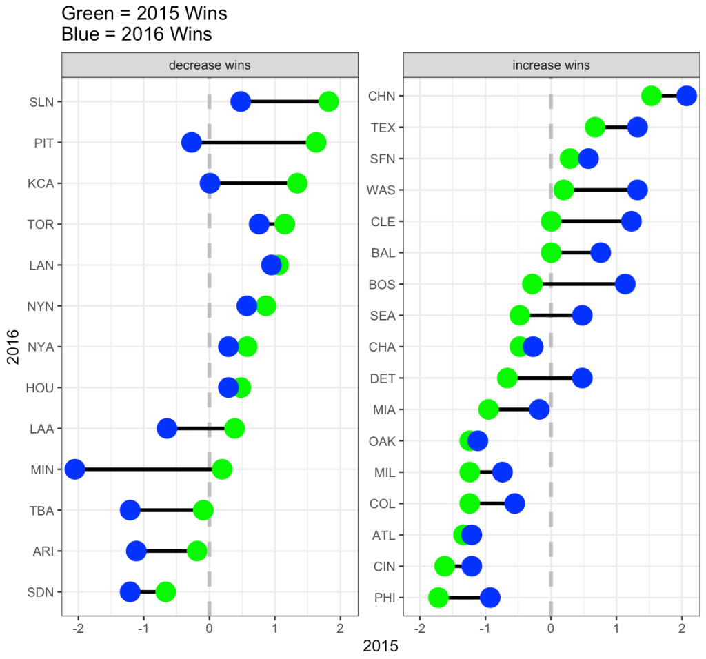
We can plot each team and show their change in wins from 2015 (green) to 2016 (blue). We will break them into two groups, teams that saw a decrease in wins in 2016 relative to 2015 and teams that saw an increase in wins from 2015 to 2016. We will plot the z-score of team wins on the x-axis so that we can reflect average as being “0”.
## get the z-score of team wins for each season
dat <- dat %>%
  mutate(z_yr1 = (yr_1 - mean(yr_1)) / sd(yr_1),
         z_yr2 = (yr_2 - mean(yr_2)) / sd(yr_2))

dat %>%
  mutate(pred_z_dir = ifelse(yr_2 > yr_1, "increase wins", "decrease wins")) %>%
  ggplot(aes(x = z_yr1, xend = z_yr2, y = reorder(teamID, z_yr1))) +
  geom_vline(xintercept = 0,
             linetype = "dashed",
             size = 1.2,
             color = "grey") +
  geom_dumbbell(size = 1.2,
                colour_x = "green",
                colour_xend = "blue",
                size_x = 6,
                size_xend = 6) +
  facet_wrap(~pred_z_dir, scales = "free_y") +
  scale_color_manual(values = c("decrease wins" = "red", "increase wins" = "black")) +
  labs(x = "2015",
       y = "2016",
       title = "Green = 2015 Wins\nBlue = 2016 Wins",
       color = "Predicted Win Direction")
On the decreasing wins side, notice that all teams from SLN to LAA had more wins in 2015 (green) and then regressed towards the mean (or slightly below the mean) in 2016. From MIN down, those teams actually got even worse in 2016.
On the increasing wins side, from BOS down to PHI all of the teams regressed upward towards the mean (NOTE: regressing upward sounds weird, which is why some refer to this as reversion to the mean). From CHN to BAL, those teams were at or above average in 2015 and got better in 2016.
It makes sense that not all teams revert towards the mean in the second year given that teams attempt to upgrade their roster from one season to the next in order to maximize their chances of winning more games.
Regression to the with linear regression
There are three ways we can evaluate regression to the mean using linear regression and all three approaches will lead us to the same conclusion.
1. Linear regression with the raw data, predicting 2016 wins from 2015 wins.
2. Linear regression predicting 2016 wins from the grand mean centered 2015 wins (grand mean centered just means subtracting the league average wins, 81, from the observed wins for each team).
3. Linear regression using z-scores. This approach will produce results in standard deviation units rather than raw values.
## linear regression with raw values
fit <- lm(yr_2 ~ yr_1, data = dat)
summary(fit)

## linear regression with grand mean centered 2015 wins
fit_grand_mean <- lm(yr_2 ~ I(yr_1 - mean(yr_1)), data = dat)
summary(fit_grand_mean)

## linear regression with z-score values
fit_z <- lm(z_yr2 ~ z_yr1, data = dat)
summary(fit_z)
Next, we take these equations and simply make predictions for 2016 win totals for each team.
dat$pred_fit <- fitted(fit)
dat$pred_fit_grand_mean <- fitted(fit_grand_mean)
dat$pred_fit_z <- fitted(fit_z) dat %>%
  head()
You’ll notice that the first two predictions are exactly the same. The third prediction is in standard deviation units. For example, Arizona (ARI) was -0.188 standard deviations below the mean in 2015 and in 2016 they were predicted to regress towards the mean and be -0.102 standard deviations below the mean. However, they actually went the other way and got even worse, finishing the season -1.12 standard deviations below the mean!
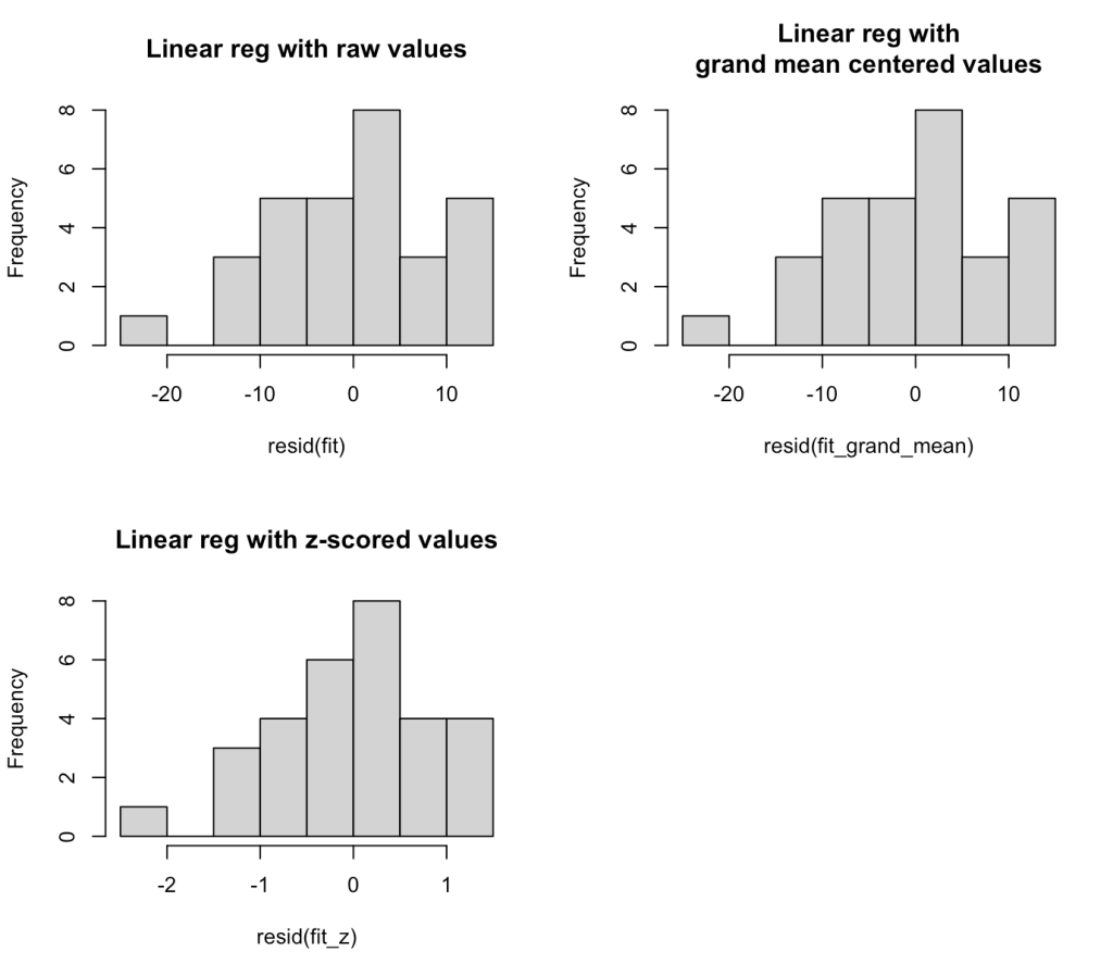
We can plot the residuals and see how off our projections where for each team’s 2016 win total.
par(mfrow = c(2,2))
hist(resid(fit), main = "Linear reg with raw values")
hist(resid(fit_grand_mean), main = "Linear reg with\ngrand mean centered values")
hist(resid(fit_z), main = "Linear reg with z-scored values")
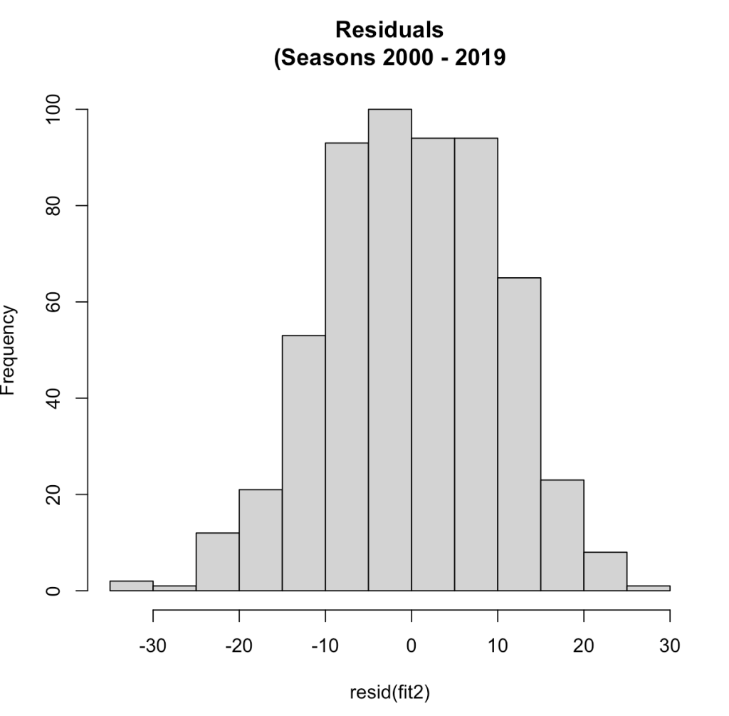
The residuals look weird here because we are only dealing with two seasons of data. At the end of this blog article I will run the residual plot for all seasons from 2000 – 2019 to show how the residuals resemble more of a normal distribution.
We can see that there seems to be an extreme outlier that has a -20 win residual. Let’s pull that team out and see who it was.
dat %>%
  filter((yr_2 - pred_fit) < -19)
It was Minnesota, who went from an average season in 2015 (83 wins) and dropped all the way to 59 wins in 2016 (-2.05 standard deviations below the mean), something we couldn’t have really predicted.
The average absolute change from year1 to year2 for these teams was 8 wins.
mean(abs(dat$yr_2 - dat$yr_1))
Calculating Regression to the mean by hand
To explore the concept more, we can calculate regression toward the mean for the 2016 season by using the year-to-year correlation of team wins, the average wins for the league, and the z-score for each teams wins in 2015. The equation looks like this:
yr2.wins = avg.league.wins + sd_wins * predicted_yr2_z
Where predicted_yr2_z is calculated as:
predicted_yr2_z = (yr_1z * year.to.year.correlation)
We calculated the correlation coefficient above but let’s now store it as its own variable. Additionally we will store the league average team wins and standard deviation in 2015.
avg_wins <- mean(dat$yr_1)
sd_wins <- sd(dat$yr_1)
r <- cor.test(dat$yr_1, dat$yr_2)$estimate

avg_wins
sd_wins
r
On average teams won 81 games (which makes sense for a 162 season) with a standard deviation of about 10 games.
Let’s look at Pittsburgh (Pitt)
dat %>%
  filter(teamID == "PIT") %>%
  select(yearID:z_yr1) %>%
  mutate(predicted_yr2_z = z_yr1 * r,
         predicted_yr2_wins = avg_wins + sd_wins * predicted_yr2_z)
- In 2015 Pittsburgh had 98 wins, a z-score of 1.63.
- We predict them in 2016 to regress to the mean and have a z-score of 0.881 (90 wins)
Add these by hand regression to the mean predictions to all teams.
dat <- dat %>%
  mutate(predicted_yr2_z = z_yr1 * r,
         predicted_yr2_wins = avg_wins + sd_wins * predicted_yr2_z)

dat %>%
  head()

We see that our by hand calculation produces the same prediction, as it should.
Show the residuals for all seasons from 2000 – 2019
Here, we will filter out the data from the data base for the desired seasons, refit the model, and plot the residuals.
dat2 <- Teams %>%
  select(yearID, teamID, W) %>%
  arrange(teamID, yearID) %>%
  filter(between(x = yearID,
                 left = 2000,
                 right = 2019)) %>%
  group_by(teamID) %>%
  mutate(yr_2 = lead(W)) %>%
  rename(yr_1 = W) %>%
  filter(!is.na(yr_2)) %>%
  ungroup()

## Correlation between year 1 and year 2
cor.test(dat2$yr_1, dat2$yr_2)


## linear model
fit2 <- lm(yr_2 ~ yr_1, data = dat2)
summary(fit2)

## residual plot
hist(resid(fit2),
     main = "Residuals\n(Seasons 2000 - 2019")
Now that we have more than a two seasons of data we see a normal distribution of the residuals. The correlation between year1 and year2 in this larger data set was 0.54, the same correlation we saw with the two seasons data.
With this larger data set, the average change in wins from year1 to year2 was 9 (not far from what we saw in the smaller data set above).
mean(abs(dat2$yr_2 - dat2$yr_1))
Wrapping Up
Regression to the mean is a common phenomenon in life. It can be difficult for practitioners in sports medicine and strength and conditioning to tease out the effects of regression to the mean when applying a specific training/rehab intervention. Often, regression to the mean fools us into believing that the intervention we did apply has some sort of causal relationship with the observed outcome. This phenomenon is also prevalent in sport when evaluating the performance of individual players and teams from one year to the next. With some simple calculations we can explore what regression to the mean could look like for data in our own setting, providing a compass and some base rates for us to evaluate observations going forward.
All of the code for this blog can be accessed on my GitHub page. If you notice any errors, please reach out!
References
1) Barnett, AG. van der Pols, JC. Dobson, AJ. (2005). Regression to the mean: what it is and how to deal with it. International Journal of Epidemiology; 34: 215-220.
2) Schall, T. Smith, G. Do baseball players regress toward the mean? The American Statistician; 54(4): 231-235.


