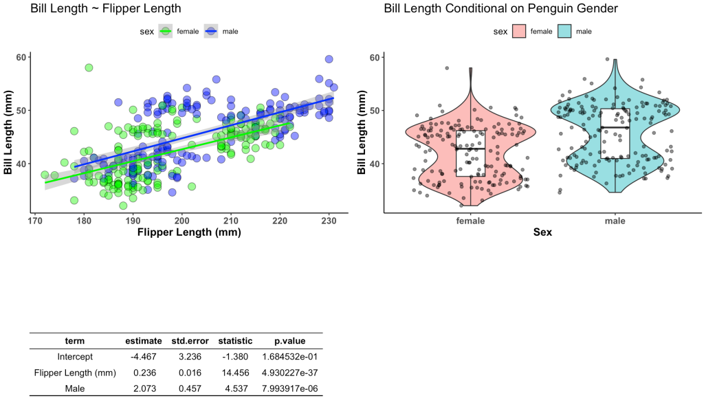
A common question that I get asked is for a simple way of displaying tables and plots together in the same one-page report. Most in the sport science space that are new to R will copy and paste their plot and table outputs into a word document and then share that with their colleagues. But, this creates extra work — copying, pasting, making sure you don’t mess up and forget to paste the latest plot, etc. So, today’s blog article will walk through a really easy way to create a single page document for combining tables and plots into a single report, which you can save to PDF or jpeg directly from RStudio. This same approach is also useful for researchers looking to combine tables and plots into a single figure for publication. I’ll show how to do this using both ggarange() and {patchwork}.
As always, the full code is available on my GITHUB page.
Load Libraries and Set a Plotting Theme
### Load libraries
library(tidyverse)
library(ggpubr)
library(gridExtra)
library(patchwork)
library(broom)
library(palmerpenguins)

## set plot theme
theme_set(theme_classic() +
            theme(axis.text = element_text(size = 11, face = "bold"),
                  axis.title = element_text(size = 13, face = "bold"),
                  plot.title = element_text(size = 15),
                  legend.position = "top"))
Load Data
We will use the {palmerpenguins} data that is freely available in R.
## load data
data("penguins")
d <- penguins %>%
  na.omit()
Build the Plots & Table
First we will build our plots. We are going to create two plots and one table. The table will store the information from a linear regression which regresses bill length on flipper length and penguin sex. The plots will be our visualization of these relationships.
## Create Plots
plt1 <- d %>%
  ggplot(aes(x = flipper_length_mm, y = bill_length_mm)) +
  geom_point(aes(fill = sex),
             size = 4,
             shape = 21,
             color = "black",
             alpha = 0.5) +
  geom_smooth(method = "lm",
              aes(color = sex)) +
  scale_fill_manual(values = c("female" = "green", "male" = "blue")) +
  scale_color_manual(values = c("female" = "green", "male" = "blue")) +
  labs(x = "Flipper Length (mm)",
       y = "Bill Length (mm)",
       title = "Bill Length ~ Flipper Length")


plt2 <- d %>%
  ggplot(aes(x = sex, y = bill_length_mm)) +
  geom_violin(alpha = 0.5,
              aes(fill = sex)) +
  geom_boxplot(width = 0.2) +
  geom_jitter(alpha = 0.5) +
  labs(x = "Sex",
       y = "Bill Length (mm)",
       title = "Bill Length Conditional on Penguin Gender")


## Create table
fit <- d %>%
  lm(bill_length_mm ~ flipper_length_mm + sex, data = .) %>%
  tidy() %>%
  mutate(across(.cols = estimate:statistic,
                ~round(.x, 3)),
         term = case_when(term == "(Intercept)" ~ "Intercept",
                          term == "flipper_length_mm" ~ "Flipper Length (mm)",
                          term == "sexmale" ~ "Male"))
Convert the table into a ggtextable format
Right now the table is in a tibble/data frame format. To get it into a format that is usable within the display grid we will convert it to a ggtextable and use some styling to make it look pretty.
## Build table into a nice ggtextable() to visualize it
tbl <- ggtexttable(fit, rows = NULL, theme = ttheme("blank")) %>%
  tab_add_hline(at.row = 1:2, row.side = "top", linewidth = 2) %>%
  tab_add_hline(at.row = 4, row.side = "bottom", linewidth = 3, linetype = 1)
Display the Table and Plots using ggarrange
We simply add our plot and table elements to the ggarrange() function and get a nice looking report.
## Plots & Table together using ggarange()
ggarrange(plt1, plt2, tbl,
          ncol = 2, nrow = 2)
Display the Table and Plots using patchwork
We can accomplish the same goal using the {patchwork} package. The only trick here is that we can’t pass a ggarrange element into patchwork. We need to convert the table into a tableGrob() to make this work. A tableGrob() is simple a way for us to capture all of the information that is required for the table structure we’d like. Also note that we can pass the same tableGrob() into ggarrange above and it will work.
## Plots & Table together using patchwork
# Need to build the table as a tableGrob() instead of ggtextable
# to make it work with patch work
tbl2 <- tableGrob(fit, rows = NULL, theme = ttheme("blank")) %>%
  tab_add_hline(at.row = 1:2, row.side = "top", linewidth = 2) %>%
  tab_add_hline(at.row = 4, row.side = "bottom", linewidth = 3, linetype = 1)
Now we wrap the tableGrob and our plots into the wrap_plots() function and we are all set!
# now visualize together
wrap_plots(plt1, plt2, tbl2,
           ncol = 2,
           nrow = 2)
Wrapping Up
Instead of copying and pasting tables and plots into word, try using these two simple approaches to creating a single report page that stores all of the necessary information that you colleagues need to see!
All of the code is available on my GITHUB page.


