Category Archives: Strength & Conditioning

Box & Dotplots for Performance Visuals

A colleague recently asked me about visualizing athlete performance of athletes relative to their teammates. More specifically, they wanted something that showed some sort of team average and normal range and then a way to highlight where the individual athlete of interest resided within the population.

Immediately, my mind went to some type of boxplot visualization combined with a dotplot where the athlete can clearly identified. Here are a few examples I quickly came up with.

Simulate Performance Data

First we will simulate some performance data for a group of athletes.

### Load libraries -----------------------------------------------
library(tidyverse)
library(randomNames)

### Data -------------------------------------------------------
set.seed(2022)
dat <- tibble(
  participant = randomNames(n = 20),
  performance = rnorm(n = 20, mean = 100, sd = 10))

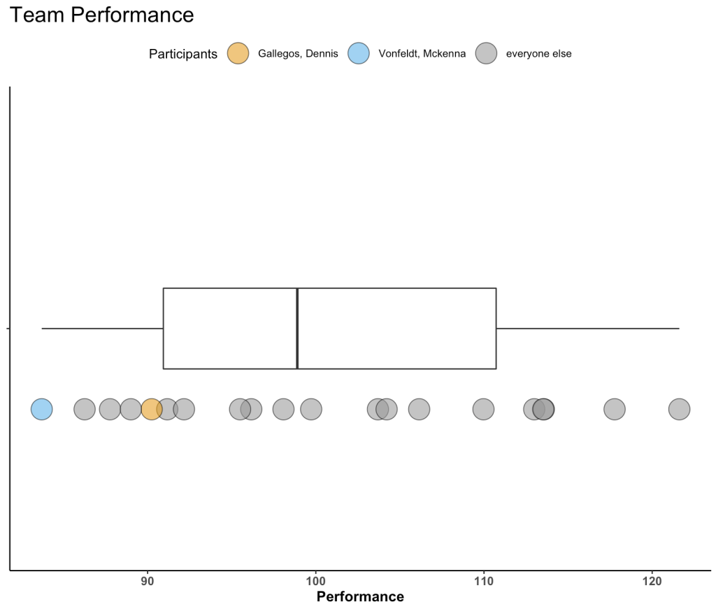
Plot 1 – Boxplot with Points

The first plot is a simple boxplot plot with dots below it.

A couple of notes:

  • I’ve selected a few athletes to be our “of_interest” players for the plot.
  • This plot doesn’t have a y-axis, since all I am doing is plotting the boxplot for the distribution of performance. Therefore, I set the y-axis variable to a factor, so that is simply identifies a space within the grid to organize my plot.
  • I’m using a colorblind friendly palette to ensure that the colors are viewable to a broad audience.
  • Everything else after that is basic {ggplot2} code with some simple theme styling for the plot space and the legend position.
dat %>%
  mutate(of_interest = case_when(participant %in% c("Gallegos, Dennis", "Vonfeldt, Mckenna") ~ participant,
                                 TRUE ~ "everyone else")) %>%
  ggplot(aes(x = performance, y = factor(0))) +
  geom_boxplot(width = 0.2) +
  geom_point(aes(x = performance, y = factor(0),
                  fill = of_interest),
              position = position_nudge(y = -0.2),
              shape = 21,
              size = 8,
              color = "black",
              alpha = 0.6) +
  scale_fill_manual(values = c("Gallegos, Dennis" = "#E69F00", "Vonfeldt, Mckenna" = "#56B4E9", "everyone else" = "#999999")) +
  labs(x = "Performance",
       title = "Team Performance",
       fill = "Participants") +
  theme_classic() +
  theme(axis.text.y = element_blank(),
        axis.title.y = element_blank(),
        axis.text.x = element_text(size = 10, face = "bold"),
        axis.title.x = element_text(size = 12, face = "bold"),
        plot.title = element_text(size = 18),
        legend.position = "top")

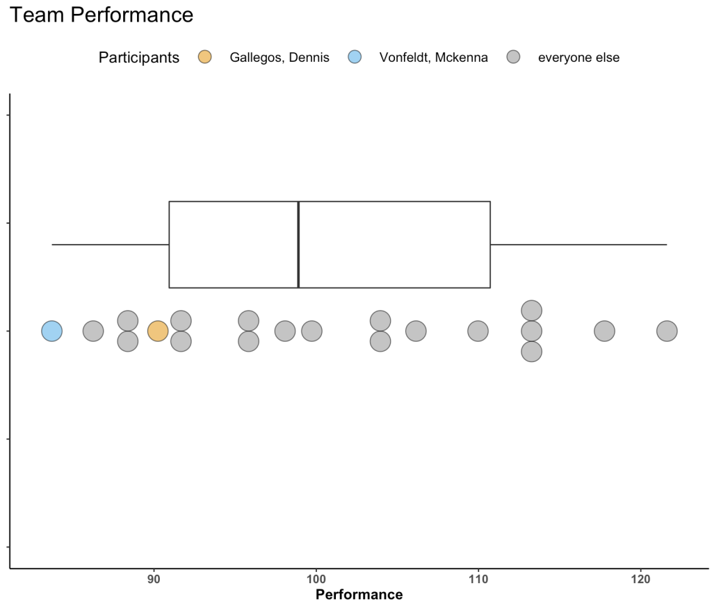
Not too bad! You might have more data than we’ve simulated and thus the inline dots might start to get busy. We can use geom_dotplot() to create separation between dots in areas where there is more density and expose that density of performance scores a bit better.

Plot 2 – Boxplot with Dotplots

Swapping out geom_point() with geom_dotplot() allows us to produce the same plot above just with a dotplot.

  • Here, I set “y = positional” since, as before, we don’t have a true y-axis. Doing so allows me to specify where on the y-axis I want to place by boxplot and dotplot in their respective aes().
# Horizontal
dat %>%
  mutate(of_interest = case_when(participant %in% c("Gallegos, Dennis", "Vonfeldt, Mckenna") ~ participant,
                                 TRUE ~ "everyone else")) %>%
  ggplot(aes(x = performance, y = positional)) +
  geom_boxplot(aes(y = 0.2),
    width = 0.2) +
  geom_dotplot(aes(y = 0, 
                   fill = of_interest),
              color = "black",
              stackdir="center",
              binaxis = "x",
              alpha = 0.6) +
  scale_fill_manual(values = c("Gallegos, Dennis" = "#E69F00", "Vonfeldt, Mckenna" = "#56B4E9", "everyone else" = "#999999")) +
  labs(x = "Performance",
       title = "Team Performance",
       fill = "Participants") +
  theme_classic() +
  theme(axis.text.y = element_blank(),
        axis.title.y = element_blank(),
        axis.text.x = element_text(size = 10, face = "bold"),
        axis.title.x = element_text(size = 12, face = "bold"),
        plot.title = element_text(size = 18),
        legend.position = "top",
        legend.title = element_text(size = 13),
        legend.text = element_text(size = 11),
        legend.key.size = unit(2, "line")) 

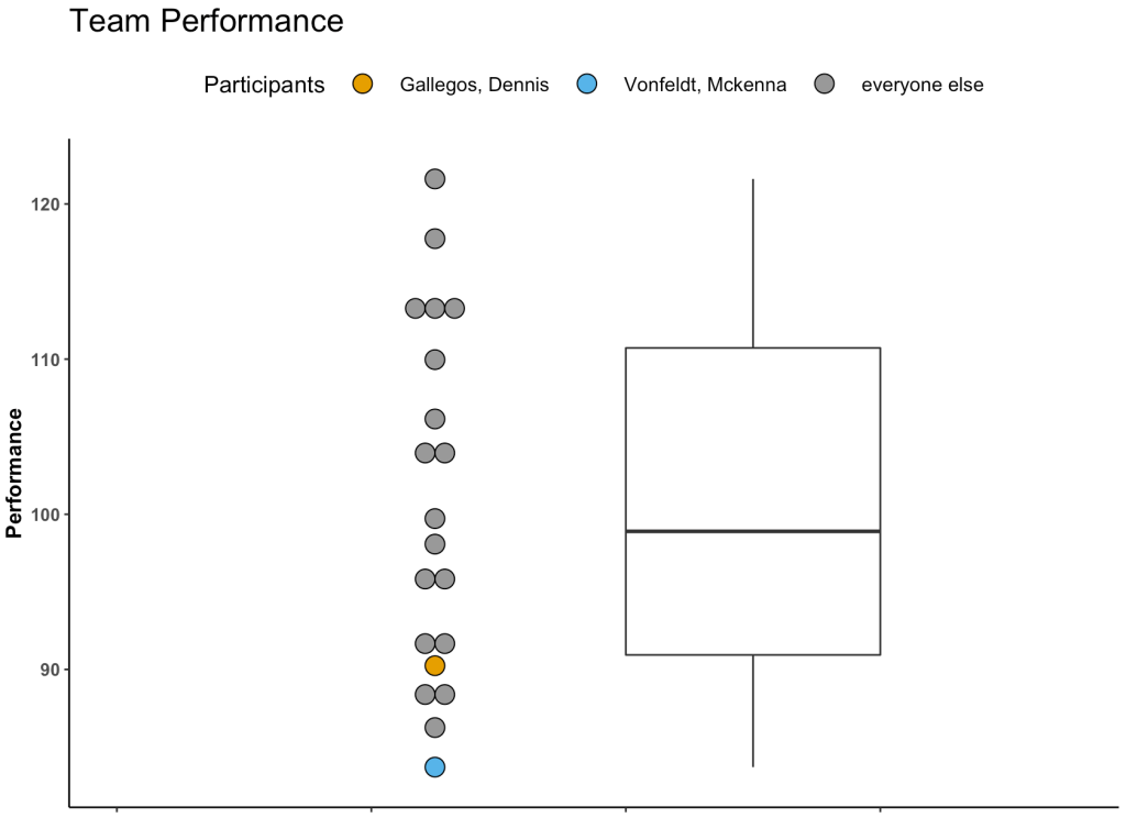
If you don’t like the idea of a horizontal plot you can also do it in vertical.

# vertical
dat %>%
  mutate(of_interest = case_when(participant %in% c("Gallegos, Dennis", "Vonfeldt, Mckenna") ~ participant,
                                 TRUE ~ "everyone else")) %>%
  ggplot(aes(x=positional, y= performance)) +
  geom_dotplot(aes(x = 1.75, 
                   fill = of_interest), 
               binaxis="y", 
               stackdir="center") +
  geom_boxplot(aes(x = 2), 
               width=0.2) +
  scale_fill_manual(values = c("Gallegos, Dennis" = "#E69F00", "Vonfeldt, Mckenna" = "#56B4E9", "everyone else" = "#999999")) +
  labs(y = "Performance",
       title = "Team Performance",
       fill = "Participants") +
  theme_classic() +
  theme(axis.text.x = element_blank(),
        axis.title.x = element_blank(),
        axis.text.y = element_text(size = 10, face = "bold"),
        axis.title.y = element_text(size = 12, face = "bold"),
        plot.title = element_text(size = 18),
        legend.position = "top",
        legend.title = element_text(size = 13),
        legend.text = element_text(size = 11),
        legend.key.size = unit(2, "line")) +
  xlim(1.5, 2.25)

Wrapping Up

Visualizing an athlete’s performance relative to their team or population can be a useful for communicating data. Boxplots with dotplots can be a compelling way to show where an athlete falls when compared to their peers. Other options could have been to show a density plot with points below it (like a Raincloud plot). However, I often feel like people have a harder time grasping a density plot whereas the the boxplot clearly gives them an average (line inside of the box) and some “normal” range (interquartile range, referenced by the box) to anchor themselves to. Finally, this plot can easily be built into an interactive plot using Shiny.

All of the code for this article is available on my GITHUB page.

Shiny – User Defined Chart Parameters

A colleague was working on a web app for his basketball team and asked me if there was a way to create a {shiny} web app that allowed the user to define which parameters they would like to see on the plot. I figured this would be something others might be interested in as well, so here we go!

Load Packages, Helper Functions & Data

I’ll use data from the Lahman baseball database (seasons 2017 – 2019). I’m also going to create two helper functions, one for calculating the z-scores for our stats of interest and one for calculating the t-value from the z-score. The t-value will put the z-score on a 0 to 100 scale for plotting purposes in our polar plot. Additionally, we will use these standardized scores to conditionally format colors on our {gt} table (but we will hide the standardized columns so that the user only sees the raw data and colors). Finally, I’m going to create both a wide and long format of the data as it will be easier to use one or the other, depending on the type of plot or table I am building.

#### Load packages ------------------------------------------------
library(tidyverse)
library(shiny)
library(Lahman)
library(gt)
library(plotly)

theme_set(theme_minimal() + 
            theme(
              axis.text = element_text(face = "bold", size = 12),
              legend.title = element_blank(),
              legend.position = "none"
            ) )

#### helper functions -------------------------------------------

z_score <- function(x){
  z = (x - mean(x, na.rm = T)) / sd(x, na.rm = T)
  return(z)
}

t_score <- function(x){ t = (x * 10) + 50 t = ifelse(t > 100, 100, 
             ifelse(t < 0, 0, t))
  return(t)
}


#### Get Data ---------------------------------------------------

dat <- Batting %>%
  filter(between(yearID, left = 2017, right = 2019),
         AB >= 200) %>% 
  group_by(yearID, playerID) %>%
  summarize(across(.cols = G:GIDP,
         ~sum(.x)),
         .groups = "drop") %>%
  mutate(ba = H / AB,
         obp = (H + BB + HBP) / (AB + HBP + SF),
         slg = ((H - X2B - X3B - HR) + X2B*2 + X3B*3 + HR*4) / AB,
         ops = obp + slg,
         hr_rate = H / AB) %>%
  select(playerID, yearID, AB, ba:hr_rate) %>%
  mutate(across(.cols = ba:hr_rate,
                list(z = z_score)),
         across(.cols = ba_z:hr_rate_z,
                list(t = t_score))) %>%
  left_join(People %>%
              mutate(name = paste(nameLast, nameFirst, sep = ", ")) %>%
              select(playerID, name)) %>%
  relocate(name, .before = yearID)


dat_long <- Batting %>%
  filter(between(yearID, left = 2017, right = 2019),
         AB >= 200) %>% 
  group_by(playerID) %>%
  summarize(across(.cols = G:GIDP,
                   ~sum(.x)),
            .groups = "drop") %>%
  mutate(ba = H / AB,
         obp = (H + BB + HBP) / (AB + HBP + SF),
         slg = ((H - X2B - X3B - HR) + X2B*2 + X3B*3 + HR*4) / AB,
         ops = obp + slg,
         hr_rate = H / AB) %>%
  select(playerID, AB, ba:hr_rate) %>%
  mutate(across(.cols = ba:hr_rate,
                list(z = z_score)),
         across(.cols = ba_z:hr_rate_z,
                list(t = t_score))) %>%
  left_join(People %>%
              mutate(name = paste(nameLast, nameFirst, sep = ", ")) %>%
              select(playerID, name)) %>%
  relocate(name, .before = AB) %>%
  select(playerID:AB, ends_with("z_t")) %>%
  pivot_longer(cols = -c(playerID, name, AB),
               names_to = "stat") %>%
  mutate(stat = case_when(stat == "ba_z_t" ~ "BA",
                          stat == "obp_z_t" ~ "OBP",
                          stat == "slg_z_t" ~ "SLG",
                          stat == "ops_z_t" ~ "OPS",
                          stat == "hr_rate_z_t" ~ "HR Rate"))


dat %>%
  head()

dat_long %>%
  head()


The Figures for our App

Before I build the {shiny} app, I wanted to first construct the three figures I will include. The code for these will be accessible in Github, but here is what they look like:

  • For the polar plot, I will allow the user to define which variables they want on the chart.
  • For the time series plot, I am going to create an interactive {plotly} chart that allows the user to select the stat they want to see and then hover over the player’s points and obtain information like the raw value and the number of at bats in the given season via a simple tool tip.
  • The table, as discussed above, will user conditional formatting to provide the user with extra context about how that player performed relative to his peers in a given season.

Because I don’t like to clutter up my {shiny} apps, I tend to build my plots and tables into custom functions. That way, all I need to do is set up a reactive() in the server to obtain the user selected data and then call the function on that data. Here are the functions for the three figures above.

## table function
tbl_func <- function(NAME){ dat %>%
  filter(name == NAME) %>%
  select(yearID, AB:hr_rate, ends_with("z_t")) %>%
  gt(rowname_col = "yearID") %>%
  fmt_number(columns = ba:hr_rate,
             decimals = 3) %>%
  cols_label(
    AB = md("**AB**"),
    ba = md("**Batting Avg**"),
    obp = md("**OBP**"),
    slg = md("**SLG**"),
    ops = md("**OPS**"),
    hr_rate = md("**Home Run Rate**")
  ) %>%
  tab_header(title = NAME) %>%
  opt_align_table_header(align = "left") %>%
  tab_options(column_labels.border.top.color = "transparent",
              column_labels.border.top.width = px(3),
              table.border.top.color = "transparent",
              table.border.bottom.color = "transparent") %>%
  cols_align(align = "center") %>%
  cols_hide(columns = ends_with("z_t")) %>%
    tab_style(
      style = cell_fill(color = "palegreen"),
      location = cells_body(
        columns = ba,
        rows = ba_z_t > 60
      )
    )  %>%
    tab_style(
      style = cell_fill(color = "red"),
      location = cells_body(
        columns = ba,
        rows = ba_z_t < 40 ) ) %>%
    tab_style(
      style = cell_fill(color = "palegreen"),
      location = cells_body(
        columns = obp,
        rows = obp_z_t > 60
      )
    )  %>%
    tab_style(
      style = cell_fill(color = "red"),
      location = cells_body(
        columns = obp,
        rows = obp_z_t < 40 ) ) %>%
    tab_style(
      style = cell_fill(color = "palegreen"),
      location = cells_body(
        columns = slg,
        rows = slg_z_t > 60
      )
    )  %>%
    tab_style(
      style = cell_fill(color = "red"),
      location = cells_body(
        columns = slg,
        rows = slg_z_t < 40 ) ) %>%
    tab_style(
      style = cell_fill(color = "palegreen"),
      location = cells_body(
        columns = ops,
        rows = ops_z_t > 60
      )
    )  %>%
    tab_style(
      style = cell_fill(color = "red"),
      location = cells_body(
        columns = ops,
        rows = ops_z_t < 40 ) ) %>%
    tab_style(
      style = cell_fill(color = "palegreen"),
      location = cells_body(
        columns = hr_rate,
        rows = hr_rate_z_t > 60
      )
    )  %>%
    tab_style(
      style = cell_fill(color = "red"),
      location = cells_body(
        columns = hr_rate,
        rows = hr_rate_z_t < 40
      )
    ) 
}


## Polar plot function
polar_plt <- function(NAME, STATS){ dat_long %>%
    filter(name == NAME,
           stat %in% STATS) %>%
    ggplot(aes(x = stat, y = value, fill = stat)) +
    geom_col(color = "white", width = 0.75) +
    coord_polar(theta = "x") +
    geom_hline(yintercept = seq(50, 50, by = 1), size = 1.2) +
    labs(x = "", y = "") +
    ylim(0, 100)
  
} 


## time series plot function
time_plt <- function(NAME, STAT){
  
  STAT <- case_when(STAT == "BA" ~ "ba",
                    STAT == "OBP" ~ "obp",
                    STAT == "SLG" ~ "slg",
                    STAT == "OPS" ~ "ops",
                    STAT == "HR Rate" ~ "hr_rate")
  
  stat_z <- paste0(STAT, "_z")
  
  p <- dat %>% 
    filter(name == NAME) %>%
    select(yearID, AB, STAT, stat_z) %>%
    setNames(., c("yearID", "AB", "STAT", "stat_z")) %>%
    ggplot(aes(x = as.factor(yearID), 
               y = stat_z,
               group = 1,
               label = NAME,
               label2 = AB,
               lable3 = STAT)) +
    geom_hline(yintercept = 0,
               size = 1.1,
               linetype = "dashed") +
    geom_line(size = 1.2) +
    geom_point(shape = 21,
               size = 6,
               color = "black",
               fill = "white") +
    ylim(-4, 4) 
  
  
  ggplotly(p)
  
}


Build the {shiny} app

The below code will construct the {shiny} app. We allow the user to select a player, select the stats of interest for the polar plot, and select the stat they’d like to track over time.

If you’d like to see a video of the app in use, CLICK HERE <shiny – user defined chart parameters>

If you want to run this yourself or build one similar to it you can access my code on GitHub.


#### Shiny App ---------------------------------------------------------------

## User Interface
ui <- fluidPage(
  
  titlePanel("MLB Hitters Shiny App\n2017-2019"),
  
  
  sidebarPanel(width = 3,
             selectInput("name",
                             label = "Choose a Player:",
                             choices = unique(dat$name),
                             selected = NULL,
                             multiple = FALSE),
              
              selectInput("stat",
                          label = "Choose stats for polar plot:",
                          choices = unique(dat_long$stat),
                          selected = NULL,
                          multiple = TRUE),
              
              selectInput("time_stat",
                          label = "Choose stat for time series:",
                          choices = unique(dat_long$stat),
                          selected = NULL,
                          multiple = FALSE)
  ),
  
  
  mainPanel(
    
    gt_output(outputId = "tbl"),
    
    fluidRow(
      
      column(6, plotOutput(outputId = "polar")),
      column(6, plotlyOutput(outputId = "time"))
    )
    
  )
)


server <- function(input, output){
  
  ## get player selected for table
  NAME <- reactive({ dat_long %>%
      filter(name == input$name) %>%
      distinct(name, .keep_all = FALSE) %>%
      pull(name)
    })
  
  ## get stats for polar plot
  polar_stats <- reactive({ dat_long %>%
      filter(stat %in% c(input$stat)) %>%
      pull(stat)
    
  })
  
  ## get stat for time series
  ts_stat <- reactive({ dat %>%
      select(ba:hr_rate) %>%
      setNames(., c("BA", "OBP", "SLG", "OPS", "HR Rate")) %>%
      select(input$time_stat) %>% 
      colnames()
    
  })
  
  ## table output
  output$tbl <- render_gt(
      tbl_func(NAME = NAME())
  )
  
  ## polar plot output
  output$polar <- renderPlot(
    
    polar_plt(NAME = NAME(),
              STAT = polar_stats())
    
  )
  
  ## time series plot output
  output$time <- renderPlotly(
    
    time_plt(NAME = NAME(),
             STAT = ts_stat())
    
  )

  
}


shinyApp(ui, server)

Visualizing Vald Force Frame Data

Recently, in a sport science chat group on Facebook someone asked for an example of how other practitioners are visualizing their Vald Force Frame data. For those that are unfamiliar, Vald is a company that originally pioneered the Nordbord, for eccentric hamstring strength testing. The Force Frame is their latest technological offering, designed to help practitioners test abduction and adduction of the hips for performance and return-to-play purposes.

The Data

I never used the Force Frame, personally, so the author provided a screen shot of what the data looks like. Using that example, I created a small simulation of data to try and create a visual that might be useful for practitioners. Briefly, the data is structured as two rows per athlete, a row representing the force output squeeze (adduction) and a row representing pull (abduction). My simulated data looks like this:

### Vald Force Frame Visual
library(tidyverse)

set.seed(678)
dat <- tibble( player = rep(c("Tom", "Alan", "Karl", "Sam"), each = 2), test = rep(c("Pull", "Squeeze"), times = 4) ) %>%
  mutate(l_force = ifelse(test == "Pull", rnorm(n = nrow(.), mean = 305, sd = 30),
                          rnorm(n = nrow(.), mean = 360, sd = 30)),
         r_force = ifelse(test == "Pull", rnorm(n = nrow(.), mean = 305, sd = 30),
                          rnorm(n = nrow(.), mean = 360, sd = 30)),
         pct_imbalance = ifelse(l_force &gt; r_force, ((l_force - r_force) / l_force) * -1,
                            (r_force - l_force) / r_force))

In this simplified data frame we see the two rows per athlete with left and right force outputs. I’ve also calculated the Bilateral Strength Asymmetry (BSA), indicated in the percent imbalance column. This measure, as well as several other measures of asymmetry, was reported by Bishop et al (2016) in their paper on Calculating Asymmetries. The equation is as follows:

BSA = (Stronger Limb – Weaker Limb) / Stronger Limb

Additionally, if the left leg was stronger than the right I multiplied the BSA by -1, so that the direction of asymmetry (the stronger limb) can be reflected in the plot.

The Plot

Prior to plotting, I set some theme elements that allow me to style the axis labels, axis text, plot title and subtitle, and the headers of the two facets of tests that we have (one for pull and one for squeeze). Additionally, in order to make the plot look cleaner, I get rid of the legend since it didn’t offer any new information that couldn’t be directly interpreted by looking at the visual.

Before creating the visual, I first add a few variables that will help me give more context to the numbers. The goal of this visual is to help practitioners look at the tests results for a larger group of athletes and quickly identify those athletes that may require specific consideration. Therefore, I create a text string that captures the left and right force outputs so that they can be plotted directly onto the plot and a corresponding “flag” variable that indicates when an athlete may be below some normalized benchmark of strength in the respective test. Finally, I created an asymmetry flag to indicate when an athlete has a BSA that exceeds 10% in either direction. This threshold can (and should) be whatever is meaningful and important with your athletes and in your sport.

For the plot itself, I decided that plotting the BSA values for both tests would be something that practitioners would find valuable and comprehending the direction of asymmetry in a plot is also very easy. Remember, the direction that the bar is pointed represents the stronger limb. To provide context for the asymmetry direction, I created a shaded normative range and whenever the bar is outside of this range, it changes to red. When it is inside the range it remains green. To provide the raw value force numbers, I add those to the plot as labels, in the middle of each plot region for each athlete. If the athlete is flagged as having a force output for either leg that is below the predetermined threshold the text will turn red.


theme_set(theme_classic() +
          theme(strip.background = element_rect(fill = "black"),
                strip.text = element_text(size = 13, face = "bold", color = "white"),
                axis.text = element_text(size = 13, face = "bold"),
                axis.title.x = element_text(size = 14, face = "bold"),
                plot.title = element_text(size = 18),
                plot.subtitle = element_text(size = 14),
                legend.position = "none"))

dat %>%
  mutate(left = paste("Left =", round(l_force, 1), sep = " "),
         right = paste("Right =", round(r_force, 1), sep = " "),
         l_r = paste(left, right, sep = "\n"),
         asym_flag = ifelse(abs(pct_imbalance) > 0.1, "flag", "no flag"),
         weakness_flag = ifelse((test == "Pull" & (l_force < 250 | r_force < 250)) |
                                 (test == "Squeeze" & (l_force < 330 | r_force < 330)), "flag", "no flag")) %>%
  ggplot(aes(x = pct_imbalance, y = player)) +
  geom_rect(aes(xmin = -0.1, xmax = 0.1),
            ymin = 0,
            ymax = Inf,
            fill = "light grey",
            alpha = 0.3) +
  geom_col(aes(fill = asym_flag),
           alpha = 0.6,
           color = "black") +
  geom_vline(xintercept = 0, 
             size = 1.3) +
  annotate(geom = "text",
           x = -0.2, 
           y = 4.5,
           size = 6,
           label = "Left") +
  annotate(geom = "text",
           x = 0.2, 
           y = 4.5,
           size = 6,
           label = "Right") +
  geom_label(aes(x = 0, y = player, label = l_r, color = weakness_flag)) +
  scale_color_manual(values = c("flag" = "red", "no flag" = "black")) +
  scale_fill_manual(values = c("flag" = "red", "no flag" = "palegreen")) +
  labs(x = "% Imbalance",
       y = NULL,
       title = "Force Frame Team Testing",
       subtitle = "Pull Weakness < 250 | Squeeze Weakness < 330") +
  facet_grid(~test) +
  scale_x_continuous(labels = scales::percent_format(accuracy = 0.1),
                     limits = c(-0.3, 0.3))


At a quick glance we can notice that 3 of the athletes exhibit a strength asymmetry for Pull and two exhibit a strength asymmetry for Squeeze. Additionally, one of the athletes, Karl, is also below the strength threshold for both Pull and Squeeze while Sam is exhibiting strength below the threshold for Squeeze only.

Wrapping Up

There are a lot of ways to visualize this sort of single day testing data. This is just one example and would be different if we were trying to visualize serial measurements, where we are tracking changes over time. Hopefully this short example provides some ideas. If you’d like to play around with the code and adapt it to your own athletes, you can access it on my GitHub page.

First time collecting new data on your team? Bayesian updating can help!

A few weeks ago I was speaking with some athletic trainers and strength coaches who work for a university football team. They asked me the following question:

“We are about to start using GPS to collect data on our team. But we have never collected anything in the past. How do we even start to understand whether the training sessions we are doing are normal or not? Do we need to tell the coach that we have to collect data for a full season before we know anything meaningful?”

This is a fascinating question and it is an issue that we all face at some point in the applied setting. Whenever we start with a new data collection method or a new technology it can be daunting to think about how many observations we need in order to start making sense of our data and establishing what is “normal”.

We always have some knowledge!

My initial reaction to the question was, “Why do you believe that you have NOTHING to make a decision on?”

Sure, you currently have no data on your specific team, but that doesn’t mean that you have no prior knowledge or expectations! This is where Bayes can help us out. We can begin collecting data on day 1, combine it with our prior knowledge, and continually update our knowledge until we get to a point where we have enough data on our own team that we no longer need the prior.

Where does our prior knowledge come from?

Establishing the prior in this case can be done in two ways:

  1. Get some video of practices, sit there and watch a few players in each position group and record, to the best you can estimate, the amount of distance they covered for each rep they perform in each training drill.
  2. Pull some of the prior research on college football and try and make a logical estimation of what you’d assume a college football practice to be with respect to various training metrics (total distance, sprints, high speed running, accelerations, etc).

Option 1 is a little time consuming (though you probably wont need to do as many practices as you think) and probably not the option most people want to hear (Side Note, I’ve done this before and, yes, it does take some time but you learn a good deal about practice by manually notating it. When trying to do total distance always remember that if a WR runs a route they have to always run back to the line of scrimmage once the play is over, so factor that into the distance covered in practice).

Option 2 is reasonably simple. Off the top of my head, the two papers that could be useful here are from DeMartini et al (2011) and Wellman et al (2016). The former quantifies training demands in collegiate football practices while the latter is specific to the quantification of competitive demands during games. To keep things brief for the purposes of this blog post, I’ll stick to total distance. I’ve summarized the findings from these papers in the table below.

Notice that the DeMartini paper uses a broader position classification — Linemen or Non-Linemen. As such, it is important to consider that the mean’s and standard deviations might be influenced by the different ergonomic demands of the groups that have been pooled together. Also, DeMartini’s paper is of practice demands, so the overall total distance may differ compared to what we would see in games, which is what Wellman’s data is showing us. All that aside, we can still use this information to get a general sense for a prior.

Let’s bin the players into groups that compete against each other and therefore share some level of physical attributes.

Rather than getting overly complicated with Markov Chain Monte Carlo, will use normal-normal conjugate (which we discussed in TidyX 102). This approach provides us a with simple shortcut for performing Bayesian inference when dealing with data coming from a normal distribution. To make this approach work, we need three pieces of prior information from our data:

  1. A prior mean (prior mu)
  2. A prior standard deviation for the mean (sigma) which we will convert to precision (1 / sigma^2)
  3. An assumed/known standard deviation for the data

The first two are rather easy to wrap our heads around. We need to establish a reasonable prior estimate for the average total distance and some measure of variability around that mean. The third piece of information is the standard deviation of the data and we need to assume that it is known and fixed.

We are dealing with a Normal distribution, which is a two parameter distribution, possessing a Mean and Standard Deviation. Both of these parameters have variability around them (they have their own measures of center and dispersion). The Mean is what we are trying to figure out for our team, so we set a prior center (mu) and dispersion (sigma) around it. Because we are stating up front that the Standard Deviation for the population is known, we are not concerned with the dispersion around that variable (if we don’t want to make this assumption we will need to resort to an approach that allows us to determine both of these parameters, such as GIBBS sampling).

Setting Priors

Let’s stick with the Skill Positions for the rest of this article. We can take an average of the WR, DB, and RB distances to get a prior mean. The dispersion around this mean is tricky and Wellman’s paper only tells us the total number of athletes in their sample, not the number of athletes per position. From the table above we see that the WR group has a standard deviation of 996. We will make the assumption that there were 5 WR’s that were tracked and thus the standard error of the mean (the dispersion around the mean) ends up being 996 / sqrt(5) = 445. Since we also have DB’s and RB’s in our skill grouping lets just round that up to 500. Finally, just eyeballing the standard deviations in the table above, I set the known SD for the population of skill positions to be 750. My priors for all three of our position groups are as follows:

Bayesian Updating

Looking at the Skill Positions, what we want to do is observe each training session for our team and update our prior knowledge about the normal amount of total running distance we expect skill position players to do given what we know.

First, let’s specify our priors and then create a table of 10 training sessions that we’ve collected on our team. I’ve also created a column that provides a running/cumulative total distance for all of the sessions as we will need this for our normal-normal conjugate equation.

library(tidyverse)

## set a prior for the mean
mu_prior <- 4455
mu_sd <- 500
tau_prior <- 1/mu_sd^2

## To use the normal-normal conjugate we will make an assumption that the standard deviation is "known"
assumed_sd <- 750
assumed_tau <- 1 / assumed_sd^2

## Create a data frame of observations
df <- data.frame(
  training_day = 1:10,
  dist = c(3800, 3250, 3900, 3883, 3650, 3132, 3300, 3705, 3121, 3500)
)

## create a running/cumulative sum of the outcome of interest
df <- df %>%
  mutate(total_dist = cumsum(dist))

df


We discussed the equation for updating our prior mean in TidyX 102. We will convert the standard deviations to precision (1/sd^2) for the equations below. The equation for updating our knowledge about the average running distance in practice for our skill players is as follows:


Because we want to do this in-line, we will want to update our knowledge about our team’s training after every training sessions. As such, the mu_prior and tau_prior will be updated with the row above them and session 1 will be updated with the initial priors. To make this work, we will program a for() loop in R which will update our priors after each new observation.

First, we create a few vectors to store our values. NOTE: The vectors need to be 1 row longer than the number of observations we have in the data set since we will be starting with priors before observing any data.

## Create a vector to store results from the normal-normal conjugate model
N <- length(df$dist) + 1
mu <- c(mu_prior, rep(NA, N - 1))
tau <- c(tau_prior, rep(NA, N - 1))
SD <- c(assumed_sd, rep(NA, N - 1))

Next, we are ready to run our for() loop and then put the output after each observation into the original data set (NOTE: remember to remove the first element of each output vector since it just contains our priors, before observing any data).

## For loop to continuously update the prior with every new observation
for(i in 2:N){

## Set up vectors for the variance, denominator, and newly observed values
numerator <- tau[i - 1] * mu[i - 1] + assumed_tau * df$total_dist[i - 1]
denominator <- tau[i - 1] + df$training_day[i - 1] * assumed_tau

mu[i] <- numerator / denominator
tau[i] <- denominator
SD[i] <- sqrt(1 / denominator)

}

df$mu_posterior <- round(mu[-1], 0)
df$SD_posterior <- round(SD[-1], 0)
df$tau_posterior <- tau[-1]

df

The final row in our data set represents the most up to date knowledge we have about our skill players average total running distance (mu_posterior = 3620 ± 99 yards) at practice. We can compare these results to summary statistics produced on the ten rows of our distance data:

### look at the summary stats after 10 sessions
mean(df$dist)            # Mean
sd(df$dist) / sqrt(10)   # Standard Error of the Mean
sd(df$dist)              # Standard Deviation

The posterior mean (mu_posterior) and posterior SD of the mean (SD_posterior) are relatively similar to what we have observed for our skill players after 10 training sessions (3524 with a standard error of 96). Our assumed SD was rather large to begin with (750) but the standard deviation for our skill players over the 10 observed sessions is much lower (305).

We’ve effectively started with prior knowledge of how much average total distance per training session we expect our skill players to perform and updated that knowledge, after each session, to learn as we go rather than waiting for enough data to begin having discussions with coaches.

Plot the data

Finally, let’s make a plot of the data to see what it looks like.

The grey shaded region shows the 95% confidence intervals around the posterior mean (red line) which are being updated after each training session. Notice that after about 8 sessions the data has nearly converged to something that is bespoke to our team’s skill players. The dashed line represents the average of our skill players’ total distance after 10 sessions. Note that we would not be able to compute this line until after the 10 sessions (for a team that practices 3 times a week, that would take 3 weeks!). Also note that taking a rolling average over such a short time period (e.g., a rolling average of every 3 or 4 sessions) wouldn’t have produced the amount of learning that we were able to obtain with the Bayesian updating approach.

Wrapping Up

After the first 3 sessions we’d be able to inform the coach that our skill players are performing less total running distance than what we initially believed skill players in college football would do, based on prior research. This is neither good nor bad — it just is. It may be more a reflection of the style of practice or the schematics that our coach employs compared to those of the teams that the original research is calculated on.

After about 6 sessions we are able to get a clearer picture of the running demands of our skill players and help the coach make a more informed decision about the total distance being performed by our skill players and hopefully assist with practice planning and weekly periodization. After about 9 or 10 sessions the Bayesian updating approach has pretty much converged with the nuances of our own team and we can begin to use our own data to make informed decisions.

Most importantly, we were able to update our knowledge about the running demands of our skill players, in real time, without waiting several weeks to figure out what training looks like for our team.

How much less running are our skill players doing compared to those of the players reported in the study?

This is a logical next question a coach might ask. For this we’d have to use a different type of Bayesian approach to compare what we are observing to our prior parameters and then estimate the magnitude of the difference. We will save this one for another blog post, though.

Finally, this Bayesian updating approach is not only useful when just starting to collect new data on your team. You can use priors from this season at the start of training camp next season to compare work rates to what you’d believe to be normal for your own team. You can also use this approach for the start of new training phases or for return to play, when a player begins a running program. Any time you start collecting new data on new people there is an opportunity to start out with your prior knowledge and beliefs and update as you go along. You always have some knowledge — usually more than you think!

All of the code for this article is available on my GITHUB page.

If the examples we see in textbooks don’t represent the real world, what about the sports science papers we read?

I enjoyed this short article by Andrew Gelman on the blog he keeps with several of his colleagues. The main point, which I agree 100% with, is that the examples in our stats and data analysis textbooks never seem to match what we see in the real world. The examples always seem to work! The data is clean and looks perfectly manicured for the analysis. I get it! The idea is to convey the concept of how different analytical approaches work. The rub is that once you get to the real world and look at your data you end up being like, “Uh. Wait….what is this? What do I do now?!”

The blog got me thinking about something else, though. Something that really frustrates me. If the examples we see in textbooks don’t reflect the data problems we face in the real world, what about the examples we read about in applied sport science research? How much do those examples reflect what we see in the real world?

At the risk of upsetting some colleagues, I’ll go ahead and say it:

I’m not convinced that the research we read in publications completely represents the real world either!

How can that be? This is applied science! Isn’t the real word THE research?

Well, yes and no. Yes, the data was collected in the real world, with real athletes, and in a sport setting. But often, reading a paper, looking at the aim and the conclusions, and then parsing through the methods section to see how they handled the data leaves me scratching my head.

My entire day revolves around looking at data and I can tell you; the real world is very messy.

  • How things get collected
  • How things get saved
  • How things get loaded
  • How things get logged

There are potential hiccups all along the way, no matter how stringent you are in trying to keep sound data collection practices!

In research, the problem is that the data is often touched up in some manner to create an analysis sufficient for publication. Missing values need to be handled a certain way (sometimes those rows get dropped, sometimes values get imputed), class imbalance can be an issue, errant values and outliers from technology flub-ups are a very real thing, data entry issues arise, etc. These things are all problematic and, if not identified prior to analysis, can be a major issue with the findings. I do believe that most people recognize these problems and would agree with me that they are very real issues. However, it is less about knowing that there are problems but rather, figuring out what to do about them. Often the methods sections gloss over these details (I get it, word counts for journals can be a pain in the butt) and simply produce a result that, on paper at least, seems overly optimistic. As I read through the results section, without details about data processing, I frequently say to myself, “No way. There is no way this effect is as real as they report. I can’t reproduce this without knowing how they cleaned up their data to observe this effect.”

Maybe someone should post a paper about how crappy their data is in the applied setting? Maybe we should just be more transparent about the data cleaning processes we go through so that we aren’t overly bullish on our findings and more realistic about the things we can say with confidence in the applied setting?

Does anyone else feel this way? Maybe I’m wrong and I’m being pessimistic, and this isn’t as big of an issue as I believe it to be? Is the data we see in publication truly representative of the real world?