Category Archives: Sports Analytics

Bayesian Simple Linear Regression by Hand (Gibbs Sampler)

Earlier this week, I briefly discussed a few ways of making various predictions from a Bayesian Regression Model. That article took advantage of the Bayesian scaffolding provided by the {rstanarm} package which runs {Stan} under the hood, to fit the model.

As is often the case, when possible, I like to do a lot of the work by hand — partially because it helps me learn and partially because I’m a glutton for punishment. So, since we used {rstanarm} last time I figured it would be fun to write our own Bayesian simple linear regression by hand using a Gibbs sampler.

To allow us to make a comparison to the model fit in the previous article, I’ll use the same data set and refit the model in {rstanarm}.

Data & Model

library(tidyverse)
library(patchwork)
library(palmerpenguins)
library(rstanarm)

theme_set(theme_classic())

## get data
dat <- na.omit(penguins)
adelie <- dat %>% 
  filter(species == "Adelie") %>%
  select(bill_length_mm, bill_depth_mm)

## fit model
fit <- stan_glm(bill_depth_mm ~ bill_length_mm, data = adelie)
summary(fit)


Build the Model by Hand

Some Notes on the Gibbs Sampler

  • A Gibbs sampler is one of several Bayesian sampling approaches.
  • The Gibbs sampler works by iteratively going through each observation, updating the previous prior distribution and then randomly drawing a proposal value from the updated posterior distribution.
  • In the Gibbs sampler, the proposal value is accepted 100% of the time. This last point is where the Gibbs sampler differs from other samples, for example the Metropolis algorithm, where the proposal value drawn from the posterior distribution is compared to another value and a decision is made about which to accept.
  • The nice part about the Gibbs sampler, aside from it being easy to construct, is that it allows you to estimate multiple parameters, for example the mean and the standard deviation for a normal distribution.

What’s needed to build a Gibbs sampler?

To build the Gibbs sampler we need a few values to start with.

  1. We need to set some priors on the intercept, slope, and sigma value. This isn’t different from what we did in {rstanarm}; however, recall that we used the default, weakly informative priors provided by the {rstanarm} library. Since we are constructing our own model we will need to specify the priors ourselves.
  2. We need the values of our observations placed into their own respective vectors.
  3. We need a start value for the intercept and slope to help get the process going.

That’s it! Pretty simple. Let’s specify these values so that we can continue on.

Setting our priors

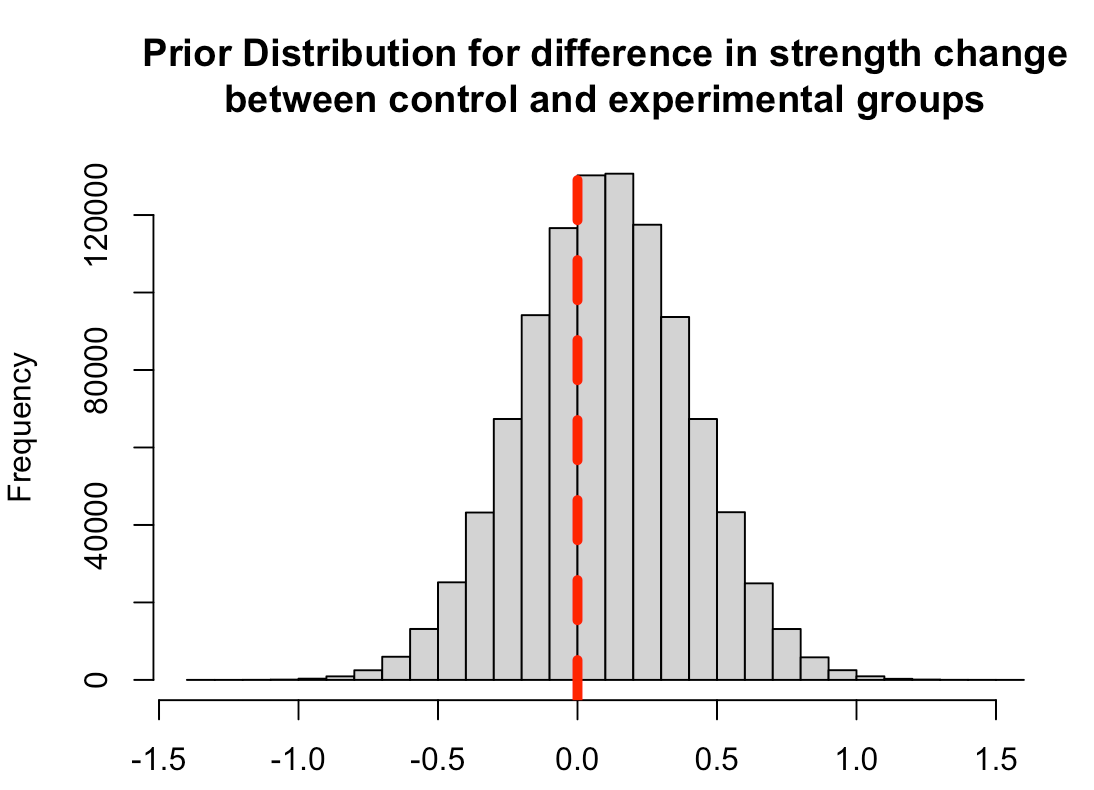
Since we have no real prior knowledge about the bill depth of Adelie penguins and don’t have a good sense for what the relationship between bill length and bill depth is, we will set our own weakly informative priors. We will specify both the intercept and slope to be normally distributed with a mean of 0 and a standard deviation of 30. Essentially, we will let the data speak. One technical note is that I am converting the standard deviation to precision, which is nothing more than 1 / variance (and recall that variance is just standard deviation squared).

For our sigma prior (which I refer to as tau, below) I’m going to specify a gamma prior with a shape and rate of 0.01.

## set priors
intercept_prior_mu <- 0
intercept_prior_sd <- 30
intercept_prior_prec <- 1/(intercept_prior_sd^2)

slope_prior_mu <- 0
slope_prior_sd <- 30
slope_prior_prec <- 1/(slope_prior_sd^2)

tau_shape_prior <- 0.01
tau_rate_prior <- 0.01

Let’s plot the priors and see what they look like.

## plot priors
N <- 1e4
intercept_prior <- rnorm(n = N, mean = intercept_prior_mu, sd = intercept_prior_sd)
slope_prior <- rnorm(n = N, mean = slope_prior_mu, sd = slope_prior_sd)
tau_prior <- rgamma(n = N, shape = tau_shape_prior, rate = tau_rate_prior)

par(mfrow = c(1, 3))
plot(density(intercept_prior), main = "Prior Intercept", xlab = )
plot(density(slope_prior), main = "Prior Slope")
plot(density(tau_prior), main = "Prior Sigma")

Place the observations in their own vectors

We will store the bill depth and length in their own vectors.

## observations
bill_depth <- adelie$bill_depth_mm
bill_length <- adelie$bill_length_mm


Initializing Values

Because the model runs iteratively, using the data in the previous row as the new prior, we need to get a few values to help start the process before progressing to our observed data, which would be row 1. Essentially, we need to get some values to give us a row 0. We will want to start with some reasonable values and let the model run from there. I’ll start the intercept value off with 20 and the slope with 1.


intercept_start_value <- 20
slope_start_value <- 1

Gibbs Sampler Function

We will write a custom Gibbs sampler function to do all of the heavy lifting for us. I tried to comment out each step within the function so that it is clear what is going on. The function takes an x variable (the independent variable), a y variable (dependent variable), all of the priors that we specified, and the start values for the intercept and slope. The final two arguments of the function are the number of simulations you want to run and the burnin amount. The burnin amount, sometimes referred to as the wind up, is basically the number of simulations that you want to throw away as the model is working to converge. Usually you will be running several thousand simulations so you’ll throw away the first 1000-2000 simulations as the model is exploring the potential parameter space and settling in to something that is indicative of the data. The way the Gibbs sampler slowly starts to find the optimal parameters to define the data is by comparing the estimated result from the linear regression, after each new observation and updating of the posterior distribution, to the actual observed value, and then calculates the sum of squared error which continually adjusts our model sigma (tau).

Each observation is indexed within the for() loop as row “i” and you’ll notice that the loop begins at row 2 and continues until the specified number of simulations are complete. Recall that the reason for starting at row 2 is because we have our starting values for our slope and intercept that kick off the loop and make the first prediction of bill length before the model starts updating (see the second code chunk within the loop).

## gibbs sampler
gibbs_sampler <- function(x, y, intercept_prior_mu, intercept_prior_prec, slope_prior_mu, slope_prior_prec, tau_shape_prior, tau_rate_prior, intercept_start_value, slope_start_value, n_sims, burn_in){
  
  ## get sample size
  n_obs <- length(y)
  
  ## initial predictions with starting values
  preds1 <- intercept_start_value + slope_start_value * x
  sse1 <- sum((y - preds1)^2)
  tau_shape <- tau_shape_prior + n_obs / 2
  
  ## vectors to store values
  sse <- c(sse1, rep(NA, n_sims))
  
  intercept <- c(intercept_start_value, rep(NA, n_sims))
  slope <- c(slope_start_value, rep(NA, n_sims))
  tau_rate <- c(NA, rep(NA, n_sims))
  tau <- c(NA, rep(NA, n_sims))
  
  for(i in 2:n_sims){
    
    # Tau Values
    tau_rate[i] <- tau_rate_prior + sse[i - 1]/2
    tau[i] <- rgamma(n = 1, shape = tau_shape, rate = tau_rate[i]) 
    
    # Intercept Values
    intercept_mu <- (intercept_prior_prec*intercept_prior_mu + tau[i] * sum(y - slope[i - 1]*x)) / (intercept_prior_prec + n_obs*tau[i])
    intercept_prec <- intercept_prior_prec + n_obs*tau[i]
    intercept[i] <- rnorm(n = 1, mean = intercept_mu, sd = sqrt(1 / intercept_prec))
    
    # Slope Values
    slope_mu <- (slope_prior_prec*slope_prior_mu + tau[i] * sum(x * (y - intercept[i]))) / (slope_prior_prec + tau[i] * sum(x^2))
    slope_prec <- slope_prior_prec + tau[i] * sum(x^2)
    slope[i] <- rnorm(n = 1, mean = slope_mu, sd = sqrt(1 / slope_prec))
    
    preds <- intercept[i] + slope[i] * x
    sse[i] <- sum((y - preds)^2)
    
  }
  
  list(
    intercept = na.omit(intercept[-1:-burn_in]), 
    slope = na.omit(slope[-1:-burn_in]), 
    tau = na.omit(tau[-1:-burn_in]))
  
}


Run the Function

Now it is as easy as providing each argument of our function with all of the values specified above. I’ll run the function for 20,000 simulations and set the burnin value to 1,000.

sim_results <- gibbs_sampler(x = bill_length,
    y = bill_depth,
    intercept_prior_mu = intercept_prior_mu,
    intercept_prior_prec = intercept_prior_prec,
    slope_prior_mu = slope_prior_mu,
    slope_prior_prec = slope_prior_prec,
    tau_shape_prior = tau_shape_prior,
    tau_rate_prior = tau_rate_prior,
    intercept_start_value = intercept_start_value,
    slope_start_value = slope_start_value,
    n_sims = 20000,
    burn_in = 1000)


Model Summary Statistics

The results from the function are returned as a list with an element for the simulated intercept, slope, and sigma values. We will summarize each by calculating the mean, standard deviation, and 90% Credible Interval. We can then compare what we obtained from our Gibbs Sampler to the results from our {rstanarm} model, which used Hamiltonian Monte Carlo (a different sampling approach).

## Extract summary stats
intercept_posterior_mean <- mean(sim_results$intercept, na.rm = TRUE)
intercept_posterior_sd <- sd(sim_results$intercept, na.rm = TRUE)
intercept_posterior_cred_int <- qnorm(p = c(0.05,0.95), mean = intercept_posterior_mean, sd = intercept_posterior_sd)

slope_posterior_mean <- mean(sim_results$slope, na.rm = TRUE)
slope_posterior_sd <- sd(sim_results$slope, na.rm = TRUE)
slope_posterior_cred_int <- qnorm(p = c(0.05,0.95), mean = slope_posterior_mean, sd = slope_posterior_sd)

sigma_posterior_mean <- mean(sqrt(1 / sim_results$tau), na.rm = TRUE)
sigma_posterior_sd <- sd(sqrt(1 / sim_results$tau), na.rm = TRUE)
sigma_posterior_cred_int <- qnorm(p = c(0.05,0.95), mean = sigma_posterior_mean, sd = sigma_posterior_sd)

## Extract rstanarm values
rstan_intercept <- coef(fit)[1]
rstan_slope <- coef(fit)[2]
rstan_sigma <- 1.1
rstan_cred_int_intercept <- as.vector(posterior_interval(fit)[1, ])
rstan_cred_int_slope <- as.vector(posterior_interval(fit)[2, ])
rstan_cred_int_sigma <- as.vector(posterior_interval(fit)[3, ])

## Compare summary stats to the rstanarm model
## Model Averages
model_means <- data.frame(
  model = c("Gibbs", "Rstan"),
  intercept_mean = c(intercept_posterior_mean, rstan_intercept),
  slope_mean = c(slope_posterior_mean, rstan_slope),
  sigma_mean = c(sigma_posterior_mean, rstan_sigma)
)

## Model 90% Credible Intervals
model_cred_int <- data.frame(
  model = c("Gibbs Intercept", "Rstan Intercept", "Gibbs Slope", "Rstan Slope", "Gibbs Sigma","Rstan Sigma"),
  x5pct = c(intercept_posterior_cred_int[1], rstan_cred_int_intercept[1], slope_posterior_cred_int[1], rstan_cred_int_slope[1], sigma_posterior_cred_int[1], rstan_cred_int_sigma[1]),
  x95pct = c(intercept_posterior_cred_int[2], rstan_cred_int_intercept[2], slope_posterior_cred_int[2], rstan_cred_int_slope[2], sigma_posterior_cred_int[2], rstan_cred_int_sigma[2])
)

## view tables
model_means
model_cred_int

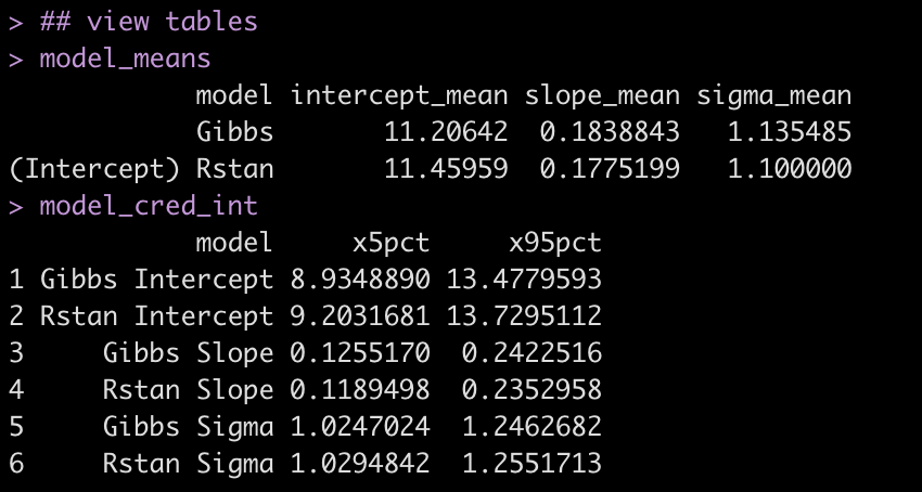
Even though the two approaches use a different sampling method, the results are relatively close to each other.

Visual Comparisons of Posterior Distributions

Finally, we can visualize the posterior distributions between the two models.

# put the posterior simulations from the Gibbs sampler into a data frame
gibbs_posteriors <- data.frame( Intercept = sim_results$intercept, bill_length_mm = sim_results$slope, sigma = sqrt(1 / sim_results$tau) ) %>%
  pivot_longer(cols = everything()) %>%
  arrange(name) %>%
  mutate(name = factor(name, levels = c("Intercept", "bill_length_mm", "sigma")))

gibbs_plot <- gibbs_posteriors %>%
  ggplot(aes(x = value)) +
  geom_histogram(fill = "light blue",
                 color = "grey") +
  facet_wrap(~name, scales = "free_x") +
  ggtitle("Gibbs Posterior Distirbutions")


rstan_plot <- plot(fit, "hist") + 
  ggtitle("Rstan Posterior Distributions")


gibbs_plot / rstan_plot


Wrapping Up

We created a simple function that runs a simple linear regression using Gibbs Sampling and found the results to be relatively similar to those from our {rstanarm} model, which uses a different algorithm and also had different prior specifications. It’s often not necessary to write your own function like this, but doing so can be a fun approach to learning a little bit about what is going on under the hood of some of the functions provided in the various R libraries you are using.

The entire code can be accessed on my GitHub page.

Feel free to reach out if you notice any math or code errors.

Making Predictions with a Bayesian Regression Model

One of my favorite podcasts is Wharton Moneyball. I listen every week, usually during my weekly long run, and I never miss an episode. This past week the hosts were discussing an email they received from a listener, a medical doctor, who encouraged them add a disclaimer before their COVID discussions because he felt that some listeners may interpret their words as medical advice. This turned into a conversation amongst the hosts of the show about how they are reading and interpreting the stats within the COVID studies and an explanation of the difference between the average population effect and an effect for a single individual within a population are two very different things.

The discussion made me think a lot about the difference between nomothetic (group-based) research and idographic (individual person) research, which myself and some colleagues discussed in a 2017 paper in the International Journal of Sports Physiology and Performance, Putting the “I” back in team. It also made me think about something Gelman and colleagues discussed in their brilliant book, Regression and Other Stories. In Chapter 9, the authors’ discussion Prediction & Bayesian Inference and detail three types of predictions we may seek to make from our Bayesian regression model:

  1. A point prediction
  2. A point prediction with uncertainty
  3. A predictive distribution for a new observation in the population

The first two points are directed at the population average and seek to answer the question, “What is the average prediction, y, in the population for someone exhibiting variables x?” and, “How much uncertainty is there around the average population prediction?” Point 3 is a little more interesting and also one of the valuable aspects of Bayesian analysis. Here, we are attempting to move away from the population and say something specific about an individual within the population. Of course, making a statement about an individual within a population will come with a large amount of uncertainty, which we can explore more specifically with our Bayes model by plotting a distribution of posterior predictions.

The Data

We will use the Palmer Penguins data, from the {palmerpenguis} package in R. To keep things simple, we will deal with the Adelie species and build a simple regression model with the independent variable bill_length_mm and dependent variable bill_depth_mm.

Let’s quickly look at the data.

knitr::opts_chunk$set(echo = TRUE)
library(tidyverse)
library(palmerpenguins)
library(rstanarm)

theme_set(theme_classic())

dat <- na.omit(penguins)
adelie <- dat %>% 
  filter(species == "Adelie") %>%
  select(bill_length_mm, bill_depth_mm)

adelie %>%
  ggplot(aes(x = bill_length_mm, y = bill_depth_mm)) +
  geom_smooth(method = "lm",
              size = 2,
              color = "black",
              se = FALSE) +
  geom_point(size = 5,
             shape = 21,
             fill = "grey",
             color = "black") +
  labs(x = "Bill Length (mm)",
       y = "Bill Depth (mm)",
       title = "Bill Depth ~ Bill Length",
       subtitle = "Adelie Penguins")

The Model

Since I have no real prior knowledge about the bill length or bill depth of penguins, I’ll stick with the default priors provided by {rstanarm}.

fit <- stan_glm(bill_depth_mm ~ bill_length_mm, data = adelie)
summary(fit)

Making predictions on a new penguin

Let’s say we observe a new Adelie penguin with a bill length of 41.3 and we want to predict what the bill depth would be. There are two ways to go about this using {rstanarm}. The first is to use the built in functions for the {rstanarm} package. The second is to extract posterior samples from the {rstanarm} model fit and build our distribution from there. We will take each of the above three prediction types in turn, using the built in functions, and then finish by extracting posterior samples and confirm what we obtained with the built in functions using the full distribution.

new_bird <- data.frame(bill_length_mm = 41.3)

1. Point Prediction

Here, we want to know the average bill depth in the population for an Adelie penguin with a bill length of 41.3mm. We can obtain this with the predict() function or we can extract out the coefficients from our model and perform the linear equation ourselves. Let’s do both!

# predict() function
predict(fit, newdata = new_bird)

# linear equation by hand
intercept <- broom.mixed::tidy(fit)[1, 2]
bill_length_coef <- broom.mixed::tidy(fit)[2, 2]

intercept + bill_length_coef * new_bird$bill_length_mm

We predict an Adelie with a bill length of 41.3 to have, on average, a bill depth of 18.8. Let’s put that point in our plot to where it falls with the rest of the data.

adelie %>%
  ggplot(aes(x = bill_length_mm, y = bill_depth_mm)) +
  geom_smooth(method = "lm",
              size = 2,
              color = "black",
              se = FALSE) +
  geom_point(size = 5,
             shape = 21,
             fill = "grey",
             color = "black") +
    geom_point(aes(x = 41.3, y = 18.8),
             size = 5,
             shape = 21,
             fill = "palegreen",
             color = "black") +
  labs(x = "Bill Length (mm)",
       y = "Bill Depth (mm)",
       title = "Bill Depth ~ Bill Length",
       subtitle = "Adelie Penguins")

There it is, in green! Our new point for a bill length of 41.3 falls smack on top of the linear regression line, the population average predicted bill depth given this bill length. That’s awful precise! Surely there has to be some uncertainty around this new point, right?

2. Point prediction with uncertainty

To obtain the uncertainty around the predicted point estimate we use the posterior_linpred() function.

new_bird_pred_pop <- posterior_linpred(fit, newdata = new_bird)

hist(new_bird_pred_pop)

mean(new_bird_pred_pop)
sd(new_bird_pred_pop)
qnorm(p = c(0.025, 0.975), mean = mean(new_bird_pred_pop), sd(new_bird_pred_pop))

What posterior_linpred() produced is a vector of posterior draws (predictions) for our new bird. This allowed us to visualize a distribution of potential bill depths. Additionally, we can take that vector of posterior draws and find that we predict an Adelie penguin with a bill length of 41.3 mm to have a bill depth of 18.8 mm, the same value we obtained in our point estimate prediction, with a 95% credible interval between 18.5 and 19.0.

Both of these approaches are still working at the population level. What if we want to get down to an individual level and make a prediction of bill depth for a specific penguin in the population? Given that individuals within a population will have a number of factors that make them unique, we need to assume more uncertainty.

3. A predictive distribution for a new observation in the population

To obtain a prediction with uncertainty at the individual level, we use the posterior_predict() function. This function will produce a vector of uncertainty that is much larger than what we saw above, as it is using the model error in the prediction.

new_bird_pred_ind <- posterior_predict(fit, newdata = new_bird)
head(new_bird_pred_ind)


hist(new_bird_pred_ind,
     xlab = "Bill Depth (mm)",
     main = "Distribution of Predicted Bill Depths\nfor a New Penguin with a Bill Length of 41.3mm")
abline(v = mean(new_bird_pred_ind[,1]),
       col = "red",
       lwd = 6,
       lty = 2)

mean(new_bird_pred_ind)
sd(new_bird_pred_ind)
mean(new_bird_pred_ind) + qnorm(p = c(0.025, 0.975)) * sd(new_bird_pred_ind)

Similar to the prediction and uncertainty for the average in the population, we can extract the mean predicted value with 95% credible intervals for the new bird. As explained previously, the uncertainty is larger that estimating a population value. Here, we have a mean prediction for bill depth of 18.8 mm, the same as we obtained in the population example. Our 95% Credible, however, has increased to a range of potential values between 16.6 and 21.0 mm.

Let’s visualize this new point with its uncertainty together with the original data.

new_df <- data.frame( bill_length_mm = 41.3, bill_depth_mm = 18.8, low = 16.6, high = 21.0 ) adelie %>%
  ggplot(aes(x = bill_length_mm, y = bill_depth_mm)) +
  geom_smooth(method = "lm",
              size = 2,
              color = "black",
              se = FALSE) +
  geom_point(size = 5,
             shape = 21,
             fill = "grey",
             color = "black") +
 geom_errorbar(aes(ymin = low, ymax = high),
               data = new_df,
               linetype = "dashed",
               color = "red",
               width = 0,
               size = 2) +
  geom_point(aes(x = bill_length_mm, y = bill_depth_mm),
             data = new_df,
             size = 5,
             shape = 21,
             fill = "palegreen",
             color = "black") +
  labs(x = "Bill Length (mm)",
       y = "Bill Depth (mm)",
       title = "Bill Depth ~ Bill Length",
       subtitle = "Adelie Penguins")

Notice how much uncertainty we now have (red dashed errorbar) in our prediction!

Okay, so what is going on here? To unpack this, let’s pull out samples from the posterior distribution.

Extract samples from the posterior distribution

We extract our samples using the as.matrix() function. This produced 4000 random samples of the intercept, bill_length_mm coefficient, and the sigma (error). I’ve also summarize the mean for each of these three values below. Notice that the mean across all of the samples are the same values we obtained in the summary output of our model fit.

posterior_samp <- as.matrix(fit)
head(posterior_samp)
nrow(posterior_samp)

colMeans(posterior_samp)

We can visualize uncertainty around all three model parameters and also plot the original data and the regression line from our samples.

par(mfrow = c(2,2))
hist(posterior_samp[,1], main = 'intercept',
     xlab = "Model Intercept")
hist(posterior_samp[,2], main = 'beta coefficient',
     xlab = "Bill Length Coefficient")
hist(posterior_samp[,3], main = 'model sigma',
     xlab = "sigma")
plot(adelie$bill_length_mm, adelie$bill_depth_mm, 
     pch = 19, 
     col = 'grey',
       xlab = "Bill Length (mm)",
       ylab = "Bill Depth (mm)",
       main = "Bill Depth ~ Bill Length")
abline(a = mean(posterior_samp[, 1]),
       b = mean(posterior_samp[, 2]),
       col = "red",
       lwd = 3,
       lty = 2)

Let’s make a point prediction for the average bill depth in the population based on the bill length of 41.3mm from our new bird and confirm those results with what we obtained with the predict() function.

intercept_samp <- colMeans(posterior_samp)[1]
bill_length_coef_samp <- colMeans(posterior_samp)[2]

intercept_samp + bill_length_coef_samp * new_bird$bill_length_mm

# confirm with the results from the predict() function
predict(fit, newdata = new_bird)

Next, we can make a population prediction with uncertainty, which will be the standard error around the population mean prediction. These results produce a mean and standard deviation for the predicted response. We confirm our results to those we obtained with the posterior_linpred() function above.

intercept_vector <- posterior_samp[, 1]
beta_coef_vector <- posterior_samp[, 2]

pred_vector <- intercept_vector + beta_coef_vector * new_bird$bill_length_mm
head(pred_vector)

## Get summary statistics for the population prediction with uncertainty
mean(pred_vector)
sd(pred_vector)
qnorm(p = c(0.025, 0.975), mean = mean(pred_vector), sd(pred_vector))

## confirm with the results from the posterior_linpred() function
mean(new_bird_pred_pop)
sd(new_bird_pred_pop)
qnorm(p = c(0.025, 0.975), mean = mean(new_bird_pred_pop), sd(new_bird_pred_pop))

Finally, we can use the samples from our posterior distribution to predict the bill depth for an individual within the population, obtaining a full distribution to summarize our uncertainty. We will compare this with the results obtained from the posterior_predict() function.

To make this work, we use the intercept and beta coefficient vectors we produced above for the population prediction with uncertainty. However, in the above example the uncertainty was the standard error of the mean for bill depth. Here, we need to obtain a third vector, the vector of sigma values from our posterior distribution samples. Using that sigma vector we will add uncertainty to our predictions by taking a random sample from a normal distribution with a mean of 0 and a standard deviation of the sigma values.


sigma_samples <- posterior_samp[, 3]
n_samples <- length(sigma_samples)

individual_pred <- intercept_vector + beta_coef_vector * new_bird$bill_length_mm + rnorm(n = n_samples, mean = 0, sd = sigma_samples)

head(individual_pred)

## summary statistics
mean(individual_pred)
sd(individual_pred)
mean(individual_pred) + qnorm(p = c(0.025, 0.975)) * sd(individual_pred)

## confirm results obtained from the posterior_predict() function
mean(new_bird_pred_ind)
sd(new_bird_pred_ind)
mean(new_bird_pred_ind) + qnorm(p = c(0.025, 0.975)) * sd(new_bird_pred_ind)

We obtain nearly the exact same results that we did with the posterior_predict() function aside form some rounding differences. This occurs because the error for the prediction is using a random number generator with mean 0 and standard deviation of the sigma values, so the results are not exactly the same every time.

Wrapping Up

So there you have it, three types of predictions we can obtain from a Bayesian regression model. You can easily obtain these from the designed functions from the {rstanarm} package or you can extract a sample from the posterior distribution and make the predictions yourself as well as create visualizations of model uncertainty.

You can access the full code on my GitHub Page. In addition to what is above, I’ve also added a section that recreates the above analysis using the {brms} package, which is another package available for fitting Bayesian models in R.

Visualizing Group Changes

CJ Mayes recently posted some really nice plots for visualizing group differences to Twitter.

My personal favorite was the bottom right plot, which can be a nice way of visualizing pre and post changes in a study. I believe the original plots were done in Tableau, so I’ve gone ahead and reproduced that bottom right plot in R.

You can grab the full code, all in one piece, from my GitHub page.

Simulate Some Data

library(tidyverse)
library(gghalves)
theme_set(theme_light())

set.seed(1234)
dat <- tibble( subject = LETTERS[1:26], pre = rnorm(n = 26, mean = 10, sd = 3) ) %>%
  mutate(post = pre + rnorm(n = 26, mean = 0, sd = 2))

dat_long <- dat %>%
  pivot_longer(cols = -subject) %>%
  mutate(name = factor(name, levels = c("pre", "post"))) 

Create the plot

dat_long %>%
  ggplot(aes(x = name, y = value)) +
  geom_line(aes(group = subject),
            color = "light grey",
            size = 0.7) +
  geom_point(aes(group = subject,
                 color = name),
             alpha = 0.7,
             size = 2) +
  geom_half_violin(aes(x = name),
                   data = dat_long %&gt;% filter(name == 'pre'),
                   fill = "light grey",
                   color = "light grey",
                   side = 'l',
                   alpha = 0.7) +
  geom_half_violin(aes(x = name),
                   data = dat_long %&gt;% filter(name == 'post'),
                   fill = "palegreen",
                   color = "palegreen",
                   side = 'r',
                   alpha = 0.7) +
  scale_color_manual(values = c("pre" = "light grey", "post" = "palegreen")) +
  labs(x = "Test Time",
       y = NULL,
       title = "Changes from Pre to Post") +
  theme(axis.text = element_text(face = "bold", size = 12),
        axis.title = element_text(face = "bold", size = 15),
        plot.title = element_text(size = 18),
        legend.position = "none")


Visualizing Vald Force Frame Data

Recently, in a sport science chat group on Facebook someone asked for an example of how other practitioners are visualizing their Vald Force Frame data. For those that are unfamiliar, Vald is a company that originally pioneered the Nordbord, for eccentric hamstring strength testing. The Force Frame is their latest technological offering, designed to help practitioners test abduction and adduction of the hips for performance and return-to-play purposes.

The Data

I never used the Force Frame, personally, so the author provided a screen shot of what the data looks like. Using that example, I created a small simulation of data to try and create a visual that might be useful for practitioners. Briefly, the data is structured as two rows per athlete, a row representing the force output squeeze (adduction) and a row representing pull (abduction). My simulated data looks like this:

### Vald Force Frame Visual
library(tidyverse)

set.seed(678)
dat <- tibble( player = rep(c("Tom", "Alan", "Karl", "Sam"), each = 2), test = rep(c("Pull", "Squeeze"), times = 4) ) %>%
  mutate(l_force = ifelse(test == "Pull", rnorm(n = nrow(.), mean = 305, sd = 30),
                          rnorm(n = nrow(.), mean = 360, sd = 30)),
         r_force = ifelse(test == "Pull", rnorm(n = nrow(.), mean = 305, sd = 30),
                          rnorm(n = nrow(.), mean = 360, sd = 30)),
         pct_imbalance = ifelse(l_force &gt; r_force, ((l_force - r_force) / l_force) * -1,
                            (r_force - l_force) / r_force))

In this simplified data frame we see the two rows per athlete with left and right force outputs. I’ve also calculated the Bilateral Strength Asymmetry (BSA), indicated in the percent imbalance column. This measure, as well as several other measures of asymmetry, was reported by Bishop et al (2016) in their paper on Calculating Asymmetries. The equation is as follows:

BSA = (Stronger Limb – Weaker Limb) / Stronger Limb

Additionally, if the left leg was stronger than the right I multiplied the BSA by -1, so that the direction of asymmetry (the stronger limb) can be reflected in the plot.

The Plot

Prior to plotting, I set some theme elements that allow me to style the axis labels, axis text, plot title and subtitle, and the headers of the two facets of tests that we have (one for pull and one for squeeze). Additionally, in order to make the plot look cleaner, I get rid of the legend since it didn’t offer any new information that couldn’t be directly interpreted by looking at the visual.

Before creating the visual, I first add a few variables that will help me give more context to the numbers. The goal of this visual is to help practitioners look at the tests results for a larger group of athletes and quickly identify those athletes that may require specific consideration. Therefore, I create a text string that captures the left and right force outputs so that they can be plotted directly onto the plot and a corresponding “flag” variable that indicates when an athlete may be below some normalized benchmark of strength in the respective test. Finally, I created an asymmetry flag to indicate when an athlete has a BSA that exceeds 10% in either direction. This threshold can (and should) be whatever is meaningful and important with your athletes and in your sport.

For the plot itself, I decided that plotting the BSA values for both tests would be something that practitioners would find valuable and comprehending the direction of asymmetry in a plot is also very easy. Remember, the direction that the bar is pointed represents the stronger limb. To provide context for the asymmetry direction, I created a shaded normative range and whenever the bar is outside of this range, it changes to red. When it is inside the range it remains green. To provide the raw value force numbers, I add those to the plot as labels, in the middle of each plot region for each athlete. If the athlete is flagged as having a force output for either leg that is below the predetermined threshold the text will turn red.


theme_set(theme_classic() +
          theme(strip.background = element_rect(fill = "black"),
                strip.text = element_text(size = 13, face = "bold", color = "white"),
                axis.text = element_text(size = 13, face = "bold"),
                axis.title.x = element_text(size = 14, face = "bold"),
                plot.title = element_text(size = 18),
                plot.subtitle = element_text(size = 14),
                legend.position = "none"))

dat %>%
  mutate(left = paste("Left =", round(l_force, 1), sep = " "),
         right = paste("Right =", round(r_force, 1), sep = " "),
         l_r = paste(left, right, sep = "\n"),
         asym_flag = ifelse(abs(pct_imbalance) > 0.1, "flag", "no flag"),
         weakness_flag = ifelse((test == "Pull" & (l_force < 250 | r_force < 250)) |
                                 (test == "Squeeze" & (l_force < 330 | r_force < 330)), "flag", "no flag")) %>%
  ggplot(aes(x = pct_imbalance, y = player)) +
  geom_rect(aes(xmin = -0.1, xmax = 0.1),
            ymin = 0,
            ymax = Inf,
            fill = "light grey",
            alpha = 0.3) +
  geom_col(aes(fill = asym_flag),
           alpha = 0.6,
           color = "black") +
  geom_vline(xintercept = 0, 
             size = 1.3) +
  annotate(geom = "text",
           x = -0.2, 
           y = 4.5,
           size = 6,
           label = "Left") +
  annotate(geom = "text",
           x = 0.2, 
           y = 4.5,
           size = 6,
           label = "Right") +
  geom_label(aes(x = 0, y = player, label = l_r, color = weakness_flag)) +
  scale_color_manual(values = c("flag" = "red", "no flag" = "black")) +
  scale_fill_manual(values = c("flag" = "red", "no flag" = "palegreen")) +
  labs(x = "% Imbalance",
       y = NULL,
       title = "Force Frame Team Testing",
       subtitle = "Pull Weakness < 250 | Squeeze Weakness < 330") +
  facet_grid(~test) +
  scale_x_continuous(labels = scales::percent_format(accuracy = 0.1),
                     limits = c(-0.3, 0.3))


At a quick glance we can notice that 3 of the athletes exhibit a strength asymmetry for Pull and two exhibit a strength asymmetry for Squeeze. Additionally, one of the athletes, Karl, is also below the strength threshold for both Pull and Squeeze while Sam is exhibiting strength below the threshold for Squeeze only.

Wrapping Up

There are a lot of ways to visualize this sort of single day testing data. This is just one example and would be different if we were trying to visualize serial measurements, where we are tracking changes over time. Hopefully this short example provides some ideas. If you’d like to play around with the code and adapt it to your own athletes, you can access it on my GitHub page.

Two Group Comparison – Frequentist vs Bayes – Part 1

One of the more common types of analysis conducted in science is the comparison of two groups (e.g., a treatment group and a control group) to identify whether an intervention had a desired effect. The problem, in sport science and other fields, is often a lack of participants (small sample sizes) and an inability to combine prior knowledge (e.g., outcomes from previous research or domain expertise) with the observed data in order to make a broader statement of our findings (IE, a Bayesian approach). Consequently, this leaves us analyzing the data on hand and reporting whatever potential findings shake out.

This tutorial will step through a two group comparison of some simulated data from both a frequentist (t-test) and Bayesian approach.

All code is accessible on my GITHUB page.

Two Groups – Simulated Data

We are conducting a study on the effect of a new strength training program. Participants are randomly allocated into a control group (n = 17), receiving a normal training program, or an experimental group (n = 22), receiving the new training program.

The data consists of the change in strength score observed for each participant in their respective groups. (NOTE: For the purposes of this example, the strength score is a made up number describing a participants strength).

Simulate the data

library(tidyverse)
library(patchwork)

theme_set(theme_classic())

set.seed(6677)
df <- data.frame( subject = 1:39, group = c(rep("control", times = 17), rep("experimental", times = 22)), strength_score_change = c(round(rnorm(n = 17, mean = 0, sd = 0.5), 1), round(rnorm(n = 22, mean = 0.5, sd = 0.5), 1)) ) %>%
  mutate(group = factor(group, levels = c("experimental", "control")))


Summary Statistics

df %>%
  group_by(group) %>%
  summarize(N = n(),
            Avg = mean(strength_score_change),
            SD = sd(strength_score_change),
            SE = SD / sqrt(N))


It looks like the new strength training program led to a greater improvement in strength, on average, than the normal strength training program.

Plot the data

Density plots of the two distributions

df %>%
  ggplot(aes(x = strength_score_change, fill = group)) +
  geom_density(alpha = 0.2) +
  xlim(-2, 2.5)


Plot the means and 95% CI to compare visually

df %>%
  group_by(group) %>%
  summarize(N = n(),
            Avg = mean(strength_score_change),
            SD = sd(strength_score_change),
            SE = SD / sqrt(N)) %>%
  ggplot(aes(x = group, y = Avg)) +
  geom_hline(yintercept = 0,
             size = 1,
             linetype = "dashed") +
  geom_point(size = 5) +
  geom_errorbar(aes(ymin = Avg - 1.96 * SE, ymax = Avg + 1.96 * SE),
                width = 0,
                size = 1.4) +
  theme(axis.text = element_text(face = "bold", size = 13),
        axis.title = element_text(face = "bold", size = 17))

Plot the 95% CI for the difference in means

df %>%
  mutate(group = factor(group, levels = c("control", "experimental"))) %>%
  group_by(group) %>%
  summarize(N = n(),
            Avg = mean(strength_score_change),
            SD = sd(strength_score_change),
            SE = SD / sqrt(N),
            SE2 = SE^2,
            .groups = "drop") %&amp;gt;%
  summarize(diff = diff(Avg),
            se_diff = sqrt(sum(SE2))) %&amp;gt;%
  mutate(group = 'Group\nDifference') %&amp;gt;%
  ggplot(aes(x = diff, y = 'Group\nDifference')) +
  geom_vline(aes(xintercept = 0),
             linetype = "dashed",
             size = 1.2) +
  geom_point(size = 5) +
  geom_errorbar(aes(xmin = diff - 1.96 * se_diff,
                    xmax = diff + 1.96 * se_diff),
                width = 0,
                size = 1.3) +
  xlim(-0.8, 0.8) +
  labs(y = NULL,
       x = "Average Difference in Strengh Score",
       title = "Difference in Strength Score",
       subtitle = "Experimental - Control (Mean Difference ± 95% CI)") +
  theme(axis.text = element_text(face = "bold", size = 13),
        axis.title = element_text(face = "bold", size = 17),
        plot.title = element_text(size = 20),
        plot.subtitle = element_text(size = 18))


Initial Observations

  • We can see that the two distributions have a decent amount of overlap
  • The mean change in strength for the experimental group appears to be larger than the mean change in strength for the control group
  • When visually comparing the group means and their associated confidence intervals, there is an observable difference. Additionally, looking at the mean difference plot, that difference appears to be significant based on the fact that the confidence interval does not cross zero.

So, it seems like something is going on here with the new strength training program. Let’s do some testing to see just how large the difference is between our two groups.

Group Comparison: T-test

First, let’s use a frequentist approach to evaluating the difference in strength score change between the two groups. We will use a t-test to compare the mean differences.

diff_t_test <- t.test(strength_score_change ~ group,
       data = df,
       alternative = "two.sided")

## store some of the main values in their own elements to use later
t_test_diff  <- as.vector(round(diff_t_test$estimate[1] - diff_t_test$estimate[2], 2))

se_diff <- 0.155    # calculated above when creating the plot

diff_t_test

  • The test is statistically significant, as the p-value is less than the magic 0.05 (p = 0.01) with a mean difference in strength score of 0.41 and a 95% Confidence Interval of 0.1 to 0.73.

Here, the null hypothesis was that the difference in strength improvement between the two groups is 0 (no difference) while the alternative hypothesis is that the difference is not 0. In this case, we did a two sided test so we are stating that we want to know if the change in strength from the new training program is either better or worse than the normal training program. If we were interested in testing the difference in a specific direction, we could have done a one sided test in the direction of our hypothesis, for example, testing whether the new training program is better than the normal program.

But, what if we just got lucky with our sample in the experimental group, and they happened to respond really well to the new program, and got unlucky in our control group, and they happened to not change as much to the normal training program? This could certainly happen. Also, had we collected data on a few more participants, it is possible that the group means could have changed and no effect was observed.

The t-test only allows us to compare the group means. It doesn’t tell us anything about the differences in variances between groups (we could do an F-test for that). The other issue is that rarely is the difference between two groups exactly 0. It makes more sense for us to compare a full distribution of the data and make an inference about how much difference there is between the two groups. Finally, we are only dealing with the data we have on hand (the data collected for our study). What if we want to incorporate prior information/knowledge into the analysis? What if we collect data on a few more participants and want to add that to what we have already observed to see how it changes the distribution of our data? For that, we can use a Bayesian approach.

Group Comparison: Bayes

The two approaches we will use are:

  1. Group comparison with a known variance, using conjugate priors
  2. Group comparisons without a know variance, estimating the mean and SD distributions jointly

Part 1: Group Comparison with known variance

First, we need to set some priors. Let’s say that we are skeptical about the effect of the new strength training program. It is a new training stimulus that the subjects have never been exposed to, so perhaps we believe that it will improve strength but not much more than the traditional program. We will set our prior belief about the mean improvement of any strength training program to be 0.1 with a standard deviation of 0.3, for our population.  Thus, we will look to combine this average/expected improvement (prior knowledge) with the observations in improvement that we see in our respective groups. Finally, we convert the standard deviation of the mean to precision, calculated as 1/sd^2, for our equations going forward.

prior_mu <- 0.1
prior_sd <- 0.3
prior_var <- prior_sd^2
prior_precision <- 1 / prior_var

Plot the prior distribution for the mean difference

hist(rnorm(n = 1e6, mean = prior_mu, sd = prior_sd),
     main = "Prior Distribution for difference in strength change\nbetween control and experimental groups",
     xlab = NULL)
abline(v = 0,
       col = "red",
       lwd = 5,
       lty = 2)

Next, to make this conjugate approach work we need to have a known standard deviation. In this example, we will not be estimating the joint posterior distributions (mean and SD). Rather, we are saying that we are interested in knowing the mean and the variability around it but we are going to have a fixed/known SD.

Let’s say we looked at some previously published scientific literature and also tried out the new program in a small pilot study of athletes and we the improvements of a strength training program are normally distributed with a known SD of 0.6.

known_sd <- 0.6
known_var <- known_sd^2

Finally, let’s store the summary statistics for each group in their own elements. We can type these directly in from our summary table.

df %>%
  group_by(group) %>%
  summarize(N = n(),
            Avg = mean(strength_score_change),
            SD = sd(strength_score_change),
            SE = SD / sqrt(N))

experimental_N <- 22
experimental_mu <- 0.423
experimental_sd <- 0.494
experimental_var <- experimental_sd^2
experimental_precision <- 1 / experimental_var

control_N <- 17
control_mu <- 0.0118
control_sd <- 0.469
control_var <- control_sd^2
control_precision <- 1 / control_var

Now we are ready to update the observed study data for each group with our prior information and obtain posterior estimates. We will use the updating rules provided by William Bolstad in Chapter 13 of his book, Introduction to Bayesian Statistics, 2nd Ed.

##### Update the control group observations ######
## SD
posterior_precision_control <- prior_precision + control_N / known_var
posterior_var_control <- 1 / posterior_precision_control
posterior_sd_control <- sqrt(posterior_var_control)

## mean
posterior_mu_control <- prior_precision / posterior_precision_control * prior_mu + (control_N / known_var) / posterior_precision_control * control_mu

posterior_mu_control
posterior_sd_control

##### Update the experimental group observations ######
## SD
posterior_precision_experimental <- prior_precision + experimental_N / known_var
posterior_var_experimental <- 1 / posterior_precision_experimental
posterior_sd_experimental <- sqrt(posterior_var_experimental)

## mean
posterior_mu_experimental <- prior_precision / posterior_precision_experimental * prior_mu + (experimental_N / known_var) / posterior_precision_experimental * experimental_mu

posterior_mu_experimental
posterior_sd_experimental

Compare the posterior difference in strength change

# mean
mu_diff <- posterior_mu_experimental - posterior_mu_control
mu_diff

# sd = sqrt(var1 + var2)
sd_diff <- sqrt(posterior_var_experimental + posterior_var_control)
sd_diff

# 95% Credible Interval
mu_diff + qnorm(p = c(0.025, 0.975)) * sd_diff

  • Combining the observations for each group with our prior, it appears that the new program was more effective than the normal program on average (0.34 difference in change score between experimental and control) but the credible interval suggests the data is consistent with the new program having no extra benefit [95% Credible Interval: -0.0003 to 0.69].

Next, we can take the posterior parameters and perform a Monte Carlo Simulation to compare the posterior distributions.

Monte Carlo Simulation is an approach that uses random sampling from a defined distribution to solve a problem. Here, we will use Monte Carlo Simulation to sample from the normal distributions of the control and experimental groups as well as a simulation for the difference between the two. To do this, we will create a random draw of 10,000 values with the mean and standard deviation being defined as the posterior mean and standard deviation from the respective groups.

## Number of simulations
N <- 10000

## Monte Carlo Simulation
set.seed(9191)
control_posterior <- rnorm(n = N, mean = posterior_mu_control, sd = posterior_sd_control)
experimental_posterior <- rnorm(n = N, mean = posterior_mu_experimental, sd = posterior_sd_experimental)
diff_posterior <- rnorm(n = N, mean = mu_diff, sd = sd_diff)

## Put the control and experimental groups into a data frame
posterior_df <- data.frame(
  group = c(rep("control", times = N), rep("experimental", times = N)),
  posterior_sim = c(control_posterior, experimental_posterior)
)

Plot the mean and 95% CI for both simulated groups

posterior_df %>%
  group_by(group) %>%
  summarize(Avg = mean(posterior_sim),
            SE = sd(posterior_sim)) %>%
  ggplot(aes(x = group, y = Avg)) +
  geom_hline(yintercept = 0,
             size = 1,
             linetype = "dashed") +
  geom_point(size = 5) +
  geom_errorbar(aes(ymin = Avg - 1.96 * SE, ymax = Avg + 1.96 * SE),
                width = 0,
                size = 1.4) +
  labs(x = NULL,
       y = "Mean Diff",
       title = "Difference in Strength Score",
       subtitle = "Monte Carlo Simulation of Posterior Mean and SD") +
  theme(axis.text = element_text(face = "bold", size = 13),
        axis.title = element_text(face = "bold", size = 17),
        plot.title = element_text(size = 20),
        plot.subtitle = element_text(size = 17))

  • We see more overlap here than we did when we were just looking at the observed data. Part of this is due to the priors that we set.

Plot the posterior simulation for the difference

hist(diff_posterior,
     main = "Posterior Simulation of the Difference between groups",
     xlab = "Strength Score Difference")
abline(v = 0,
       col = "red",
       lwd = 5,
       lty = 2)

Compare these results to the observed data and the t-test results

data.frame(
  group = c("control", "experimental", "difference"),
  observed_avg = c(control_mu, experimental_mu, t_test_diff),
  posterior_sim_avg = c(posterior_mu_control, posterior_mu_experimental, mu_diff),
  observed_standard_error = c(control_sd / sqrt(control_N), experimental_sd / sqrt(experimental_N), se_diff),
  posterior_sim_standard_error = c(posterior_sd_control, posterior_sd_experimental, sd_diff)
  )

  • Recall that we set out prior mean to 0.1 and our prior SD to 0.3
  • Also notice that, because this conjugate approach is directed at the means, I convert the observed standard deviations into standard errors (the standard deviation of the mean given the sample size). Remember, we set the SD to be known for this approach to work, so we are not able to say anything about it following our Bayesian procedure. To do so, we’d need to estimate both parameters (mean and SD) jointly. We will do this in part 2.
  • Above, we see that, following the Bayesian approach, the mean value of the control group gets pulled up closer to our prior while the mean value of the experimental group gets pulled down closer to that prior.
  • The posterior for the difference between the two groups, which is what we are interested in, has come down towards the prior, considerably. Had we had a larger sample of data in our two groups, the movement towards the prior would have been less extreme. But, since this was a relatively small study we get more movement towards the prior, placing less confidence in the observed sample of participants we had. We also see that the standard error around the mean difference increased, since our prior SD was 0.3. So, the mean difference decreased a bit and the standard error around that mean increased a bit. Both occurrences lead to less certainty in our observed outcomes.

Compare the Observed Difference to the Bayesian Posterior Difference

  • Start by creating a Monte Carlo Simulation of the observed difference from the original data.
  • Notice that the Bayesian Posterior Difference (blue) is pulled down towards our prior, slightly.
  • We also see that the Bayesian Posterior has more overlap of 0 than the Observed Difference (red) from the original data, which had a small sample size and hadn’t combined any prior knowledge that we might have had.
N <- 10000

set.seed(8945)
observed_diff <- rnorm(n = N, mean = t_test_diff, sd = se_diff)

plot(density(observed_diff),
     lwd = 5,
     col = "red",
     main = "Comparing the Observed Difference (red)\nto the\nBayes Posterior Difference (blue)",
     xlab = "Difference in Strength Score between Groups")
lines(density(diff_posterior),
      lwd = 5,
      col = "blue")
abline(v = 0,
       lty = 2,
       lwd = 3,
       col = "black")

Wrapping Up

That’s it for part 1. We’ve computed a frequentist t-test of the observed data in our study and compared those results to Bayesian estimation where we combined the observed data with some prior knowledge that we accessed from previous research and domain expertise. In this example, we used a conjugate approach and therefore were required to specify a known standard deviation for the data. Unfortunately, this may not always make sense to do and we may instead need to jointly estimating both the mean and standard deviation simultaneously. In part 2, we will discuss how to do this.

The code for this article is accessible on my GITHUB page.

If you see any code or mathematical errors, please email me.