TidyTuesday is a really neat project where every week a new data set is provided (for free) and anyone can download the data and share their findings. The basic idea was to get people to trade ideas on how to arrange, summarize, and visualize data within R (primarily using the suite of data science packages that make up the tidyverse).
I’ve enjoyed seeing what people share on Twitter and my friend Ellis Hughes suggested that I join in the fun. As such, I found a data set from an earlier week that was sports related (to keep the analysis relevant with the theme of my blog).
The data set comes from the TidyTuesday on 10/8/2019 (free to download HERE). Briefly, the data set contains outcomes from International Powerlifting Federation (IPF) Competitions from 1973 up through 2019. Each row represents an individual athlete’s best lift in the squat, bench press, and deadlift, for a given competition. In total, the data set contains 38,244 rows and 15996 unique lifters. (NOTE: There is a much larger data set that is linked to on the GitHub page, but I did not use that one).
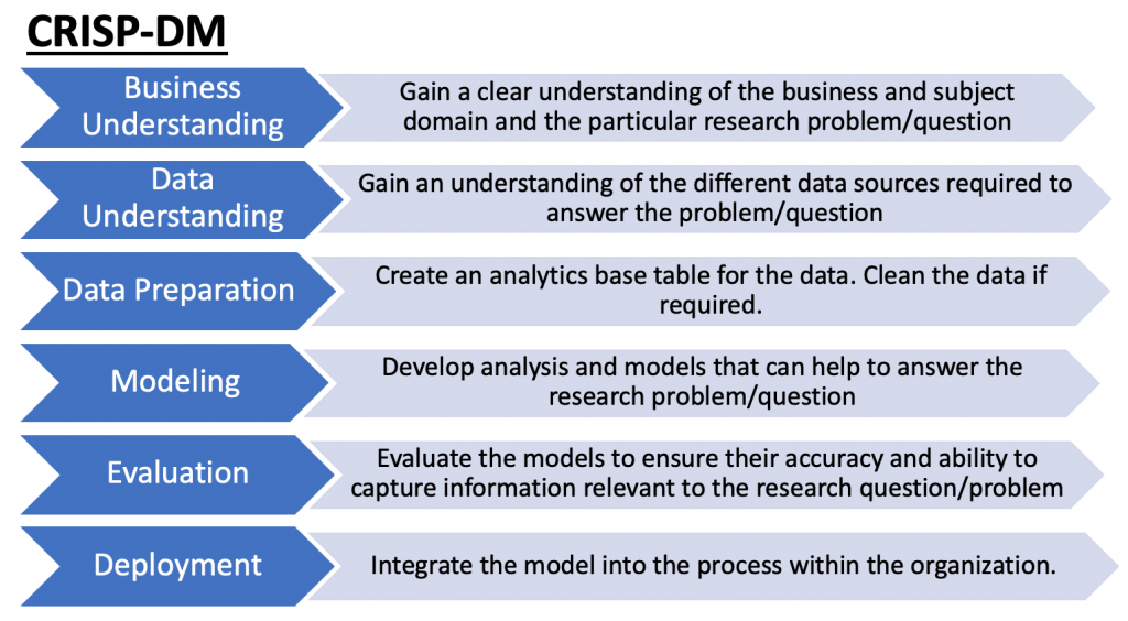
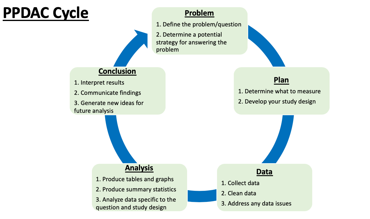
I’ll use the Data Analysis Template I discussed in a previous blog article. The only difference between the template from the prior article and the approach I’ll take here is that I have no prior knowledge of the data set. The template works well when we have a specific question to answer as it helps to guide the process from data collection to analysis. However, in this case, as is sometimes common in the real world, people may provide you with a data set without a specific question. As such, some level of data exploration is required to understand the data set and what type of questions may be interesting. Therefore, I’ll begin with just familiarizing myself with the data before developing a question I may want to answer.
Loading Data & Cleaning Data
- Read in the data from the TidyTuesday GitHub page.
- Notice that I added a cleaning step when reading in the data. I filter out any age class of 5-12 and I also remove any NA values in the age column (which happened because sometimes exact age wasn’t recorded). I added this step when importing the data after I worked through my analysis because I felt like it was better to do this right away and space in the code.
- In the second step, I ordered the data set by athlete name and date of competition.
- Finally, I created a long format of the data frame (since it is originally in a Wide format) to assist with building data visualizations and I remove any NA’s that were present in the data set (e.g., if a lifter bombs out on their squat in a competition then they have no value for the squat).
df <- readr::read_csv("https://raw.githubusercontent.com/rfordatascience/tidytuesday/master/data/2019/2019-10-08/ipf_lifts.csv") %>%
filter(age_class != "5-12", !is.na(age))

# order the data by lifter and date

df <- df %>%
arrange(name, date)

# create a long format of the data

df_long <- df %>%
reshape2::melt(., id = c("name", "date", "age", "age_class", "weight_class_kg", "sex"), measure.vars = c("best3squat_kg", "best3bench_kg", "best3deadlift_kg")) %>%
na.omit(df_long)
Data Exploration
Since I don’t really know anything about the data set provided, it is hard to have a question to answer. Thus, I create some basic plots to help orient myself to to the data we are working with.
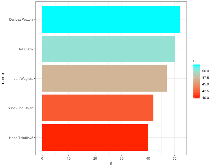
First, I wanted to see the athletes who have competed in the most competitions in this data set:
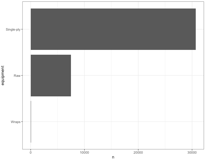
I know that lifters in the IPF have a choice of wearing different types of lifting equipment so I wanted to see what sort of competition gear the athletes in this data set wore:
I was curious about the age class and actual age of when athletes, on average, achieve their best lift:


We can also look at this by male and female:

Finally, I want to explore the distribution of power lifting totals between men and women:

Research Question
After exploring the data a little bit, some of the things that stand out:
1) The data set contains primarily lifters wearing single-ply lifting gear.
2) The boxplots use the ‘age_class’ variable, so everyone within an ‘age_class’ is treated the same and the age bins appear to be rather large (e.g., 24 – 34). I prefer not to think of age data this way since such large groupings can have a lot of variability within them.
3) Looking at the dot plots, which reflect age as a continuous variable, athletes tend to peak in all three of the lifts around their early 30’s.
4) The trend for peaking in performance seems to be consistent among men and women (which is interesting given that I would have suspected women to peak later given that they might be less inclined to take up serious weight training until later in life, whereas male’s tend to start lifting around their high school years).
5) The distribution of powerlifting totals appears to be relatively normally distributed for both men and women, with more variability in the distribution for men than women.
The beauty of graphing your data is that it often reveals underlying patterns that help you get a sense for what is going on. It is instances like this where a statistical model can serve as a gut check to confirm what you can already clearly see.
In looking at the data, the two questions I’ll explore are:
1) At what age do powerlifters peak for the 3 competition lifts?
2) How many competitions do lifters perform until they finally total elite?
I’ll keep these rather simple and brief, as a means of sharing some ideas. These models can (and should) be more thorough and account for things like sex (in the aging curve model, for example) and other variables that may be relevant to how powerlifters progress across career. What is presented below is just a simple jumping off point of where I might begin when working with data like this to answer a question before extending the model (for example, creating a mixed model to account for individual lifters).
Models
Powerlifter Aging Curve
To develop a simple aging curve model I built a polynomial regression for each of the 3 lifts (again, to keep things simple, I did not include sex in these models). Before building the models, we noticed from our data exploration was that most of the lifters in this data set are single-ply lifters. So I’m going to limit the analysis to them since changing competition gear can influence performance (I’m not going to get into the philosophical debate about which one is “better” than the other — I’ll leave that to the lifters). Additionally, since I’m interested in how lifters perform across their career and when they tend to “peak”, I’m going to limit my analysis to only those lifters who have competed in at least 10 competitions. After cleaning up the data specific to the above inclusion criteria we are left with 6169 rows of data and 426 unique athletes.
# Data clean up for aging curve model
sply <- df %>%
filter(equipment == "Single-ply") %>%
group_by(name) %>%
filter(n() >= 10)

nrow(sply)
nrow(distinct(sply, name))

# 6169
# 426 athletes
Now that the data is in the format we’d like, we can build some simple models for each of the three lifts:
squat_age_fit <- lm(best3squat_kg ~ age + I(age^2), data = sply)
bench_age_fit <- lm(best3bench_kg ~ age + I(age^2), data = sply)
deadlift_age_fit <- lm(best3deadlift_kg ~ age + I(age^2), data = sply)
The summary of the three models can be found on my GitHub page. Here is an example of the squat model output:

We see that the coefficient for age is positive while the polynomial of age is negative. This shouldn’t come as a surprise given that we observed an upside down “U” in our plots during the data exploration phase of our analysis. We can use these two coefficients to calculate the peak age from our regression equation. I’ve written a function to do that:
peak_age <- function(coef1, coef2){
x = -(coef1) / (2 * (coef2))
}
By supplying the custom function with the two coefficient (age and age^2) we can obtain the peak age from each of our models:
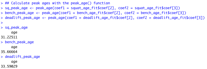
Just as suggested in our data visualizations, the peak age is around the early to mid 30’s with the squat peaking earlier and the bench press peaking later. As an example, we can plot the actual data along with a prediction line and 95% Confidence Interval for the bench press, where the peak age is around 36 years old:

Number of Competitions Until Totaling Elite
To try and answer this question I built a simple time-to-event (survival) model. In this case, the event of interest is the individual achieving an elite total, coded as a 1, and any competition where they do not achieve an elite total coded as a 0. I’m only calculating time to first elite total for each lifter, so there are some lifters that achieve elite and others that do not.
I wasn’t sure of where to obtain the elite total criteria so I found a criteria to use on THIS WEBSITE. However, I’m not certain if these criteria will carry over to single-ply lifters (IE, perhaps these criteria are only specific to raw lifters?). I also wasn’t able to locate an elite total criteria for female lifters, so the below analysis is only specific to male lifters. Finally, not all of the weight classes observed in the data were available on the referenced website. So, this analysis is far from perfect given the data but it will suffice for a simple example.
After adding in the elite total criteria and removing the athletes who were not in a weight class that was specific to the elite total criteria presented in the website, I was left with 6074 male lifters of which, 22% of them (1335) achieved an elite total during their career:

In looking at the number of competitions until a lifter totals elite (plot below), it appears that many of them are achieving that status in their first competition. This makes me skeptical of the data as I feel like most lifters would require a number of competitions to achieve an elite total. This may be a function of either (a) the subset of data that has been provided by TidyTuesday or (b) I’m using the wrong elite total criteria for single-ply lifters.

The data was fit with a Kaplan-Meier curve in order to create a simple model and nice visual of the data. Below is the summary table produced from the model followed by the time-to-event curve (event being elite total).


Conclusions
The TidyTuesday project is a great way to get access to data sets and share ideas. This was a fun one to do given it is specific to sport and I had the opportunity to try a few different models while also showing different ways of graphing the data. Finally, there is a bunch of different coding approaches I used to clean up the data, which you can check out on my GitHub page.