In the last three blog articles we’ve been talking about ways of displaying athletes’ test performance from both a numeric and visual stand point. Often, practitioners require these types of analysis to be placed in a report that can be used as a discussion point in meetings.
As much as I love {shiny} some colleagues work in environments where they don’t have the ability to make their web apps accessible to their decision-makers because they don’t have access to server space and don’t want to make their report public, for anyone to see (gotta retain that competitive advantage!). In these situations, I turn to Rmarkdown, plotly, and crosstalk.
Together, these three packages are massively valuable for producing interactive reports that can be saved in html format and emailed out to decision-makers and practitioners without having to worry about the data being hosted on a web application or something that might end up in the public domain. Essentially, we are just creating a report, like any other report we might email, but building it with html widgets that allow the recipients to interact directly with the data (which they often seem to appreciate and have fun with).
For this web report I am going to use data from the {Lahman} baseball database, which is freely accessible in R.
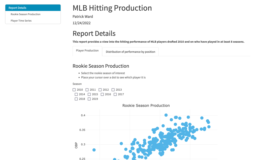
The finished product looks like this:
If you would like to view the finished product in action, CLICK HERE >> mlb_player_report.
To access the html file and play with it yourself, CLICK HERE >> mlb_player_report.
To access all the code to produce this report and build your own, go to my GITHUB page.
Some of the key features:
- The Report Details note tells the used the type of data being used in the report (All MLB players drafted in 2010 or later who have played at least 8 seasons).
- Each plot has a larger header section with bulleted notes indicating the ways in which the user can interact with it.
- Notice that I have a handy table of contents that the user can click on and immediately be brought to the section of the report they are interested in.
- There are two tabs. The first tab is dedicated to evaluating players. The second tab is specific to evaluating differences between positional groups.
- All of the plots have been built with plotly so they are completely interactive.
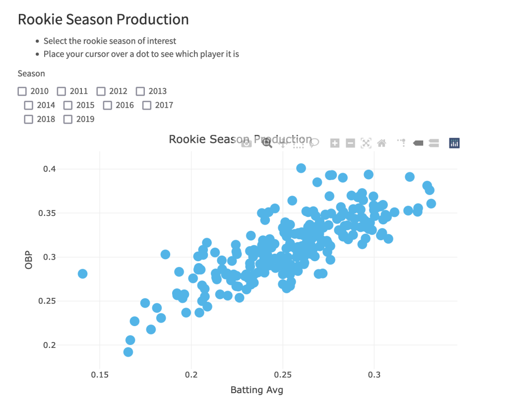
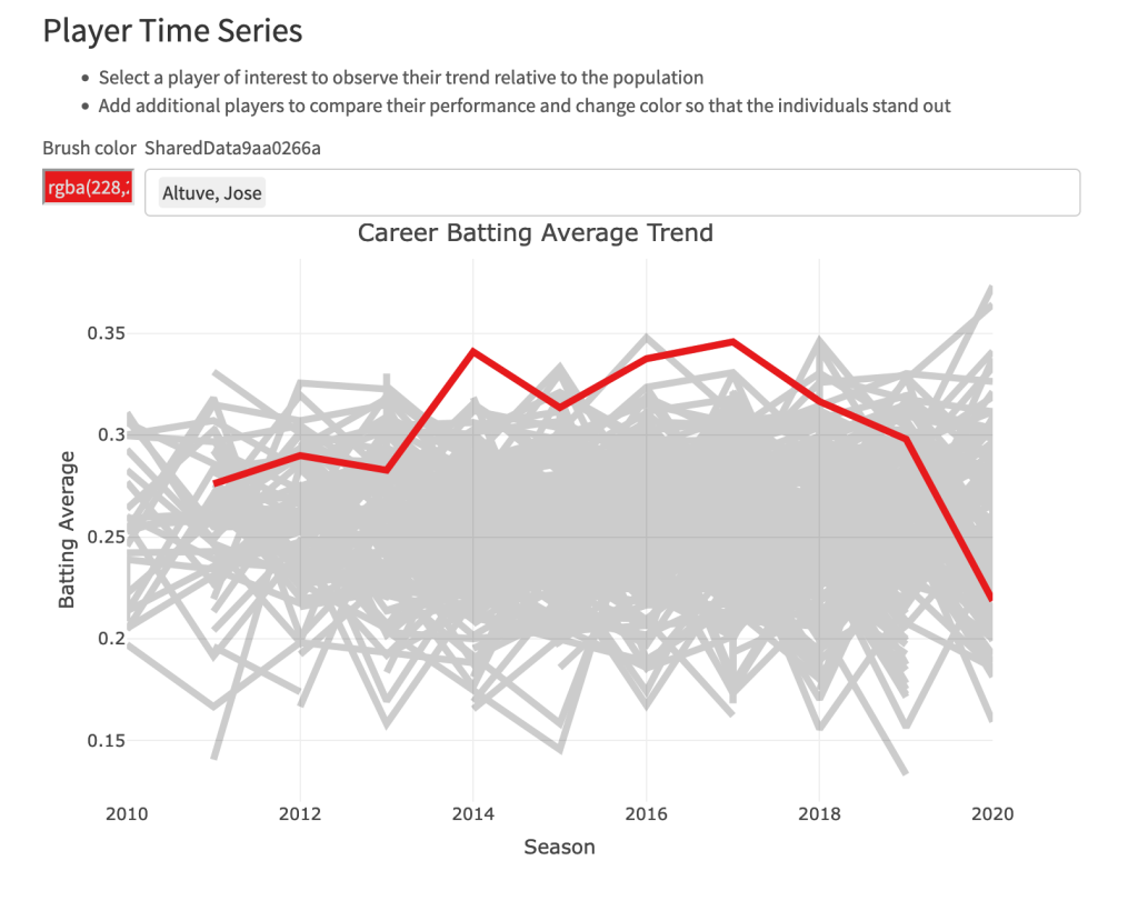
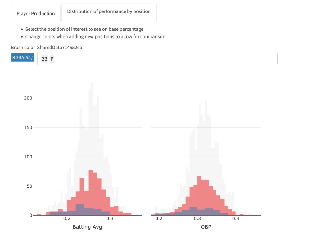
- I used crosstalk to create plots that allow the user to select/filter things of interest, such as rookie seasons (plot 1), players (plot 2), or positional groups (plot 3).
Let’s look at some still photos of the plots.
Rookie Season Plot
Player Career Performance Plot
Position Comparison Plot


