Yesterday, I provided some code to make a simple boxplot with doplot in order to visualize an athlete’s performance relative to their peers.
Today, we will try and make this plot interactive. To do so, we will use the {plotly} package and save the plots as html files that can be sent to our coworkers or decision-makers so that they can interact directly with the data.
Data
We will use the same simulated data from yesterday and also load the {plotly} library.
1 2 3 4 5 6 7 8 | ### Load libraries -----------------------------------------------library(tidyverse)library(randomNames)library(plotly)### Data -------------------------------------------------------set.seed(2022)dat <- tibble( participant = randomNames(n = 20), performance = rnorm(n = 20, mean = 100, sd = 10)) |
Interactive plotly plot
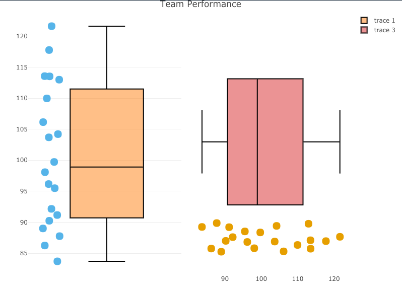
Our first two plots will be the same, one vertical and one horizontal. Plotly is a little different than ggplot2 in syntax.
- I start by creating a base plot, indicating I want the plot to be a boxplot. I also tell plotly that I want to group by participant, so that the dots will show up alongside the boxplot, as they did in yesterday’s visual.
- Once I’ve specified the base plot, I indicate that I want boxpoints to add the points next to the boxplot and set some colors (again, using a colorblind friendly palette)
- Finally, I add axis labels and a title.
- For easy, I use the subplot() function to place the two plots next to each other so that you can compare the vertical and horizontal plot and see which you prefer.
1 2 3 4 5 6 7 8 9 10 11 12 13 14 15 16 17 18 19 20 21 22 23 24 25 26 27 28 29 30 31 | ### Build plotly plot -------------------------------------------# Set plot baseperf_plt <- plot_ly(dat, type = "box") %>% group_by(participant)# Vertical plotvert_plt <- perf_plt %>% add_boxplot(y = ~performance, boxpoints = "all", line = list(color = 'black'), text = ~participant, marker = list(color = '#56B4E9', size = 15)) %>% layout(xaxis = list(showticklabels = FALSE)) %>% layout(yaxis = list(title = "Performance")) %>% layout(title = "Team Performance") # Horizontal plothz_plt <- perf_plt %>% add_boxplot(x = ~performance, boxpoints = "all", line = list(color = 'black'), text = ~participant, marker = list(color = '#E69F00', size = 15)) %>% layout(yaxis = list(showticklabels = FALSE)) %>% layout(xaxis = list(title = "Performance")) %>% layout(title = "Team Performance") ## put the two plots next to each othersubplot(vert_plt, hz_plt) |
- Statically, we can see the plot below and if you click on the red link beneath it you will be taken to the interactive version, where you can hover over the points and see the individual athlete’s name and performance on the test.
Interactive plotly with selector option
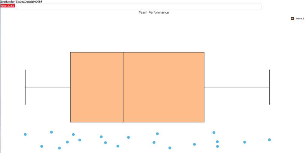
Next, we build the same plot but add a selector box so that the user can select the individual of interest and see their point relative to the boxplot (the population data).
This approach requires a few steps:
- I have to create a highlight key to explicitly tell plotly that I want to be able to highlight the participants.
- Next I create the base plot but this time instead of using the original data, I pass in the highlight key that I created in step 1.
- I build the plot just like before.
- Once the plot has been built I use the highlight() function to tell plotly how I want the plot to behave.
NOTE: This approach is super useful and easy and doesn’t require a shiny server to share the results. That said, I find this aspect of plotly to be a bit clunky and, when given the choice between this or using shiny, I take shiny because it has a lot more options to customize it exactly how you want. The downside is that you’d need a shiny server to share your results with colleagues or decision-makers, so there is a trade off.
1 2 3 4 5 6 7 8 9 10 11 12 13 14 15 16 17 18 19 20 21 22 23 24 25 26 27 28 | ### plotly with selection box -------------------------------------------# set 'particpant' as the group to selectperson_of_interest <- highlight_key(dat, ~participant)# create a new base plotly plot using the person_of_interest_elementselection_perf_plt <- plot_ly(person_of_interest, type = "box") %>% group_by(participant)# build the plotplt_selector <- selection_perf_plt %>% group_by(participant) %>% add_boxplot(x = ~performance, boxpoints = "all", line = list(color = 'black'), text = ~participant, marker = list(color = '#56B4E9', size = 15)) %>% layout(yaxis = list(showticklabels = FALSE)) %>% layout(xaxis = list(title = "Performance")) %>% layout(title = "Team Performance") # create the selector toolplt_selector %>% highlight(on = 'plotly_click', off = 'plotly_doubleclick', selectize = TRUE, dynamic = TRUE, persistent = TRUE) |
- Statically, we can see what the plot looks like below.
- Below the static image you can click the red link to see me walk through the interactive plot. Notice that as I select participants it selects them out. I can add as many as I want and change color to highlight certain participants over others. Additionally, once I begin to remove participants you’ll notice that plotly will create a boxplot for the selected sub population, which may be useful when communicating performance results.
- Finally, the last red link will allow you to open the interactive tool yourself and play around with it.
Wrapping Up
Today’s article provided some interactive options for the static plots that were created in yesterday’s blog article.
As always, the complete code for this article is available on my GITHUB page.


