This week, Ellis Hughes and I begin by explaining code from Peter (@DataVizGuy_1648), who made a cool line plot for the Big Mac Index, which used colors to emphasizes the top 5 and bottom 5 countries for the price of a Big Mac, scaled to US Dollars, over time (data courtesy of TidyTuesday Project).
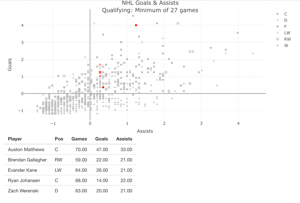
After that, we build on some of the work we did in TidyX 41, as we dive deeper into {plotly} and build an interactive NHL data visualization. We then take our {plotly} visualization and build it into a {shiny} app.
To watch the screen cast, CLICK HERE.
To access our code, CLICK HERE.

