Patrick Ward, PhD | Sports Science & Analytics

Menu

Skip to content
  • Home
  • About
  • Contact

TidyX 36: {plotly} user controlled animation

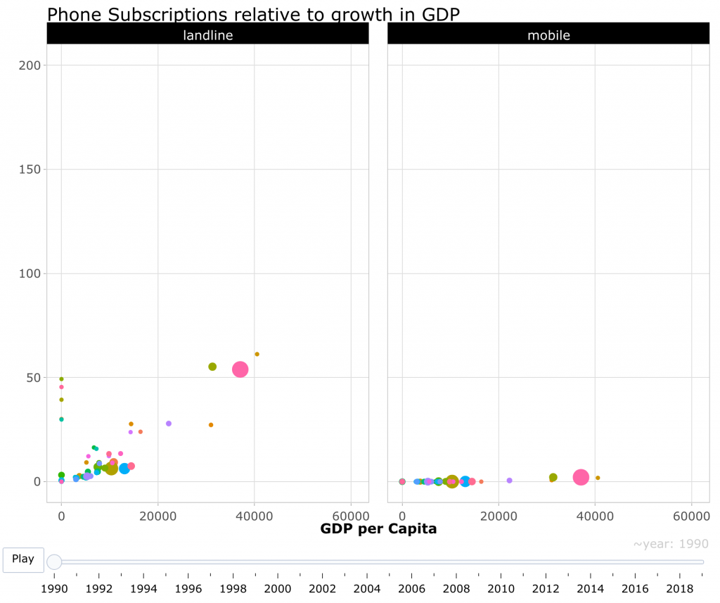
This week, Ellis Hughes and I use the {plotly} package to create a user controlled animation for evaluating trends in changes in landline and cellphone usage from data provided by the Tidy Tuesday Project.

To watch our screen cast, CLICK HERE.

To access our code, CLICK HERE.

This entry was posted in TidyX Screen Cast on November 16, 2020 by Patrick.

Post navigation

← R Tips & Tricks: Creating a Multipage PDF with {ggplot2} TidyX 37: Parsing JSON & Code Review →

Recent Posts

  • XGBOOST Tuning – Tutorial in {xgboost} and {tidymodels}
  • Crossed vs Nested Random Effects
  • K-Nearest Neighbor: {tidymodels} tutorial
  • TidyX Episode 186: {camcorder}
  • TidyX Episode 184: Intro to {purrr}

Categories

  • Bayesian Model Building
  • Model Building in Python
  • Model Building in R
  • Python Tips & Tricks
  • R Tips & Tricks
  • Sports Analytics
  • Sports Science
  • Strength & Conditioning
  • TidyX Screen Cast
  • Uncategorized

Follow

Twitter
LinkedIn
RSS Feed
Copyright © 2006-2025 Optimum Sports Performance LLC | Patrick A. Ward, PhD