Ellis Hughes and I start by discussing a really cool script for developing line plots by Leon Eyrich Jessen. Leon created these plots for analyzing data from the TidyTuesday Project on the famous television show Friends.
We then continue our discussion of {shiny} web apps by showing you how to add tab panels so that you can have different pages of information within the same app and improve the user interface experience.
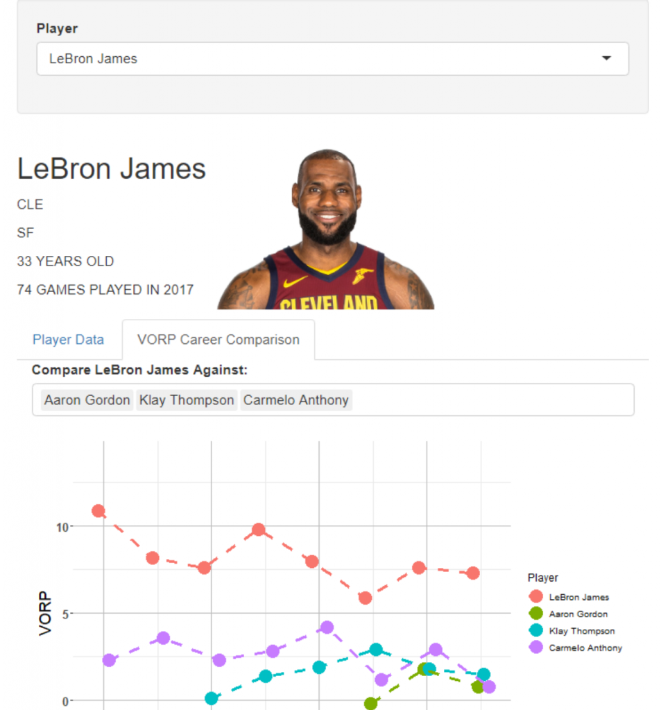
We extend our app from last week by adding a tab panel consisting of line plots for evaluating career comparisons between players in the Value Over Replacement Player (VORP) statistic.
To watch the screen cast, CLICK HERE.
To access our code, CLICK HERE.

