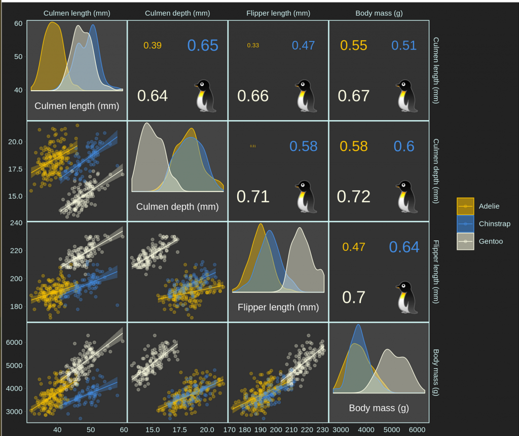
Pairs plots are plots of data in a matrix format to allow one to visualize as many numeric relationships as they would like. Oftentimes the data are plotted as scatter plots, however, this format can be extended to include other visualizations such as histograms, boxplots, and even correlation coefficients.
This week, Ellis Hughes and I explore these types of plots using the {palmerpenguins} data set pulled together by Allison Horst for the TidyTuesday Project.
This is a really fun data set for starting out in R because the data is very clean and has a few columns with nice relationships that can be exploited with statistical models. Ellis and I discuss some potential use cases for modeling this data and then we create a number of plots of the data to show various statistical relationships. We create pair plots using the {GGally} package and then we build some interactive {plotly} graphics with the data and explain how to build interactive visualizations of regression coefficients from a linear model.
Finally, we wrap up by going through the code of Roman Link. Roman created his own package, {corrmorant}, for creating pairs plots. This package offers a ton of flexibility and allows you to style the visualization in a more customized way. We had a lot of fun playing around with the package and the final project that Roman created using the {palmerpenguins} data set was this:
To listen to the screen cast, CLICK HERE.
To check out our code, CLICK HERE.

