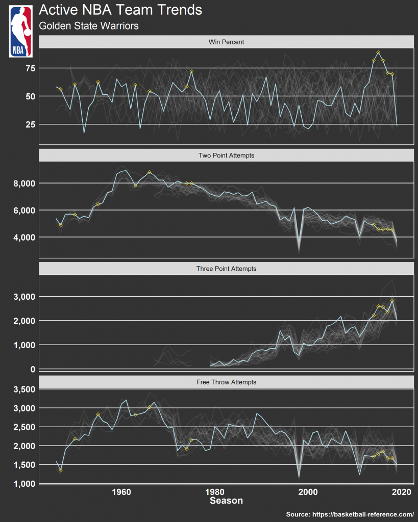
This week, Ellis Hughes and I discuss plotting lines for a single group with grey traced lines in the background representing the rest of the population.
First, with data provided by the TidyTuesday Project, we go over how Jake Kaupp used this approach to visualize some of the top grossing Broadway shows over the past couple decades.
Then, we apply this same approach to historic NBA data to show how different teams have trended in a variety of game statistics and produce a plot like this:
To watch our screen cast, CLICK HERE.
To access our code, CLICK HERE.

