A battery of performance tests (e.g., strength, power, fitness, agility) are often used by strength and conditioning and sports science staffs to evaluate a player’s current physical status. Such information can help to guide future training programs aiming to improve deficiencies and enhance performance. Having a single value that represents the athlete’s overall athleticism may be useful to identify the most well-rounded athletes in the club and may also help in communicating the test results of each player to the coaching staff in a digestible manner.
Recently, Anthony Turner and colleagues published the paper, Total Score of Athleticism: Holistic Athlete Profiling to Enhance Decision-Making, in the NSCA’s Strength and Conditioning Journal. While there are number of ways that one could index an athlete and represent their athleticism in a single value, this approach is simple to calculate for the practitioner and therefore I wanted to use it as an example of how you can create an R markdown report and Shiny app for displaying the results. (NOTE: For those interested in doing the analysis in excel, Anthony has a YouTube channel where he details the process. CLICK HERE).
Calculating Total Score of Athleticism (TSA)
The TSA is derived by calculating the z-score for each test in your battery and then averaging over the z-score for each individual to produce a single value.
The z-score is calculated simply as:

The values for a z-score will be reported with a mean of 0 and standard deviations ranging from -3 to 3 where ±1 SD represents ~68% of the scores, ±2 SD represents ~95% of the scores, and ±3 SD represents ~99% of the scores. In this way, values that are negative suggest the athlete is below average while values that are positive suggest the athlete is above average, relative to the group.
Some coaches or practitioners, however, may not like looking at a z-score because it is difficult for them to wrap their heads around the values (though I think it is easier to see the results as a z-score when performance is represented as positive and negative) and may instead prefer to look at the scores on a 0-100 scale. To convert the z-scores to t-scores on a 0-100 scale we use this formula:
Now, instead of having positive and negative values representing above or below average athletes, a score of a 50 represents average. As such, 10 points in either direction of 50 represent the number of standard deviations from average the athlete is. For example 60 = 1 SD, 70 = 2 SD, and 80 = 3 SD.
R Markdown Report
R Markdown is a simple way to take your analysis and turn it into a report or document for sharing. The beauty of R Markdown is that you can choose to show your R Code (if you are sharing with other professionals or colleagues) or hide your R Code and just show the results of the analysis (if you are sharing with coaches or other staff members).
I’ll put my R code in here to walk through the steps but if you are interested in the R Markdown file, just go over to my GitHub page.
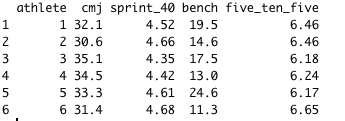
First, we need to load our required packages and make up some fake data (since I don’t have any data I can use publicly).
# Packages
library(tidyverse)
library(reshape)
library(stringr)

# Simulate data
set.seed(3344)
athlete <- as.factor(1:30)
cmj <- c(round(rnorm(n = 10, mean = 30, sd = 4), 1), round(rnorm(n = 10, mean = 24, sd = 4), 1), round(rnorm(n = 10, mean = 33, sd = 2), 1))
sprint_40 <- c(round(rnorm(n = 10, mean = 4.5, sd = .1), 2), round(rnorm(n = 10, mean = 4.9, sd = .2), 2), round(rnorm(n = 10, mean = 5, sd = .2), 2))
bench <- c(round(rnorm(n = 10, mean = 20, sd = 4), 1), round(rnorm(n = 10, mean = 12, sd = 4), 1), round(rnorm(n = 10, mean = 30, sd = 4), 1))
five_ten_five <- c(round(rnorm(n = 10, mean = 6.4, sd = .2), 2), round(rnorm(n = 10, mean = 6.7, sd = .2), 2), round(rnorm(n = 10, mean = 7.5, sd = .4), 2))
df <- data.frame(athlete, cmj, sprint_40, bench, five_ten_five)

Next we need to write 2 functions, one for calculating our z-score and one for calculating our t-score.
## z-score function
z_score <- function(x){
z = (x - mean(x, na.rm = T)) / sd(x, na.rm = T)
return(z)
}

## t-score function
t_score <- function(x){
t = (x * 10) + 50
return(t)
}
Now we are all set to calculate the z-score and t-score results for our individual athletes. Also, note that before converting to the t-score, any test where negative reflects better performance (e.g., speed tests where a faster time is more favorable) you can multiple the z-score by -1. This intuitively makes it easier for those reading the report to always associate values that are positive as “above average” and values that are negative as “below average”.
## calculate the z-score
df <- df %>%
mutate_if(is.numeric, list(z = z_score))

df$sprint_40_z <- df$sprint_40_z * -1
df$five_ten_five_z <- df$five_ten_five_z * -1

## calculate the t-score
df <- df %>%
  mutate(cmj_t = t_score(cmj_z),
         sprint_40_t = t_score(sprint_40_z),
         bench_t = t_score(bench_z),
         five_ten_five_t = t_score(five_ten_five_z))
Finally calculate the TSA z-score (TSA_z) and TSA t-score (TSA_t).
## calculate TSA_z
df$TSA_z <- apply(df[, 6:9], MARGIN = 1, FUN = mean)

## calculate TSA_z
df$TSA_t <- with(df, (TSA_z * 10) + 50)

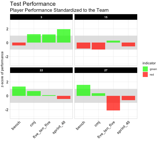
Now that the data is prepared we construct our report. Before plotting the TSA z-scores we need to move the data from the wide format, that it is currently in, to a long format. This will make it easier to code the plot. We will remove the “_z” at the end of each variable to make the labels cleaner looking. We are also going to add a shaded range between -1 and 1 (you can pick whatever range makes sense for you in your situation). Finally, we will include an indicator value that flags the athlete as “green” when they are above average and “red” when they are below average.
# Change data from a wide to long format
df_long <- df %>%
melt(., id = "athlete", measure.vars = c("cmj_z", "sprint_40_z", "bench_z", "five_ten_five_z"))

# remove the _z
df_long$Test <- str_sub(df_long$variable, end = -3)

# Add indicator value
df_long <- df_long %>% mutate("indicator" = ifelse(value > 0, "above avg", "below avg"))

# plot
df_long %>%
filter(athlete %in% c(3, 15, 22, 27)) %>%
ggplot(aes(x = Test, y = value)) +
geom_rect(aes(ymin = -1, ymax = 1), xmin = 0, xmax = Inf, fill = "light grey", alpha = 0.3) +
geom_col(aes(fill = indicator), alpha = 0.8) +
facet_wrap(~athlete) +
scale_fill_manual(values = c("green", "red")) +
theme_light() +
theme(axis.text.x = element_text(face = "bold", size = 12, angle = 45, vjust = 1, hjust = 1),
axis.text.y = element_text(face = "bold", size = 12),
strip.background = element_rect(fill = "black"),
strip.text = element_text(color = "white", face = "bold"),
plot.title = element_text(size = 18),
plot.subtitle = element_text(size = 15)) +
labs(x = "", y = "z-score of performance") +
ggtitle("Test Performance", subtitle = "Player Performance Standardized to the Team") +
ylim(-3, 3)

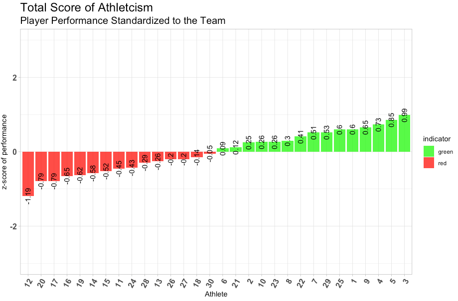
We can also plot the entire team’s TSA z-score in a similar manner. I’ve included the TSA z-score values on the plot as well, to help with interpretation.

If you would like to see what the finished markdown file looks like click here:
Total_Score_of_Athleticism_-_Report
You can certainly manipulate the code to produce different plots or add more text for the coaches to read. I’ve stuck with the z-score in this report because I personally don’t think the t-score conveys the information in the same manner. My personal preference is that I like to see below average as negative and above average as positive. I’ve added the code for the t-score plot in the markdown file so you can manipulate it if you’d like. Quickly, here is what the plot would look like (horizontal dashed line at 50, indicating average) so you can judge which one you prefer better:
Shiny App
You may have noticed from the markdown report that when plotting the individual test results I only showed 4 athletes. In this way the report is rather static! It doesn’t allow us to scroll through players in an efficient manner. For that, we need something that is interactive. Enter Shiny!
Shiny is a way for us to quickly build interactive webpages in R that can be hosted directly on our computer. There is a lot of versatility in these apps. The example below is just a simple app that allows the coach to select an athlete and it will automatically change to that individual’s plot, showing their performance in all of the individual tests as well as their TSA.
We could extend this app to have a second plot to allow for player comparisons or a table of results to allow for viewing the raw values for each of the tests. The code is provided below for you to run on your computer. I don’t go into what all of the elements of the code are doing (for time sake) but perhaps I could revisit other ways of using Shiny in future blog posts and explain more clearly how the code works.
### TotalScore of Athleticism - Shiny App

# Load packages
library(tidyverse)
library(reshape)
library(stringr)
library(shiny)

# simulate data
set.seed(3344)
athlete <- as.factor(1:30)
cmj <- c(round(rnorm(n = 10, mean = 30, sd = 4), 1), round(rnorm(n = 10, mean = 24, sd = 4), 1), round(rnorm(n = 10, mean = 33, sd = 2), 1))
sprint_40 <- c(round(rnorm(n = 10, mean = 4.5, sd = .1), 2), round(rnorm(n = 10, mean = 4.9, sd = .2), 2), round(rnorm(n = 10, mean = 5, sd = .2), 2))
bench <- c(round(rnorm(n = 10, mean = 20, sd = 4), 1), round(rnorm(n = 10, mean = 12, sd = 4), 1), round(rnorm(n = 10, mean = 30, sd = 4), 1))
five_ten_five <- c(round(rnorm(n = 10, mean = 6.4, sd = .2), 2), round(rnorm(n = 10, mean = 6.7, sd = .2), 2), round(rnorm(n = 10, mean = 7.5, sd = .4), 2))
df <- data.frame(athlete, cmj, sprint_40, bench, five_ten_five)

# z-score function

z_score <- function(x){
z = (x - mean(x, na.rm = T)) / sd(x, na.rm = T)
}

##### Data Pre-Processing #####
###############################

# calculate the z-score
df <- df %>%
mutate_if(is.numeric, list(z = z_score))

df$sprint_40_z <- df$sprint_40_z * -1
df$five_ten_five_z <- df$five_ten_five_z * -1

# calculate TSA_z
df$TSA_z <- apply(df[, 6:9], MARGIN = 1, FUN = mean)

# Change data from a wide to long format
df_long <- df %>%
melt(., id = "athlete", measure.vars = c("cmj_z", "sprint_40_z", "bench_z", "five_ten_five_z", "TSA_z"))

# remove the _z
df_long$Test <- str_sub(df_long$variable, end = -3)

# Add indicator value
df_long < df_long %<% mutate("indicator" = ifelse(value > 0, "above avg", "below avg"))

##### Shiny App #####
#####################

## User Interface

athlete <- as.vector(unique(df_long$athlete))

ui <- fluidPage(

titlePanel("Performance Testing Results"),

selectInput(
input = "athlete",
label = "athlete",
choices = athlete,
selected = "1"
),

plotOutput(outputId = "tsa.plot",
width = "60%")
)

## server

server <- function(input, output){

dat <- reactive({
dataset <- subset(df_long, athlete == input$athlete)
dataset
})

output$tsa.plot <- renderPlot({
d <- dat()

athlete.plot <- ggplot(data = d, aes(x = Test, y = value)) +
geom_rect(aes(ymin = -1, ymax = 1), xmin = 0, xmax = Inf, fill = "light grey", alpha = 0.3) +
geom_col(aes(fill = indicator), alpha = 0.8) +
scale_fill_manual(values = c("green", "red")) +
theme_light() +
theme(axis.text.x = element_text(face = "bold", size = 12, angle = 45, vjust = 1, hjust = 1),
axis.text.y = element_text(face = "bold", size = 12),
strip.background = element_rect(fill = "black"),
strip.text = element_text(color = "white", face = "bold"),
plot.title = element_text(size = 18),
plot.subtitle = element_text(size = 15)) +
labs(x = "", y = "z-score of performance") +
ggtitle("Test Performance", subtitle = "Player Performance Standardized to the Team") +
ylim(-3, 3)

print(athlete.plot)
})
}

## Run the app
shinyApp(ui = ui, server = server)
The website ends up looking like this:
Conclusion
There are a number of ways that one can index several performance tests and create a single number for coaches to digest. This is one simple example of an approach that is easy for practitioners to understand and action against (e.g., low values in red may require specialized approaches to training and performance development). The simplicity of this approach makes it easy to create simple reports and web apps that allow the strength coach and sports science staff to quickly share information with the coaching staff in an easy and interactive manner.
Obviously care should go into selecting the test battery as it should reflect elements that are specific to success in your given sport. Finally, the current format of the Total Score of Athleticism treats each test with equal weight. However, there may be situations where you want to place more weight on certain tests. For example, some tests may be more important for certain position groups than others. Alternatively, some tests may have a stronger association with sports performance and thus require greater weight than other tests. All of these things can be addressed in your setting by simply using the code in this blog and altering it to meet your needs.
References
1) Turner, AN. et al. (2019). Total Score of Athleticism: Holistic Athlete Profiling to Enhance Decision-Making, Strength Cond J. 2019. Epub-ahead-of-print.


